Chris Thorpe
Graphic Designer
ABOUT
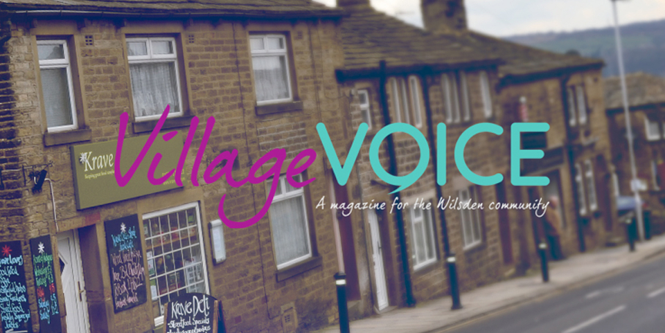
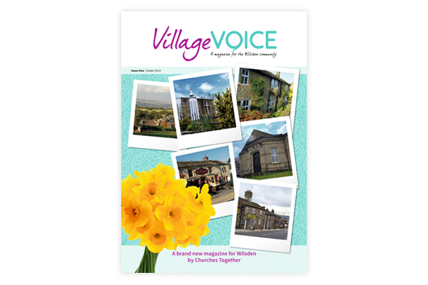
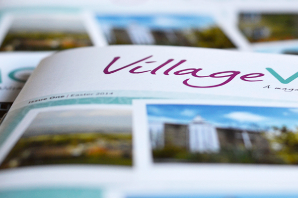
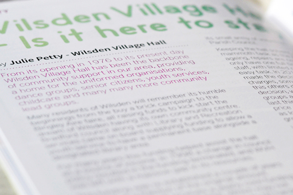
I created the masthead of the Village Voice and the style of the magazine. The magazine's aim is to provide a "Voice" for the local community - in association with the local churches.
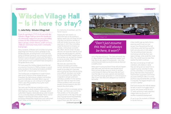
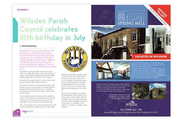
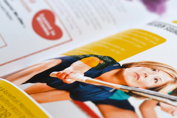
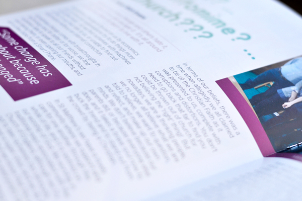
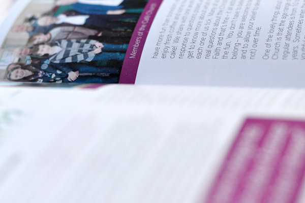
The fonts I used were District Pro and Odin Rounded, which compliment each other. District Pro - Thin was used as body copy because I wanted to give plenty of space to the editorial without having to use smaller images and this font enables that. The bright colours help draw your eyes to key items, such as quotes and headlines.