Catalyst Brand
Birmingham
ABOUT
A brand built around the people behind the cause.
Leukaemia Care has spent more than 50 years supporting people affected by leukaemia. Founded by bereaved parents who recognised the need for better support, the charity has grown into a national organisation providing practical advice, information and emotional support.
As the organisation evolved, its brand needed to catch up. It had to reflect the passion of the people behind the charity, communicate its purpose more clearly and connect with a much wider audience.
The challenge
Our initial discovery work revealed a clear gap between the organisation and how its brand was perceived. Stakeholders rated the existing brand an average of 5 out of 10, identifying outdated visuals, inconsistent messaging and a corporate tone that didn't reflect the care at the heart of the charity.
There was also confusion between Leukaemia Care and research-led charities. Its role in providing direct support to patients and families wasn't coming through clearly enough, while the brand struggled to engage people without a personal connection to leukaemia.
The challenge was to create a brand that could speak to two audiences with very different needs. People affected by leukaemia needed to see a charity they could turn to for support and reassurance. Donors, corporate partners and the wider public needed to understand its purpose and feel confident in supporting its work.
Finding the idea
We started by listening. Questionnaires and stakeholder meetings gave people across the organisation the opportunity to share their experiences, ambitions and frustrations with the existing brand.
This helped us understand what made Leukaemia Care different, what mattered to the people involved and how the organisation wanted to be perceived. We also explored its donor audiences to understand how the brand needed to communicate with individuals and corporate supporters.
One idea brought everything together.
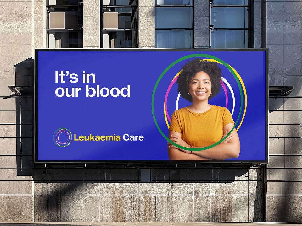
It's in our blood.
The line connects the charity's work with the reality of leukaemia as a blood cancer, while expressing the commitment and care that runs through the organisation. It also reflects the charity's origins, founded by people who understood first-hand why better support was needed.
It gave us a clear strategic direction for the brand, from its personality and messaging through to the visual identity.
Building the visual identity
The visual identity needed to feel recognisable, accessible and full of character, while giving Leukaemia Care the credibility to engage corporate partners and the warmth to connect with patients, families and individual supporters.
We explored the idea of blood cells and the creation of new cells as an initial creative direction, developing a free-flowing graphic device that could express the different people and experiences connected to the charity. The typography was selected with equal care, including the droplet-shaped counter within the letterforms.
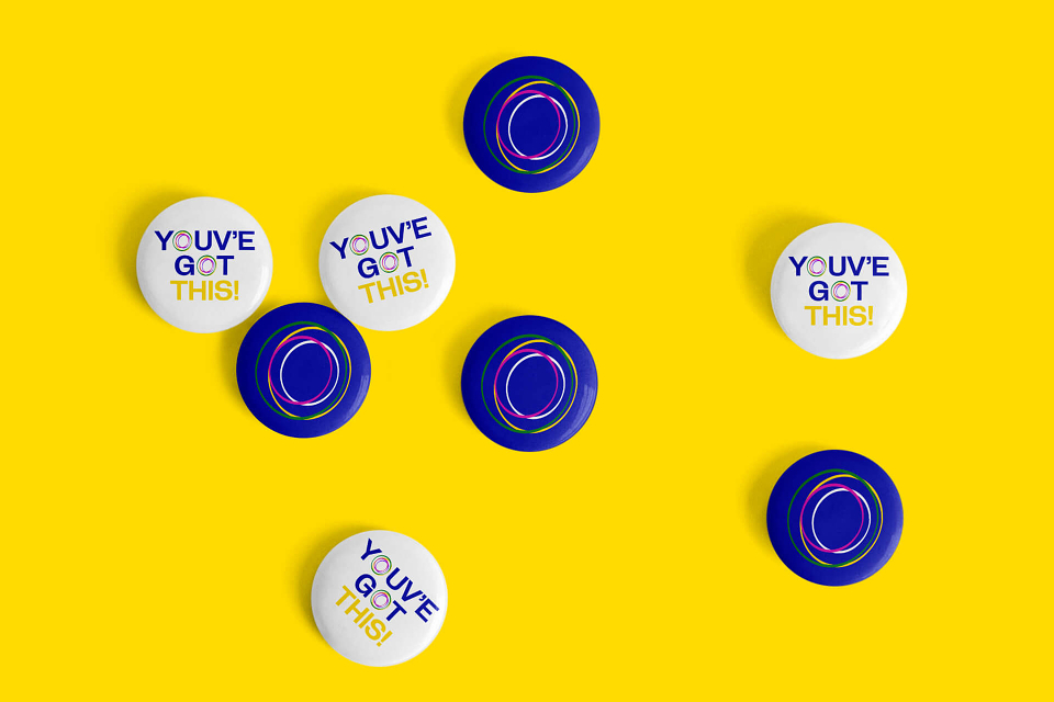
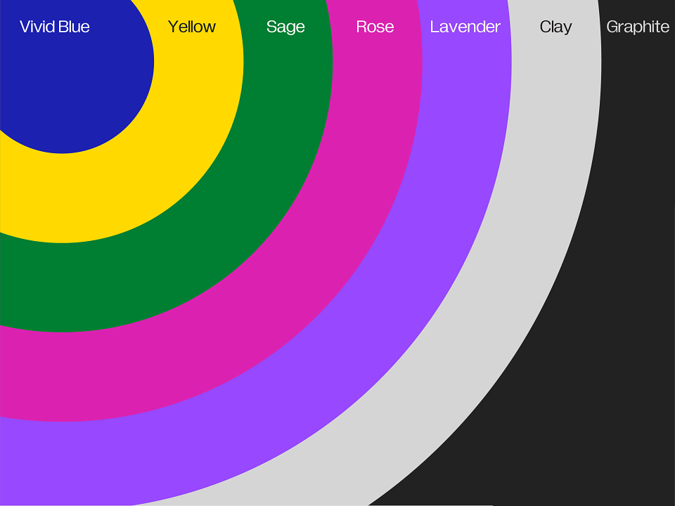
Through an iterative design process, these early ideas evolved into the identity used today. The circular forms express connection, continuity and care, while the blue and yellow palette gives the charity a distinctive presence.
The move away from red was particularly important. Research with people affected by leukaemia and the wider public found that red was more likely to suggest danger and warning than comfort. Blue offered a calmer, more reassuring direction, while yellow brought warmth and a sense of hope.
The result is an identity with a clear visual character, designed to work across the many ways Leukaemia Care communicates with its audiences.
Giving the brand a voice
A new visual identity would only go so far if the language remained inconsistent. Leukaemia Care needed a verbal identity that gave its people a shared way to explain the organisation, its purpose and the support it provides.
Working with stakeholders, we developed a messaging toolkit covering the overarching brand proposition, specific propositions for donors and corporate audiences, the organisation's purpose and its revised values.
The messaging was built around three central principles.
Care. Compassion. Support.
These principles informed the language used across the organisation, with an emphasis on plain English, inclusive communication and accessibility. The toolkit gave employees, volunteers and supporters a clearer way to talk about Leukaemia Care, while allowing the message to adapt to different audiences without losing its meaning.
Bringing the brand to life
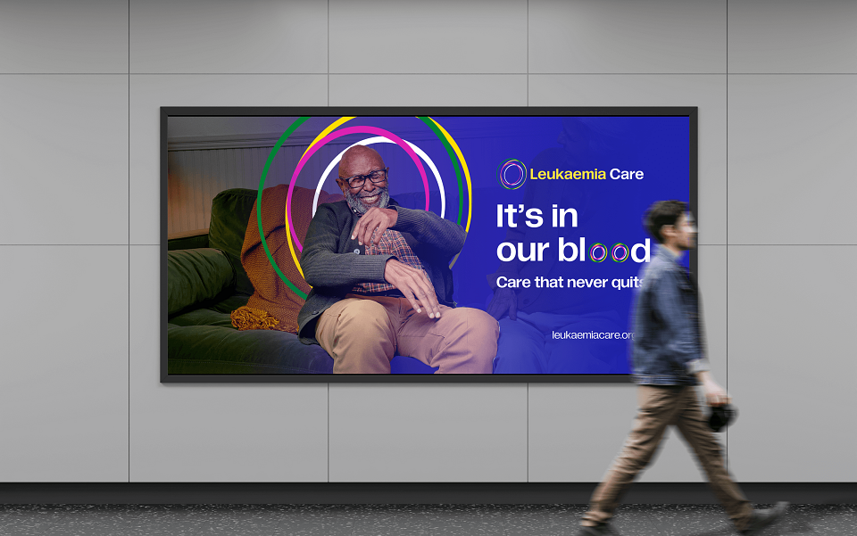
Photography played an important role in expressing the character of the new brand. The imagery needed to show the people behind the charity and the support they provide, without relying on overly staged or sentimental scenes.
We focused on candid, well-lit photography that captured real moments with empathy. Patients, families, supporters and the wider community needed to feel represented, with imagery that reflected the human relationships at the centre of Leukaemia Care's work.
The result is a brand with a stronger sense of purpose and a visual identity that reflects the organisation behind it. It gives Leukaemia Care a clearer way to communicate with the people who need its support, while helping donors and corporate partners understand the value of the work they make possible.