

Out-of-home advertising has always had a nasty habit of exposing weak thinking. A TV spot can hide behind music, pacing and a decent casting choice. A social campaign can survive on repetition, targeting and a few algorithmic favours. A poster gets none of that. It has to work in public, at speed, often in bad weather, against distraction, routine and half a dozen competing stimuli. That’s precisely why the best OOH ads of all time still feel so impressive. They don’t merely occupy space. They command it. And because out-of-home is, by definition, advertising seen in public spaces, the very best work becomes part of the texture of a city rather than an interruption imposed on it.
That still matters now. Industry bodies report that OOH reaches 98% of the UK population every week, that the average UK adult spends more than three hours a day out and about, and that 98% of marketers already use OOH in purchase-driven initiatives.
WARC, meanwhile, reported healthy global growth in digital out-of-home, forecasting worldwide DOOH spend to reach $17.6bn in 2025. In other words, outdoor advertising isn’t some nostalgic holdout from the age of glue and six-sheets. It’s still a live, growing, highly public medium with real reach, real authority and an increasingly serious role in the media mix.
So, when we talk about the best out-of-home advertising of all time, what we’re really talking about is a canon of ideas that understood the medium’s pressure and used it brilliantly. Some of these billboard ads are funny. Some are elegant. Some are technical marvels. Some are barely ads at all in the conventional sense. A few come from categories or cultural moments we’d approach very differently now.
But all of them prove the same underlying point: when a brand gets outdoor right, it can sear itself into public memory with a speed most media can only envy.
Why great out-of-home advertising still wins
Posterscope
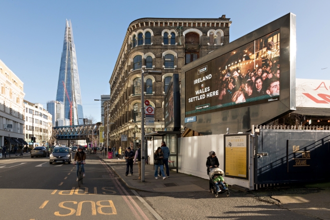
There’s a reason outdoor advertising inspires such affection among creatives. It is brutally clarifying. The best OOH ads do not have the luxury of over-explaining themselves. They are built around compression: one thought, one visual move, one line, one tension, one moment of recognition. OOH is a medium of memorability, presence, impact and where strategy has to become visible. If the idea isn’t legible at a glance, it doesn’t matter how clever the deck looked in the meeting.
That’s why the greatest billboard campaigns tend to feel inevitable once you’ve seen them. They don’t read like hard work. They read like truth delivered with confidence. The audience is usually asked to do a tiny amount of decoding, but never too much. Enough to feel smart. Not enough to feel burdened. That balance is harder than it looks. Most weak outdoor work fails for one of two reasons: either it’s trying to say five things at once, or it’s so pleased with its own cleverness that it forgets people are walking past with coffee, shopping bags and ten other things on their minds.
The best poster ads know better. They understand that public space rewards boldness, but it also rewards courtesy. Great outdoor respects the audience’s time. It arrives quickly, lands cleanly and leaves a residue. Sometimes that residue is a laugh. Sometimes it’s admiration. Sometimes it’s just the satisfying feeling that a brand has said exactly the right thing in exactly the right way. That residue is what turns a billboard into a memory, and a memory into fame.
The best headline-led OOH ads ever made
If you want to understand why headline-led outdoor still terrifies mediocre writers, start with The Economist. The 1988 poster “I never read The Economist.” – “Management trainee. Aged 42.” didn’t merely sell a publication. It established a whole worldview: dry, superior, self-aware, flattering to the reader and faintly cruel to the person outside the club. Decades later, it still lands because the viewer completes the joke for themselves, and that little act of participation is part of the pleasure.
With one of the clearest defences of headline-led outdoor I’ve heard lately, Agly Sharman, Chief Creative Officer at Joint, explains:
“With out of home ads, you have such a fleeting moment to communicate to people, and what better way to do that, than with humour? It’s proven time and again to be the most memorable, and effective way to communicate your message.
Our latest ad for the wealth management company Quilter does just that. We see a panda sitting next to a pile of money and the headline reads “Left to their own devices neither will reproduce.” Unexpected, persuasive and funny.
So, it won’t come as a surprise some of my favourite poster ads of all time are great headlines communicated brilliantly. Here’s a few of them.
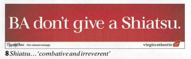
First up Virgin Atlantic. The brief was to tell people about the massages you can have in a Virgin lounge. A very smart copywriter came up with “BA don’t give a Shiatsu.” Funny, provocative and memorable. Love it!
Next, cast your mind back to the early noughties, and the last ever episode of Friends was about to air. On a Friday it turns out. How do you tell this in the simplest way possible? A simple rearranging of the letters gives you the answer in a way that can’t fail to raise a smile - E.N.D.S F.R.I
And finally, an appraisal of the best out of home headlines couldn’t possibly overlook The Economist. So many to choose from, so let’s go with an all-time classic – ‘I never read The Economist.’ - Management trainee. Aged 42. Just brilliant.”
The examples he reaches for all reveal the same truth. Virgin Atlantic’s “BA don’t give a Shiatsu.” is still one of the sharpest examples of challenger-brand poster copy ever produced, taking a service benefit (complimentary shiatsu massage) and weaponising it against British Airways in six wickedly efficient words.
The campaign ran on giant billboards near Heathrow and became part of a much wider period of provocative anti-BA creativity that helped define Virgin’s swaggering underdog persona. It worked because the joke and the proposition arrived together. You didn’t need a second look, although plenty of people gave it one.
Then there’s Channel 4’s “Friends Ends Fri”, which remains an almost absurdly elegant example of how little a billboard sometimes needs to do. Launched in 2004 to promote the final UK airing of Friends, it turned a routine bit of scheduling information into a public goodbye.
4Creative reused the sitcom’s instantly recognisable typography and let the rearranged letters do the emotional work. The result was witty, culturally precise and faintly melancholy without ever becoming sentimental. It didn’t shout. It just let the audience feel the ending for themselves. That’s poster advertising at its most disciplined.
What unites work like this is not simply “good copy”, though there’s plenty of that. It’s tonal exactness. The Economist sounds like The Economist. Virgin sounds like a cheeky airline spoiling for a fight. Channel 4 sounds like a broadcaster that understands the emotional temperature of its viewers and trusts them to get the joke.
That’s a bigger lesson than it first appears. The best OOH copy doesn’t merely communicate a message. It reveals a brand’s social posture in public, quickly enough to be absorbed in passing and sharply enough to be remembered later.
The most iconic visual billboard campaigns
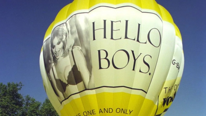
Headline-led outdoor may be the purest expression of the craft, but some of the greatest billboard ads of all time hardly need words at all. Wonderbra’s 1994 “Hello Boys” poster is the obvious case. The photograph of Eva Herzigová in a black bra, the downward glance, the black-and-white treatment and the minimal line combined to create one of the best-known images in British advertising history.
Its legacy is hardly uncomplicated now, and you can’t discuss it honestly without acknowledging the male gaze it cheerfully exploited. But as an example of a poster that changed a brand’s visibility almost overnight, its place in the canon is secure.
If Wonderbra was all blunt-force immediacy, Silk Cut was something subtler and, in creative terms, more slippery. Stanford’s archive of tobacco advertising notes that the campaign emerged in 1984 after ad restrictions forced the brand into more inventive territory. Purple silk, literal cuts through fabric and surreal, art-directed visual puns became a platform that ran for years and taught viewers to solve the joke in their own heads.
Later histories of the work traced its inspiration back to Lucio Fontana’s slashed canvases, which tells you something useful about the campaign’s ambition. It wasn’t merely decorating a cigarette brand. It was turning brand communication into a symbolic visual system. The category itself now feels dated at best and toxic at worst, but the creative principle remains fresh: when brand assets are distinctive enough, suggestion can do far more work than explanation.
Absolut took that principle and made it feel practically inexhaustible. The bottle shape became central to its advertising identity after launch, and one of its most memorable city-specific outdoor executions used a map image to imply the bottle silhouette without labouring the point. That’s what made the wider Absolut platform so enduring. It turned a pack asset into a language.
Rather than chasing novelty by abandoning recognisable brand cues, it kept returning to the same bottle outline and finding fresh ways to make it mean something different each time. That level of discipline is rare. Most long-running billboard campaigns decay into self-parody. Absolut managed to become more recognisable the more it repeated itself.
The common factor across these iconic visual billboard campaigns is ownability. You could crop them, glance at them from across the street, catch them half-obscured by a bus and still know whose work you were looking at. That matters because recall in OOH often begins with shape before it arrives at language. A downward gaze. A slash through silk. A bottle outline hidden in plain sight. Before the audience has consciously parsed the execution, the brand is already beginning to stick.
When out-of-home advertising made the medium do the work
Geoff Wilton
The next great leap in outdoor advertising happens when the site itself starts doing some of the selling. That is where billboard advertising stops being a surface and starts becoming behaviour. IBM’s People for Smarter Cities campaign remains one of the cleanest examples. The posters bent into ramps, benches and rain shelters, allowing a piece of outdoor advertising to become a small act of urban usefulness rather than a conventional demand for attention.
It’s a campaign that made ads genuinely helpful, and the work went on to win the Outdoor Grand Prix at Cannes. What makes it endure is not simply clever construction. It’s the fact that the creative idea proves the brand promise instead of merely stating it. “Smarter cities” is no longer a claim. It’s a bench.
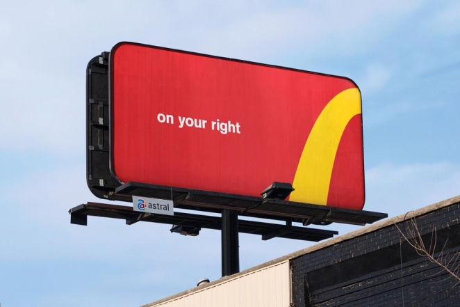
Then there’s McDonald's and “Follow the Arches”, a campaign so simple it almost feels rude. D&AD described it as transforming the Golden Arches into a unifying wayfinding system by cropping the logo into directional paths, while The One Club awarded it a Gold Pencil in 2018. And that really is the whole idea: take one of the most recognisable symbols in branding, remove half of it, and trust people to understand where they’re being sent. That trust is the genius. It suggests not only that the brand’s logo is famous enough to survive dismemberment, but that the audience is perfectly capable of reading a fragment of brand language and doing the rest themselves.
This is where some of the best out-of-home advertising separates itself from merely attractive poster design. It lets the medium participate in the communication. IBM made the billboard useful. McDonald’s made it directional. Neither campaign relied on a large body copy block, a sentimental brand manifesto or a hyperactive digital gimmick. They simply looked at the medium more closely than everyone else did and asked a better question.
Not “What can we put on this site?” but “What can this site itself do?” Once you ask that, outdoor becomes much more interesting.
The digital OOH campaigns that changed billboard advertising
British Airways
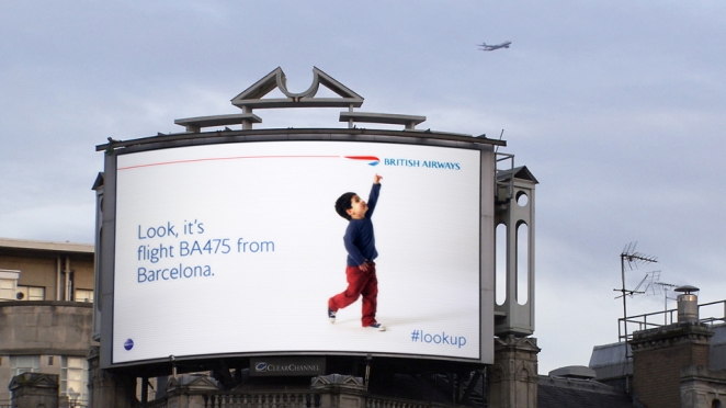
Digital OOH has produced a lot of expensive wallpaper over the years. Screens move, copy updates, data flows and very little of it is memorable five minutes later. The work that lasts tends to use technology in a much more disciplined way. It doesn’t show off the machinery for the sake of it. It uses the machinery to reveal something human. British Airways’ Magic of Flying is still the textbook example.
It was a legitimate world first idea: digital billboards that reacted to specific BA planes overhead. The screens showed the flight number and where the aircraft was coming from, with dynamic retail messaging matched to the route. Yet for all the technical sophistication, what people remember is the child on the screen pointing up at the sky. The data mattered. The wonder mattered more.
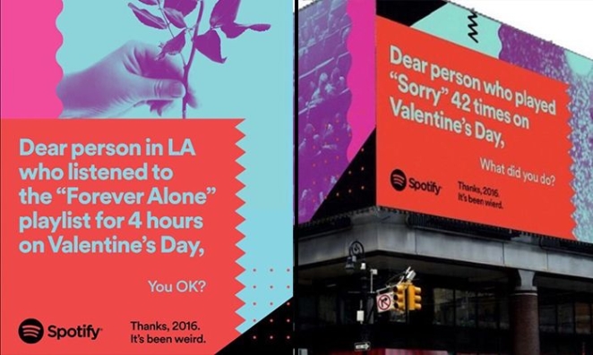
Spotify’s “Thanks, 2016. It’s Been Weird” pulled off a different trick. The campaign generated 164 unique data stories across 11 countries, using listener behaviour to create local, funny, hyper-specific outdoor headlines. So much data-driven advertising feels bloodless because it arrives dressed as insight but sounds like admin. Spotify’s outdoor campaign understood that people will forgive a brand for knowing a lot about them if the brand uses that knowledge to tell a joke, flatter a tribe or hold up a mirror to culture at exactly the right angle. Suddenly, analytics had a pulse.
Apple’s Shot on iPhone platform, and especially the original World Gallery work, made an equally important point in a quieter register. The campaign used user-generated photographs across 73 cities in 25 countries, turning outdoor space into a public photography exhibition rather than a conventional product boast. Apple later kept that logic alive through Shot on iPhone challenges, with winning images again earmarked for billboards, retail and online placements.
In 2025, Cannes Lions awarded the long-running platform the Creative Effectiveness Grand Prix, praising its ability to democratise creativity. That phrase gets overused in marketing, but here it fits. Apple took product proof, authorship and aspiration, then wrapped them into a billboard system that let ordinary people’s images carry extraordinary scale.
What these campaigns prove is that digital out-of-home works best when it behaves less like a screen and more like a stage-managed public moment. British Airways turned real-time data into awe. Spotify turned aggregate listening habits into cultural self-recognition. Apple turned billboards into galleries. None of them relied on motion for motion’s sake. They understood that technology is only interesting in outdoor when it deepens the human bit.
What the best OOH ads of all time still teach brands
Look across the best OOH ads of all time and the same lessons keep surfacing.
One idea beats ten messages every single time
The Economist, “Friends Ends Fri” and “Follow the Arches” all work because they are reduced to a single. clean move. One deduction. One joke. One visual instruction. There is no clutter to fight through and no explanatory paragraph waiting to rescue the work later. That kind of reduction feels risky inside organisations because it leaves nowhere to hide. But in outdoor, that is exactly the point.
Distinctive brand assets aren’t a nice extra, they are often the whole game
The best billboard campaigns are usually built around something only that brand could plausibly own: the red-and-white authority of The Economist, the purple slash of Silk Cut, the bottle silhouette of Absolut, the Golden Arches of McDonald’s, the recognisable user-made aesthetic of Apple’s Shot on iPhone. Brands that lack those assets tend to compensate with volume, complexity or borrowed style. Brands that possess them can whisper and still be heard.
Humour remains one of outdoor’s great unfair advantages
Humour is still one of the fastest ways to make a fleeting encounter memorable, which is exactly what Sharman was getting at in that long, enthusiastic defence of headline-led posters. Virgin’s anti-BA line still gets repeated because it’s funny. Spotify’s data jokes travelled because they were funny. Even “Friends Ends Fri” gets its emotional sting from a sly typographic smile. Outdoor is not the place for indulgent wit that takes thirty seconds to unpack. But it is absolutely the place for a line or visual turn sharp enough to make somebody feel briefly delighted on the way to somewhere else.
The medium itself can and should contribute to the idea
IBM’s posters became infrastructure. British Airways made a billboard react to the sky above it. McDonald’s turned brand signage into directions. This is one reason OOH still feels so alive, even after every new platform has spent years promising to replace it. Outdoor has a relationship with real place, real movement and real public life that other media still struggle to replicate. When a campaign makes genuine use of that fact, it gains a kind of authority you can’t fake on a feed.
The greatest out-of-home advertising never feels like it’s trying too hard
That doesn’t mean it was easy. Usually the opposite is true. “Effortless” outdoor is almost always the result of brutal editing, deep strategic clarity and a creative team willing to kill anything that slows the idea down. But when that discipline is there, the finished work takes on a strange kind of public grace. It feels as though it belongs where it is. As though the city was waiting for that line, that image, that visual trick all along.
That is why the best billboard ads endure. They are not simply clever pieces of advertising history. They are public artefacts. People quote them years later. They reference them in briefs, in award juries, in pub arguments, in agency corridors, in magazine features exactly like this one. Some of them survive because they were funny. Some because they were beautiful. Some because they made the medium itself feel newly possible. All of them survive because they understood a hard truth that remains true now: if you can say something brilliantly in a glance, you can last a very long time indeed.
John Martin May 3rd, in the morning
Well done - good read.