Callum Crew
Graphic Designer & Art Director
ABOUT
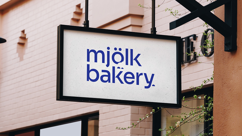
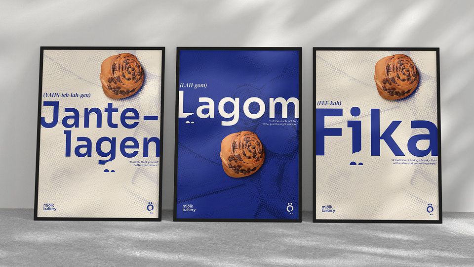
Mjölk is not your everyday café, but it aims to bring fika to you every day. While bakeries and cafés are everywhere, Mjölk has a much stronger USP and purpose: to bring the Scandinavian lifestyle to its customers, along with its delicious pastries.
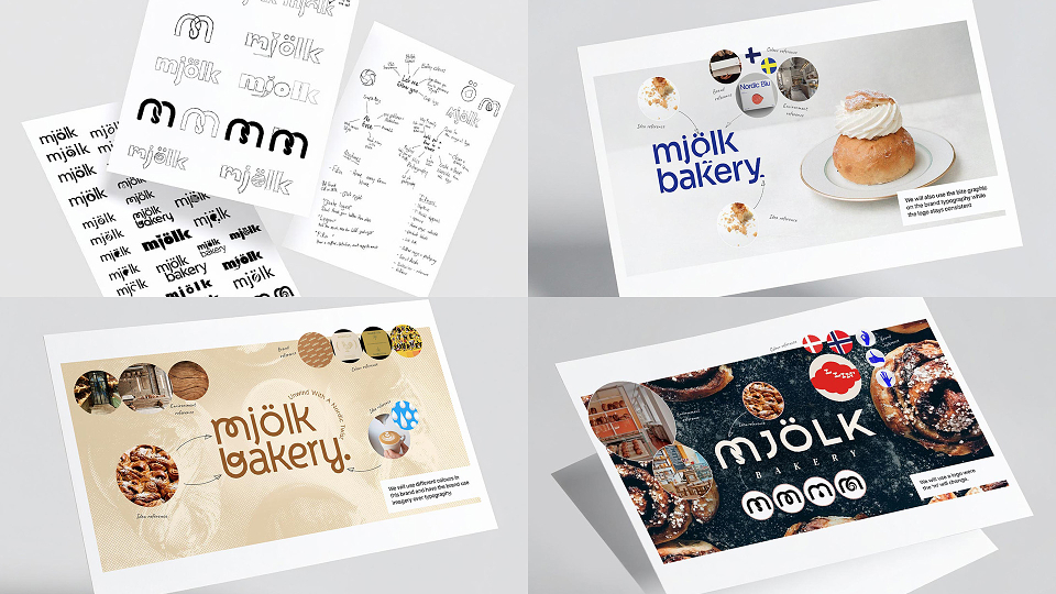
The client requested a proposal for a visual rebrand to help Mjölk stand out from the crowd and expand its audience. I proposed that we take the business’s USP and use it to drive the brand’s visuals and voice, with the intention of turning the bakery into a bigger cornerstone of the community. Where do you go for your freshly baked bread and morning coffee, or to catch up on that book with a freshly baked pastry? Mjölk Bakery.
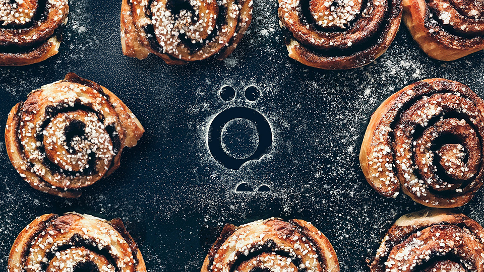
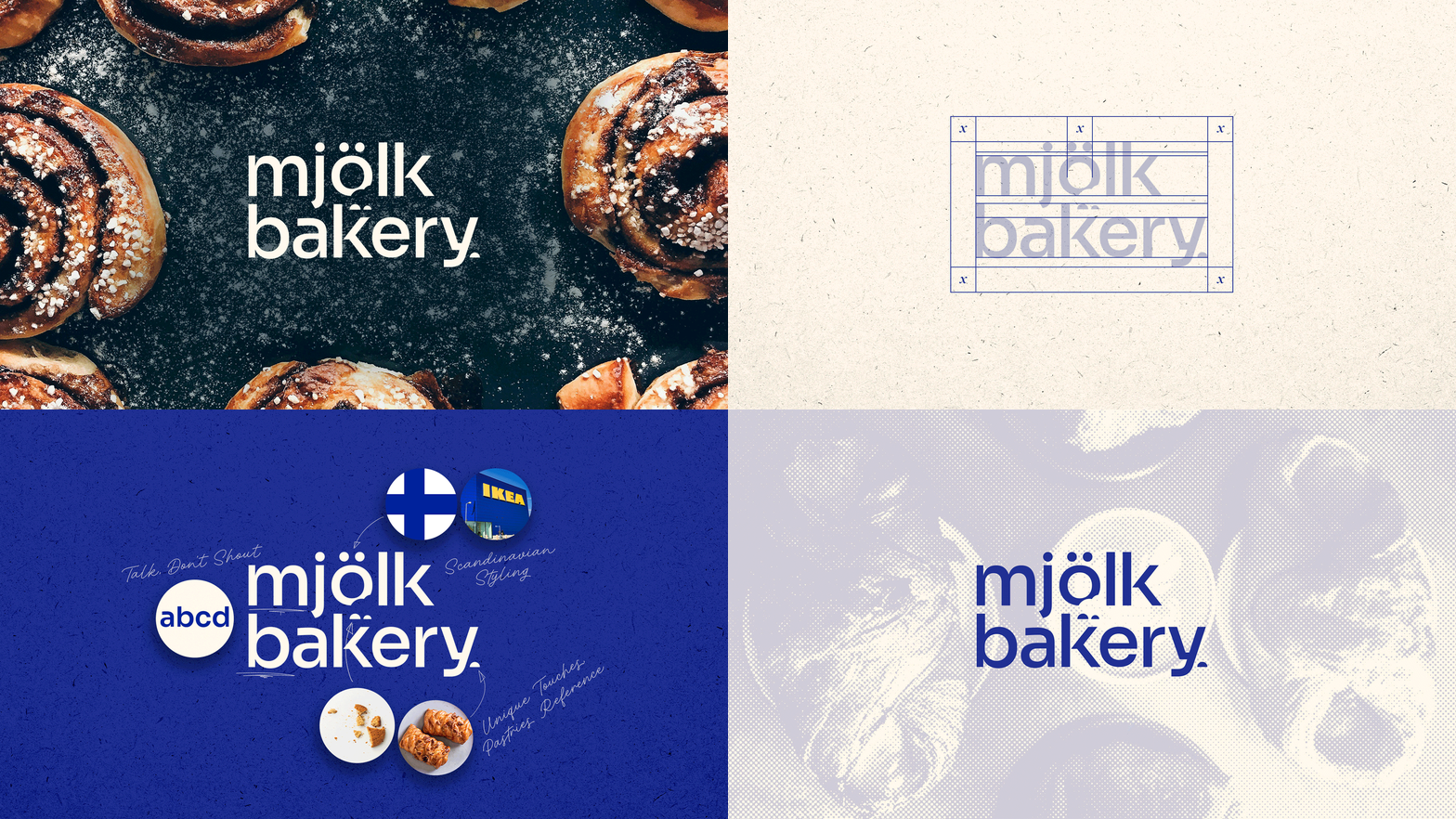
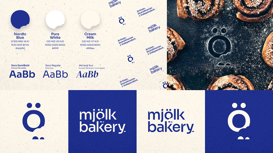
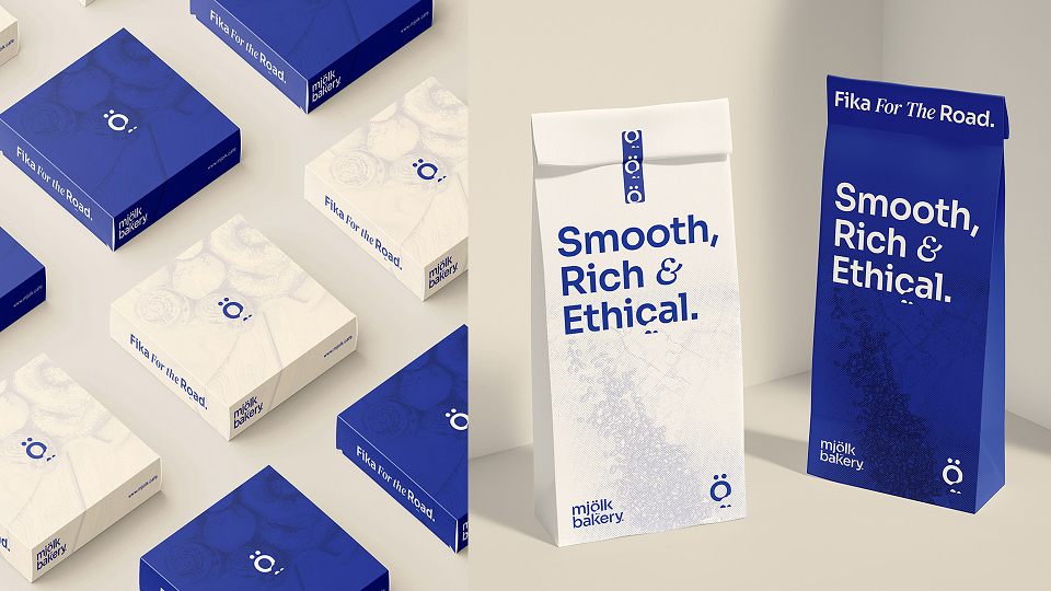
The design and tone of voice were built around the concept of being Scandinavian, not Nordic. The visuals are subtle and clean, prioritising functionality and purpose, while never shying away from cultural ties that may not immediately translate to a British audience. Making the “Ö” the brand’s icon is an example of this “lean into it” approach.
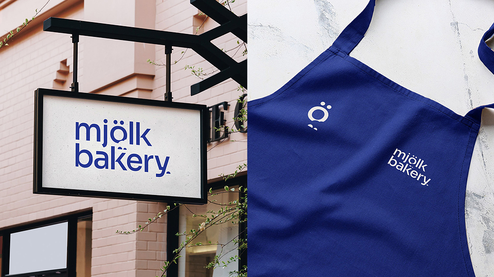
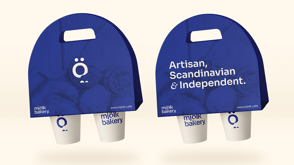
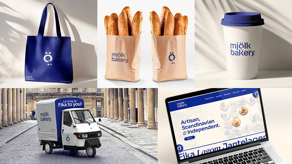
The final result is a visual brand identity that uses white space, warm and calming colours, and playful yet functional typography that welcomes its audience to North European culture.
MADEIT CREDITS
-

Callum CrewCreative Director & Art Director