Broken Doodle
Automotive Concept Artist
ABOUT
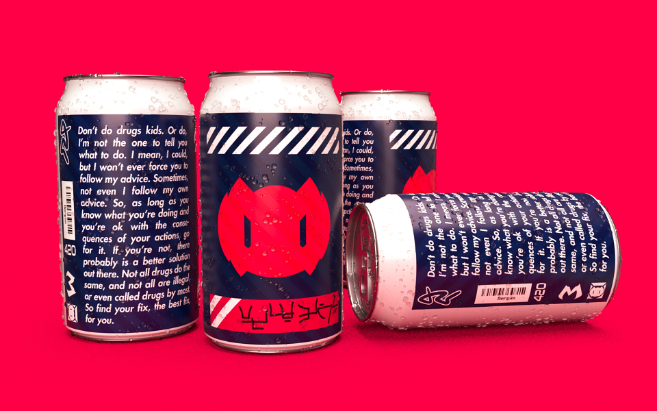
Having consumed a surreal amount of energy drinks in the previous month (college finals), I started paying closer attention to the packaging of the brands available. I believe that the strong contrast, along with the vibrant color in the logos would make this design stand out far more than what I saw on the market. When you're in need of a boost in energy you're not really awake, so being able to spot your fuel from anywhere is a big plus. the white line at the top leaves room for any additional information but also serves as an instantly recognizable design element. The striped patterns and the big, bold text also draw the attention of the eyes with their contrast while not being the overused ultra-aggressive black-on-white default. Finally, the bold yet clean logo makes the brand identifiable from far away, with the color hinting at the flavor and energetic property of the drink.
MADEIT CREDITS
-

Broken DoodleConcept Artist