Branding by Garden
London
ABOUT
Norwex had strong equity in “less chemicals”, especially in home care, but the offer had grown far beyond detergents. The challenge was to elevate personal and family care without feeling like a bolt-on, and to build a brand architecture that could stretch across categories and 50+ SKUs. Working in partnership with Workroom, we were asked to deliver brand strategy, corporate identity, packaging design and guidelines that felt Norwegian, ethical and direct-to-market ready.
We anchored everything to a simple, human proposition, living cleaner, safer, better. It gave Norwex a consistent way to talk about reducing harmful chemicals, while staying grounded in everyday routines rather than big claims. The strategy set the tone for both corporate brand and packaging.
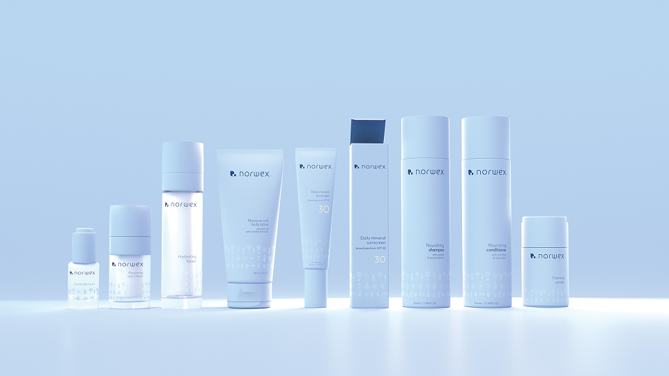
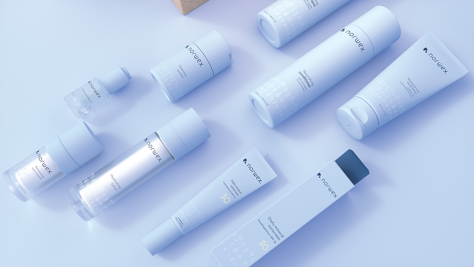
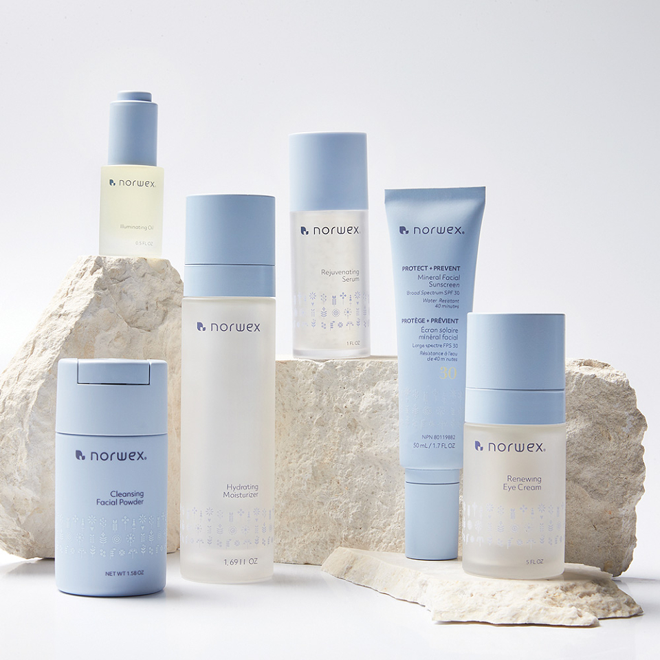
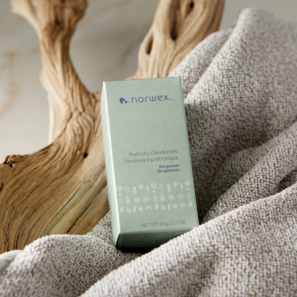
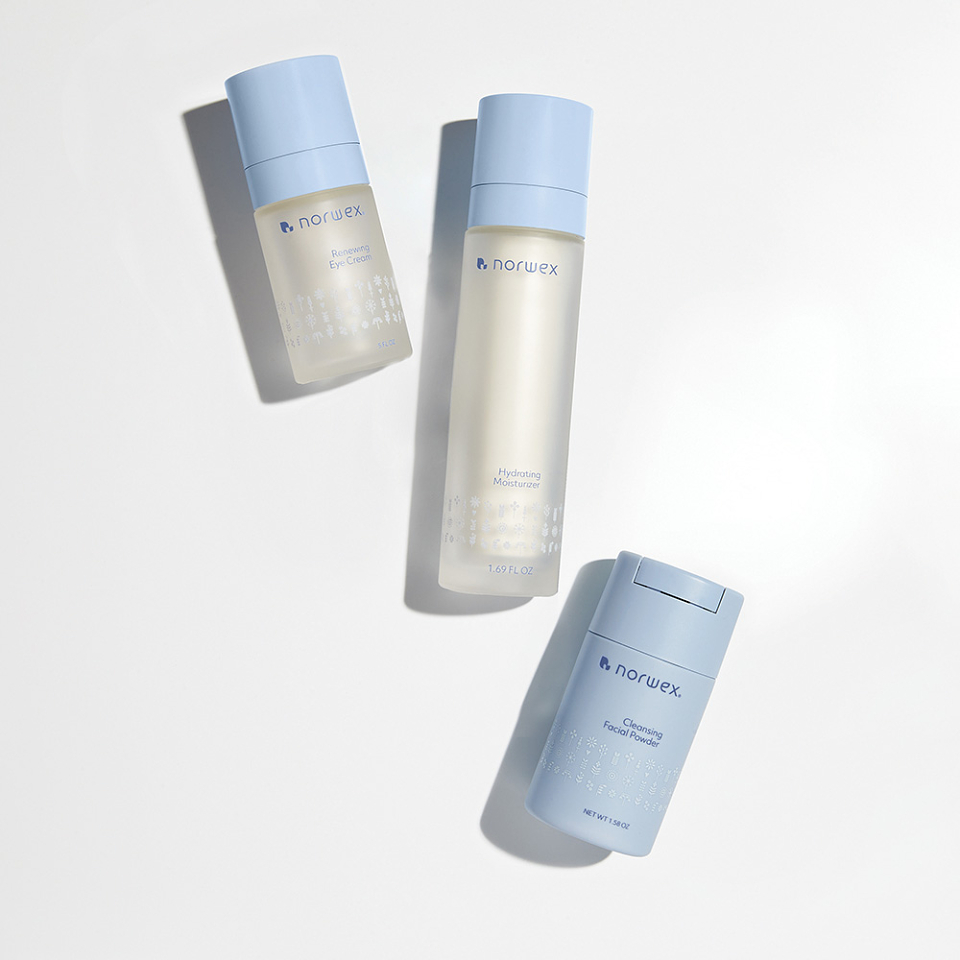
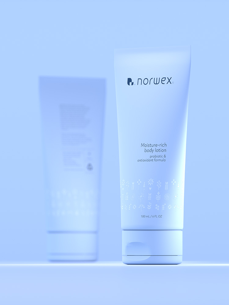
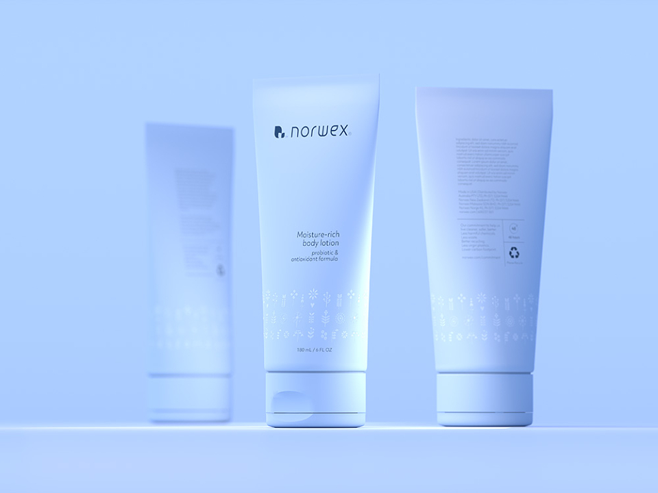
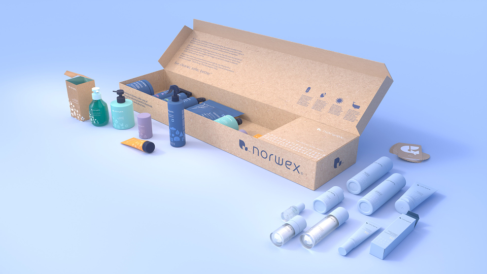
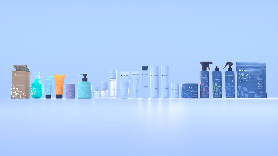
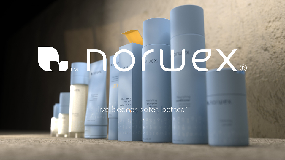
The identity and architecture were designed to work across personal care, family care and home care without forcing sameness. We created clear category cues and a packaging system that can expand, keeping Norwex recognisable on shelf and consistent across markets.
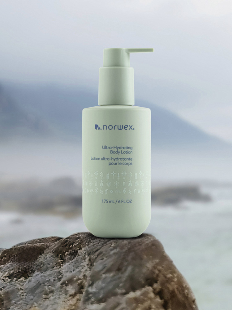
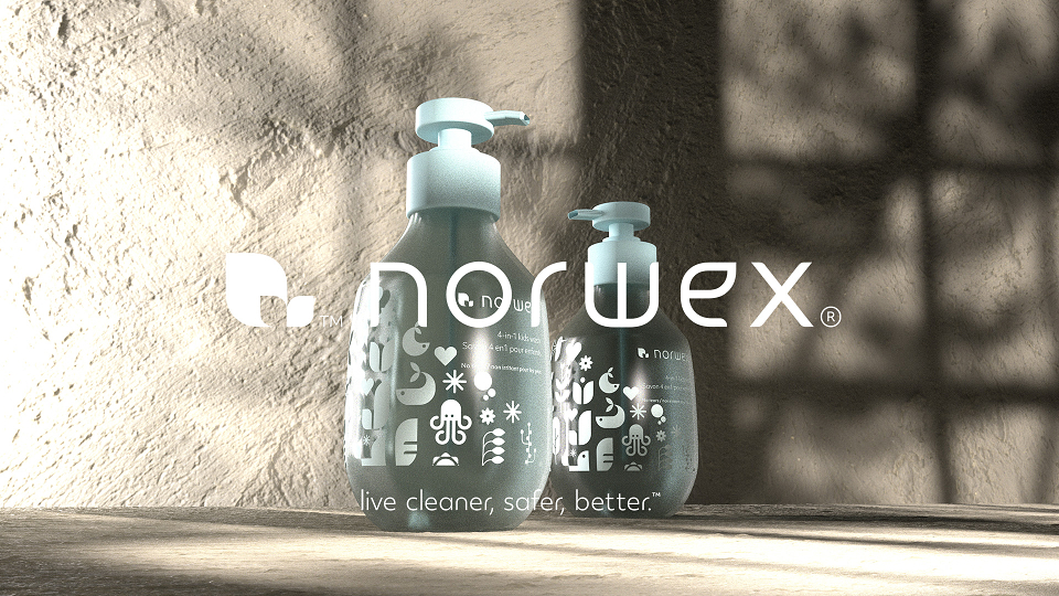
Norwegian iconography became a practical tool, not decoration. It was used to express values and bring reassurance to a wide demographic, while the overall look stayed Scandinavian in its restraint. This balance helped the brand feel premium enough for skincare, but credible for home care.
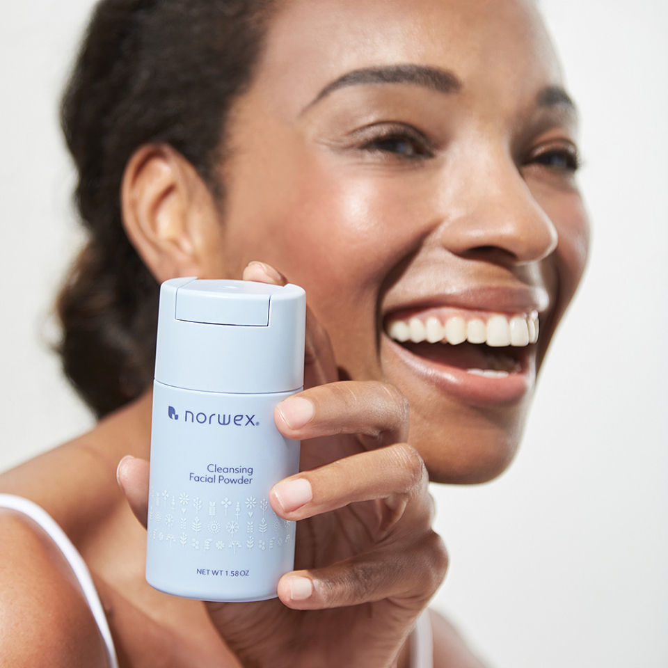
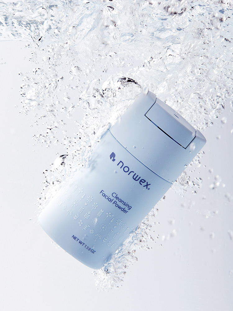
The work came to life through the full packaging rollout, supported by iconography, guidelines and ongoing packaging design consultancy. The architecture helped Norwex show up as one brand across personal, family and home care, while still making it easy to shop by need. The Scandinavian photography style and blue-led palette created a consistent shelf presence, and the corporate identity anchored everything for a global, direct-to-market model. Built with scale in mind, the system supports rollouts across 52 countries.
The result:
A clearer, more premium Norwex, recognised by the industry and ready to scale globally
Norwex now has a coherent brand strategy and identity that connects its mission to everyday product choices, without overcomplicating the story. The architecture brings clarity across categories, helping personal and family care feel as credible as home care. The Norwegian cues add distinctiveness, while the overall system stays calm, modern and consistent, the kind of work you expect from an experienced branding agency and branding company.
The packaging system delivered 50+ SKUs within a six-month programme.
AWARDS:
The project won five Transform Awards in the UK, including Best Overall Visual Identity (Gold), Best Visual Identity from the Lifestyle and Wellbeing Sector (Gold), Best Brand Development Project to Reflect a Change of Mission (Gold), Values or Positioning, Consumer (Gold), and Best Brand Evolution, Corporate (Gold). It also received Best Brand Evolution, Consumer (Silver).
More recently our work was recognised by the Transform Magazine Awards North America. Where we came away with 3 golds and a silver across categories: Best Brand Evolution (Corporate), Best Brand Evolution (Consumer), Best Brand Development Project to Reflect a Change of Mission, Values or Positioning and Best Visual Identity from the Lifestyle and Wellbeing Sector.
AWARDS
Transform Awards Europe
Transform Magazine USA