Bradley Wilks
Creative Designer
ABOUT
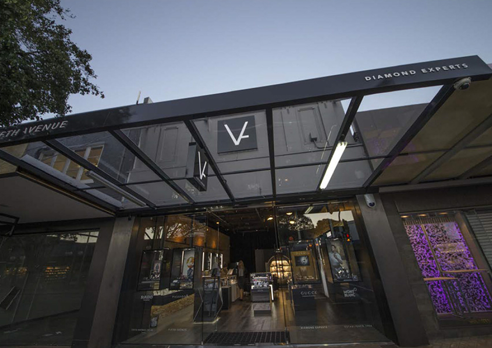
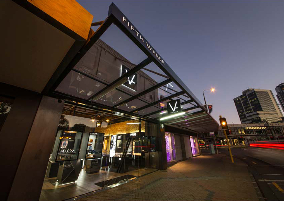
Fifth Avenue Diamond Jewellers.
Fifth Avenue was a classy family-owned diamond jeweller whose brand presentation was no longer representing their image.
The brief was to reinvent the brand and grab a wider audience whilst keeping yesteryear values and not scaring off the more modest budgets.
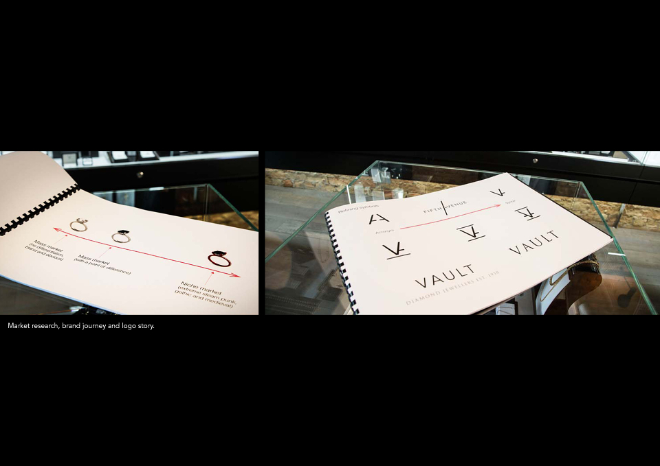
I researched competitor brands, we audited, and collected as much as we could from the client to find hints into where trends were going and to make sure our direction was on the right track. Upon brainstorming with my art director and marketing manager we came up with a positioning for the client which was, ‘a subtle steam punk collision of contemporary meets 1950’s yesteryear’.
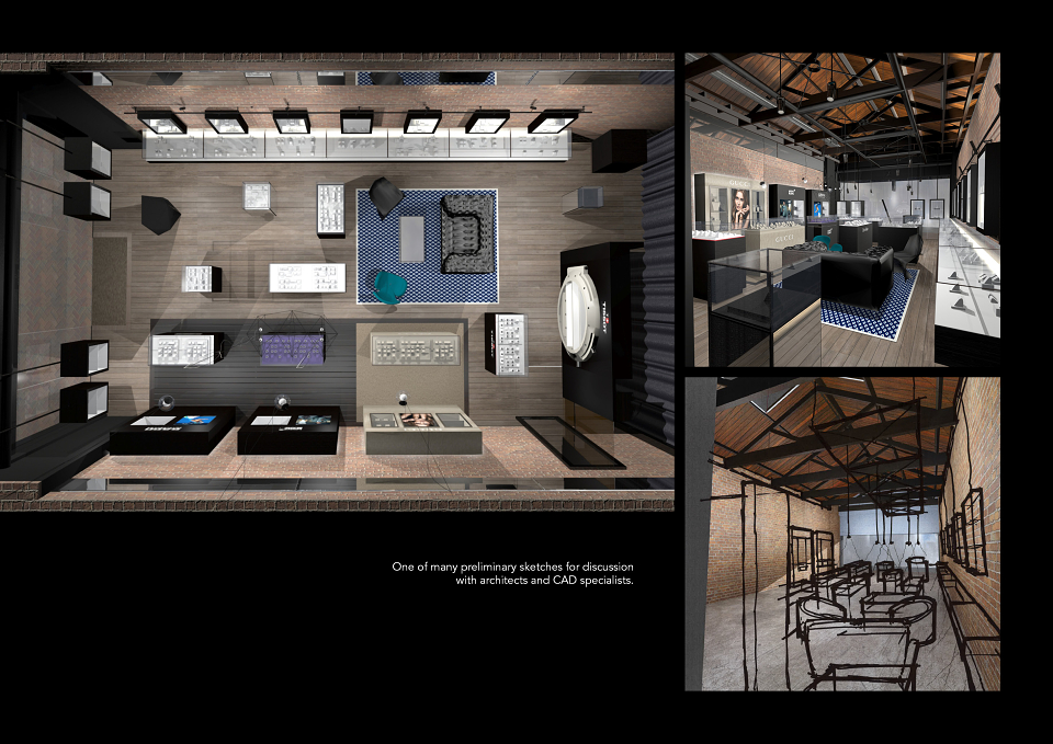
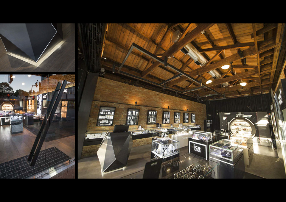
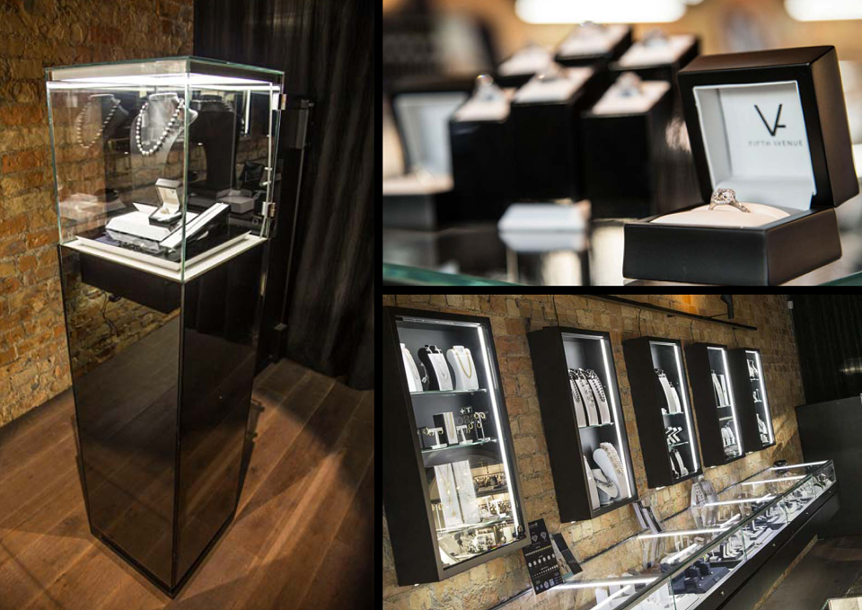
The premise was chosen, a 1940’s to 50’s historic building. With a restricted budget, we were fortunate to be able to re-furbish the old brick and expose the timber roof trusses. Ideally, I wanted polished concrete flooring, however the tight timeframe wouldn’t allow it. We used antique wooden style slats which worked and keep in with the theme.
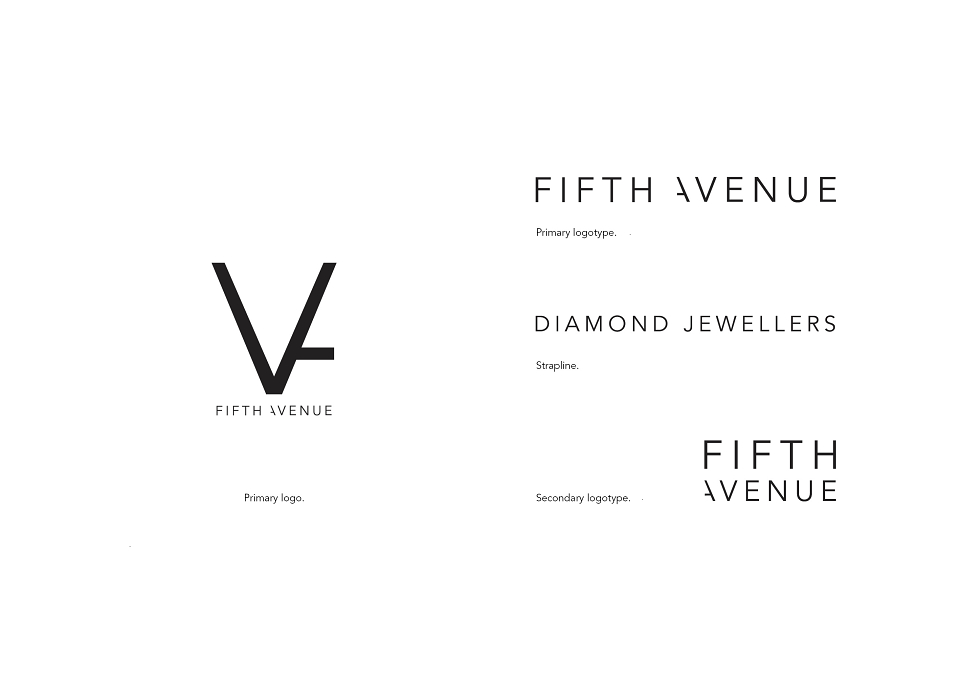
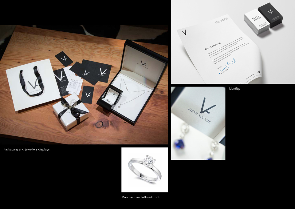
I designed a symbol which incorporated the roman numeral ‘V’ for fifth and an extruding tail which suggests an ‘A’ for avenue, a gothic, stone mason style feel. This set-in place a brand device for use across all brand identity and packaging requirements. It also provided a shape which was incorporated into the brand journey.
I produced mood boards of furnishings, fixtures, and materials to collaborate with architects and interior technicians. I used concept sketches of the interior to guide in the production of 3D renders for client sign-off. I worked with project managers and manufacturers to manage and quality control the interior fit-out.
An achieve I am very proud. The project, a first for BRANDPARTNERS is now used as a case study promoting the company as a one-stop-shop for brand through to fit-out.
MADEIT CREDITS
-

Bradley WilksCreative and Interior Designer