Bold Stockholm
Stockholm
ABOUT
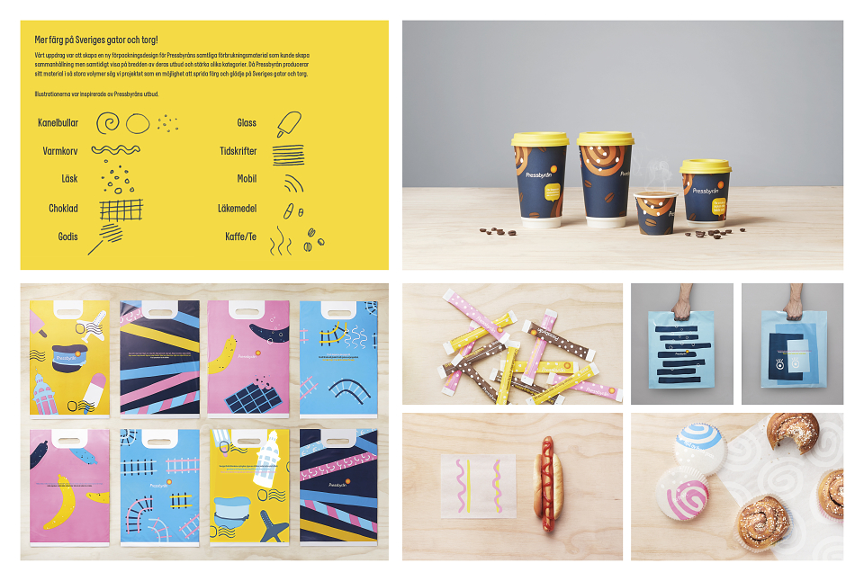
Putting some colour on the streets of Sweden!
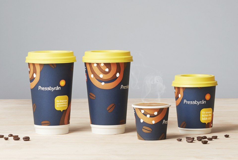
Pressyrån is one of Swedens most well known brands. It is a nationwide convenience store chain with more than 300 stores and around 1,7 million visitors every week.
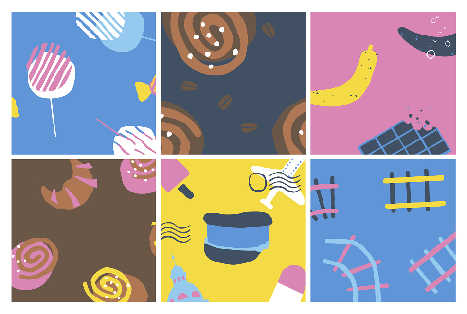
Our brief was to create a new packaging design for Pressbyrån’s range of consumable products that could create unity as well as highlight different categories. Due to the fact that Pressbyrån produce such large volumes of material we saw the project as an opportunity to put some joy and colour on the streets of Sweden!
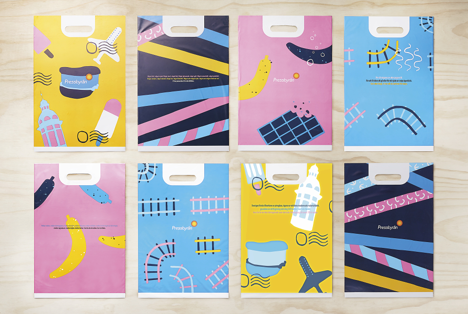
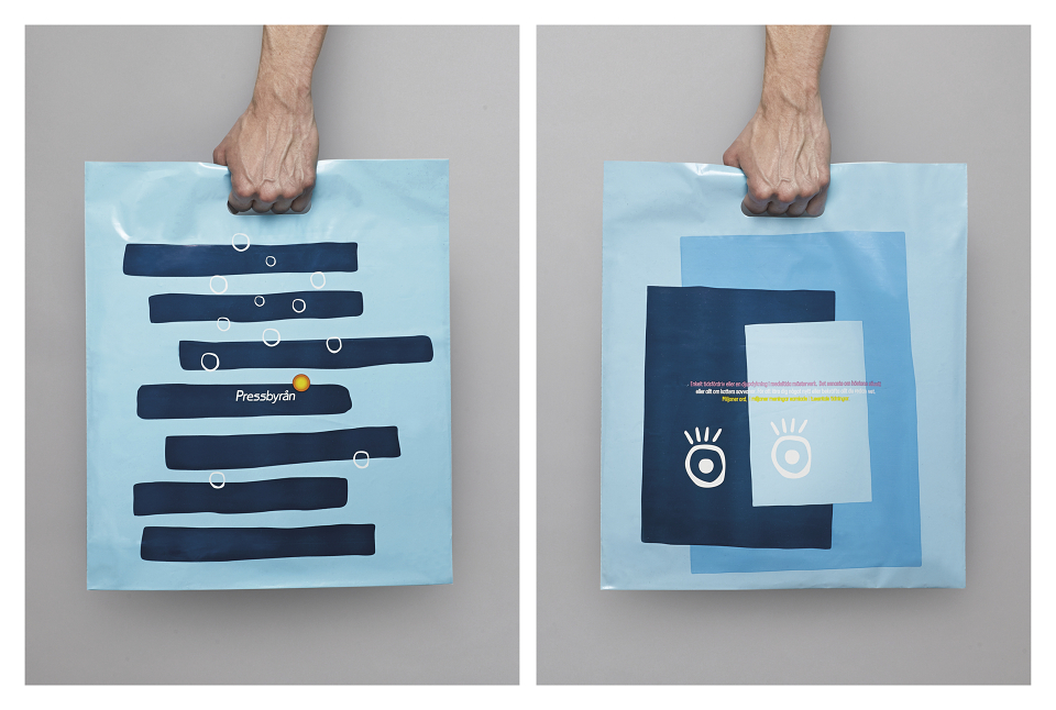
Together with the Belgian illustrator Tim Colmant we created a series of playful and colourful illustrations inspired by Pressbyrån’s products. The illustrations can be used separately or together to create a pattern.
We chose a hand-drawn illustration style that harmonised well with Pressbyrån’s typeface and visual identity and we arranged the producs in different suitable combinations, for example a coffee cup with a cinnamon roll and a soft drink with a stack of magazines. We worked with a unifying colour palette with Pressbyrån yellow as the primary colour. To achieve an even more playful and friendly feeling we integrated Pressbyrån’s tone-of-voice in the form of short, relevant messages across the entire range.
Together with our friends at StudioNoc we also designed Pressbyråns new interior design concept.