Bets Travers
Surface Pattern Designer, illustrator, Textiles
ABOUT
A new hotspot opens in the heart of Manchester
Having conquered London & Brussels, QBIC have opened their newest site in stylish Deansgate, Manchester.
Having previously worked with Qbic on their Brussels site, I was delighted to discover I was to then become involved on the new site in my home city of Manchester - especially on such a large scale. Being a ‘one woman band’ and small company it’s very humbling to be able to work on such projects as whilst the surface pattern designs are something that I have created, it’s starting point was first born within my imagination. If I could have bottled the feeling of being able to watch the interior unfold – I would have.
The pandemic, has challenged even the mightiest of companies and for any of us to be able to make it through, especially in the hospitality industry is not only a testament to the grit and determination that it takes to drive the company forward but also for just how vital the creative and design industries are to our everyday lives. So being able to work on this project knowing that when the UK began to emerge out of lockdown, this incredible venue and hotel would be there waiting with open arms.
I always get a thrill when working with Qbic, because as clients - they’re brilliantly unafraid to go bold. Challenging traditional stereotypes and blazing the trail to reinvent the concept of affordable hotels, in favour of stylish and environmentally conscious spaces in keeping with the cosmopolitan mix that is Manchester.
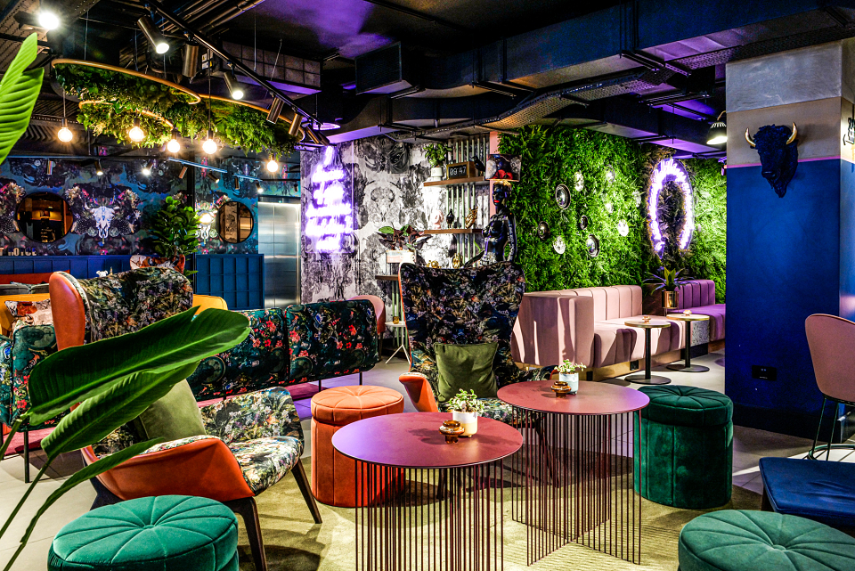
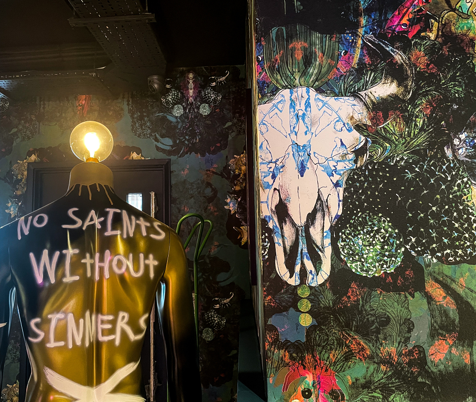
My designs are often thought of as both provocative and captivating, I create designs with delicate and intricate details with layers of mischief woven throughout. They’re more than something to look at, they’re something you look into and discover; your design choices become an extension of your identity. (Something Qbic and Motley took on board throughout the design process as a selection of our designs featured in the public space also feature on menu branding and beer pumps.) This design style and philosophy turned out to be a perfect harmony for the Qbic ‘Saints and sinners’ theme running throughout the public space and was utilised to create a fun and relaxed space where no matter your age bracket or purpose for visiting you can sit back, relax and enjoy everything that Qbic and Motley (Qbic’s bar) have to offer in both comfort and style.
My collections are often inspired by the social conscious, underpinned with messages; such as climate control, hunting and extinction. For me, design is about function, form and purpose – I believe that this stretches across all design disciplines it’s about more than just another pattern. All designs are created with hand illustrated and painted elements before being transformed within a digital platform. Surface Pattern Design encompasses so many creative disciplines, I like to harness and utilise all of them for my patterns, creating synergy between old and new techniques.
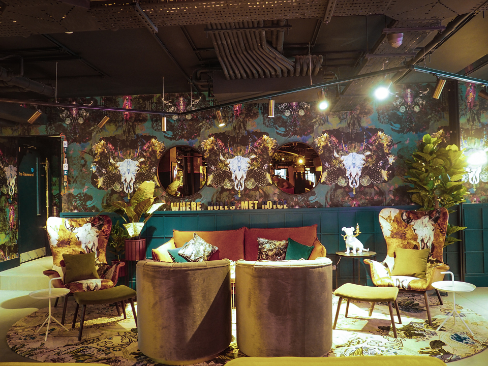
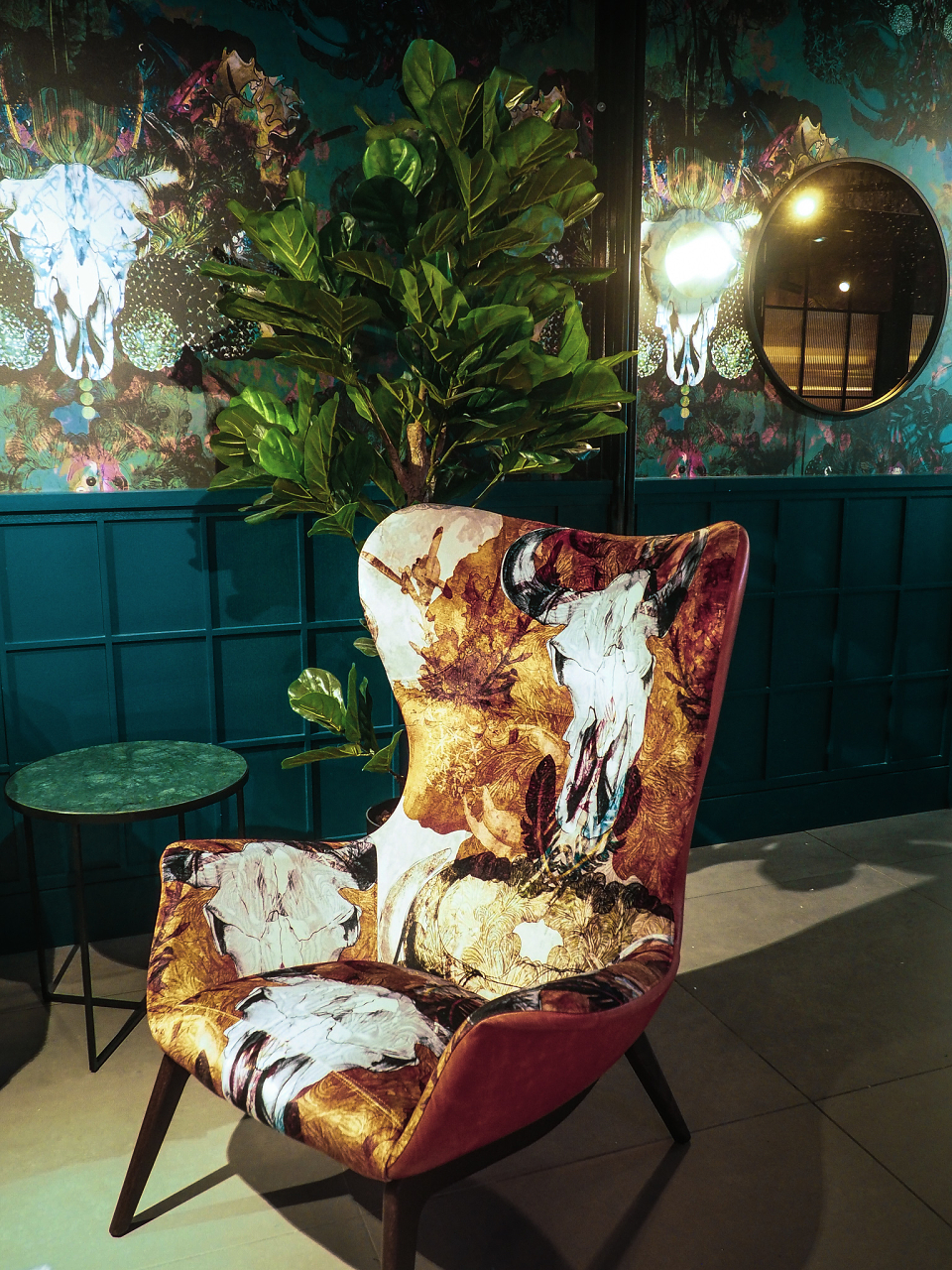
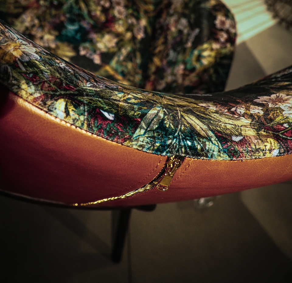
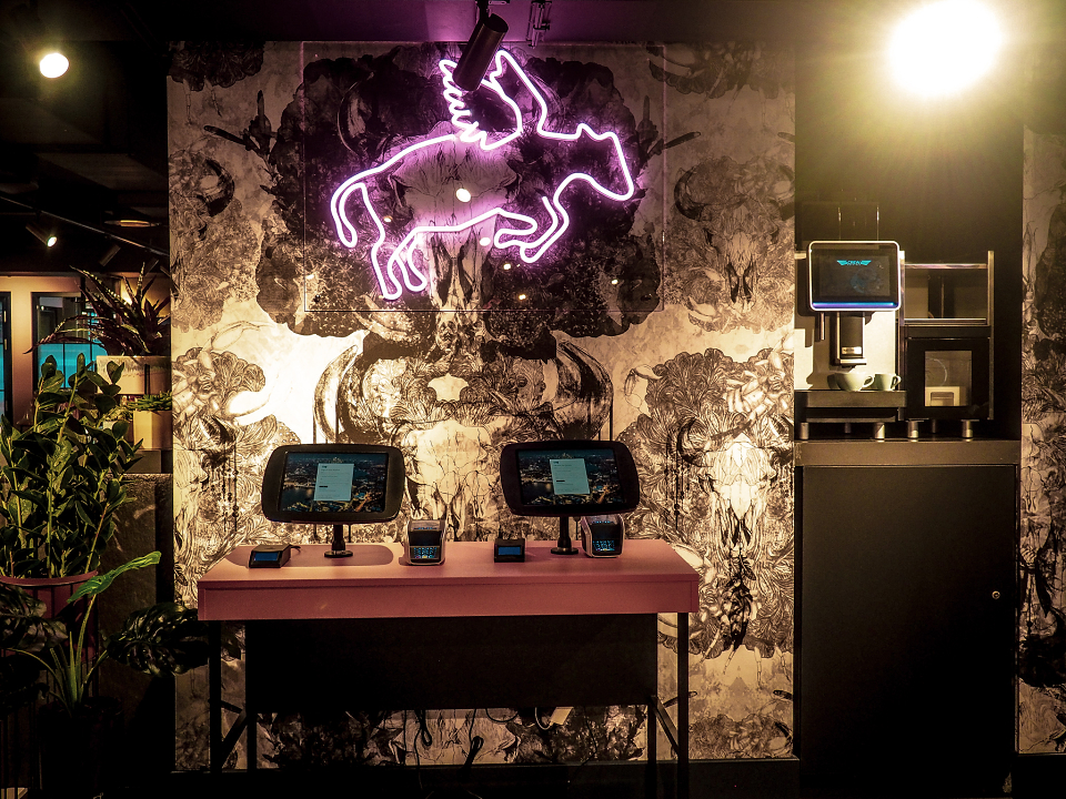
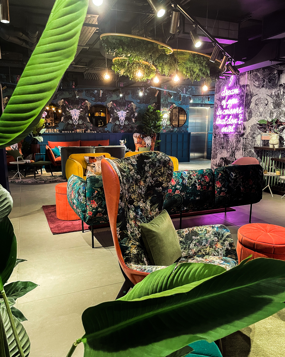
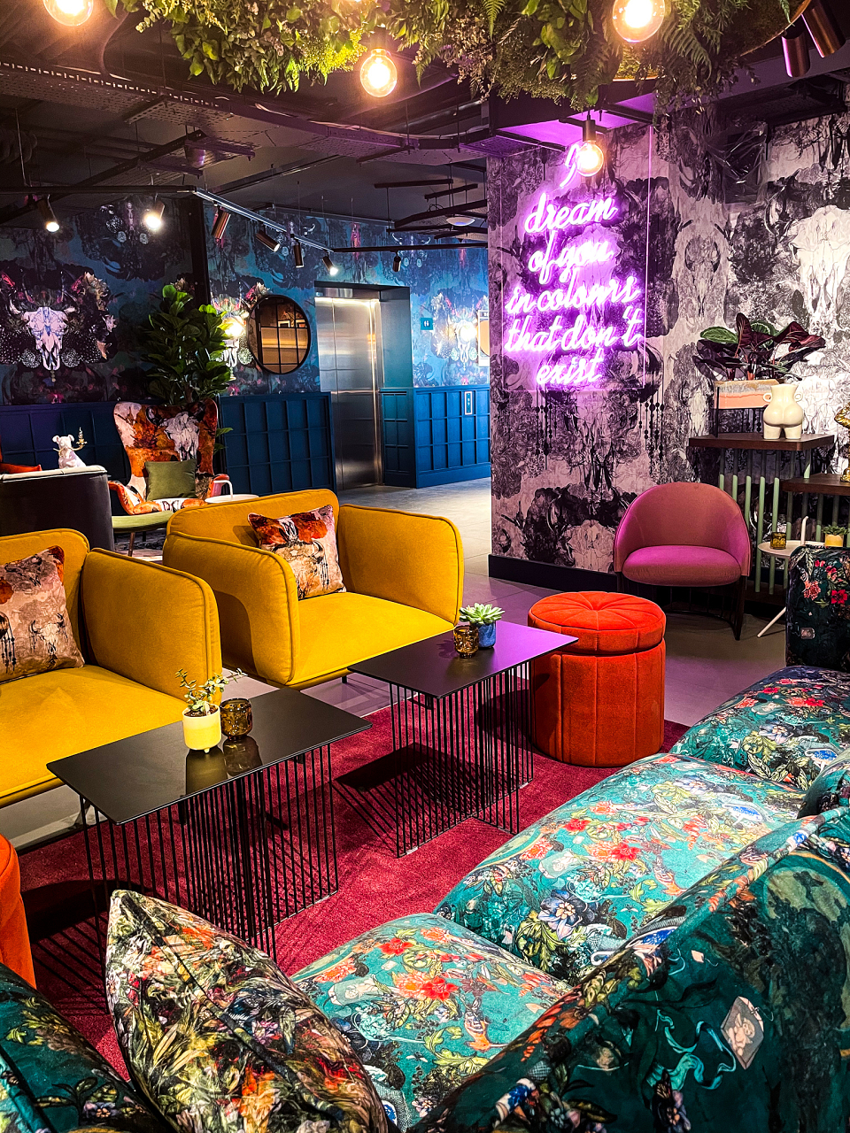
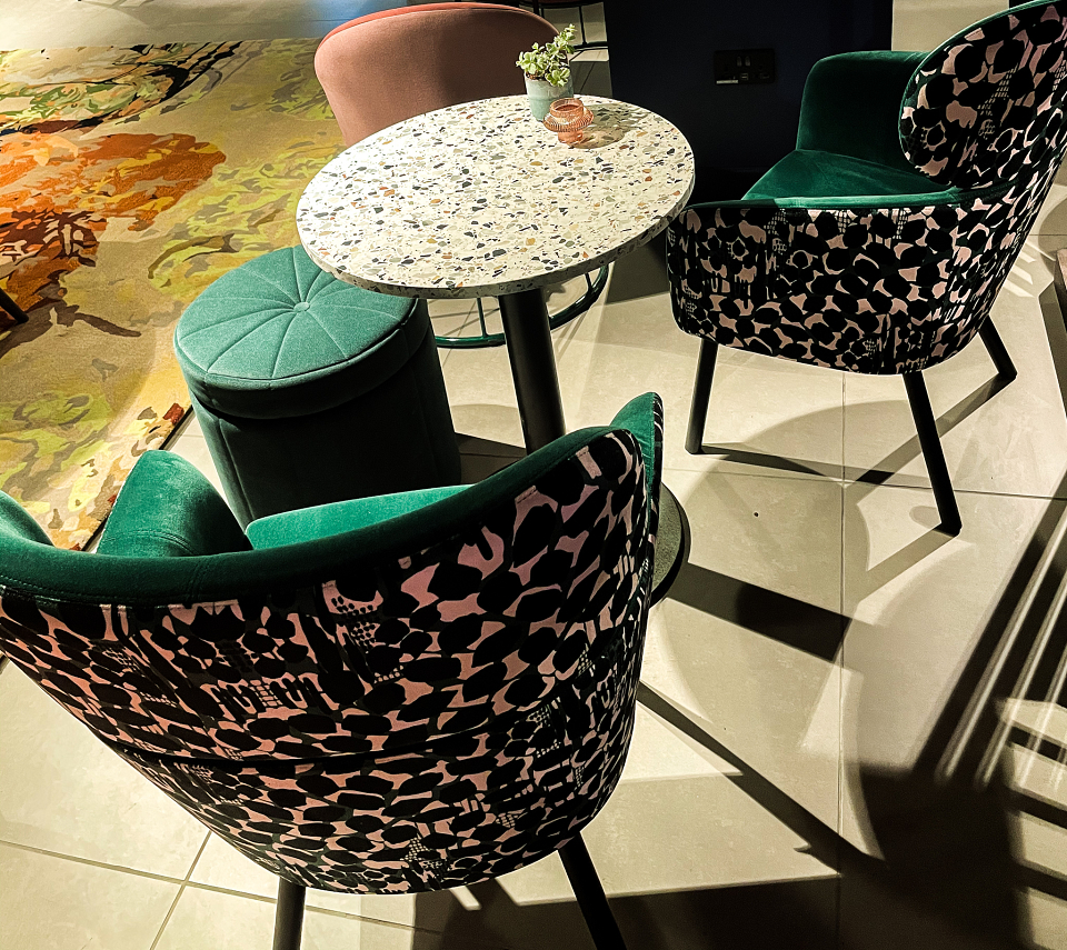
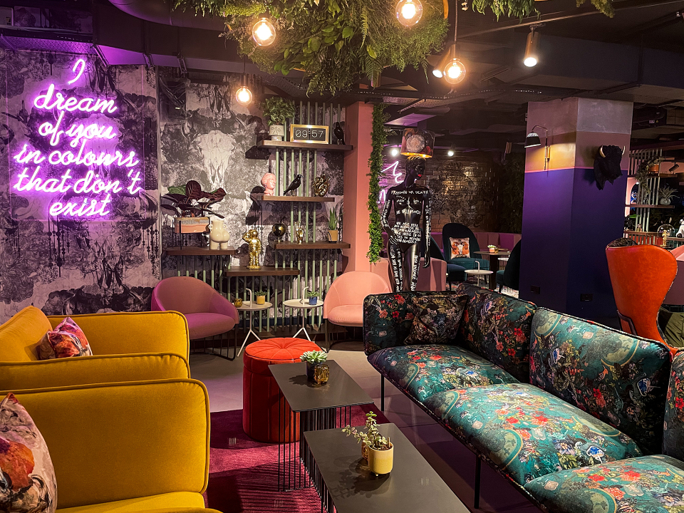
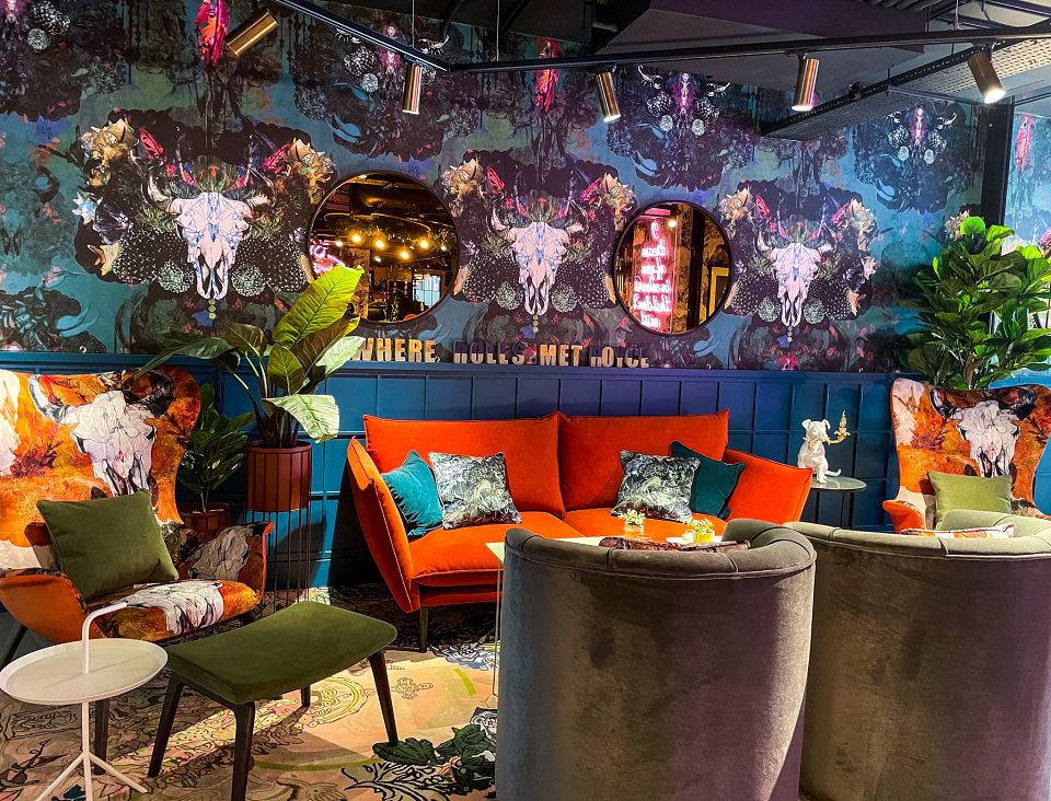
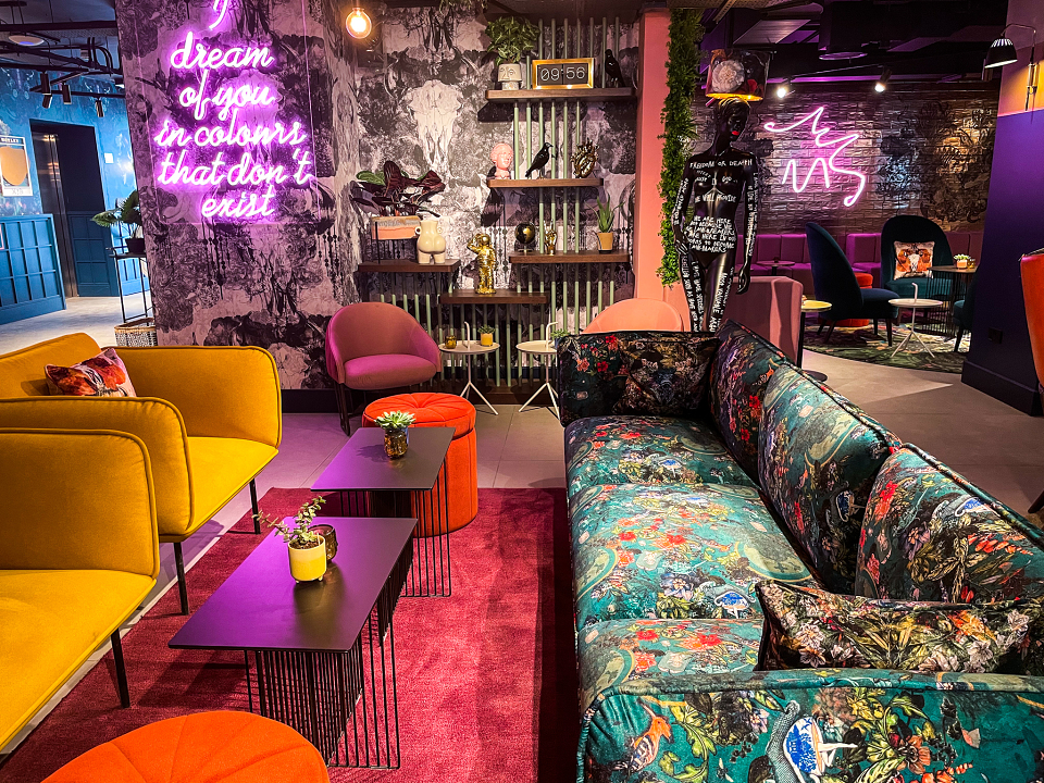
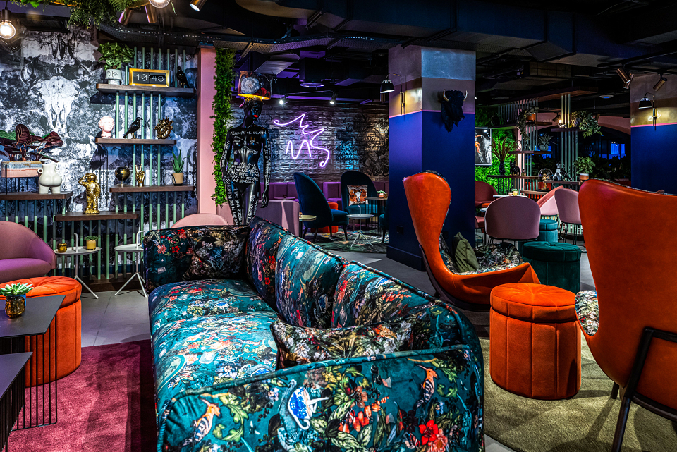
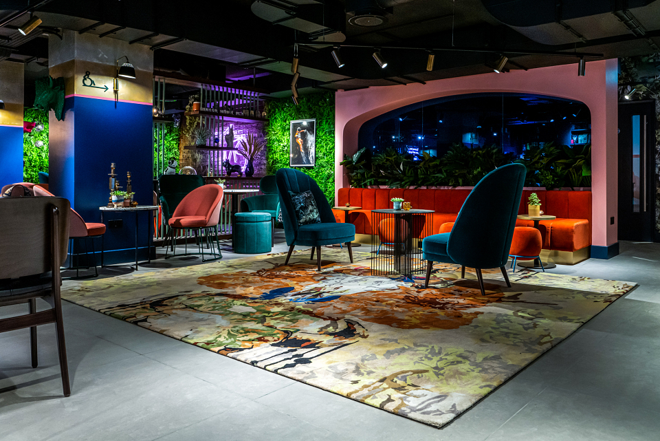
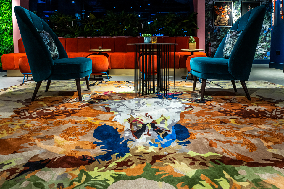
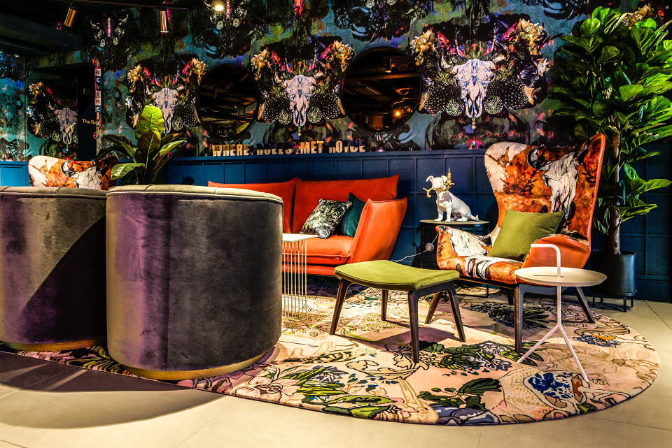
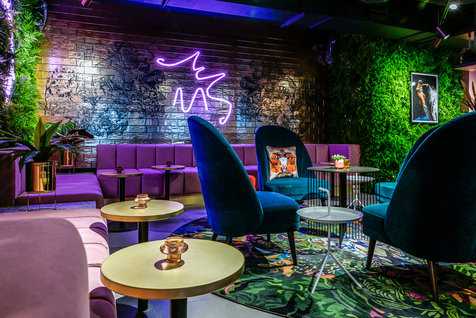
For the Qbic project we supplied Wallpapers, Upholstery fabrics, Illustrations for feature tiles, designs for rugs – even the menus and beer pumps.
In the bedrooms we supplied 9 different designs for feature headboards in every room, with each floor having a dedicated design.
Designs used throughout the scheme:
Wallpaper:
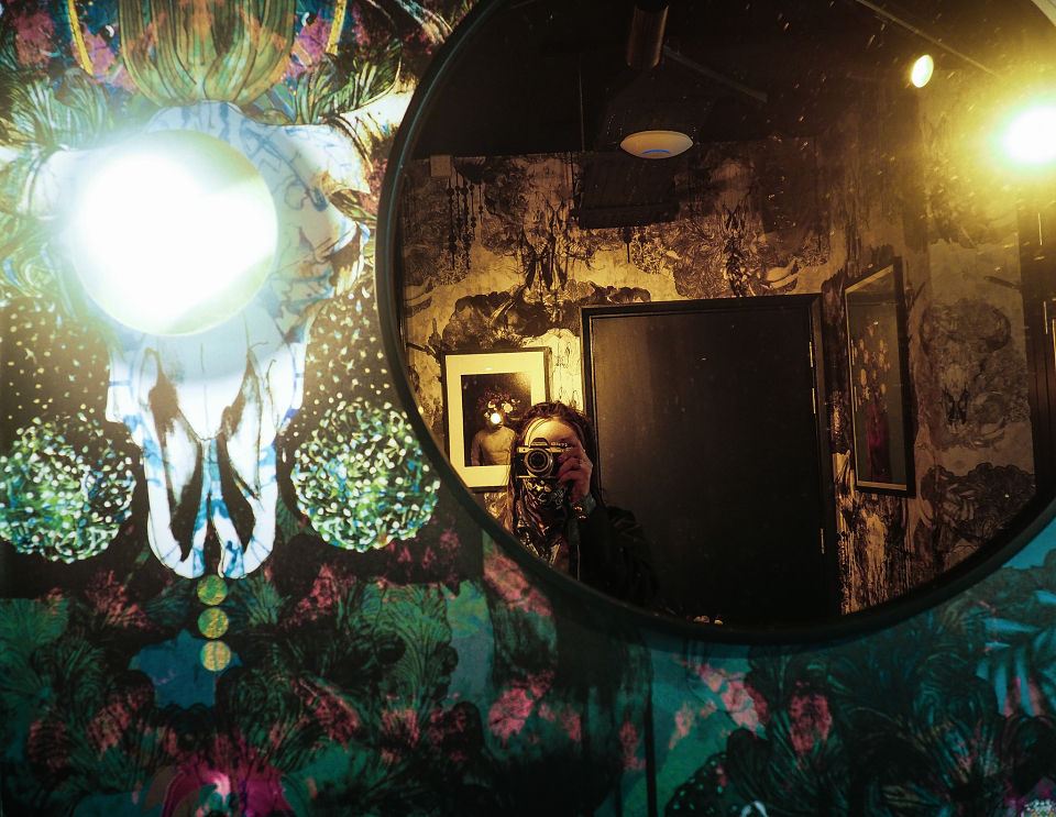
Bruja – both green and black and white (Public space)
Grove – (Public space)
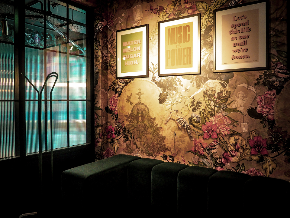
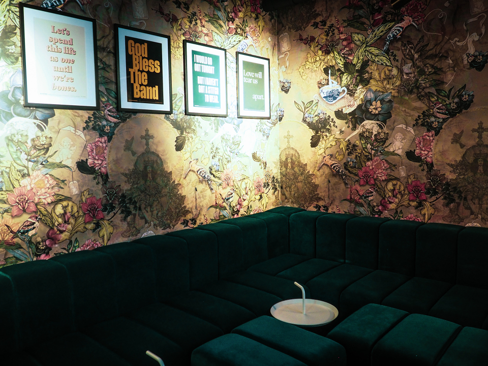
And That’s The Tea – (Karaoke room)
Ferndale – (Meeting room)
To Be The Sea – (Meeting room)
Fabric (public space and meeting rooms):
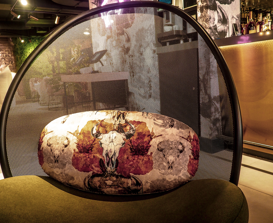
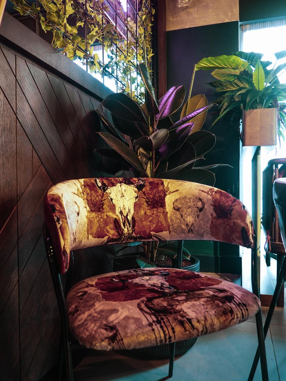
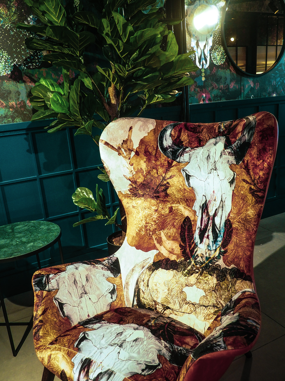
Sandstorm - velvet crib5
To Be The Sea – velvet crib5
Ferndale – velvet crib5
And That’s The Tea – velvet crib5
Leobold – velvet crib5
Rugs –
Sandstorm – (public space)
Bruja – (public space)
And That’s The Tea in both blush and blue – (public space)
Grove – (public space)
Archive sku24 – (Meeting room)]
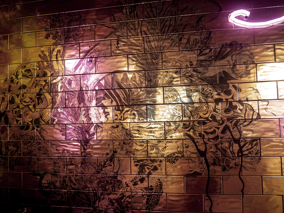
Featured tiles are illustrations from To Be The Sea
Headboards –
Mojave
And That’s The Tea (blush, green, earl grey)
To Be The Sea
Ferndale
Sandstom
Cecil
Bruja
About the designs:
Our To Be The Sea design features heavily throughout the interior spaces both upstairs and down. It is a design taken from the ‘To Be The Sea’ collection which was designed to highlight plastic pollution and consumption within our eco systems. For us this is such an important collection. Sustainability, is something that we’re extremely passionate about and whilst we recognise the textile industry has a long way to go. Keeping the majority of our products printed within the North West and the UK enables us to take the first step. Sending fabric samples and wallpaper offcuts to companies who can repurpose them – to minimise our wastage. The world is at such a pivotal point, we want to be on the right side of that.
‘The design collection submerges you deep beneath the ocean waves, dive down amongst the intoxicating layers of Adrift to discover the mischief and madness you have come to expect from BOBO1325. For this collection has a dark side, it highlights the effects of plastic and pollution within or waters. Navigate through pieces of pollution to get to the fascinating depths full of vibrant splashes, ocean botanicals, mermaids and sea creatures’
And That’s The Tea features on fabric, wallpaper and headboards
‘It’s about the power of the cup of tea.
Never has there been a drink quite like tea, it’s a drink that has the power to link cultures together both ceremonially and socially. It’s been a social drink in Britain for centuries no matter a person’s status, class or rank. But all over the world it has a representative meaning. It’s truly stood the test of time, from ladies and high tea, to the workers and to millennials. Tea is the answer. We synchronise brew breaks for a gossip we drink herbal teas for the health benefits and natural healing. Not forgetting a good cup of Yorkshire to cure heartbreak and dare I say it…hangovers.
Taking inspiration from a variety of design periods to construct the pattern, with classic floral elements from orchids, peony’s and delphiniums (a flower that represents the transcendence of time and space – which in my opinion a good cup of tea takes us to! Hand drawn and painted botanical elements linking eastern culture to where tea leaves were first discovered to western culture after King Charles II first introduced it to Britain.
Bruja, Sandstorm and Mojave are taken from our Brujaria collection. Which we designed around Mental Health. Whilst difficult to express and almost impossible to see, we can often relate and explore how we’re feeling through colours and hues. We can harness the power of colour harmonies and their energies.
‘They say that the desert is one of our planet’s harshest environments. Yet living things still manage to function and survive. More than just design with a function, it’s a message. Taking inspiration from Picasso’s rose and blue periods this collection from BOBO1325 depicts a journey of mental health in an aim to banish the stigma.
When I think of mental health, whether it be depression, anxiety or crippling insecurities; I imagine a dark powerful magic. It can feel like your mind and body are no longer your own; almost like you are suspended in time withering under the haze of a spell. Isolated. Surviving in the harshest ‘environment’ of your mind. But who wants to just survive, when you can live and you can thrive? Like the blooming desert flowers you can break the spell and live your life once more in a riot of colour’
AWARDS
Northern Design Award 2021
MADEIT CREDITS
-

Qbic HotelsClient
-

Bets TraversSurface Pattern Designer, illustrator, Textiles