

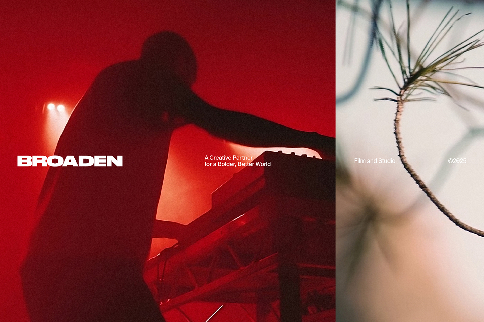
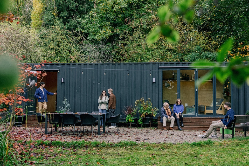
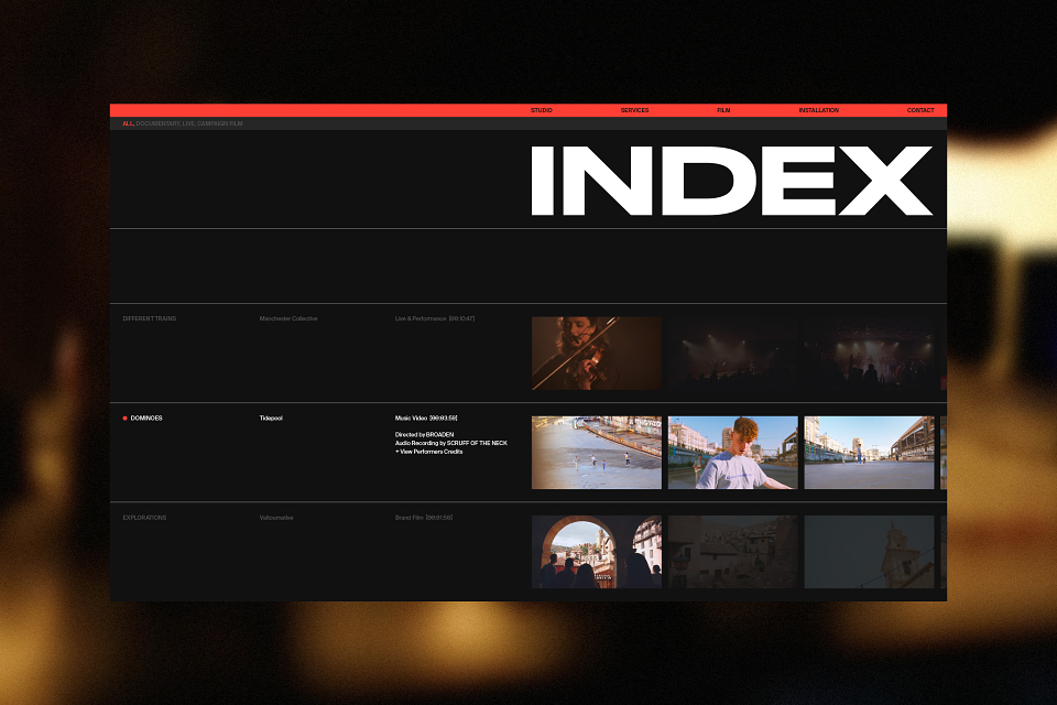
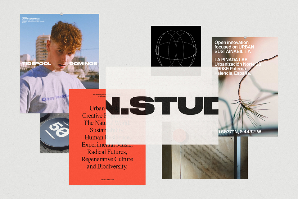

Broaden is a purpose-led film studio telling stories that help widen perspectives and inspire more imaginative ways of living. Their commitment to sustainability runs through everything they do, from travelling flight-free to building their own off-grid studio.
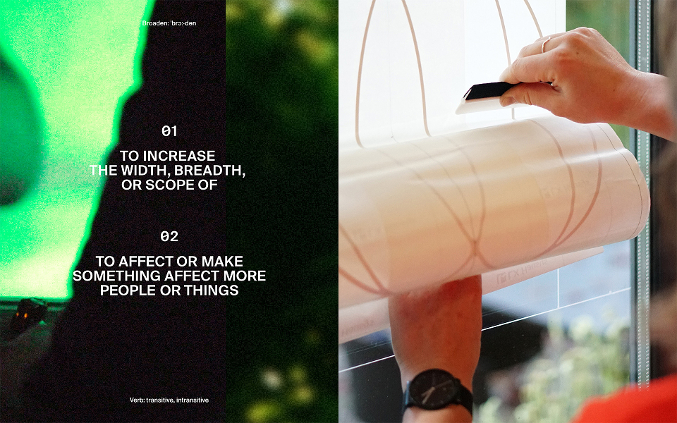
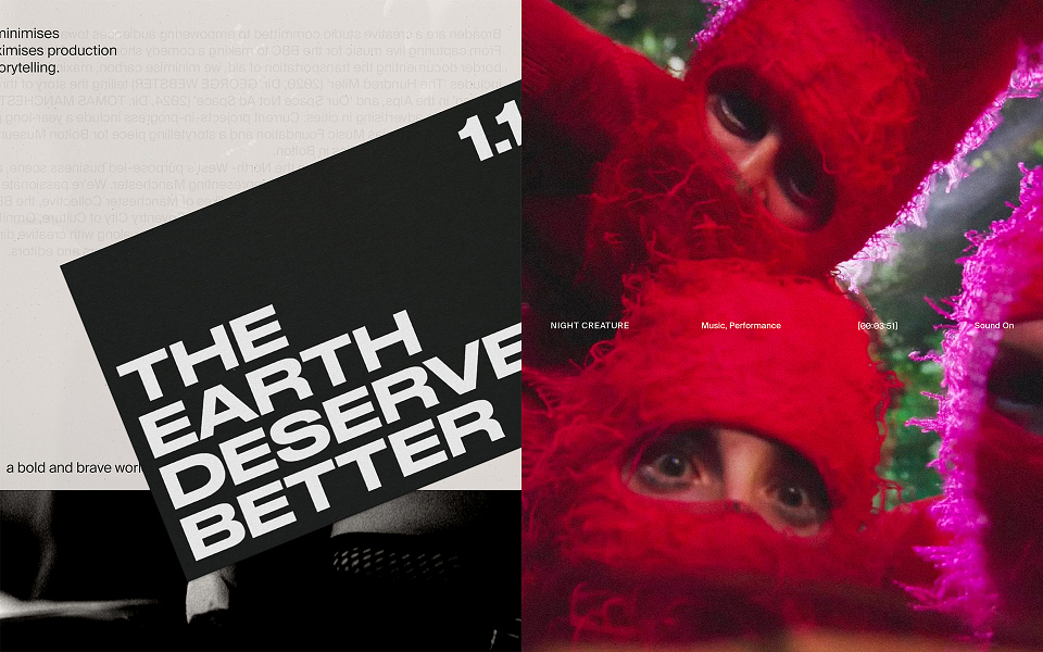
The identity takes its cue from the name to “broaden” outlooks, expand possibilities and create space for change. The extended wordmark and motion type system are designed to echo this sense of opening, shifting and widening the frame.
The icon reflects Broaden’s ecological and systems-thinking mindset, a simple reminder from their manifesto that “nature bats last”. When animated, it pulses and radiates like a signal broadcasting outward. It’s used across their digital identity and as an emblem on vinyls, artwork and stickers.
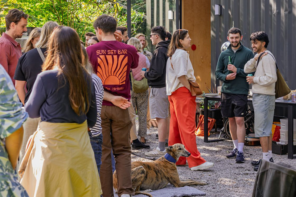
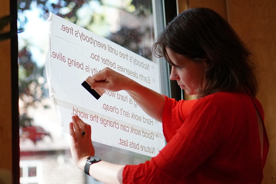
Broaden are a team of makers and doers whose work often goes beyond the screen. They build installations, launch festivals, rig lights and have even built their own studio. In other words, they make things happen. The identity needed that same physical feel, by using recycled materials, uncoated stocks and a tactile real-world edge.
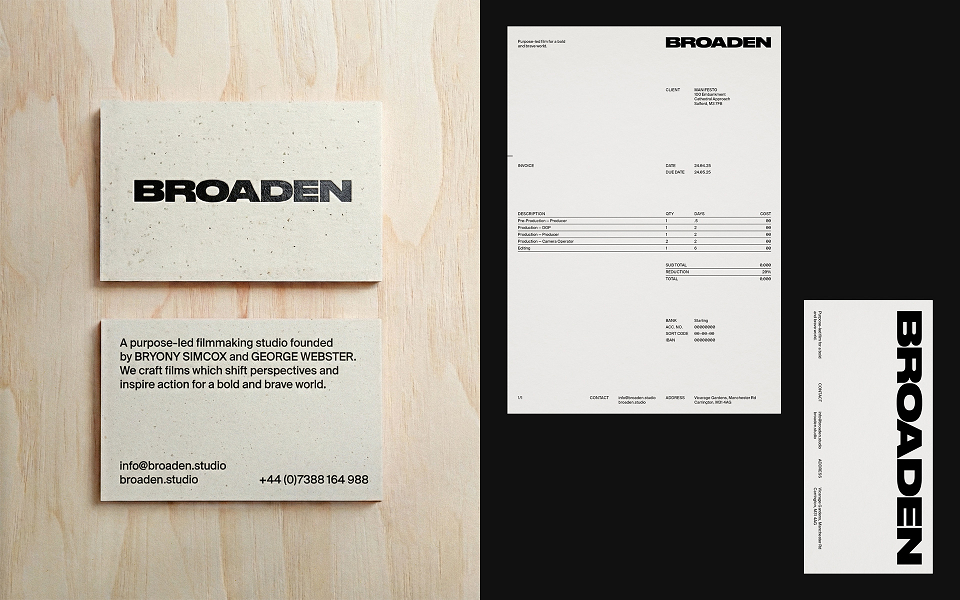
Their business cards are printed on GF Smith’s Gmund Bier, made from spent brewers’ grain and using elemental chlorine-free pulp, with a single foil-block to serve the whole team. A simple and sustainable choice that echoes Broaden’s focus on resourcefulness and story-led materials. Broaden finished them by hand with red edge-painting, (a process they’ve shared on their social channels).
CREDITS
Film, Videography & Photography – Broaden and their creative partners
Studio Launch Photography – Fiona Finchett
Motion Graphics – Ben Pick
Branding Strategy & Design – Tom Birch
TYPEFACES
Suisse Int’l – Swiss Typefaces
JHA Times Now – Jan-Hendrik Arnold
Druk Wide – Commercial Type
MATERIALS
Gmund Bier Wiezen — GF Smith