


Looking for design portfolio tips that actually lead to interviews? Start with this uncomfortable truth: most portfolios do not fail because the work is bad. They fail because the presentation is confusing, generic, bloated, or strangely hard to use. In other words, the problem often is not your talent. It is how you design your portfolio.
And yes, that distinction matters.
People hiring creatives can only judge what they can find, understand, and remember in the short window they give you. If your strongest work is buried under vague project names, clunky navigation, and walls of context-free images, you are asking busy people to do detective work. They will not. They will move on to the person whose portfolio made the decision easy.
This article breaks down seven high-impact fixes that make your portfolio stand out for the right reasons: cleaner UX, sharper project framing, stronger case study storytelling, clearer proof of outcomes, better role alignment, mobile usability, and a proper call to action. It is the difference between a portfolio that looks "quite nice" and one that quietly does the job it is supposed to do: get you contacted.
What should a portfolio include?
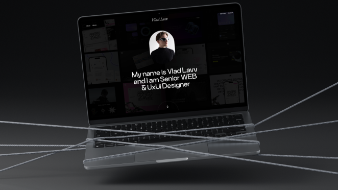
Vladislav Lavv
Let us get this out of the way: there is no mystical, universal "perfect portfolio."
There is no single layout, no magic number of images, no secret animation style, no blessed typography pairing that instantly unlocks interviews. The perfect portfolio is not a genre. It is a tool. And like any tool, it is only "perfect" if it does the job well.
What does that mean in practice? A strong portfolio is concise, easy to scan, clearly positioned, and tailored enough that someone can understand your value quickly. It tells them who you are, what you do, what kind of problems you solve, and what role you played in the work. It does not make them guess. It does not make them click around for five minutes to figure out whether you are a designer, an art director, or someone who just likes making mood boards at 2am.
A pitch-ready portfolio usually gets the basics right immediately:
- Your name is visible
- Your discipline is clear (UI/UX Designer, Motion Designer, Brand Designer, Copywriter, etc.)
- Your best work is easy to find
- Your projects are framed with context, not just visuals
- Your contribution is obvious
- The site feels considered, not chaotic
That last point matters more than people think. A portfolio is itself a piece of work. If the experience of viewing it feels messy, inconsistent, or overdesigned, it creates friction before anyone has even judged the projects. And friction is deadly when attention spans are short.
The other thing a great portfolio does well is respect the viewer's time. It does not try to impress by being dense. It impresses by being clear. Strong portfolios are selective. They choose quality over quantity. One sharp, well-explained case study is worth more than six half-finished "look what I made" pages with no context and no outcome.
And this is where a lot of portfolios go wrong. They treat the work like self-evident proof. But people reviewing portfolios are not mind readers. They do not automatically know what the brief was, what constraints existed, what you personally contributed, or whether the result worked. If you do not explain that you are leaving value on the table.
The best portfolios do not just show work. They show judgment.
They make the viewer think: this person understands how creative work functions in the real world. They can solve problems, not just decorate them. They can communicate, not just produce. They know what to include and, crucially, what to leave out.
So, if someone asks, "what is the perfect portfolio?", the most honest answer is this: it is the one that makes your relevance obvious, your thinking clear, and your next step easy.
Not flawless. Just effective.
How to structure a portfolio?

Ranga Perera
Portfolio structure is where a lot of otherwise good candidates accidentally sabotage themselves.
Someone lands on your site and starts scanning. Not reading. Scanning. They are trying to answer a few basic questions fast: Who is this person? What do they do? Is this relevant to the role? Is the work any good? Can I find what I need without getting annoyed?
Your structure either helps them answer those questions in seconds, or it gets in the way.
Start with clarity on the homepage. Your name should be obvious. Your job title or discipline should be obvious. A short value line can help if it adds meaning ("Brand Designer focused on food, retail and hospitality identities" is useful; "Designing experiences that matter" is not). Then give people an immediate path into the work: featured projects, clear categories, or both.
This is not the place for mystery.
The portfolio homepage is not an art-school puzzle. It does not need hidden navigation, vague labels, fullscreen transitions, or cleverness that only makes sense after three clicks. If someone has to "explore" to figure out what you do, you have already made the experience harder than it needs to be.
Next, organise your work into logical sections. Use labels that mean something to someone who does not know you. "Branding," "UX/UI," "Motion," "Illustration," "Campaigns," "Packaging" all work. "Play," "Worlds," "Thoughts," and "Stuff" are less helpful unless your audience is specifically hiring for poetic ambiguity.
Within each section, make the projects easy to skim. Thumbnails and titles are fine, but the title should do more than name the client. A viewer should be able to glance at a project card and understand what it is. "E-commerce Checkout Redesign, Senior Product Designer" tells them far more than "Project Mercury."
And yes, that means repeating information you think is "already obvious." It probably is not obvious to someone speed-scanning twenty portfolios before lunch.
How long do recruiters spend looking at portfolios?
Design for the first 10 seconds, not the idealised deep read. If the first impression is clear, people will keep going. If the first impression is friction, they will not stay long enough to discover how good your fourth project is.
A practical structure that works well for most creatives:
- Homepage: name, role, short positioning line, featured projects
- Portfolio / Work page: all projects or categories
- Project pages: clear title, your role, context, process, outcome, images
- About page: short bio, strengths, tools (if relevant), experience snapshot
- Contact page / CTA: obvious and easy to use
You can absolutely adapt that. But if your structure gets more complicated than the job requires, you are probably designing for yourself instead of the person hiring.
What makes a good creative portfolio?
A portfolio should feel like a well-run website, not an obstacle course. The easier it is to navigate, the easier it is to hire you.
1. Clean Navigation and UX
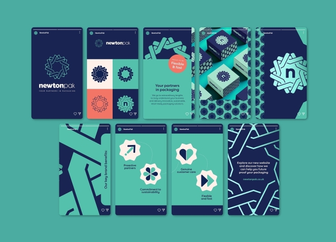
Emily Godwin
Before: A cluttered homepage with a dozen tiny images and no clear menu.
After: A simple menu ("Branding," "UX/UI," "Illustration") and three highlighted projects on the front page.
This is fix number one because it affects everything else. If your navigation is messy, even strong work gets missed.
A lot of creative portfolios fall into one of two traps: they either cram too much onto the homepage, or they hide everything behind "minimalist" navigation that is so minimal it becomes useless. Both create the same problem: the viewer has to work harder than they should.
And nobody is grading you on how much effort you can extract from them.
Clean navigation is not boring. It is professional. It tells the viewer you understand experience design, prioritisation, and the basic fact that the person on the other side has limited time. If your site feels easy to move through, that confidence spills over into how your work is perceived.
Start by reducing noise. You do not need twelve project thumbnails above the fold. You do not need competing animations, strange hover behaviours, or decorative UI elements that push actual content further down the page. White space is not empty space. It is breathing room. It helps your best work look stronger by giving it context and focus.
Make your menu obvious. "About," "Work/Portfolio," and "Contact" should not require interpretation. If you use categories, label them clearly and keep them consistent. A viewer should be able to jump to the kind of work they care about without guessing what your terminology means.
Then make your project pages consistent. This is where UX discipline really shows. If one project opens with a title and summary, another starts with a giant image, and a third hides the context halfway down, your portfolio starts to feel improvised. Consistency makes the whole site easier to scan, and it subtly reinforces the idea that you are organised and intentional.
A good test: can someone find your best relevant project in three clicks or fewer? If not, simplify.
Another good test: does your homepage immediately tell someone what you do best? A one-line headline above featured work can do a lot of heavy lifting here. "UI/UX Designer specialising in fintech products" gives instant context before they even open a project. That is useful. That is strategic. That is how you make your portfolio stand out without shouting.
Clean UX does not mean stripping out all personality. It means putting personality in the right places: your work, your words, your visual choices, not in navigation gimmicks that slow people down.
If the viewing experience feels smooth, your portfolio gets credit before the first case study even begins. That is why this fix comes first.
2. Clear Roles and Headlines
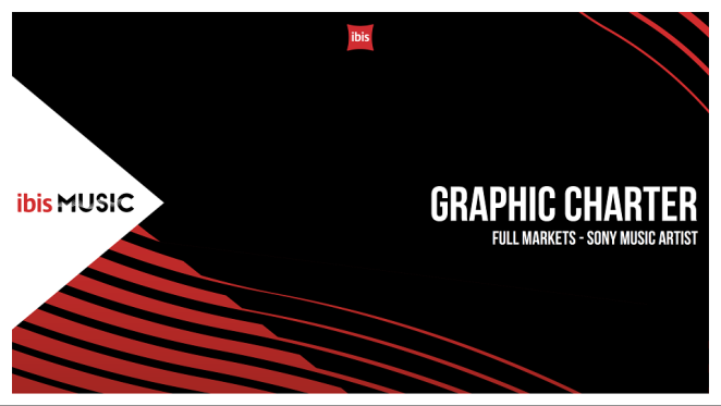
Dan Button
Before: Projects listed by client name or vague title, e.g. "Project X."
After: Each case study starts with a clear role or title line, e.g. "Lead Designer, E-commerce App."
If there is one portfolio mistake that quietly kills momentum, it is vagueness.
People reviewing portfolios do not just want to know what the project was. They want to know what you did. Not the team. Not the agency. Not the brand. You.
This sounds obvious, but plenty of portfolios still present projects like museum labels: client name, a hero image, maybe a date, and then a lot of visual output with no clear explanation of where the candidate actually fits. It looks polished, but it leaves the most important question unanswered.
That is why clear headlines matter.
Every project should begin with a one-line title that combines:
- what the project was
- what kind of work it involved
- your role in it
For example:
- Checkout Flow Redesign, Senior Product Designer
- Brand Identity for DTC Skincare Launch, Lead Brand Designer
- Campaign Film Series, Art Director
- Editorial Illustration System, Illustrator
That one line does more than label the project. It frames the entire case study. It gives the viewer a mental shortcut. They know what they are looking at and why it may be relevant before they read a single paragraph.
And relevance is the game.
Remember: someone may be skimming quickly, comparing your portfolio against others for a very specific role. If your project headlines are vague ("Case Study 01", "Project Nova", "Launch Work"), you are making your work harder to rank in their mind. If your headlines are clear, you are doing some of the filtering for them.
Clear role framing also protects you from a common trust problem: over-claiming by omission. If a project looks brilliant but you never clarify whether you led it, supported it, or contributed a small part, a hiring manager may assume the most cautious interpretation. Better to be precise. "Part of a 4-person design team; led UI flows and prototyping" is stronger than a vague presentation that invites doubt.
This is not about downplaying yourself. It is about making your contribution legible.
The "after" version of a portfolio in this section feels instantly more senior because it removes ambiguity. Even a quick glance tells the viewer: this person understands how to communicate scope, ownership, and relevance. That alone can make the difference between "nice work" and "interview shortlist."
Your headline is the handshake. Do not mumble it.
3. Case Study Storytelling

Eugene Borodulin
Before: A gallery of images with bullet points like "Designed UI. Created graphics."
After: Each project reads like a story: Challenge, Approach, Outcome, showing process and result.
A portfolio without storytelling is basically a highlight reel with the sound off.
Yes, the visuals matter. In some disciplines, they matter a lot. But if all you show is output, you force the viewer to reverse-engineer your thinking from the end result. Sometimes they can. Often they cannot. And even when they can, you have missed an opportunity to show the thing people are really trying to assess: how you think.
This is where case study storytelling earns its keep.
You do not need to write a novel for every project. In fact, please do not. The goal is not volume. The goal is clarity. A short, well-structured narrative can completely transform how your work is perceived.
A simple format works well:
- Challenge What problem needed solving?
- Approach What did you do, and why?
- Outcome What happened as a result?
That structure works because it maps neatly to how creative work is judged in the real world. It shows context, decision-making, and impact. It also stops your case studies from turning into vague lists of tasks.
Compare the difference:
- "Designed UI and created graphics"
vs.
- "The sign-up flow had a high drop-off point on mobile. I audited the journey, simplified the form steps, and introduced clearer progress cues. The redesigned flow reduced abandonment and improved completion rates."
Same project, completely different level of credibility.
The stronger version tells the viewer you were not just making screens. You were solving a problem.
And that is the wider point. Case study storytelling is not decorative writing. It is evidence of strategic thinking. It shows you understand briefs, constraints, trade-offs, collaboration, and outcomes. It also makes your portfolio more memorable because people remember narratives better than disconnected images.
A few practical rules keep this sharp rather than bloated:
- Lead with the project context quickly (what it was, for whom, why it mattered)
- Be specific about your contribution
- Explain one or two key decisions, not every tiny step
- Use plain English instead of process theatre
- End with the result (quantitative if possible, qualitative if not)
Also, avoid writing as if you are auditioning for a legal deposition. "Leveraged cross-functional ideation methodologies" is not better than "Worked with the content and product teams to simplify the onboarding journey." Clear language reads as confidence. Buzzword-heavy language reads as camouflage.
The "before" version of a portfolio in this section usually has decent visuals and weak framing. The "after" version turns each project into proof. It answers the unspoken questions: What was the problem? What did this person actually do? Did it work?
That is what makes a portfolio stand out. Not just taste. Thinking.
4. Showcase Outcome Metrics
Steven Hassall
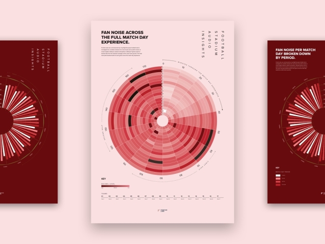
Before: "Designed marketing materials that impressed client."
After: "Designed campaign assets; click-through rate doubled within 3 months."
Creative people sometimes avoid metrics because they worry it makes the work sound dry, commercial, or reductive. Fair concern. Bad use of metrics can absolutely flatten the nuance of creative work.
But no metrics at all creates a different problem: it leaves impact vague.
If you can show what changed because of your work, do it.
Outcome metrics make your portfolio stronger because they answer the most practical hiring question of all: what difference did this make? Someone reviewing your work may love your visual taste, but if you can connect that work to performance, adoption, engagement, conversion, recognition, efficiency, or any other meaningful result, you instantly move from "looks good" to "delivers."
And yes, this applies beyond product design and marketing dashboards.
Metrics can be commercial, behavioural, operational, or editorial. Depending on the project, they might include:
- conversion rate increase
- click-through rate uplift
- reduced bounce rate
- improved completion rate
- faster task time
- increase in sign-ups or leads
- engagement uplift
- reduced support tickets
- stronger campaign reach
- internal rollout adoption
- time saved for teams
- fewer revisions after process changes
The point is not to force numbers where they do not exist. The point is to avoid vague claims when better evidence is available.
"Client loved it" is nice. "Campaign drove a 2x CTR in the first quarter" is memorable.
If you do not have hard numbers, which is common in freelance, confidential, or brand-led work, use credible qualitative outcomes instead. For example:
- "Approved and rolled out across 18 locations"
- "Adopted as the new master template by the internal team"
- "Used to support investor presentations during funding round"
- "Reduced stakeholder feedback cycles by clarifying design system rules"
That still shows impact. It still proves the work did something in the world.
When you include metrics, keep them readable. Do not bury the result at the bottom of a dense paragraph. Make it visible. A short line, a highlighted outcome, or a concise bullet at the end of the case study works well. You are not writing a data report. You are strengthening the evidence.
There is also a credibility benefit here. Portfolios that include outcomes tend to feel more mature because they signal commercial awareness. They suggest that the candidate understands creative work as part of a broader objective, not just as an isolated artefact. That matters whether you are applying to an agency, in-house team, startup, or consultancy.
So yes, aesthetics still matter. Craft still matters. Taste still matters.
But if you want your portfolio to stand out in a stack, show what your work achieved, not just what it looked like.
5. Tailor to the Role

Ben The Illustrator
Before: A generic portfolio with unrelated random projects.
After: Focused projects relevant to the job you want (industry, skillset).
A portfolio can be brilliant and still feel wrong for the role.
This is one of the more frustrating realities in creative hiring, because candidates often assume "good work is good work" and that should be enough. Sometimes it is. Often it is not. Hiring teams are not just evaluating quality in the abstract. They are evaluating fit, relevance, and risk.
That means your portfolio should speak to the job you actually want, not just your entire creative autobiography.
Tailoring does not mean faking a specialism you do not have. It means curating strategically. If you are applying for a fintech product role, lead with work that shows product thinking, complex flows, trust-building interfaces, or regulated-category clarity. If you are going for a branding role in consumer goods, lead with identity systems, packaging, campaign extensions, and brand world thinking. If the role is motion-heavy, do not make them dig through static work to find one buried animation piece.
Put your most relevant evidence first.
This matters because people hiring scan for pattern match. They are trying to answer: can this person do our kind of work? If your first few projects answer that clearly, you reduce perceived risk immediately. If your strongest relevant work is buried under unrelated experiments, you make the match harder to see.
Tailoring also means adjusting how you frame projects. The same project can support different applications depending on what you emphasise. A redesign project might be framed around visual refresh for one role, user journey optimisation for another, and cross-functional delivery for a third. You are not changing the truth. You are choosing the most relevant angle.
What you should avoid is the "everything I have ever made" portfolio. It usually reads as unfocused, not versatile. Random hobby projects, old student work, irrelevant one-offs, and filler pieces can drag down stronger work by diluting the signal. Variety is useful. Noise is not.
If a project is weaker but still worth keeping, consider repositioning it:
- move it lower down
- compress the case study
- reframe the learning
- use it to demonstrate a specific transferable skill
And if it does not support the role you are applying for, be honest: it may not need to be there.
The "after" version of this fix does not necessarily have fewer skills. It just has a clearer point of view. It says: here is the kind of work I do best, here is proof I can do it, and here is why I am relevant to this opportunity.
That is not limiting. That is persuasive.
6. Optimize for Mobile
Reuben Mychaleckyj
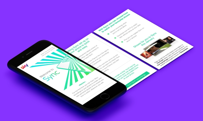
Before: A portfolio designed only for desktop, requiring pinch-zooming on phones.
After: A responsive, fast-loading portfolio that looks and works great on smartphones.
This is the fix people treat like a technical footnote right up until it costs them attention.
A lot of people reviewing portfolios will check yours on mobile, between meetings, while commuting, from a Slack link, from an email on their phone, or from a "quick look" that turns into a decision faster than you would like. If your site breaks on mobile, looks cramped, loads slowly, or requires pinch-zooming to read basic text, you are introducing friction at exactly the moment you need ease.
And users are ruthless about friction on phones.
Industry stats consistently show huge mobile usage in job search and browsing behaviour, and they also show what happens when sites feel slow or badly formatted: people leave. That is not a creative-industry exception. If your portfolio is hard to use on mobile, you are very likely losing viewers before they reach your best work.
Mobile optimisation does not require a complete reinvention. It requires basic competence and testing.
The essentials:
- responsive layout (content adapts cleanly to screen size)
- readable text without zooming
- tap-friendly buttons and links
- images that resize properly
- menus that are obvious and usable
- sensible spacing between elements
- fast loading (especially image-heavy pages)
Image handling is the big one for many creatives. Portfolios often look great on desktop because giant images are doing most of the work. On mobile, those same assets can crush load speed if they are not compressed properly. You do not need to ruin image quality. Just export intelligently and avoid making users download billboard-sized files to view a project thumbnail on a phone.
Also, test your actual portfolio on an actual phone. Not just a browser preview. Open it on iPhone and Android if you can. Tap around. Scroll a case study. Try the menu with one hand. Check whether videos autoplay badly. Check whether captions become microscopic. Check whether the CTA is visible at the point someone finishes a project. This is where obvious problems reveal themselves.
The payoff is bigger than "nice to have." A mobile-friendly portfolio is easier to review in real life. It respects the way people actually browse. It increases the chance that a quick glance becomes a longer look, then a shortlist, then an interview.
A non-responsive portfolio, on the other hand, can make strong work feel dated or careless. Fair or not, people often judge the work through the experience of viewing it.
So yes, optimize for mobile. Not because it is trendy. Because it is basic survival.
7. Add a Clear Call to Action
Paul Andrew
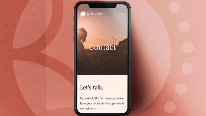
Before: Portfolio ends with no guidance: just a footer and logos.
After: Conspicuous "Contact Me" button or link and social handle at the end of every page.
This is the easiest fix on the list, and weirdly one of the most neglected.
You have done the hard part: curated the work, clarified your role, structured the site, improved the UX, written the case studies, and made it mobile-friendly. Then someone reaches the end of a project page and nothing. No clear next step. No visible contact route. Maybe an email hidden on the About page if they go looking for it.
That is a missed opportunity.
A portfolio should not just display your work. It should help convert interest into action.
And no, this does not mean turning your site into a sales funnel. It just means removing friction at the exact moment someone might be ready to contact you. If a hiring manager likes what they see, the route to reaching you should be obvious and immediate.
At minimum, your portfolio needs:
- a visible Contact link in the main navigation
- an email address that is easy to find
- a clear CTA at the end of project pages
- optional supporting links (LinkedIn, CV, selected social profile) if relevant and professional
The CTA itself can be simple. It does not need startup-copy energy. Something like:
- "Get in touch"
- "Let's talk"
- "Email me"
- "Interested in working together? Contact me here."
That is enough. Clear beats clever.
It is also worth repeating your contact route more than once. People do not always start on your homepage. They might land directly on a project page from a link. If that page ends without a clear next step, you are forcing them to hunt. Every extra click is a chance to lose momentum.
And momentum matters in hiring. Someone may think, "This is promising. I will send a note now." Make that easy and you benefit. Make it awkward and you are relying on them to remember to come back later, which is not a strategy.
One more thing: make sure your CTA feels current. If your contact details are old, broken, hidden, or tied to platforms you no longer use, it undermines confidence. A strong portfolio should feel alive, not abandoned.
The "after" version of this fix is not flashy. It is just functional. It respects the viewer's interest and gives them a clear path to act on it.
That small piece of clarity can be the difference between "good portfolio" and "booked interview."
Quick Checklist
- Navigation & Layout: Simplify menus and reduce homepage clutter. Feature a few strong projects instead of everything at once.
- Project Headlines: Start each case study with a clear title that explains the project and your role.
- Storytelling: Use a simple structure (Challenge, Approach, Outcome) so your thinking is visible, not just the final visuals.
- Results: Include a measurable outcome where possible, or a credible qualitative result when hard data is not available.
- Relevant Content: Lead with projects that match the role you want. Reorder, reframe, or cut work that muddies the signal.
- Mobile Friendly: Make sure your portfolio works properly on phones and tablets, with readable text, usable menus, and fast-loading assets.
- Contact Info: Put a clear call to action and visible contact route where people actually finish viewing your work.
By applying these design portfolio tips, you make it dramatically easier for people to say yes. Not because you have gamed the process, and not because you have crammed in more work, but because you have removed friction and improved clarity. That is what pitch-ready portfolios do: they make your strengths legible, your thinking credible, and your relevance obvious.
If you want your portfolio to stand out, do not just polish the visuals. Design the experience. Structure the story. Prove the impact. Then make the next step easy. That is how you design your portfolio like someone who understands creative work and hiring in the real world.