

The best print ads of all time still feel faintly miraculous because they do so much with so little. A great print advert gets no soundtrack, no slick edit, no retargeting sequence, no six-second cutdown to rescue it later. It gets one page, one poster, one frozen moment to prove it deserves attention. That’s exactly why the medium still carries such weight. The strongest print ad examples don’t merely fill space. They seize it, compressing argument, atmosphere and brand identity into a single visual idea that stays lodged in the brain long after the page has been turned.
That discipline is what makes print such a useful test for advertising more broadly. Strip away media complexity, platform logic and the modern industry’s favourite excuses, and you’re left with a brutal creative question: can this idea stop somebody, communicate something and be remembered? The finest print ad campaigns answered yes with unnerving confidence. They understood that attention is not won by piling on claims. It is won by finding one thing worth noticing and pushing it hard enough that people cannot quite forget it.
That’s why the best print ads in the world still matter now, even in an age that treats stillness like a disadvantage. Print is where weak ideas are exposed quickly and strong ideas become startlingly clear. It has nowhere to hide, which is precisely why so much of advertising’s clearest thinking was sharpened there first.
Jelly Founder Chris Page captures the longer arc of the medium neatly: “Advertising has been grabbing attention since the Egyptians plastered messages on papyrus. Fast forward to the 1880s, and ads were still stuck in plain black-and-white wood engravings. Then came the breakthrough: by 1900, advances in photo-engraving and printing unleashed full-colour visuals, turning ad illustration into a bold art form.”
That shift mattered because it turned the printed ad from information into performance. Once brands had the technical means to reproduce arresting images at scale, the printed page stopped being a place where they merely explained themselves and became a place where they staged a visual argument. Glamour, fear, humour, aspiration, intimidation, envy, status, authority. Print learned how to deliver all of it without ever moving.
And that, really, is why the medium still deserves study. The best creative print ads are proof that restraint, intelligence and genuine craft can generate far more force than noise ever could.
What Makes a Print Ad Truly Effective?
VML
A print ad becomes effective when it turns reduction into strength. That sounds simple, but it is where most weak work falls apart. Print does not reward panic. The moment too many claims are crammed into one layout, the ad starts to look like it does not trust itself. The truly great print ads tend to feel different. They know exactly what their central move is. One image. One line. One tension. One visual twist. One strong act of composition. Then they leave the rest alone.
That is why so much of the all-time great work is memorable as shape before it is memorable as copy. The viewer often understands the basic proposition before consciously “reading” anything. A finger pointed out of the page. A flexed arm. A shark rising from below. A small car marooned in white space. A bottle silhouette repeated until it becomes cultural furniture. The best print ads do not merely communicate. They imprint.
The strongest work also trusts the audience. It assumes people can do a little interpretive work themselves. That matters because memory often improves when the viewer has to complete the thought. The best print does not condescend. It sets the trap, then lets the audience walk into it. That is why wit, metaphor and compositional tension show up so often in the medium’s strongest examples.
Craft matters too. In a still medium, line, colour, type, spacing and image treatment are not decorative extras. They are the argument’s tone of voice. A generic piece of photography can kill a good idea just as easily as a clumsy headline can. The finest print work feels authored. It looks made, not assembled.
And finally, great print has nerve. It knows that white space can be persuasive, that silence can be louder than insistence and that the right visual idea is often more powerful than a page full of dutiful messaging. Much of the print work that survived did so because it was made by people unafraid to look intelligent.
The Best Print Ads of All Time
I Want You for U.S. Army
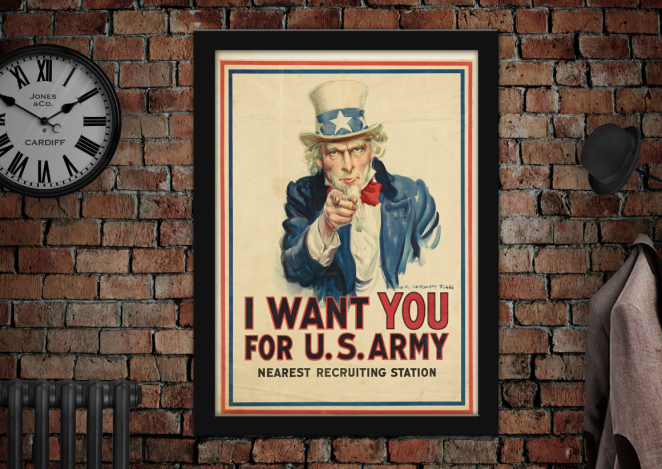
James Montgomery Flagg’s I Want You for U.S. Army remains one of the clearest examples of direct address in advertising. More than a century later, the image still feels uncomfortably effective because it collapses the distance between mass communication and personal accusation. Uncle Sam is not addressing the nation in some vague, collective sense. He is pointing at the individual viewer.
That is what gives the poster its force. The composition is blunt, frontal and disciplined. There is no clutter to soften the message, no scenic context, no elaborate narrative. Just a stare, a finger and a command. It turns recruitment into confrontation.
What makes it especially important in the history of print advertising is how clearly it shows the medium’s persuasive power. This is not an ad that explains. It pressures. It demonstrates that the page can be used not just to inform people, but to put them on the spot.
The lesson is simple: one strong act of visual address can be more powerful than a page full of explanation.
We Can Do It!
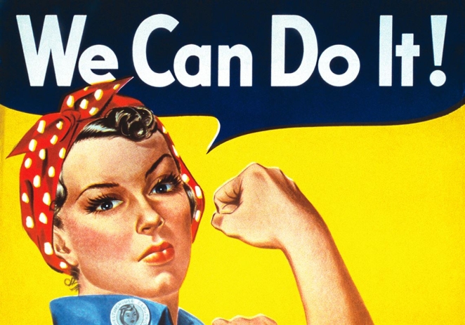
J. Howard Miller’s We Can Do It! has had one of the most fascinating afterlives in visual culture because it escaped its original brief and became something much larger. What began as a wartime motivational poster later became one of the most recognisable pieces of graphic persuasion associated with female strength and collective resolve.
Its brilliance lies in compression. Rolled sleeve. Bent arm. Fixed gaze. One short line. The poster does not spend time describing resilience or empowerment. It performs both through pose, expression and visual economy.
That is one reason it has lasted. A weaker piece of print might have loaded the page with patriotic language or overworked symbolic clutter. This one understands that the image itself can do the heavy lifting. It trusts the visual shorthand.
The lesson: the most memorable print does not merely state a value. It embodies it.
Think Small
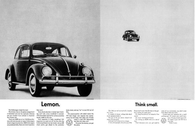
Volkswagen’s Think Small is one of those ads so frequently referenced that it risks becoming homework. That is a pity, because it still feels startlingly fresh when looked at properly. In an era when American car advertising was dominated by excess, chrome and masculine bluster, this ad did something far more interesting. It made modesty feel confident.
The layout is famously sparse. A tiny Beetle sits in a vast field of white space, with understated copy beneath it. That scale relationship does most of the work. Instead of disguising the car’s size, the ad turns smallness into the central proposition. It reframes what could have been seen as a weakness into a virtue.
What changed here was not just style, but posture. The ad treated the audience like adults. It assumed they would understand irony, restraint and self-awareness. It rejected the category’s usual bombast and replaced it with intelligence.
That is why Think Small matters so much. Plenty of modern work has borrowed the empty space without understanding the confidence underneath it. The original still works because the reduction serves a genuine strategic idea.
The lesson: understatement only works when there is real conviction behind it.
Anatomy of a Murder
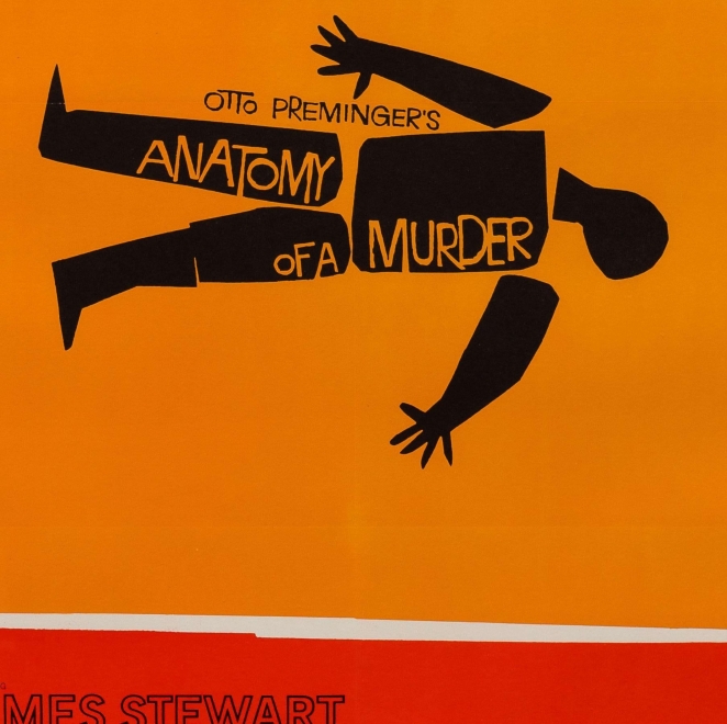
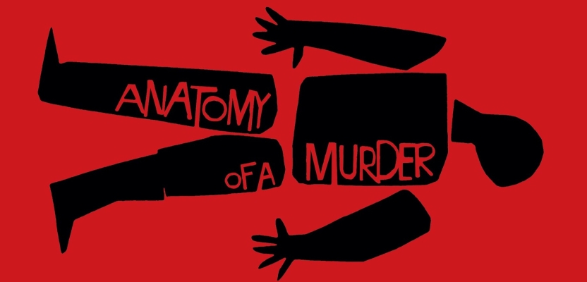
Saul Bass’s poster for Anatomy of a Murder remains one of the clearest demonstrations that a print ad can distil narrative into pure visual essence. Rather than leaning on actor portraits or melodramatic scene-setting, Bass reduces the whole film to a broken body composed of jagged black forms.
It is brutal, abstract and instantly legible. That is the genius of it. The poster does not tell the viewer the plot. It gives them dread in graphic form. In doing so, it proves that a movie poster can act as both advertisement and artwork.
Bass understood something many campaigns still miss: abstraction can sometimes communicate more powerfully than literal description. By stripping the image down to fractured shape and ominous imbalance, he created something psychologically charged rather than merely informative.
The reason it still looks modern is that it trusts visual intelligence. It expects the viewer to connect mood, form and meaning without being spoon-fed.
Simon Manchipp, Founder at SomeOne, adds: “Forget the airbrushed faces of chin-stroking actors. Bass gave us a dissected corpse made of jagged, black geometric slabs. It’s brutal, it’s reductionist, and it’s absolute visual shorthand for the entire plot. It proved that a movie poster could be high art and a psychological warning shot all at once.”
The lesson: print becomes stronger when it translates a proposition into essence rather than summary.
Jaws
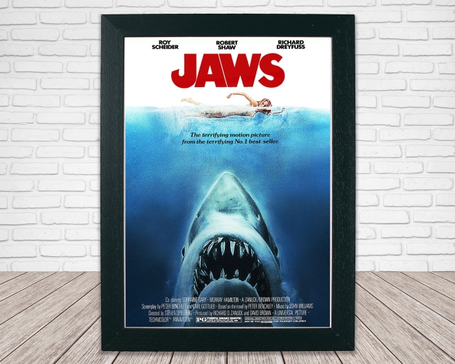
Chris Page’s great obsession is Roger Kastel’s poster for Jaws. He gushes: “One of the most powerful images of the era was Roger Kastel’s iconic poster for the film Jaws, which became as iconic as the film itself, giving an immediate sense of the power, jeopardy and enormity of the movie. I was way too young to see the film legally but managed to get into an afternoon screening to see it, much to my immediate regret.”
The brilliance of the Jaws poster lies in its inevitability. There’s no visual escape route. The threat is obvious, the vulnerability is obvious, and the empty water becomes as important as the shark itself.
Like the best print ads, it does not explain the emotion. It engineers it. The poster stages jeopardy so efficiently that the audience does the rest of the work in their own mind.
That is why it became as iconic as the film it was selling. It is not merely promotional material. It is the film’s fear, compressed into one unforgettable image.
The lesson: the strongest print advertising creates a tension the viewer instinctively completes.
Absolut
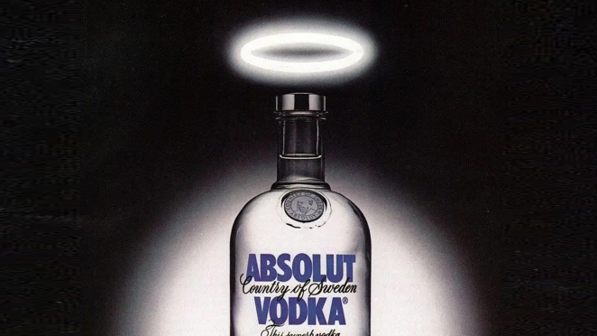
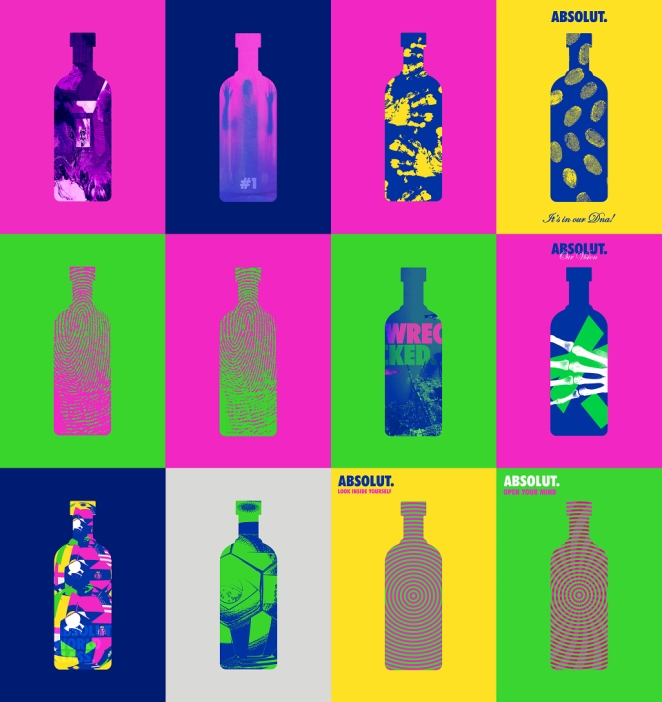
Absolut deserves its place in any list of iconic print campaigns not because of one single execution, but because of the astonishing discipline of the whole system. For years, the campaign revolved around one central asset: the bottle silhouette. That could have become repetitive in lesser hands. Instead, it became almost inexhaustible.
The genius of the campaign was in recognising that a distinctive visual asset can function as an engine rather than a limitation. Each new ad found a fresh way to reinterpret the bottle through culture, geography, objects, weather, texture or visual wit, yet the core identity remained unmistakable.
That is an important lesson in brand building. Many campaigns mistake novelty for strength, constantly reinventing themselves because the core device is not robust enough to carry repetition. Absolut did the opposite. It built equity through variation on a single recognisable theme.
The campaign’s endurance proves that consistency does not have to mean dullness. If the central device is strong enough, repetition becomes cumulative rather than deadening.
The lesson: one great brand asset, used intelligently, can become an entire advertising language.
Got Milk?
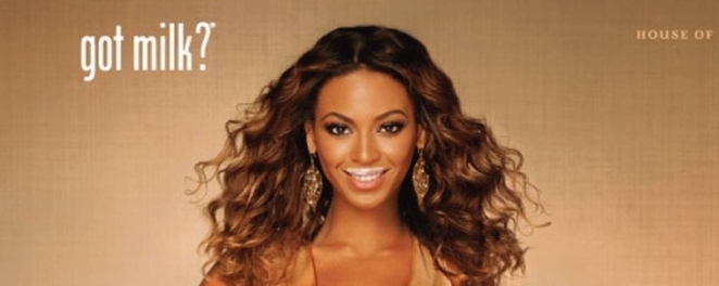
The Got Milk? campaign deserves inclusion because it shows how a print platform can thrive by dramatising absence rather than praising a product in generic terms. Instead of telling audiences that milk was wholesome, healthy or good for them in the abstract, the campaign focused on a more emotionally specific frustration: not having milk at the exact moment you needed it.
That shift was strategically smart. It turned the product from a nutritional category into a dramatic enabler of small, relatable rituals. Cereal. Coffee. Cookies. Cake. Peanut butter sandwiches. The creative platform worked because it took something ordinary and made its absence feel irritatingly vivid.
In print, this often played out through humour and recognisable scenarios rather than hard-sell messaging. The line itself did a huge amount of work. Short, colloquial and slightly incomplete, it sounded more like a human thought than a formal advertising claim.
That tone mattered. It helped the campaign feel conversational rather than institutional, and therefore much more memorable.
The lesson: product truth becomes more persuasive when it is framed as lived experience rather than abstract benefit.
Creative Print Ad Examples and Why They Worked
Ogilvy & Mather Group HK
If there’s one pattern that unites the best work in this medium, it’s reduction. Bass reduced a murder mystery to a broken body. Jaws reduced cinematic terror to one vertical collision. Think Small reduced a whole automotive proposition to a tiny image in a sea of white. I Want You reduced mass mobilisation to one man pointing. The reduction isn’t a stylistic flourish. It’s the strategy.
The second pattern is mnemonic strength. Great print ads tend to leave behind a visual skeleton that can be recalled later from almost nothing. The finger. The flexed arm. The shark below the swimmer. The corpse made of slabs. The Beetle stranded in white space. If people can redraw the ad from memory, the work has probably done its job.
The third is craft. Page puts this plainly: “I have been entranced by illustrated imagery ever since. In most cases at the moment, it’s a visual race to the bottom with the bulk of advertising consisting of identikit photography and boring Brand logos. At Jelly we talk a lot about craft and cut-through as being a raison d’etre for utilising real art and artists, and this image and its longevity proves it.”
He isn’t being nostalgic for the sake of it. Craft matters in print because execution isn’t separate from persuasion. In a still medium, line, colour, texture, composition, and typography aren’t decorative extras. They’re the argument’s tone of voice.
That’s one reason illustrated or highly stylised print often ages better than generic photography-led work. It carries authorship. It feels made, not assembled. That doesn’t mean photography can’t be brilliant in print, because it absolutely can, but it does mean the work needs a point of view strong enough to rise above category wallpaper. Too much contemporary advertising confuses slickness with distinction. The older masters rarely made that mistake.
Another reason these ads worked is that they understood the page as theatre. The best print doesn’t merely occupy space. It choreographs the eye. The viewer sees one element first, then another, then the conceptual click happens. That rhythm matters. Bass knew it. DDB knew it. So did the makers of the strongest wartime posters. Print is static, but it can still direct attention with enormous sophistication.
And then there’s tone. Tone is often the hidden reason an ad survives. Think Small works partly because it’s witty without being smug. Jaws works partly because it’s terrifying without melodrama. We Can Do It! works because it’s forceful without visual clutter. The best print gets the emotional temperature right. It knows whether to charm, intimidate, amuse, or haunt.
What Modern Marketers Can Learn from These Print Ads
Absolut
The first lesson is that simplicity isn’t a lack of ambition. Quite the opposite. Simplicity is often evidence that somebody has done the hard work of deciding what matters. The best print ads look spare because they’re strategically ruthless. Modern marketers could do with more of that and a little less message-hoarding.
The second lesson is that memorable assets beat generic polish. One of the quiet tragedies of a lot of contemporary marketing is that so much of it is technically competent and visually disposable. The strongest historic print work reminds us that brands are remembered through shapes, symbols, compositions, and tonal devices that feel theirs and nobody else’s. If the work could be swapped between three competitors without much loss, it probably isn’t strong enough.
The third lesson is to trust the audience’s intelligence. Great print rarely feels desperate. It doesn’t over-explain the joke or hammer home the metaphor. It assumes a certain level of visual literacy and rewards the viewer for having it. That isn’t an old-fashioned luxury. It’s still one of the fastest ways to make work feel premium, confident, and culturally alive.
The fourth is that craft still matters enormously. Page’s frustration with today’s “identikit photography” lands because so much brand communication now feels frictionlessly interchangeable. Craft cuts through because it signals care, intention, and character. In print especially, execution is part of the idea’s credibility. If the work looks assembled from defaults, viewers feel that instantly.
The fifth lesson is about long-term brand building. Iconic print campaigns don’t merely create a momentary spike of interest. They install something into public memory. That’s harder to measure neatly, but it’s often where the real value sits. Campaign fame isn’t a vanity metric when it becomes a durable part of how people recognise and retrieve a brand.
How Creativepool Can Help You Find the Right Print Advertising Talent
Alaa Darwish
The best print ads look effortless because all the excess has been cut away. One image. One line. One visual twist. One act of composition strong enough to survive without motion, music, targeting or a follow-up sequence. That kind of work doesn’t happen by accident. It takes strategy, copywriting, art direction, design, craft and the confidence to leave the page alone once the idea is clear.
That’s where Creativepool can be a useful place to start. For brands and marketing teams looking to create stronger print advertising, Creativepool’s company directory offers a way to discover agencies, studios and creative companies with experience across advertising, campaign strategy, design, art direction, illustration, copywriting, photography, production and brand identity.
A brand planning a print campaign may need a creative team that can reduce a complicated proposition to a single memorable thought. A cultural organisation may need a poster that feels more like a piece of visual culture than a piece of marketing. A challenger brand may need a sharper headline-led campaign that earns attention without shouting. A luxury, fashion or hospitality business may need print work where composition, restraint, paper, photography and typography all carry the premium feeling of the brand.
Creativepool can also help businesses find individual specialists through its creative talent network. That might mean a copywriter who can find the line, an art director who can shape the visual idea, an illustrator who can bring authorship and texture, a designer who understands layout and hierarchy, or a photographer who can create an image with enough force to hold the page on its own.
For teams still shaping the brief, browsing Creativepool Awards and agency case studies can also help clarify what strong print thinking looks like in practice. The best print work is rarely just “a nice visual”. It has a strategic job. It might reframe a product truth, dramatise a problem, build brand fame, create desire, provoke a response or install a distinctive asset into public memory.
That matters because print exposes weak thinking quickly. The article argues that the medium leaves nowhere to hide, which is precisely why so much of advertising’s clearest thinking was sharpened there first . Creativepool fits naturally into that argument because it helps brands find the people and companies capable of doing that hard reduction: turning a loose brief into one page, one poster or one visual idea that actually deserves attention.
For agencies and creatives, a strong Creativepool profile is also a way to make print and campaign craft visible to clients who still value ideas that can stand still and survive scrutiny. Case studies that show the brief, the concept, the craft choices and the outcome can help prove that print advertising is not nostalgic filler. Done well, it is one of the sharpest demonstrations of creative discipline there is.
The lesson from the best print ads of all time is that one brilliant page can still do more than a hundred forgettable assets. Creativepool helps brands find the creative partners who know how to make that page count.
Are Print Adverts Still Effective Today?

WINGS The Agency / Demian Campos
Yes, though not because the industry should pretend nothing has changed. Print no longer dominates attention in the way it once did, and most marketers would laugh at the idea that a press ad alone can do all the work. But that isn’t the same as irrelevance. More importantly, the creative disciplines print demands remain indispensable across every other medium.
A good print ad teaches focus. It teaches composition. It teaches how to create a distinctive asset. It teaches how to compress a proposition. It teaches how to stop relying on motion to smuggle a weak idea across the line. In that sense, print is still one of the best creative tests advertising has. If the idea can’t survive in still form, it may not be much of an idea.
There’s also something newly valuable about physical stillness in a culture increasingly built around churn. A poster, magazine spread, or printed execution has a kind of decisiveness to it. It doesn’t flicker past in an endless feed. It stands there and asks to be judged. That can make good work feel more deliberate and bad work more embarrassing, which is probably healthy for everybody.
The point isn’t that brands should all rush back to nostalgia media plans. It’s that the medium still contains some of advertising’s clearest lessons. The best print ads of all time endure because they show what happens when a print advert is built around a real idea rather than padded with process. The finest print ad examples and print ad campaigns prove that creative print ads still have the power to shape culture, sharpen brands, and outlive the conditions that produced them. And the best print ads of the world remain worth studying for one very simple reason: they remind the industry that one brilliant page can still do more than a hundred mediocre assets ever will.