


The best signs tend to stick around because they solve something practical first and emotional second. They shape expectation, signal identity, reduce uncertainty, and, at their very best, turn a business or destination into something people remember long after they’ve left.
Great signage inspiration rarely comes from decoration alone. It comes from creative signage design that understands distance, speed, contrast, emotion, and context all at once. That’s why the best signage design is never just about how a sign looks in a mockup. It’s about what happens when a tired traveller spots it from a moving car, when a pedestrian finds the right turn without thinking, or when a city’s personality gets distilled into a few letters, lights, colours, and forms.
For businesses, that matters more than ever. The most effective signage examples for attracting attention are usually the ones that solve two problems at once: they make a place easier to navigate and harder to ignore. The real lesson from the world’s greatest signs is that memorability and clarity aren’t enemies. In fact, the strongest signs tend to fuse both so tightly that they feel inevitable.
What Makes a Great Signage Design?
Simon Manchipp
A great sign has to do three things, and do them fast:-
First, it must be legible
That means contrast, hierarchy, scale, and type choices that survive distance, lighting, and movement. Official wayfinding guidance from bodies such as the U.S. Access Board and Network Rail is surprisingly aligned on this point: signs work best when contrast is strong, typography is simple, placement is consistent, and the amount of information is tightly controlled. A sign doesn’t earn points for being clever if the audience misses the message.
Second, it must belong to its environment while still standing apart from it
That sounds contradictory, but it isn’t. The London Underground roundel was created in 1908 specifically so station names would stand out against the visual noise of platform advertising, and it still works because it understands both its surroundings and its job. Times Square, by contrast, became iconic by turning visual overload into the entire point. New York’s zoning rules literally require illuminated signage in parts of the district, which tells you everything about how central signage is to the identity of the place.
Third, it must carry some emotional charge
That doesn’t mean every sign needs to be flamboyant. Sometimes the emotion is reassurance. Sometimes it’s excitement. Sometimes it’s prestige. Sometimes it’s pure civic recognition. The Hollywood Sign began as a real-estate billboard in 1923, but over time it escaped its original function and became shorthand for ambition, fantasy, fame, and Los Angeles itself. That’s what separates functional signage from cultural signage: one helps people find a place, the other helps define what the place means.
This is also where businesses often go wrong when looking for signage inspiration that works for modern brands. They chase novelty instead of distinctiveness. But the signs that last tend to be the ones that commit hard to a recognisable idea and then repeat it with conviction. McDonald’s did it with the Golden Arches. Transport for London did it with the roundel. Glico did it with the running man in Osaka. Each is simple enough to register instantly, but specific enough to be impossible to confuse with anything else.
20 Best Signage Examples of All Time
1. Welcome to Fabulous Las Vegas
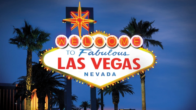
There are more technically refined signs on earth, but there may not be one that announces arrival better. Designed by Betty Willis in 1959, the Las Vegas sign feels like optimism rendered in bulbs and geometry. It’s cheerful, theatrical, and gloriously physical. SomeOne’s Simon Manchipp put it better than I ever could: “Betty Willis never copyrighted it. She called it her gift to the city. It’s a collision of mid-century optimism and neon. It creates a sense of arrival that no digital screen could ever replicate. It’s not just a sign; it’s a physical manifestation of a ‘what happens here stays here’ promise. Plus, when you see it after that LONG drive from LA it signals the beginning of a very, very fun time.”
2. The Hollywood Sign
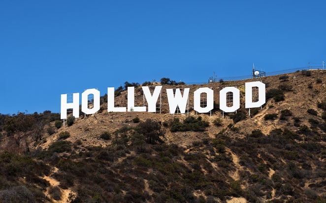
Originally erected in 1923 as “Hollywoodland,” it was supposed to advertise a housing development, not become one of the most famous signs in the world. Yet that accidental overachievement is part of its charm. The giant white letters are absurdly direct, almost anti-design in their bluntness, but their scale and setting do all the heavy lifting. The lesson is simple: sometimes the best signage design is less about ornament than placement and symbolic charge.
3. The London Underground roundel
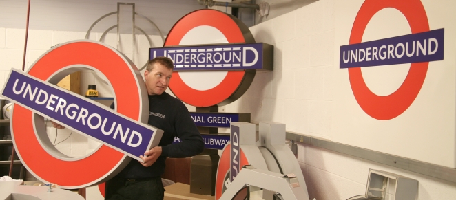
Few signage examples are as perfectly distilled as the roundel. TfL notes that it began life in 1908 as a platform nameboard intended to make station names stand out against surrounding adverts. More than a century later, it remains a masterclass in public-facing clarity: a red circle, blue bar, white lettering, nothing wasted. It doesn’t shout, but it never disappears. That’s a rare achievement.
4. Piccadilly Lights
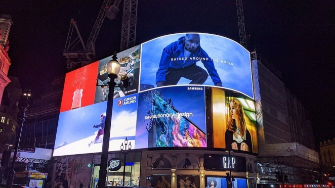
Piccadilly Circus demonstrates that spectacle can be a form of place-branding in its own right. Electric signs appeared there in the early 1900s, with Bovril becoming one of the earliest neon advertisers in 1910. The result was not subtle. But subtlety was never the point. The signage turned a junction into a theatre, and in doing so made the location inseparable from light itself.
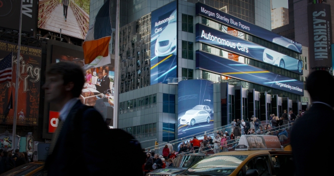
5. Times Square spectaculars
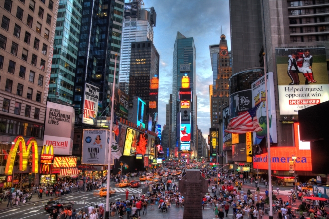
If Piccadilly is urban glamour, Times Square is full-volume sensory assault. Yet its success isn’t random. New York’s special zoning requirements codify the district’s illuminated signage as part of the architecture. That’s why the billboards there don’t feel like an afterthought bolted onto buildings. They are the buildings, at least from the street. For brands thinking about foot traffic and visibility, the lesson is blunt: when signage becomes inseparable from place, visibility stops being a line item and becomes identity.
6. McDonald’s Golden Arches

The Golden Arches are proof that structural signage can outlive the building that created it. McDonald’s own history notes that the attention-grabbing red-and-white building with arches was designed by Stanley Meston in the 1950s. The arches then migrated from architecture into symbol, and eventually into one of the most recognisable signs anywhere. It’s a reminder that creative signage design can begin as environment design.
7. The Glico Running Man, Osaka
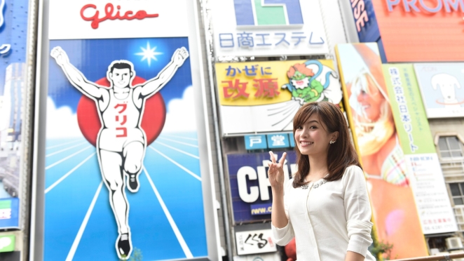
Osaka’s Glico sign has been glowing over Dotonbori in one form or another since the 1930s, and Glico’s own history tracks multiple generations of the sign over time. The enduring power comes from motion implied through stillness: the athlete crossing the line, arms raised, forever mid-victory. It’s advertising, yes, but it also behaves like civic shorthand.
8. The Wako clock tower, Ginza
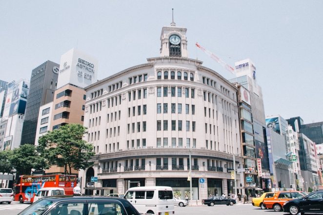
Not every great sign screams. The Wako clock tower in Tokyo does something harder. Seiko’s history traces the landmark back to the 1890s, and the tower has come to symbolise Ginza through consistency, placement, and elegance rather than volume. In a district full of luxury cues, it reads as calm authority. That’s an underrated signage strategy for premium brands.
9. Boston’s CITGO sign
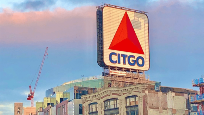
The CITGO sign is fascinating because it evolved from advertisement to local landmark. Boston residents fought to preserve it because it had become part of the city’s visual memory, especially around Fenway Park. When a sign survives because people would miss it emotionally, it has crossed from media into culture.
10. The Moulin Rouge windmill
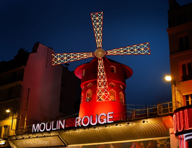
Technically, it’s part sign, part architecture, part theatrical taunt. But that’s exactly why it works. The Moulin Rouge’s red windmill has served as an emblem of Parisian nightlife since the venue opened in 1889, and the cabaret itself still frames it as a living part of its legend. It proves that signage can thrive when it becomes performance rather than plaque.
11. New York City Subway wayfinding
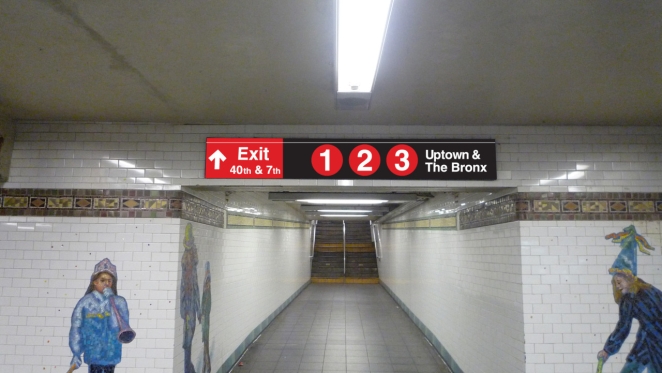
The New York City Transit graphics system by Bob Noorda and Massimo Vignelli is less glamorous than Hollywood or Vegas, but in design terms it’s one of the most influential signage systems ever made. MoMA holds the Graphics Standards Manual in its collection for good reason. This is signage as discipline: typography, spacing, repetition, logic. It shaped how millions of people move through a city.
12. National Park Service Unigrid and UniGuide systems
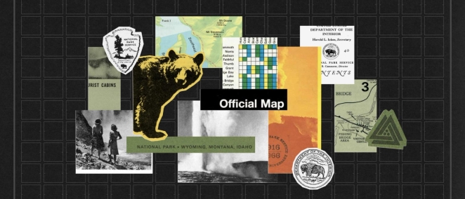
America’s national parks arguably offer some of the best signage inspiration for businesses that need clarity without blandness. The Unigrid system standardised communication while leaving room for local character, and the UniGuide standards extended that thinking into broader sign families. It’s a strong reminder that systems matter more than one-off hero moments.
13. Heathrow’s transport signage
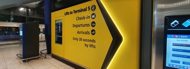
Airport signage rarely gets romance, but it deserves respect. Heathrow’s emphasis on sign standards, accessible viewing distances, and real-world readability reflects what the best public signage always understands: stress changes how people see. In environments where people are rushed, tired, and carrying luggage, good signage is a form of care.
14. Las Vegas neon casino facades
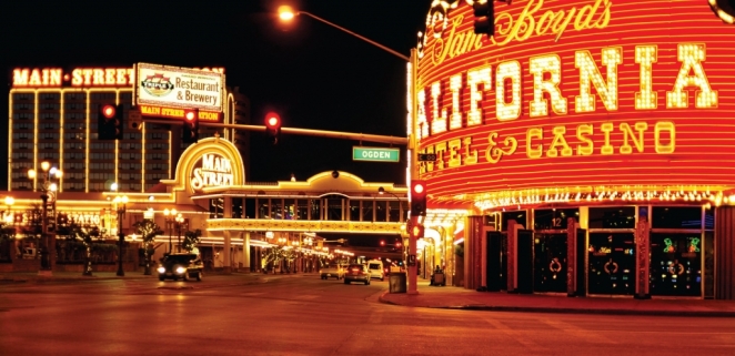
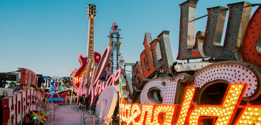
Beyond the welcome sign itself, vintage Las Vegas built an entire civic language out of neon, arrows, scripts, stars, and stacked lettering. The Neon Museum’s preservation work matters because it shows signage not as disposable promotion but as design heritage. These signs weren’t merely selling rooms. They were selling mood.
15. Route 66 roadside motel signs
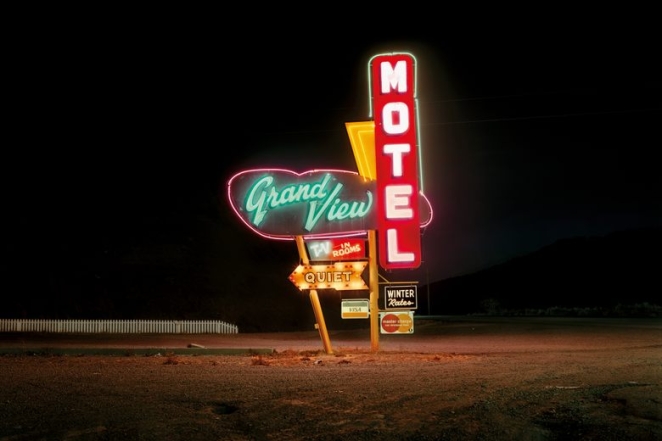
The classic American motel sign deserves a place on any list like this because it solved a brutally practical problem with flair: moving motorists had only seconds to notice, decode, and remember a business. Height, illumination, shape, and punchy naming all emerged from that pressure. It’s some of the purest “attention as survival” design there is. (This one is less a single sign than a signage tradition, but a powerful one nonetheless.)
16. The LAX sign
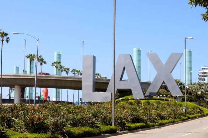
Los Angeles has always understood the theatrical value of arrival. The LAX sign works because it turns an abbreviation into an event. Big letters, strong scale, immediate recognisability. It’s brand compression at urban scale, the kind of sign that tells you you’ve arrived even before you’ve properly processed where you are.
17. The classic American diner sign

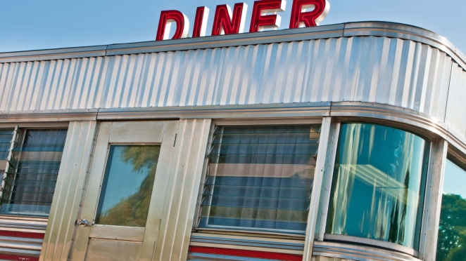
Diner signage sits in the same tradition as motels and drive-ins: designed for speed, hunger, and memory. Chrome, neon, script, arrows. It is often gloriously unsubtle, which is precisely why it works. Some businesses need refinement. Others need to be seen from across the road when somebody wants pancakes.
18. Tokyo’s stacked vertical signboards
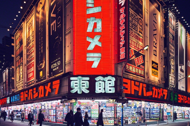
Tokyo’s most memorable street signage often works vertically rather than horizontally, turning architecture into a column of invitations. It’s the right answer to density. In crowded districts, the winning move isn’t always to be bigger. Sometimes it’s to occupy sightlines others have ignored.
19. The old-school barber pole

It might be one of the smartest pieces of symbolic signage ever invented. No reading required, no translation needed, immediate category recognition. The barber pole shows that the strongest signs often rely on shape, rhythm, and repeated colour as much as wording.
20. Apple’s store signage
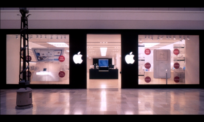
Minimalism only works in signage when the brand already carries enormous symbolic weight. Apple’s storefront signs succeed because they leverage confidence, restraint, and immaculate consistency. Strip away the brand equity and the same treatment would often feel anonymous. That’s the cautionary note many modern businesses need to hear.
What ties these wildly different examples together is not a single visual style. It’s decisiveness. The best signage examples know whether they’re guiding, seducing, reassuring, or announcing, and then commit to that role without hedging. That’s what modern businesses should copy, not the superficial look of neon or Helvetica or brushed metal.
Creative Signage Design Ideas for Modern Brands
Adam Jenkins
So where can brands find real-world signage inspiration that actually works now, rather than just looking photogenic on Pinterest? Usually in the overlap between old principles and present-day context. The historical examples above show that what lasts is rarely gimmickry. It’s strong recognition, strong placement, and strong hierarchy. The medium can change. The underlying logic doesn’t.
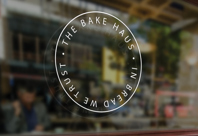
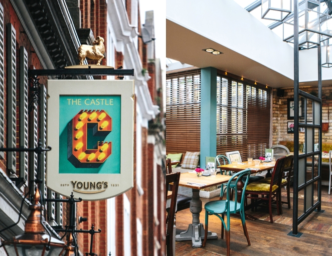
For retail and hospitality brands, one of the strongest moves is to think in layers. The main fascia sign does the job of identification from a distance. Projecting signs catch side-on pedestrian traffic. Window graphics offer secondary information. Interior wayfinding handles the final metres. Many businesses still treat these as separate tasks handled late in the process, when in reality the strongest signage design systems are built as one continuous customer journey. That is the thinking behind successful transport systems, airport environments, and civic wayfinding, and it transfers surprisingly well to commercial settings.
For crowded environments, clarity becomes even more important. If the setting is noisy, the sign should get simpler, not busier. High-contrast text, fewer words, and stronger silhouettes tend to win. The London Underground roundel works because it cuts through clutter. Times Square works because its “clutter” is controlled into a coherent district identity. The mistake many brands make is landing awkwardly in between: too loud to feel elegant, too vague to feel memorable.
And for businesses wanting to increase foot traffic, the most effective type of signage is often the one that is visible before the storefront is. That can mean illuminated signs, projecting blade signs, rooftop identifiers, or landmark-style features that help people orient themselves before they’re directly outside the door. This is partly an inference from the examples above, but it is also consistent with formal wayfinding guidance, which emphasises visibility at decision points and the importance of placement as much as message design.
Different Types of Signage Used in Branding
Anna Wilson
Not all signage is trying to do the same job, and brands often suffer when they act as though it is.
Identity signage is the big headline act: the main store name, the exterior marker, the thing people photograph or remember. This is where the Hollywood Sign, the Las Vegas sign, and the Golden Arches all sit, albeit at very different scales. It answers the question: what is this place?
Wayfinding signage helps people move. Think subway systems, airports, hospitals, stations, campuses. Here, beauty matters, but failure is measured in hesitation, confusion, and stress rather than aesthetic disappointment. Heathrow, the NYC Subway, and the National Park Service all show how powerful a disciplined sign family can be.
Promotional signage is designed to capture attention in competitive space. Piccadilly Lights, Times Square, and Osaka’s Glico sign sit here. This is signage as advertising, but at its best it becomes inseparable from the character of the district.
Symbolic signage uses forms or icons rather than lots of copy. The barber pole is the classic example. So is the roundel. So are arches. The advantage is speed. The disadvantage is that it only works if the symbol earns recognition through repetition.
Experiential signage turns signage into part of the atmosphere. The Moulin Rouge windmill, cinema marquees, and vintage neon casino facades all live here. These don’t just communicate information. They help stage the experience itself.
The smart move for brands isn’t to pick one type and ignore the rest. It’s to know which role matters most at which moment in the customer journey.
Key Elements Behind Effective Signage Design
Matt Parkes
Legibility comes first. That includes contrast, type size, spacing, and the discipline to edit. Official guidance repeatedly warns against backgrounds and finishes that compromise readability and recommends type treatments that remain clear at distance and under varied lighting. In other words, a sign is not a poster and shouldn’t be treated like one.
Placement comes next. A perfectly designed sign in the wrong place is a failed sign. Good systems place information where decisions are made, not after confusion has already set in. That principle runs through transport, healthcare, and rail guidance because it works. Businesses should steal it shamelessly. Put the message where the hesitation happens.
Consistency matters more than most brand teams want to admit. People learn places through repetition. The Wako clock, the roundel, the Arches, the Glico runner: all gained power by staying recognisably themselves over time. Refreshes are sometimes necessary. Constant reinvention usually isn’t.
Distinctiveness is the final ingredient. Plenty of signs are clear. Far fewer are ownable. The best signage design creates an association that sticks even when the wording is removed. If somebody can crop the image and you still know the place, the sign is probably doing something right.
Common Mistakes in Signage Design
Maciek Michalski
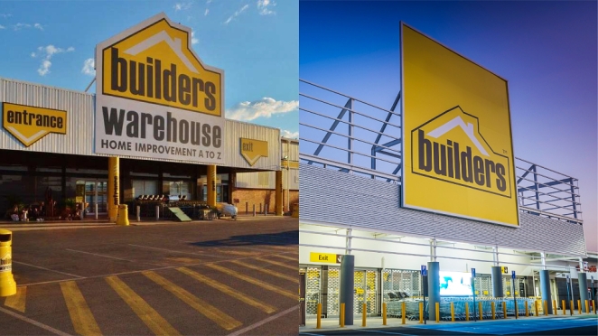
The biggest mistake is trying to say too much. Businesses often cram signs with taglines, menus, sub-brands, URLs, opening hours, social handles, and unnecessary decoration, then wonder why nothing lands. A sign usually has one primary job. Let it do that.
The second is mistaking complexity for creativity. Creative signage design isn’t about making the audience work harder. It’s about making recognition feel effortless. Some of the most iconic signs on earth are shockingly simple: a circle and a bar, a pair of arches, a giant word on a hill, a runner over a canal.
The third is ignoring context. A sign for a luxury boutique should not behave like a roadside diner, and a sign for a station should not behave like a perfume ad. The surrounding environment, the speed of the audience, the likely lighting, and the emotional state of the user all matter. Heathrow signage works because it understands airport stress. National park signage works because it understands orientation in landscape. Times Square works because it understands overload as theatre.
And the fourth is forgetting accessibility. High contrast, non-glare surfaces, and readable typography are not bureaucratic nuisances bolted on after the fact. They are part of what makes signage effective, full stop. The best signs are inclusive not because inclusion is trendy, but because unreadable signage is simply bad design.
The enduring appeal of the best signage examples is that they never confuse style with purpose. They know what they need to do in the world, and then they do it with enough flair, confidence, and clarity to become memorable. That’s why the strongest signage inspiration still comes from the same places: transport systems that guide without fuss, landmarks that announce arrival with swagger, and commercial signs that understand attention is earned in seconds.
For any brand chasing creative signage design today, that’s the real benchmark. The best signage design isn’t just visible. It becomes part of how a place is felt, found, and remembered.
How Creativepool Can Help You Find the Right Signage Designer
Creative 23
Great signage sits at the intersection of branding, architecture, wayfinding, typography, customer experience and plain old-fashioned visibility. It has to work from a distance, survive different lighting conditions, suit the environment, reflect the brand and help real people make quick decisions. That’s why hiring the right creative partner matters. A sign is rarely just a sign. It’s often the first physical expression of a brand that customers actually meet.
For businesses looking to create or improve their signage, Creativepool can be a useful place to start. Through Creativepool’s talent network, brands can discover designers, typographers, illustrators, art directors, environmental graphic designers and creative specialists who understand how signage works in the real world, not just in a polished presentation mockup.
The first step is to define what the signage needs to do. Is it there to attract foot traffic? Help customers navigate a space? Make a storefront more recognisable? Turn a hospitality venue into a destination? Create a more premium arrival experience? Or build a complete signage system across retail, workplace, leisure or public environments? The article makes clear that the best signage design depends on legibility, placement, consistency and distinctiveness, not surface decoration alone .
For larger or more complex projects, Creativepool’s company directory can help businesses find branding agencies, design studios, wayfinding specialists and environmental design partners. That can be especially useful when signage needs to connect with a wider brand identity system, including logos, colour, typography, interiors, packaging, digital touchpoints and campaign work.
A hospitality brand may need signage that creates atmosphere as much as identification. A retailer may need fascia signs, window graphics, in-store navigation and promotional displays that work together. A workplace, campus, venue or public space may need a more disciplined wayfinding system that reduces confusion and improves the visitor experience. A destination brand may need a landmark sign that people want to photograph, share and remember.
Creativepool can also help businesses judge potential partners by their actual work. Strong signage portfolios should show more than attractive lettering. They should demonstrate how the designer thinks about scale, sightlines, materials, accessibility, contrast, lighting, environment and customer behaviour. The strongest signage is never just “on brand”. It works where it lives.
For designers and studios, a strong Creativepool profile is also a way to make that expertise visible to businesses actively looking for creative support. Case studies that show the brief, the environment, the design thinking and the finished result can help clients understand why signage deserves proper creative attention rather than being left until the end of a project.
The lesson from the world’s most iconic signs is that clarity and memorability are not opposites. The best signs help people recognise, navigate and emotionally connect with a place. Creativepool helps brands find the creative people who can deliver that balance: designers who know when to be bold, when to be restrained and how to make a sign do its job beautifully.