Better
Tees Valley
ABOUT
Background
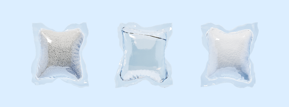
Dropps are the leading US-based challenger brand in household cleaning and care. This is a category dominated by huge plastic jugs of highly effective but often highly chemical formulations. Although eco-friendly detergents are nothing new, they tend to fall short on efficacy in their bid to be kinder to the planet. Enter Dropps — a powerful nature based cleaning pod, shipped direct to consumers in minimum waste packaging.
The Brief
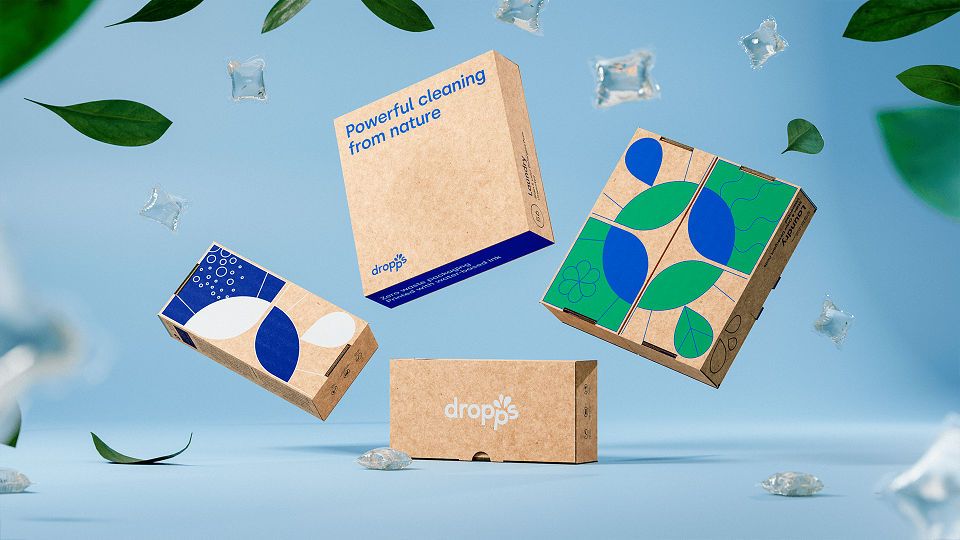
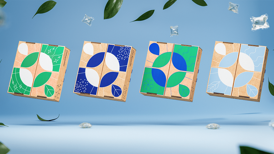
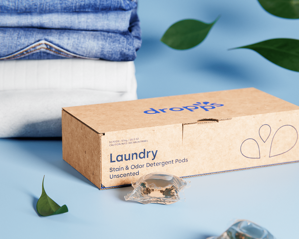
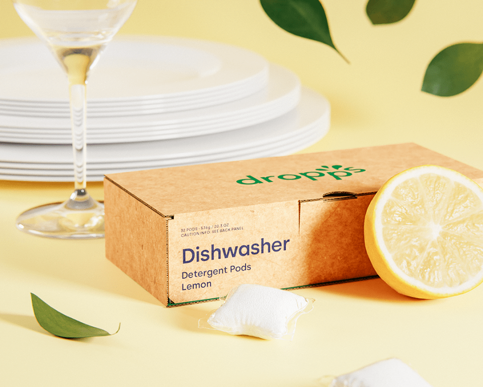
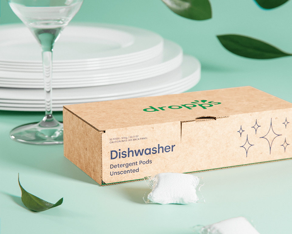
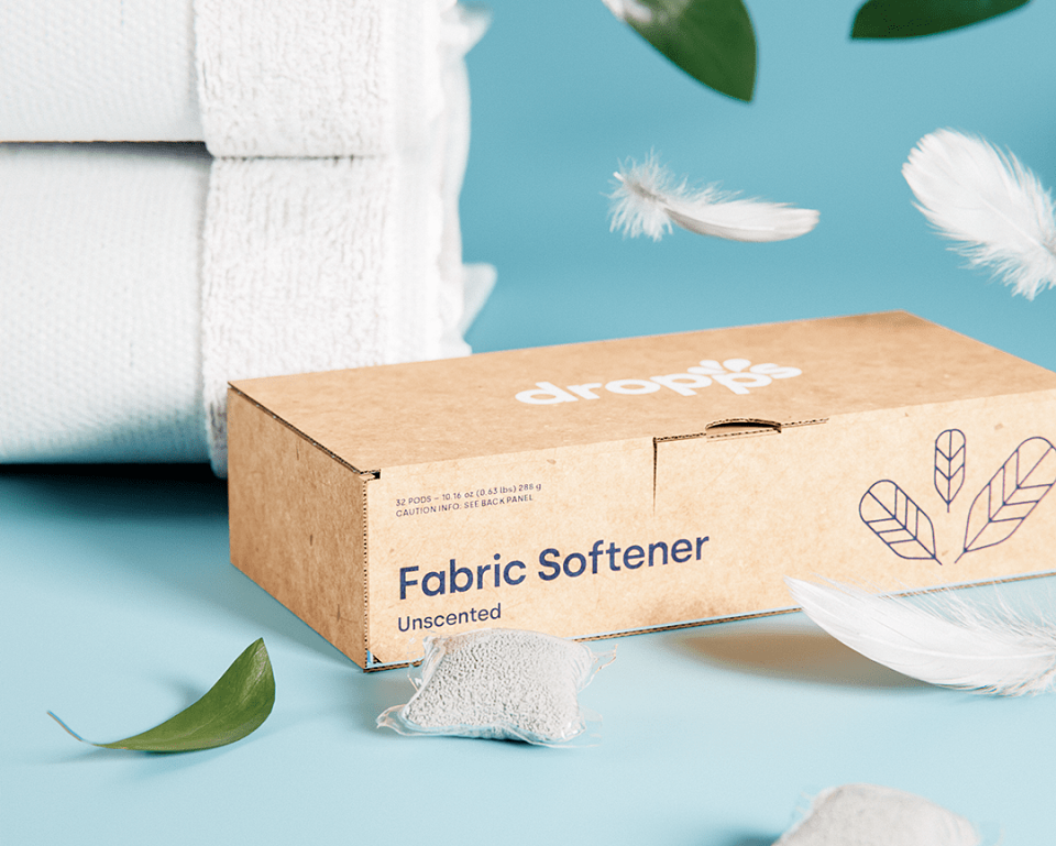
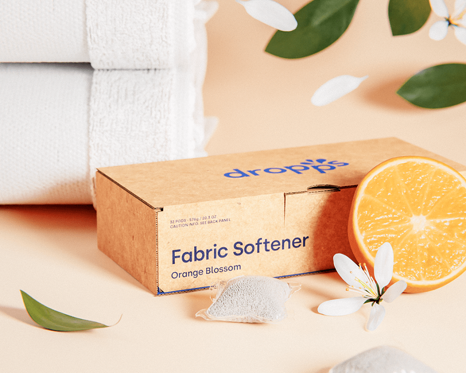
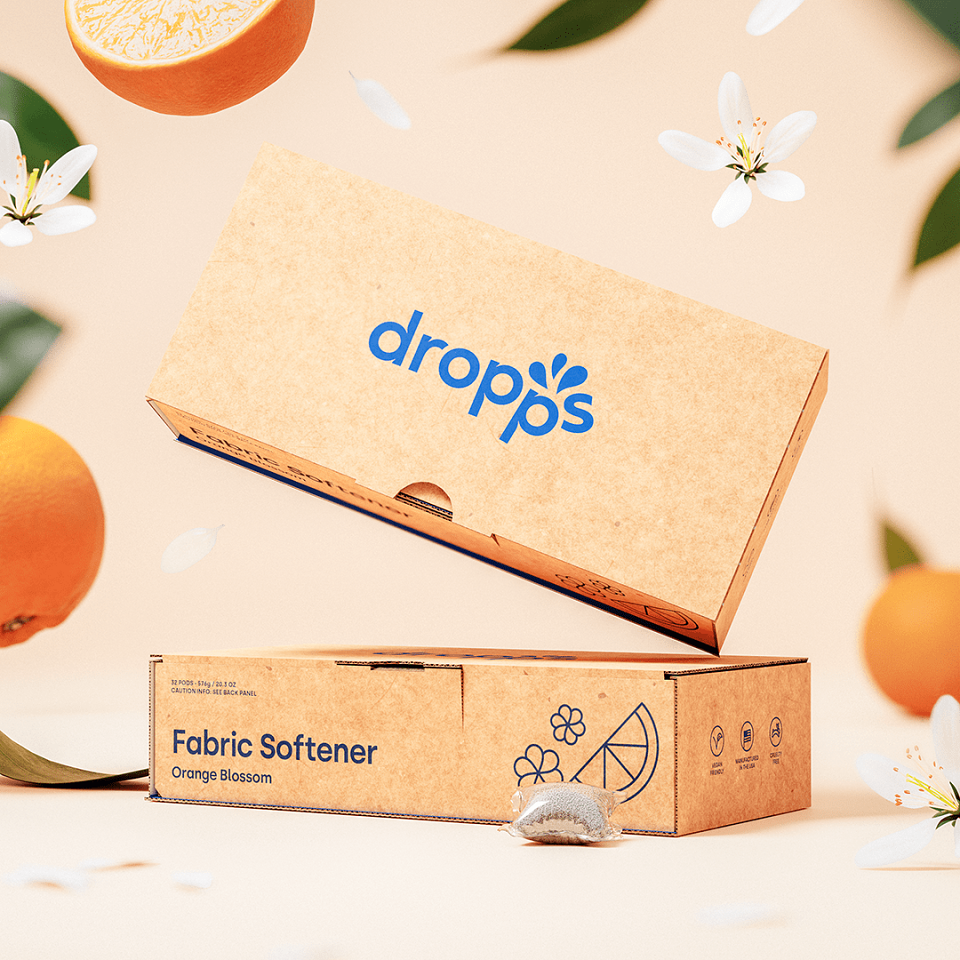
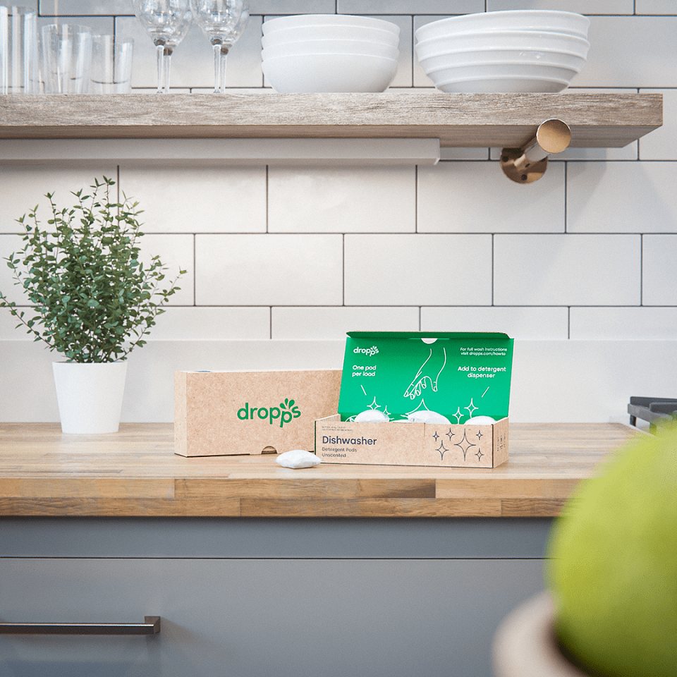
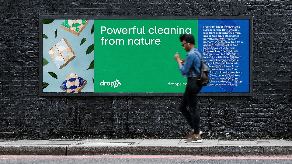
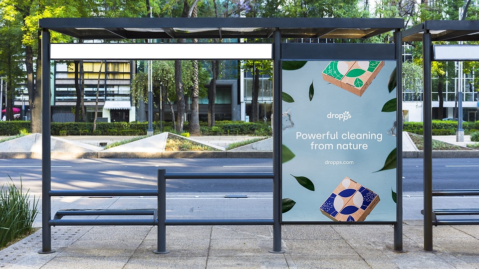
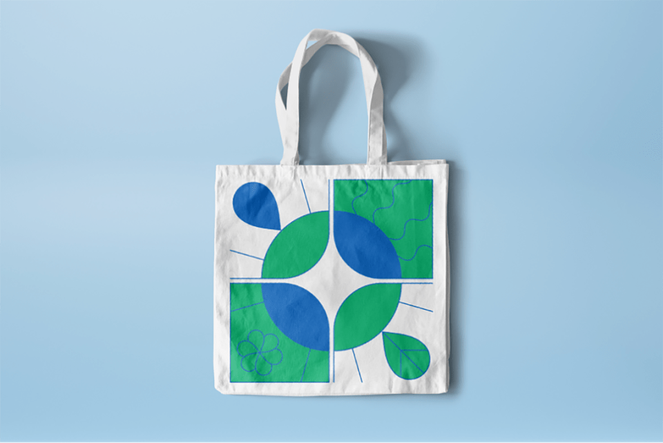
Following a new round of investment, Dropps approached Better to help optimise the brand assets that are working for them. By no means a blank sheet of paper rebrand, it was crucial that we retained existing brand equities and recognition. This started with refreshing and refining their visual identity, rethinking their signature packaging and finally applying the results by art directing their eCommerce imagery.
The Solution
Rather than being a fundamental rethink, or even an additive process, the key to the creative direction lay in the Dropps philosophy: “Eliminate the stupid, amplify the core.” This meant that at every opportunity we attempted to smarten-up, simplify or reduce; resulting in an intelligent, minimal and elegantly functional brand that still retains plenty of character.