Edelbert Rosales
Graphic Designer
ABOUT
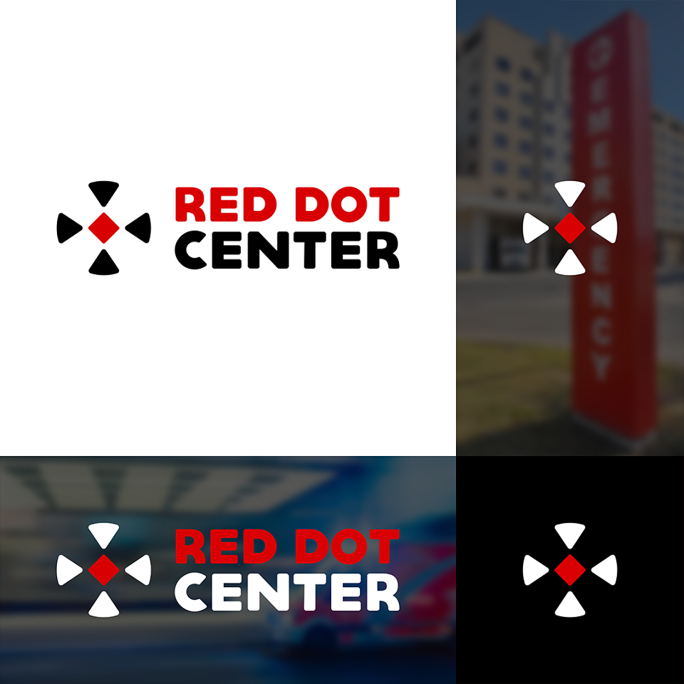
The "Red Dot Center" logo features a clean and straightforward design. At the center of the logo is a bold, red dot, symbolizing focus, attention, and a central point of importance. Surrounding the red dot, there is an arrow pointing towards it, representing progress, direction, and growth.
The color red is used for the dot to evoke a sense of urgency and importance in healthcare matters, while the arrow and cross are in a soothing and calming shade of blue or green to represent healing and tranquility.
Overall, the "Red Dot Center" logo conveys a clear message of a healthcare facility with a focus on providing essential and compassionate services. Its simple and recognizable design makes it suitable for various applications, ensuring effective brand representation for the hospital.
MADEIT CREDITS
-

Edelbert RosalesGraphic Designer