Ben Gilchrist
Graphic Designer
ABOUT
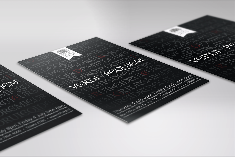
I had the opportunity to design for the Royal Opera House's performance of Verdi Requiem. With no photographic imagery allowed to be used I challenged myself to use typography as my central visual. The muddled letters, in a font inspired by the original 1874 Verdi poster, represents each sound. When each sound is placed in the correct order, it highlights the title.
MADEIT CREDITS
-

Ben GilchristGraphic Designer