Ben Korda
Graphic Designer
ABOUT
CONCEPT:
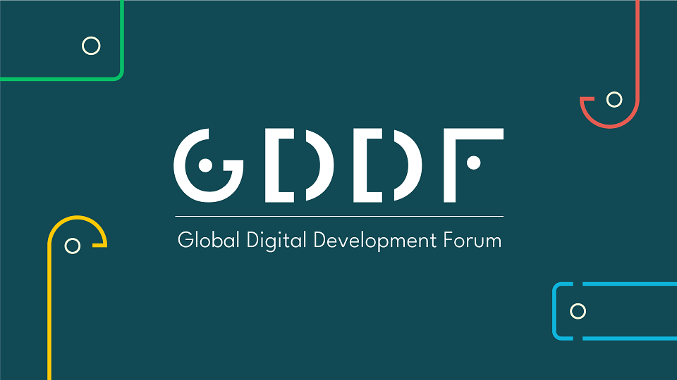
GDDF is a social good, hybrid worldwide event that convenes the digital development community to address challenges, discuss solutions, and foster partnerships in the realm of international development. We set out to reflect its digital focus and its commitment to inclusion, and accessibility; as well as remaining recognisable to past attendees and sponsors.
EXECUTION:
When redesigning the logo, I incorporated elements reflecting inclusion, accessibility, and the digital focus of the forum. This is depicted through the peeking faces forming the letters "G" and "F", the coding brackets "D" integrated into the logo lettering and that "F" doubles up as a mobile device.
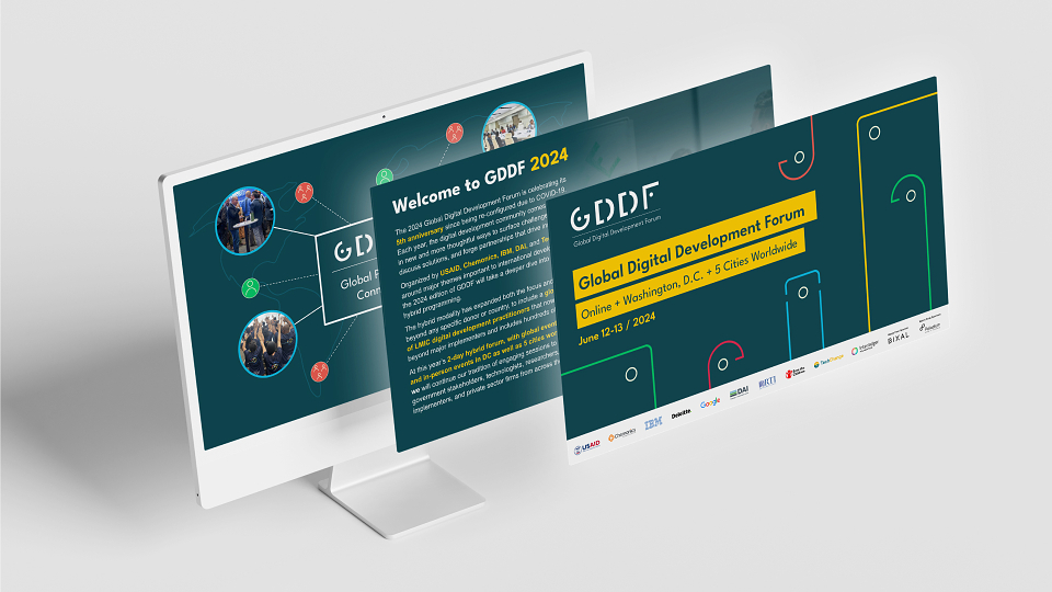
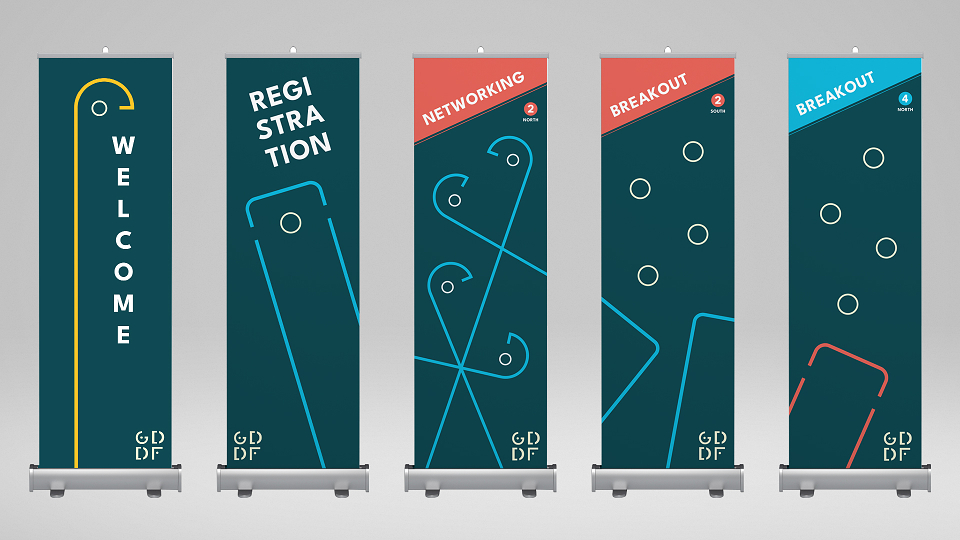
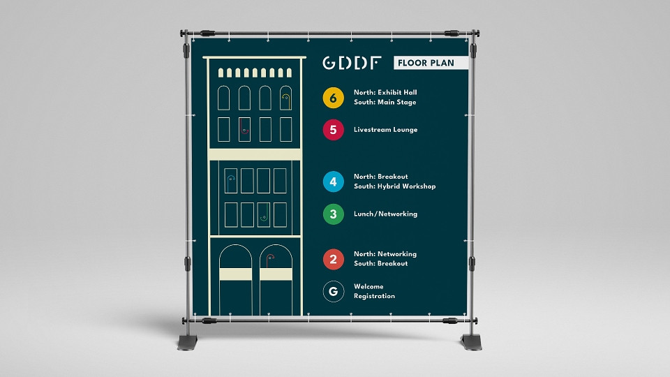
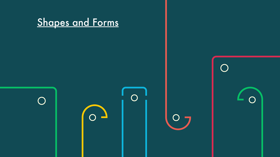
To expand on this concept, I crafted shapes, characters and iconography created using the logo forms. These are featured throughout brand materials even being incorporated into imagery.
Ensuring universal representation, the old brand colours were evolved to mirror those found in country and city flags, allowing us to represent many locations around the globe. The primary colours are close enough to the previous branding to aid continued recognition and trust.
RESULTS:
The rebranding is already maintaining and strengthening the core identity and objectives of the event; repetition of forms, shapes and imagery styling aids this. Im confident that the rebranding initiative will bolster awareness and participation for GDDF this coming June (2024). With stakeholders and participants engaged, my hope is they will become catalysts for a ripple effect within their spaces, carrying their learnings and sparking a real positive change in an exponential manner.