Beatrice
Branding & Packaging Designer
ABOUT
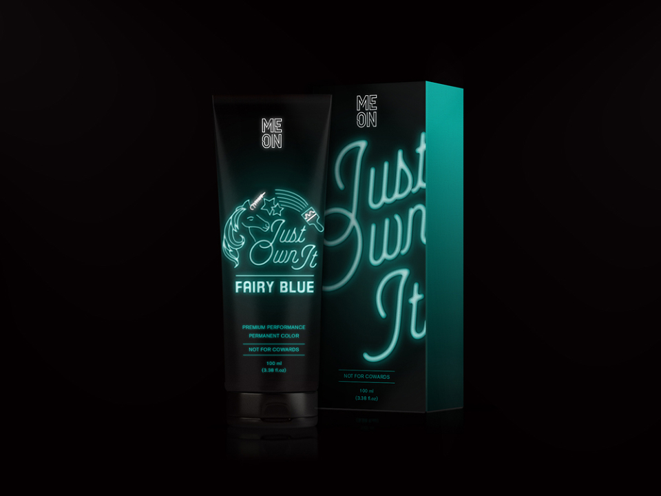
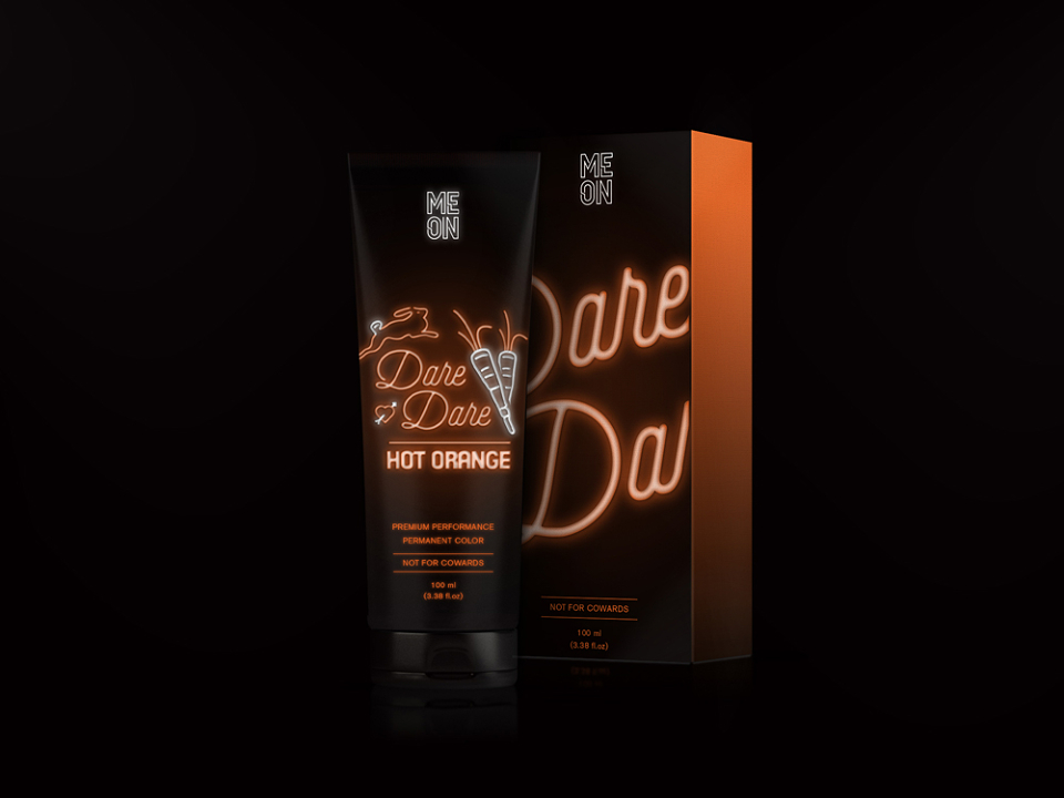
What is Meon? It’s a brand for neon colour hair dyes, not for cowards!
Nowadays the market is full of crazy hair dyes, from shocking pink to dreamy turquoise, but the packaging is lacking personality, definitely not reflecting the bold individual buying the product. This is the reason why we’ve decided to turn things around and create Meon, a packaging that would truly reflect the personality of the product inside!
The naming “Meon” it’s a combination of “neon” and “me”. It’s all about crafting your own identity through your image, so we’ve created a brand that would directly talked to consumers was an effective way of communication.
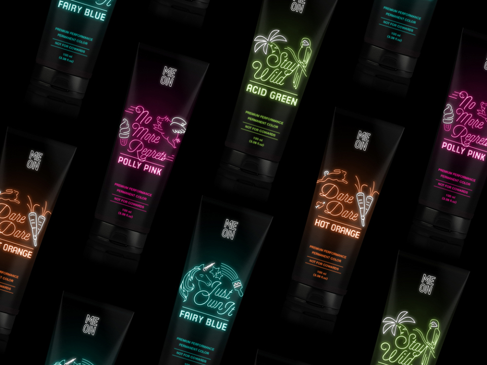
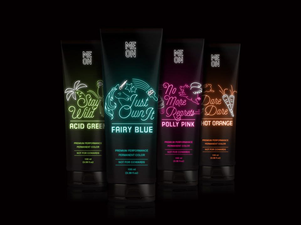
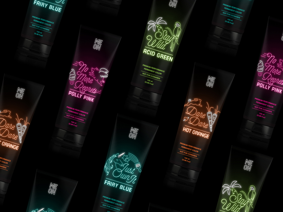
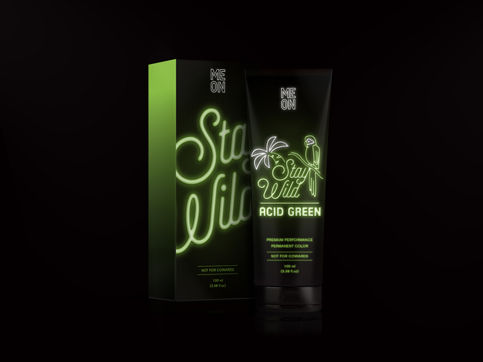
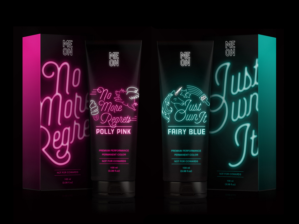
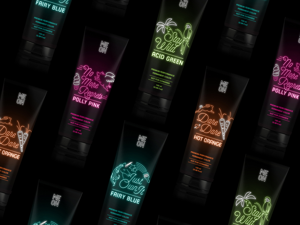
The Meon range comes in four neon colours; acid green, fairy blue, polly pink and hot orange. Each colour comes with an adjective that describes both the colour and the personality of the consumer buying it. The colour personalities are supported by a sentence on the packaging; for example the “Acid Green” colour comes along with the sentence “Stay Wild”. Last but not least the outer packaging warns that this product is “not for cowards” provoking the consumers buying it.
In collaboration with Anna Johansson.
MADEIT CREDITS
-

BeatriceGraphic/Packaging Designer