

Responsive websites have become one of the hottest trends in 2013. This is due in part to the growth of smartphones and other mobile devices.
More people are using smaller-screen devices to view websites on the go and, according to Mashable, tablet sales are expected to exceed 100 million this year.
A responsive website resizes itself to suit the type of device it is being viewed on. This can be anything from a desktop computer monitor or laptop to a 10” tablet or 4” smartphone screen.
The sites use fluid grids where all page elements are sized by proportion, rather than pixels. The website is built as one template but it has elements that respond differently when viewed on devices of varying sizes.
For instance, when viewing a ‘fixed’ website on a desktop computer, the page might show three columns. But when you view that same layout on a smaller tablet, it might force you to scroll horizontally – something users don’t like – elements might be hidden from view or look distorted. Also, text can be difficult to read on a small smartphone screen.
However, if a site uses responsive design, the tablet version would automatically adjust to display just two columns to ensure the content is readable and easy to navigate. On a smartphone, the content could appear as a single column.
Responsive website design shouldn’t be confused with a mobile site. This is a website that has been specifically designed for viewing on a smartphone or tablet and has a completely new design template to the original desktop version of the site. As the size of phone screens changes a new template will need to be designed for each. With a responsive website there is just one template used across all platforms, which allows more flexibility with the constant changes in technology.
Theoretically, the process of designing and building a responsive website should be less time-consuming because you only need one template. However, our designers often have to create visuals to show how the site should look on different electronic devices. With so many variations of smartphones, tablets and computers on the market, this could result in lots of design time and testing.
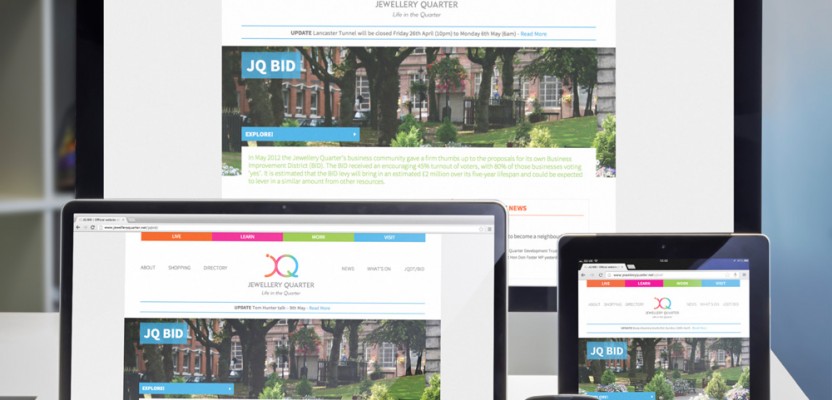
Many of the websites Barques has worked on recently have been responsive, including Dotted Eyes, English Tour, Hollywood Monster and the official Jewellery Quarter site.
Here’s what the jewelleryquarter.net website looks like across all platforms.