


Reflections from working with a community charity and re-thinking brand identity through lived experience!
Working with a community-focused charity team fundamentally changed how I understand graphic design. Going into the project, I assumed the challenge would be visual: colours, typography, logo systems, and consistency. Very quickly, I realised the real task was not how the brand should look, but who it should listen to.
Rather than starting with sketches or mood boards, the early stages of the project were rooted in conversations. Meetings with the charity team, researchers, and people directly affected by the issue revealed a clear message: a lot of work had already been done to understand the causes of the problem. What was needed now was action—and design had a role to play in that shift. This immediately reframed the purpose of the visual identity. It was not about rebranding for the sake of modernisation, but about creating a system that could support action, visibility, and dignity.
Moving away from “designing for”
Initially, it was tempting to approach the project in a traditional way—interpreting the brief, proposing solutions, and presenting outcomes. However, listening to the community charity team made it clear that designing for people can unintentionally distance them from the final outcome. Visual decisions made in isolation, no matter how well-intentioned, risk misrepresenting lived realities.
In many social-impact contexts, branding often falls into predictable patterns: muted tones, sombre imagery, and language that frames communities through struggle alone. Through discussions with the team, I became more aware of how these choices can reinforce power imbalances. People are reduced to case studies rather than recognised as individuals with agency, pride, and resilience.
This pushed me to question my own role as a designer. Instead of positioning myself as someone who “fixes” the identity, I began to see myself as someone who facilitates translation—turning lived experience into visual language without smoothing out its complexity.
Lived experience shaping the system
Planning the re-creation of the brand identity involved treating lived experience as design intelligence rather than background context. Insights from conversations—frustrations with how organisations are perceived, hopes for how communities want to be represented, and the language people actually use—started to inform the direction of the identity.
This influenced decisions at every level. The idea of a rigid, singular logo felt inappropriate for a community that is not static. Instead, I began exploring modular and flexible systems that could adapt across platforms and voices. Typography choices were considered not just for legibility, but for tone—aiming for something human, open, and non-authoritative. Colour palettes were thought about emotionally, not symbolically, asking how they made people feel rather than what they traditionally represented.
Rather than imposing a finished visual narrative, the goal became to design a framework that could hold multiple stories.

From feedback to co-creation
One of the most important shifts in this project was moving beyond feedback-led design towards co-creation. Instead of presenting near-final visuals for approval, the planning process focused on how community voices could shape the identity from the outset. Ideas such as workshops, questionnaires, and collaborative activities were explored as tools not just for validation, but for authorship.
This approach challenged my assumptions about control and polish. Community-informed contributions are often messy, emotional, and contradictory—but that is exactly what makes them honest. Learning to work with this complexity, rather than refining it away, felt like a crucial part of developing a more ethical design practice.
Rethinking what a brand identity is
Through this experience, I stopped seeing brand identity as a fixed set of assets and started seeing it as a living system. One that needs to grow with the community it represents, rather than speak over it. This perspective aligns with the realities of social change, where needs evolve and priorities shift.
For the charity, this meant planning an identity that could last beyond a single campaign—one that remains recognisable but flexible enough to adapt. For me as a designer, it meant understanding that strong branding is not about tight control, but about trust.

What this project taught me
Working with a community charity team reshaped my design values. It reinforced the idea that good design is not just visually effective, but socially responsible. Designing with communities requires patience, humility, and a willingness to let go of authorship—but it results in work that feels grounded, meaningful, and real.
Ultimately, this project made it clear that visual identity should not speak for communities. It should speak with them. When lived experience is allowed to shape design systems, branding becomes more than representation—it becomes participation. And that, to me, is where graphic design becomes truly powerful.
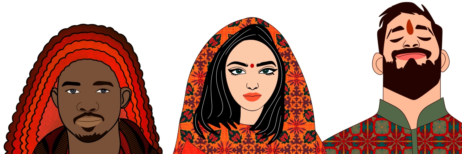
 Illustrated by Ayman Zahid