

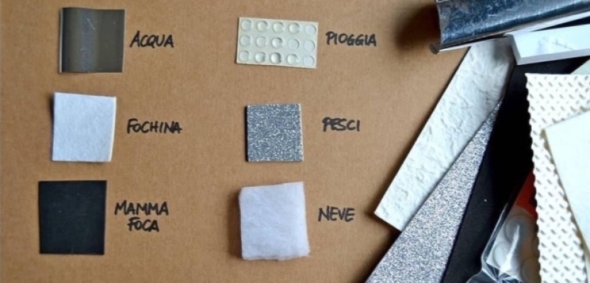

This project explores how sensory design can transform a children’s book into an interactive learning experience. Rather than relying solely on visual storytelling, the project integrates touch, interaction, and materiality to communicate safety messages through experience.

Aim & Objectives
Aim: To design a children’s book that uses multi-sensory interaction to improve understanding and retention of safety messages.
Objectives:
- Translate abstract safety concepts (e.g. heat, danger) into physical experiences
- Reduce fear by pairing sensitive moments with comforting textures
- Encourage active participation rather than passive reading
- Develop a coherent sensory system across the entire book

Research & Rationale
Primary and secondary research revealed that children aged 3–6 learn best through sensory engagement and play-based interaction.
Key findings from the sensory guide include:
- Cognitive: Touch improves memory encoding — children remember what they physically interact with
- Emotional: Soft textures can reduce anxiety when addressing sensitive topics
- Language: Sensory experiences introduce descriptive vocabulary (e.g. rough, smooth)
- Social: Shared interaction encourages dialogue between child and caregiver
This informed a design approach where each page becomes a learning interaction, not just a visual composition.

Design Development
1. From Illustration → Interaction
Initially, the project focused on traditional illustration. However, feedback and research highlighted a gap:
The visuals were strong, but the learning experience remained passive.
This led to a shift towards interactive storytelling, where design decisions were driven by how a child would physically engage with the page.
2. Page-by-Page Sensory Integration
Each spread was designed with a specific sensory purpose:
- Teddy Bear Scene → Soft fleece textures + raised dots → Supports counting and kinaesthetic learning
- Bath Safety Scene → Smooth vs rough textures → Encodes “safe vs dangerous” through touch
- Rainy Day Scene → Sandpaper + stamped boot textures → Connects illustration to real-world experience
- Accident Scene → Raised paint drip → Encourages children to trace the narrative moment
3. Key Innovation: Making the Invisible Visible
A key breakthrough was the use of thermochromic (heat-sensitive) materials:
- Changes colour when touched
- Simulates the concept of heat
- Translates an abstract danger into a visible, safe interaction
This approach ensures that children do not just hear about danger — they experience and remember it.

System Thinking: Whole-Book Design
Beyond individual pages, the book was designed as a cohesive sensory system:
- ???? Colour coding: Red = danger, Blue = safe
- ???? Sound modules: Water, ambulance, calming voice
- ???? Scent elements: Bath-related smells for memory recall
- ✂️ Tactile edges: Physical navigation through the story
- ???? Interactive flaps: Encouraging discovery and engagement
This ensures consistency and reinforces learning through repetition and association.

Ethical & Safety Considerations
Designing for young children required careful material choices:
- Non-toxic, washable materials
- Avoidance of small detachable elements
- Supervised interaction where necessary
- Sensory elements tested for durability and safety
This reflects a designing with care approach, balancing creativity with responsibility.

Outcomes & Impact
The final outcome demonstrates:
- Increased engagement through tactile interaction
- Improved memory retention of safety messages
- A more inclusive learning experience (supporting different learning styles)
- A shift from storytelling to experiential learning
The project moves beyond aesthetics, positioning design as a tool for behavioural understanding and early education.
Critical Reflection
This project significantly developed my approach as a designer.
Initially, I prioritised visual aesthetics. However, through research and feedback, I realised that:
Effective design is not just about what looks good, but what works for the user.
By adopting a sensory-led approach, I learned to:
- Design with empathy and user understanding
- Translate research into practical design decisions
- Think beyond visuals towards systems and experiences
If developed further, I would:
- Test the book with children in a real setting
- Explore durability in mass production
- Refine accessibility for children with additional needs

Conclusion
This book demonstrates how sensory design can transform communication for young audiences.
By combining illustration with tactile interaction, the project creates a learning experience that is:
- Memorable
- Engaging
- Emotionally supportive
Ultimately, this work reinforces a key principle:
Design is most powerful when it is not only seen — but felt.

Ayman Zahid April 20th, in the evening
Thankyou creative pool for featuring my article in your magazine. @creativepool