Ash Fielder
Creative Lead
ABOUT
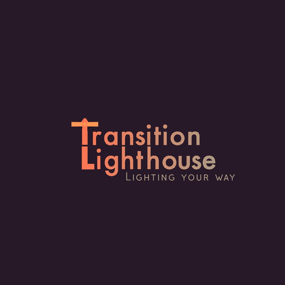
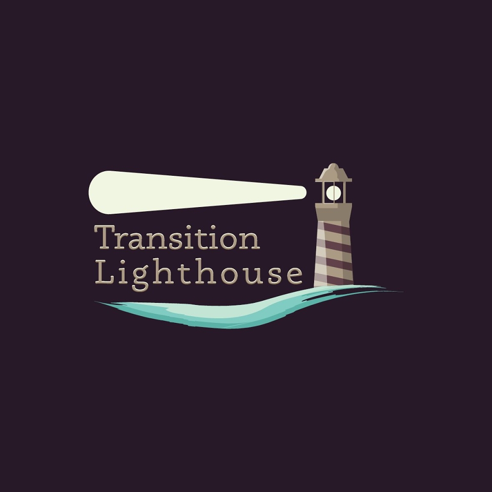
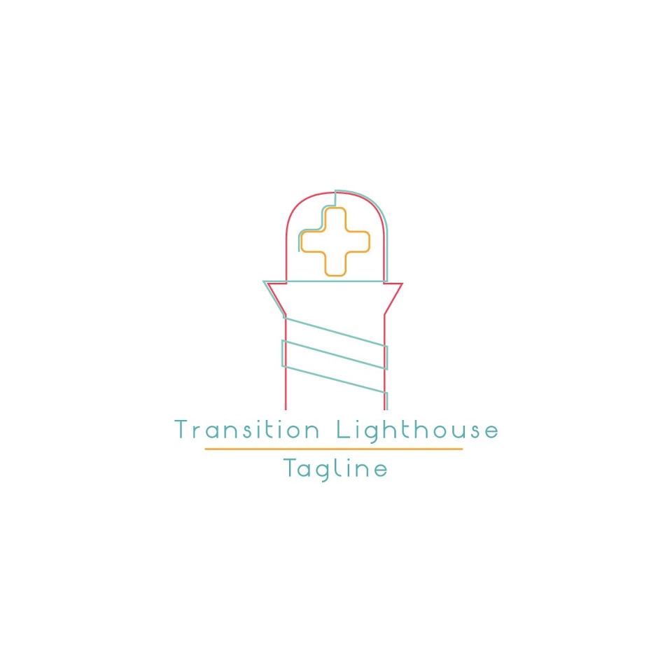
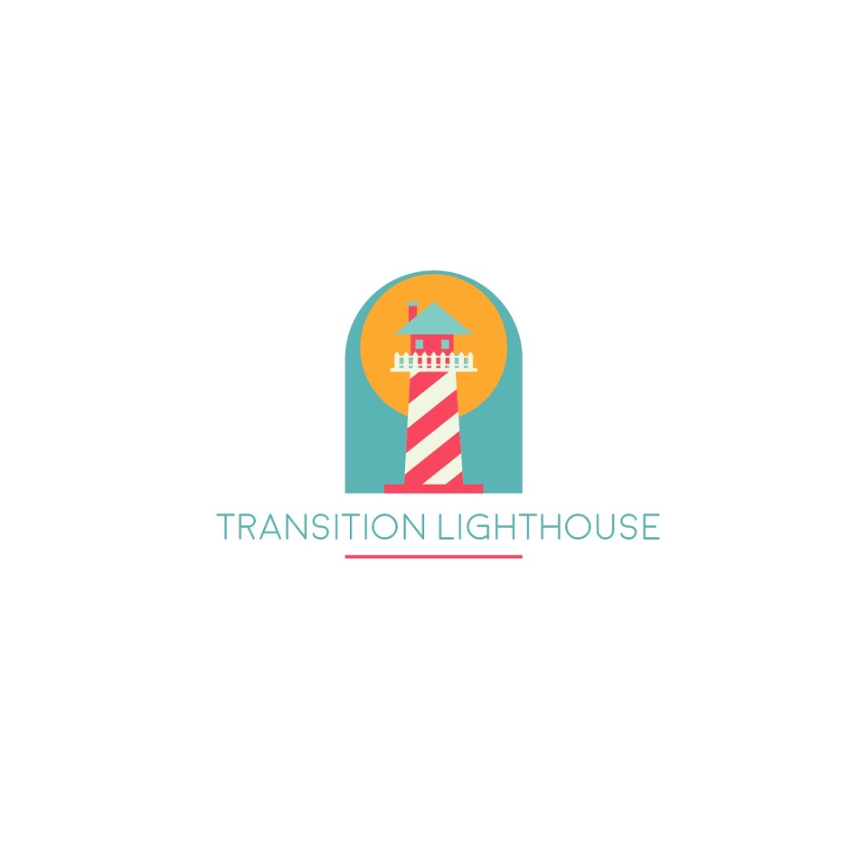
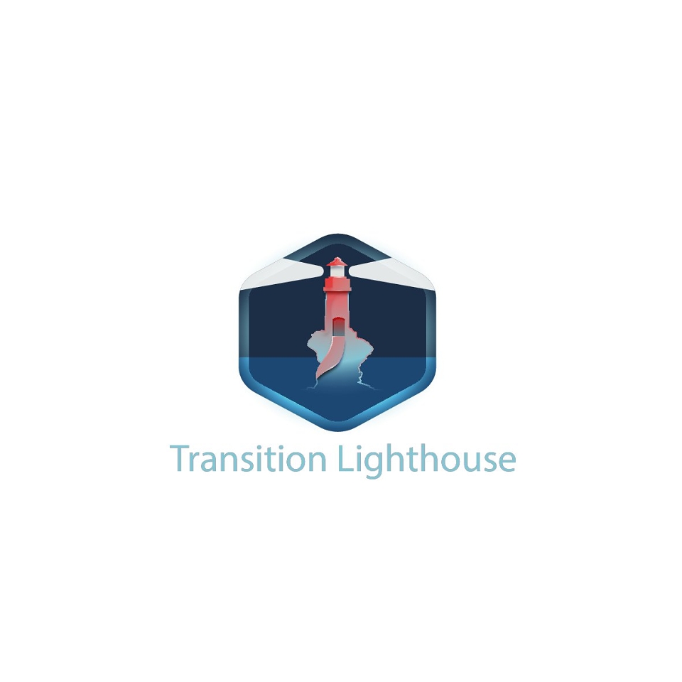
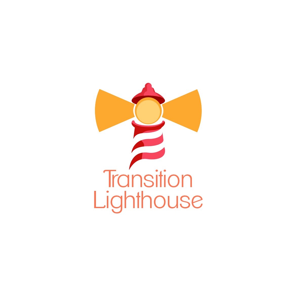
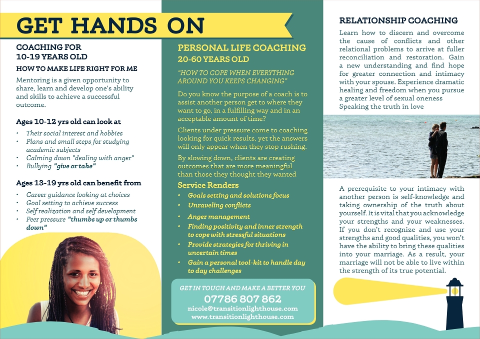
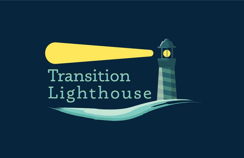
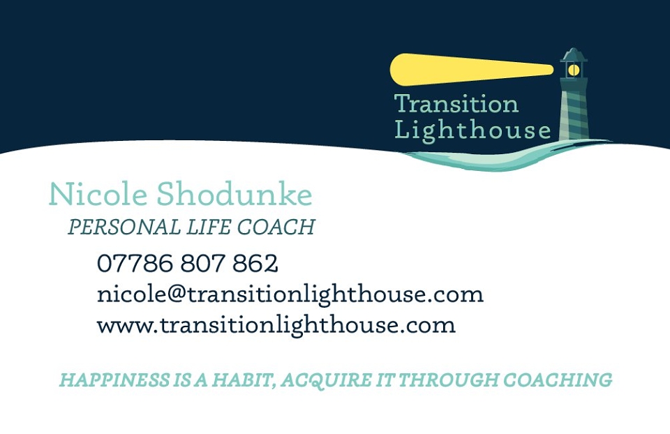
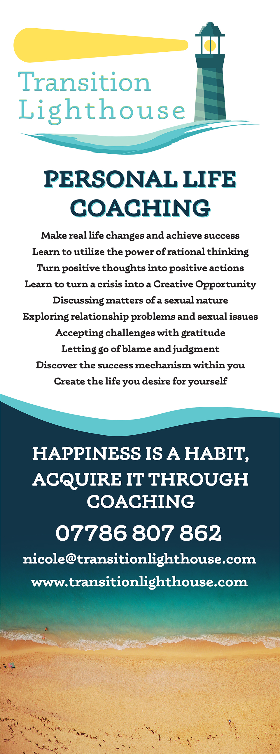
A Life coach start up company in Oxford apporchaed me for a complete branding and advertisement package. The Client was after an Identity that was approachable and soft. They desired to have the lighthouse icon hold up all of the brand imagery and have an end product that would match their approach to coaching.
Aside from the above brief, the client was very unaware/undecided on any particular style, which allowed me a lot of room to find something matching their vision in the initial draft stages and lay some solid foundations for the rest of the aesthetic.
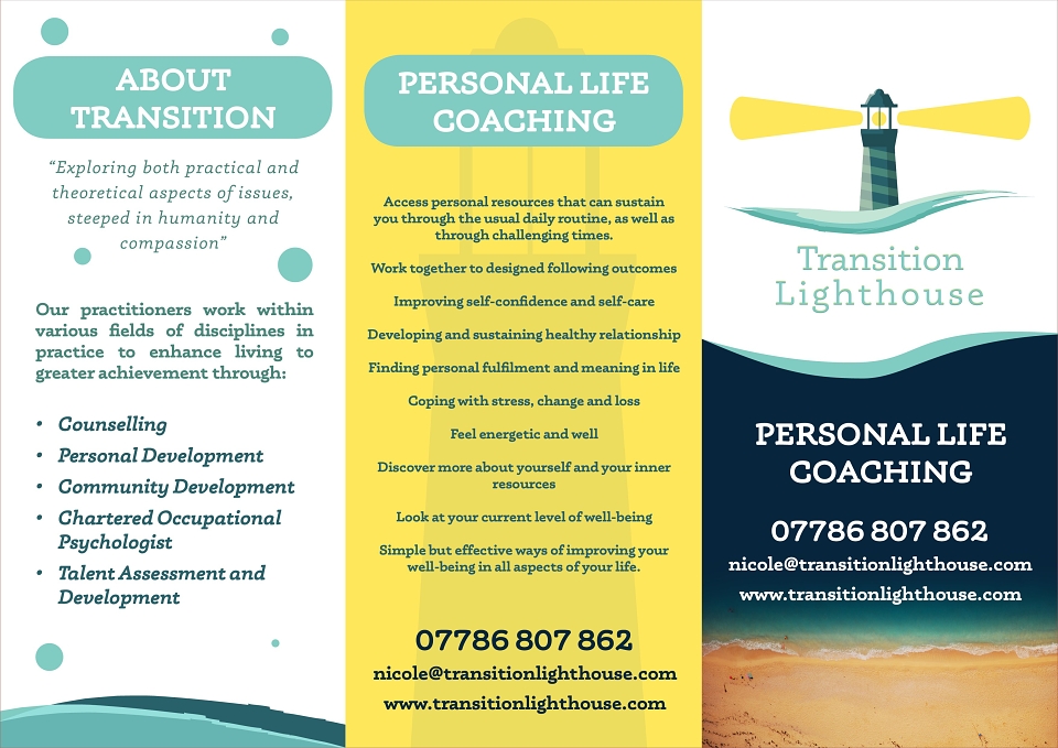
After my initial draft process, I had a small amount of tinkering to their selected logo design, some colour swaps and tweaking to the lighting effects, and I was then able to progress onto the actual branding. I went with a very flat design with a strong colour balance to feel bright, encouraging and safe. I selected Museo as a font for the project as I feel it has both a solidity and a curved safe feeling, which matched a supportive but strong coaching method. I used imagery of beaches as well from afar, to encourage tranquillity and also a sense of a goal, as if you are aiming to be at that tranquillity. The package components consisted of logo design, business card, a trifold brochure and a roller banner for events.
I