Ash Clark
Marketing & New Business
ABOUT
Opportunity
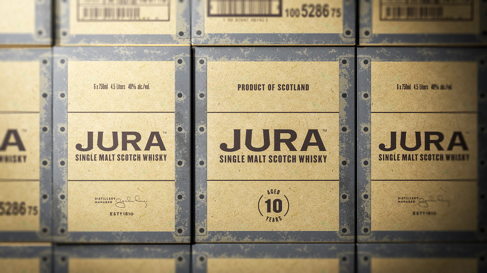
Founded on the Isle of Jura in 1810, Jura’s distillery has seen its fair share of visitors in its time. One place their whisky hadn’t yet ventured to though, was the USA. With a burgeoning market for Single Malt Scotch Whisky developing across the Atlantic, now was the time to make that journey. To rise to the challenge, we were tasked with making their 10 Year Old Single Malt fit-for-purpose: the truest, boldest, and proudest expression of Jura yet.
Creative idea
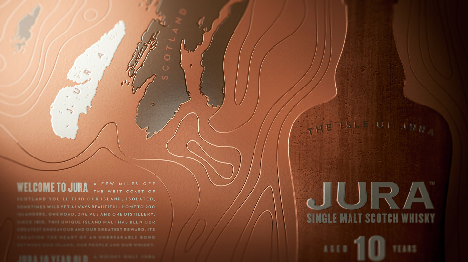
Cut-off from mainland Scotland, notoriously wild and home to only 200 people, the prosperity and strength of Jura is defined by a virtuous circle, the reciprocity of island, whisky and community. Without each other, none could thrive. This insight drove our creative idea as we set about crafting a whisky truly Made by Jura, a labour-of-love shaped by the nature of a place and its people.
Creative expression
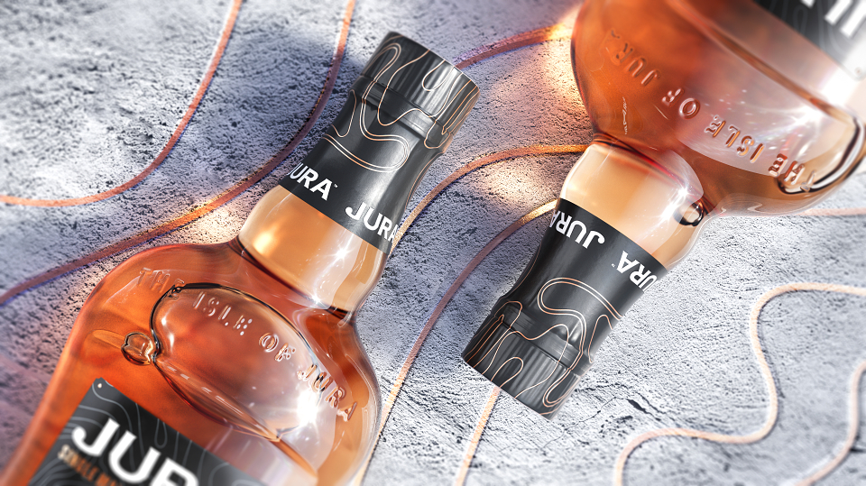
The unique shape of Jura’s bottle – purpose-built to resist rough seas – is the brand’s greatest asset, but its stature needed work. By elevating its height and broadening its shoulders we had a future-facing icon on our hands and this injection of confidence and craft carried through to the pack itself. Centre-stage is the bottle silhouette, reborn and yet familiar. Emanating from its silhouette are debossed contours, a visual language inspired by the island’s landscape that draw the holder in with their tactility. Crafted details and colour-ways drawn from the distillery itself provided a final seal of true Diurach authenticity.
MADEIT CREDITS
-

Whyte & MackayClient
-

Jones Knowles Ritchie -

Ash ClarkMarketing & New Business -

Amy MawMarketing Manager -

Christopher SharpeCopywriter -

Sean ThomasCreative Director -

Luke ThompsonGraphic Designer -

Brett StablerDesign Director