ABOUT
The redesigned template: The brief was very simple - retain the existing structure o the magazine but make it more elegant and easier to navigate with a bolder news stand presence.
I know the size is unwieldy but I couldn’t think of a better way of giving an overview of Forbes Indian edition and its departure from Forbes US in its structure, attitude and approach to stories
This project necessitated a lot of changes in storytelling. We tried to make business stories easier to read and avoid the jargon that one associated with it. We retained the masthead and text fonts from the parent US edition.
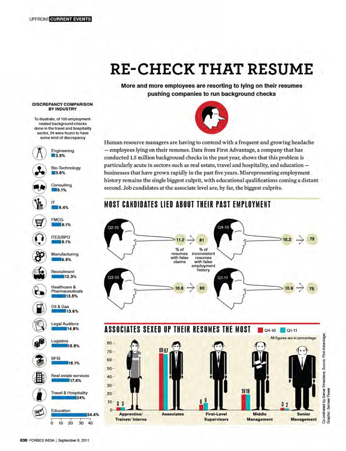
First we isolated the masthead for a stronger presence at the news stand. We changed the fonts and introduced a very flexible grid and played up the negative space. Not only did it make the pages look more inviting it also made for easier reading. The FOB and the BOB have the same look and use a different font family and grid. They are shorter, snappier and act as bookends. We also introduced an info-graphic page. The features section is now more playful with very flexible grids which can run between 1 to 5 columns depending on the content.
We consciously tried a mix of typographic, photographic and illustrative openers for variety and stronger impact. Design, desk and photo had to work closer and stories discussed in detail to generate ideas. There was resistance to freezing headlines and visuals because the tendency is to wait till the last minute before finalizing the headlines.


