Anvitha Prakki
Graphic Designer
ABOUT
I have included 3 unique projects from my portfolio:
Ecovarium – Sustainable Brand Identity
Concept
Ecovarium is a conceptual sustainable brand focused on promoting environmentally conscious aquarium keeping through a balance of nature and modern design. The idea was to create a brand that feels educational yet approachable, encouraging users to engage with sustainability in a simple, everyday way. The identity draws from ecosystems and circular systems, reflecting renewal, balance, and long-term impact.
Execution
I developed a visual identity system using organic forms, clean typography, and a nature-inspired colour palette to communicate clarity and trust. The logo and supporting graphics were designed to reflect interconnected ecosystems, while layouts prioritised readability and structure. Deliverables included brand guidelines, packaging concepts, and marketing collateral, ensuring consistency across digital and print applications.
Results
The outcome is a cohesive and scalable brand system that communicates sustainability without feeling overly technical or niche. The project demonstrates my ability to translate complex environmental ideas into accessible visual communication while maintaining strong brand consistency across multiple touchpoints.
E-Sense – EDM Festival Branding
Concept
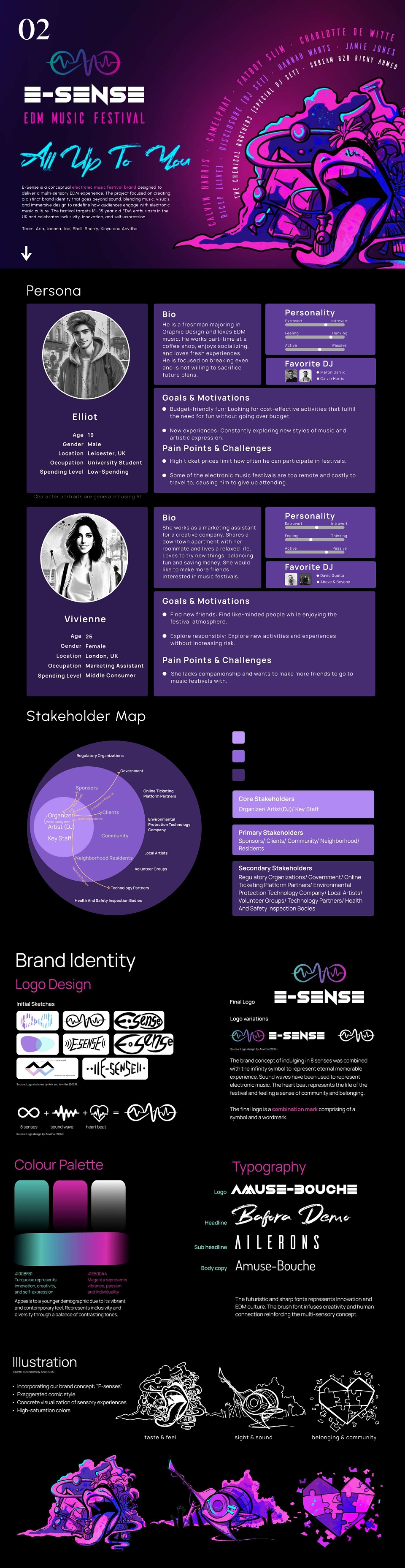
E-Sense is a conceptual electronic music festival brand designed around the idea of a multi-sensory experience. The project aimed to break away from the oversaturated EDM visual style by creating a brand that feels both futuristic and human, appealing to a diverse audience of 18–35 year old music enthusiasts.
Execution
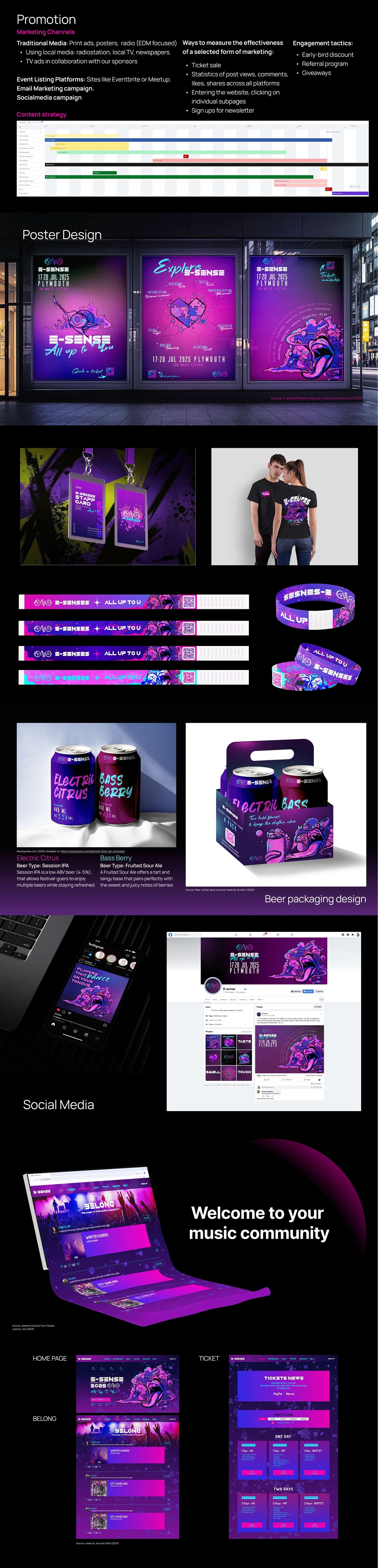
As a Brand Designer and Illustrator, I contributed to building a distinctive identity system rooted in the concept of “eight senses.” I designed a hybrid logo combining sound waves, a heartbeat, and an infinity symbol to represent continuity and experience. A bold colour palette of turquoise and magenta was developed alongside a mix of futuristic and expressive typography. I created posters, merchandise, and packaging concepts, ensuring visual consistency across all applications.
Results
The final outcome is a visually striking and cohesive brand that stands out in a competitive festival market. The project successfully demonstrates how strategic branding and storytelling can elevate an event into an immersive experience, showcasing my ability to develop concept-led design systems across multiple formats.
Kuchipudi – Editorial Book Design
Concept
This project focused on designing a contemporary editorial book around Kuchipudi, a classical Indian dance form. The aim was to preserve cultural authenticity while presenting the content in a modern, engaging format that appeals to younger audiences and global readers.
Execution
I designed a structured editorial layout that balances imagery, text, and white space to enhance readability and storytelling. The typography system was carefully selected to reflect elegance and rhythm, inspired by the movement and expression of the dance form. Visual elements such as grids, image placement, and pacing were used to guide the reader through the narrative. The book was prepared as a print-ready publication, ensuring technical accuracy and consistency.
Results
The result is a refined editorial piece that bridges tradition and contemporary design. The project highlights my ability to work with content-heavy layouts, apply strong typographic hierarchy, and create engaging long-form design while maintaining cultural sensitivity and visual clarity.
MADEIT CREDITS
-

Anvitha PrakkiGraphic Designer