Anton Moglia
Typedesigner & consultant
ABOUT
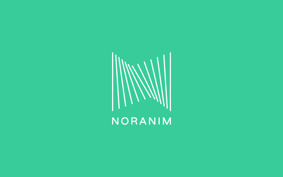
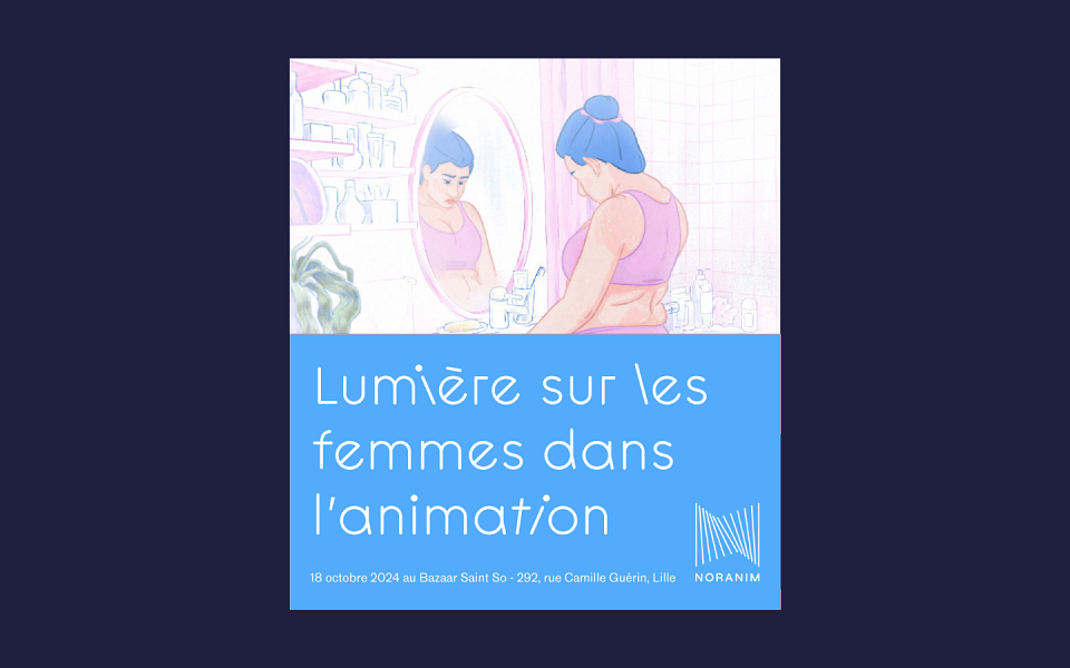
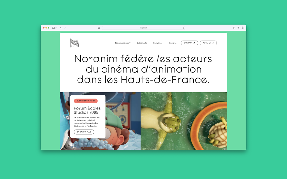
Noranim federates animation cinema actors across the Hauts-de-France region, providing tailored support to studios, schools, producers, students, technicians, and authors. This networking organization needed a visual identity that would capture both the collective energy and the essence of animation.
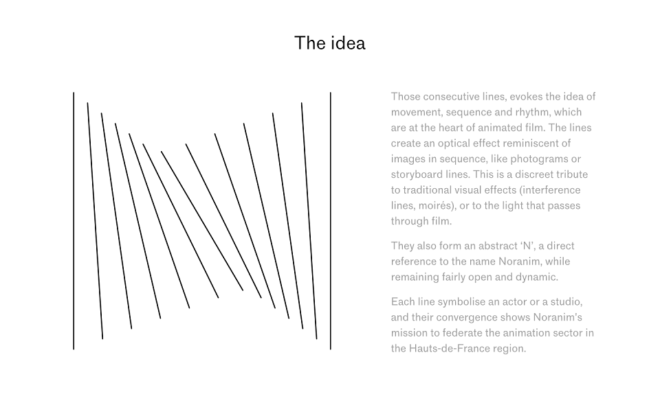
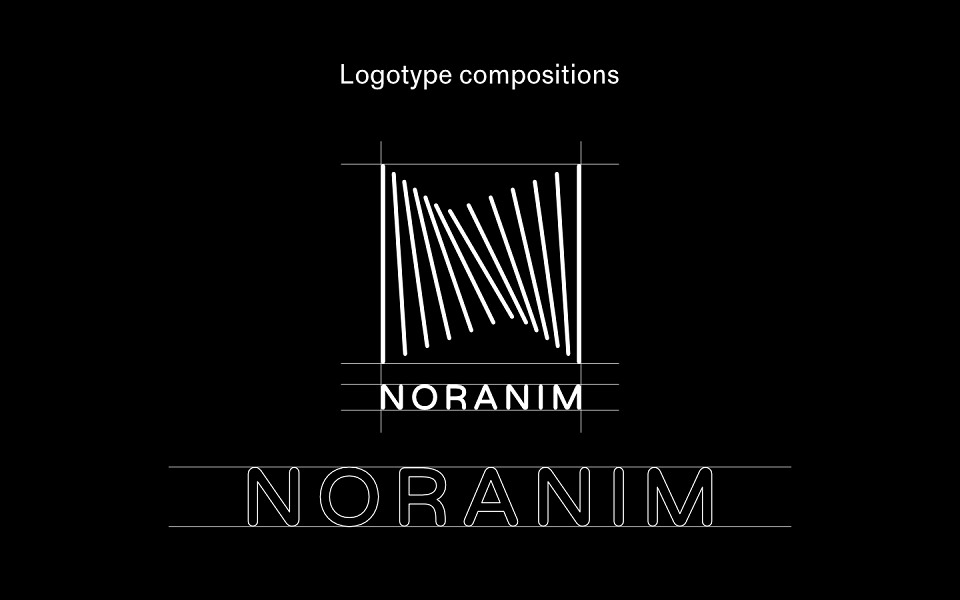
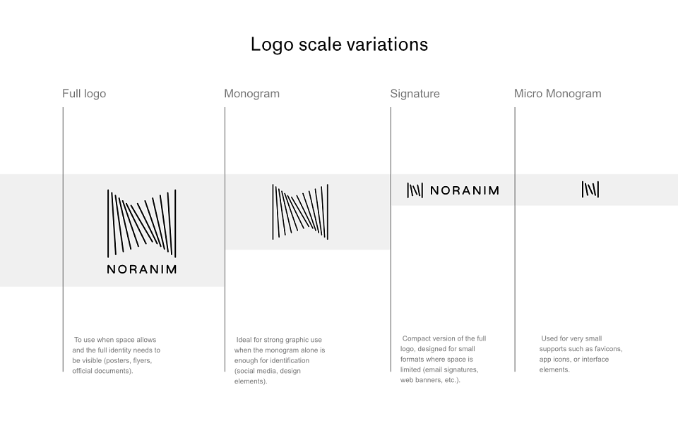
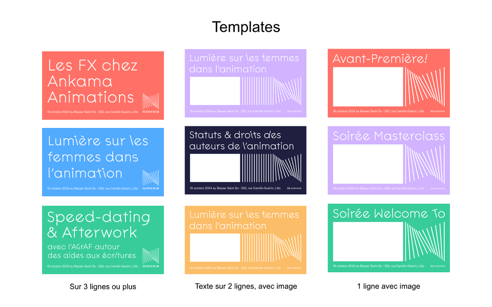
I created the logo system based on consecutive lines that create a powerful visual metaphor for animation – evoking sequential frames, storyboard panels, and the fundamental rhythm of moving images. These lines form an abstract "N" while generating optical effects that reference traditional animation techniques and film interference patterns.
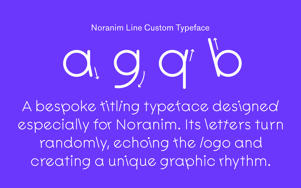
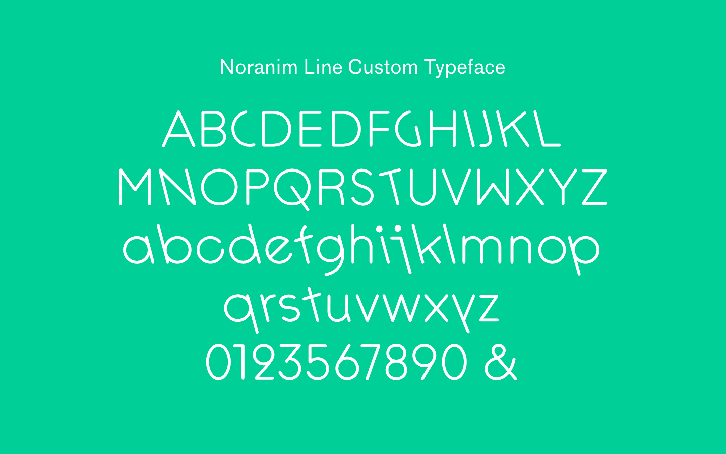
The custom titling typeface extends this concept through randomly rotating letters that echo the logo's dynamic rhythm, creating a unique graphic language that feels both technical and playful – perfectly suited to the animation industry.
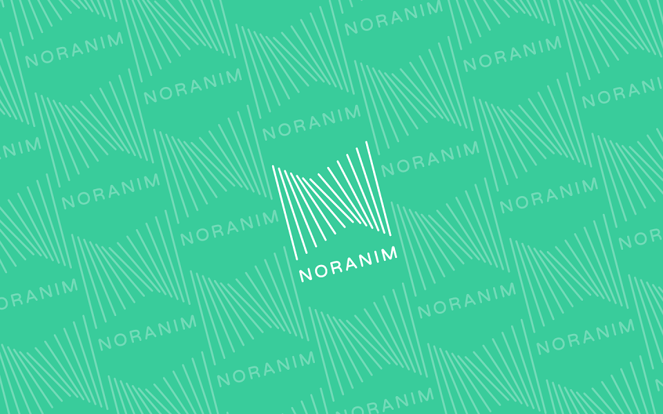
The result is an identity that celebrates both the craft of animation and the power of creative collaboration, positioning Noranim as the essential networking hub for the region's animation community.