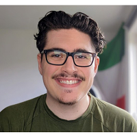
Antonio Bertagna
Freelance Digital Designer
ABOUT
I noticed a problem with the original website. As much as the website looks stylish and sleek. The photos of the cars were too close together. Mixed with the photos being the full width of the screen, each image melted into each other and could cause the eyes to the strain. I wanted the side menu, the original menu was to hard to find after scrolling down on the page. I wanted to make it easier to access and see. I also introduced the side menu. I styled it after the new logo Nissan brought out. Having the side menu merge into the background allows the users eyes to be directed towards the car photos but due to the shadowing you can still see the menu, and access it easily. Having the images on the right hand side of the screen and spaced apart makes it easier on the eyes and more appealing to look at.The problem: No white space between the images. Solution:
Sorry for the quality of the images and video.
MADEIT CREDITS
-

Antonio BertagnaFreelance Digital Designer
