Antonio Amado
Graphic Designer
ABOUT
Excited to unveil my latest packaging design for ErgoNutrition!
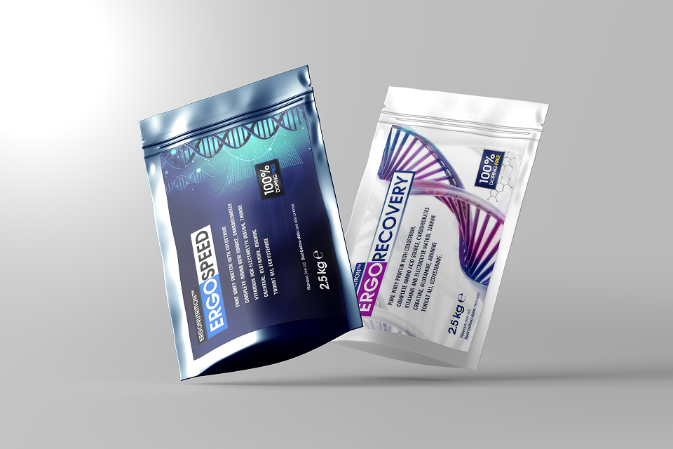
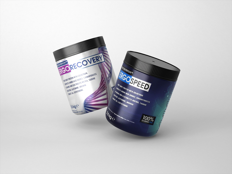
Introducing ERGOSPEED and ERGORECOVERY – our premium protein powders designed for athletes and fitness enthusiasts.
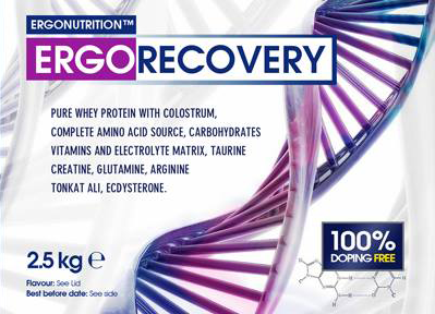
Colour Choices: We went with blue and white for a reason. Blue symbolizes trust and reliability, while white stands for purity and simplicity. Together, they create a clean, professional look that stands out on the shelves.
DNA Double Helix Graphic: This isn’t just a cool design element. It represents the scientific research and innovation that goes into every product. We wanted to visually communicate that our protein powders are backed by serious science.
Ergonomic Packaging: The shape and size of the packets were carefully designed to be user-friendly. The packaging is easy to handle and store, whether at the gym or on the go.
Minimalist Design: We aimed for a sleek, minimalist look to keep the focus on what’s important – the high-quality protein inside. Less clutter means a more premium feel.
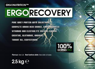
Feedback Loop: We involved our community in the design process. From initial sketches to final tweaks, we gathered feedback from athletes and fitness enthusiasts to ensure the design met their needs and preferences.
We hope you love the new design as much as we do!
hashtag#ErgoNutrition hashtag#DesignSecrets hashtag#ProteinPower hashtag#FitnessGoals hashtag#Innovation