Anne Bonson-Johnson
Graphic Designer and illustrator
ABOUT
Contemporary, modern, forward-looking, digital
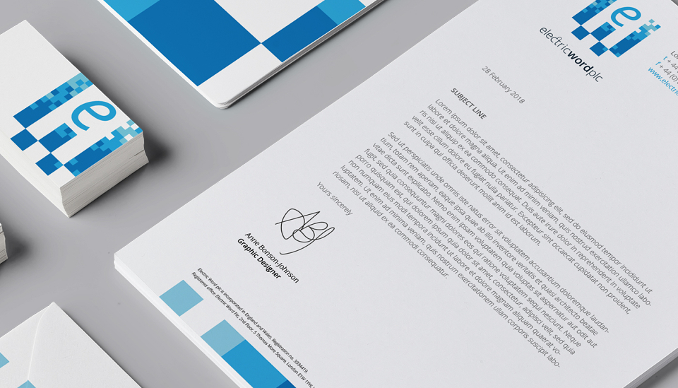
Like many publishing houses in recent times, Electric Word (EW) began moving its print offering over to digital and wanted new branding to reflect this. It was however, important to EW to retain certain elements of the existing identity and 20-year heritage.
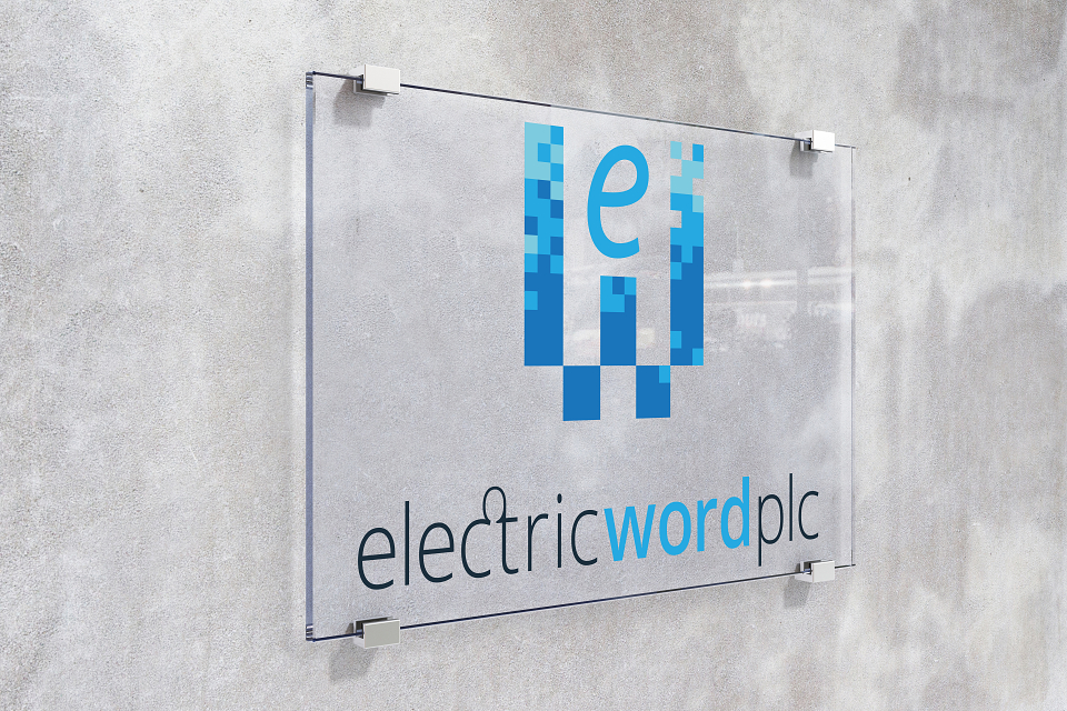
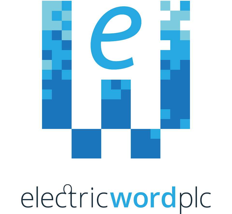
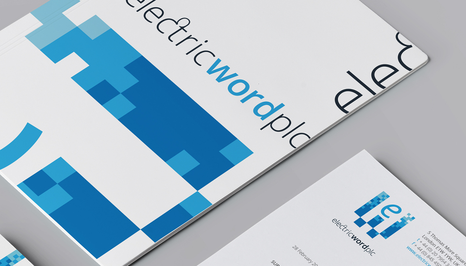
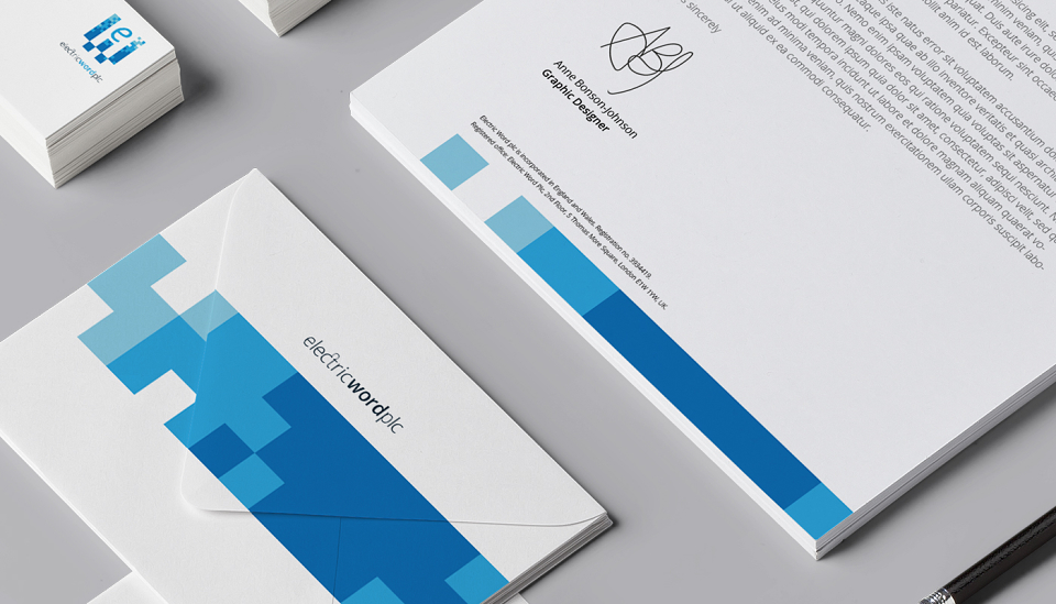
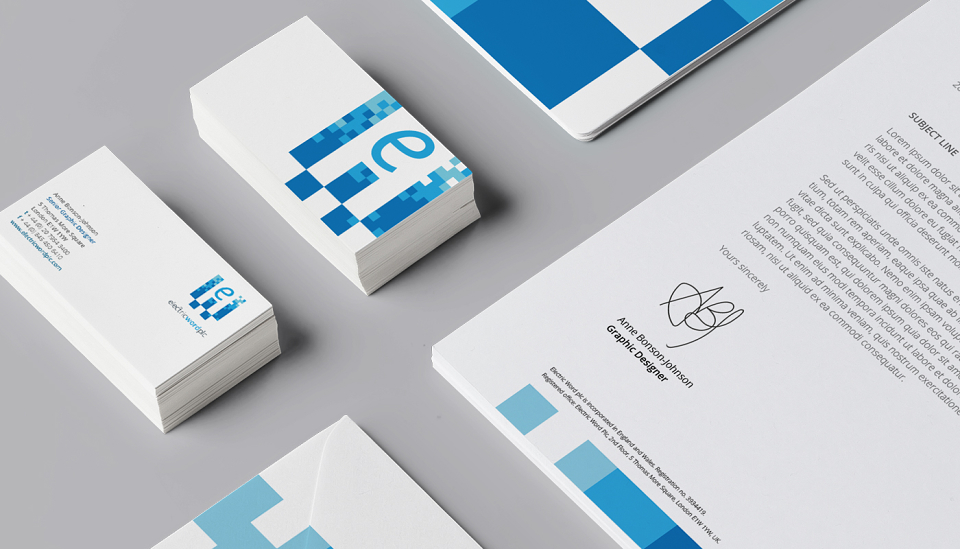
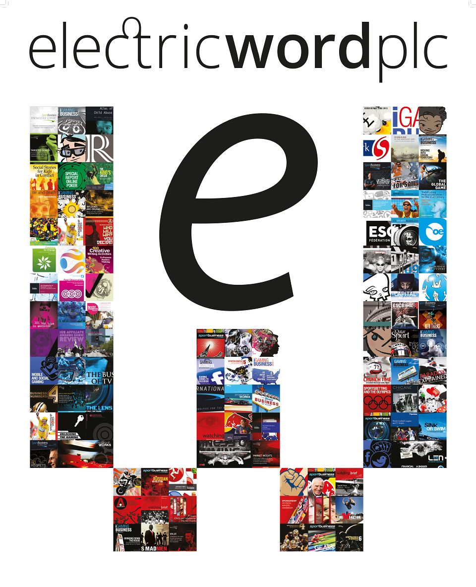
I therefore, kept the blocky 'W' of the existing logo and modernised it by pixilating the bold verticals with a palette of three vibrant blues, thus reflecting EW's digital persona. The blocks of the 'W' are versatile and lend themselves to bold flat contemporary graphics for web and print, and sculptural elements for events and signage. I paired the graphic blocks with a clean and crisp custom sans serif typeface, adding visual interest with a ligature on the 'c' and 't' of 'Electric', to give a nod to the heritage of print typesetting and to connote the union of print with digital.
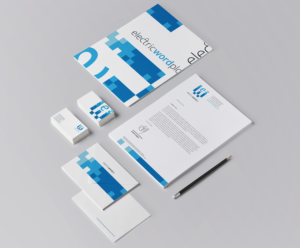
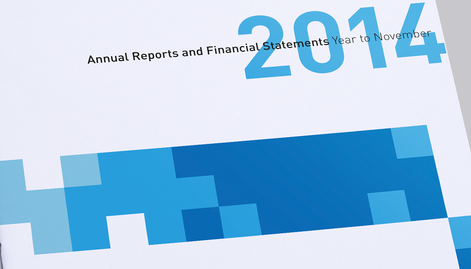
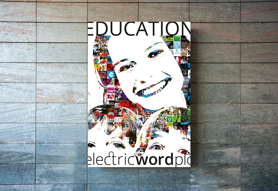
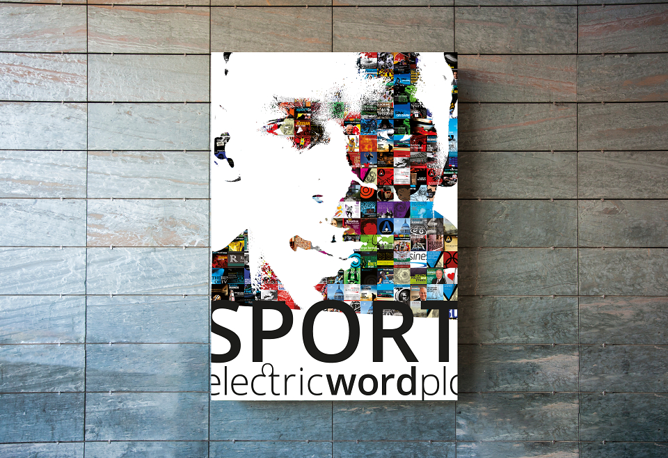
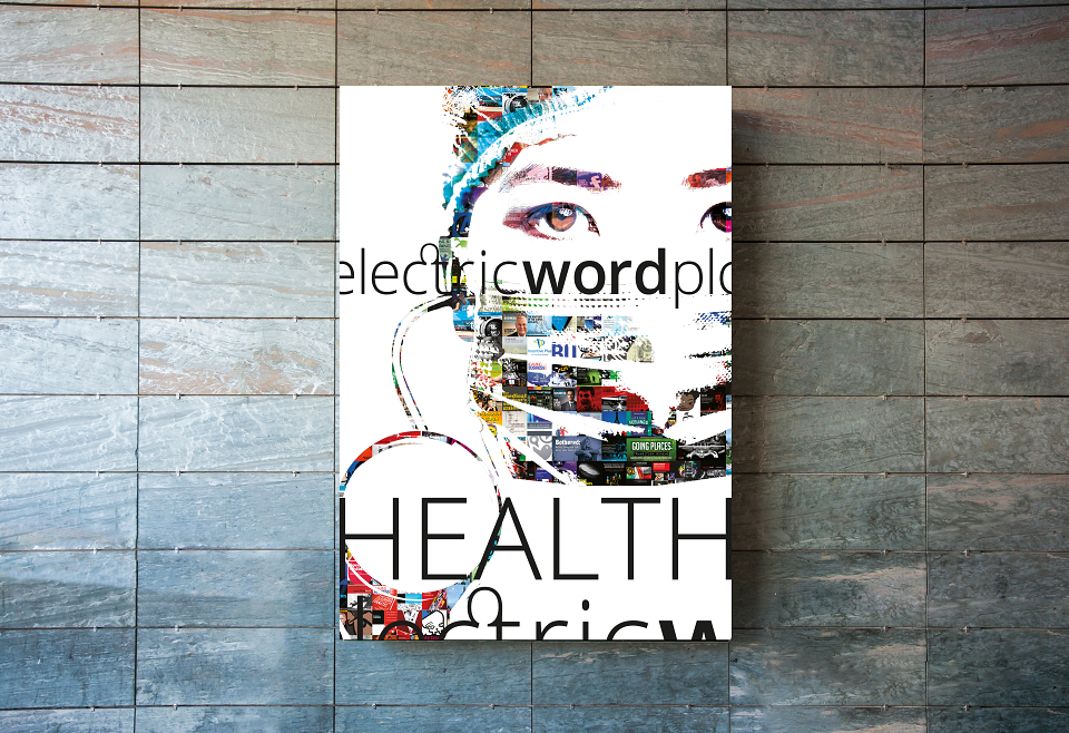
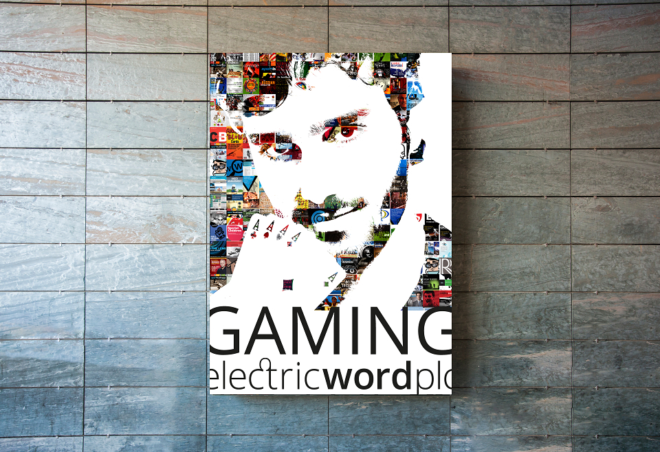
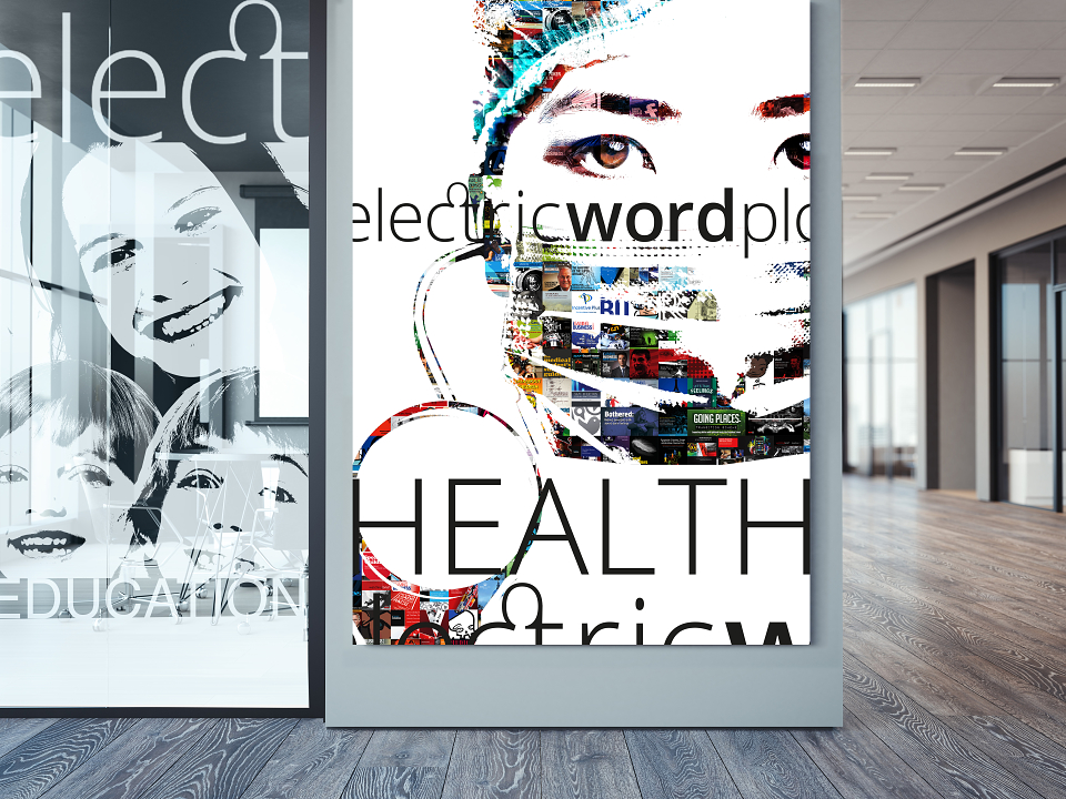
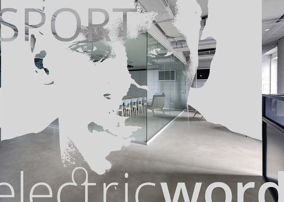
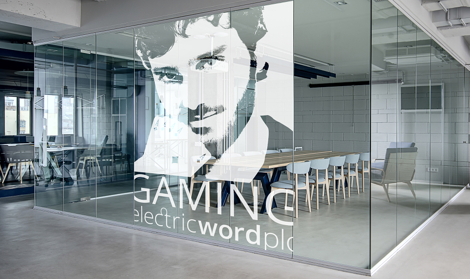
The versatile pixel grid has been used to create artwork featuring EW's four businesses (education, health, sport and igaming). For example, as a framework for cover designs from EW publications over the years, which were then used for various office installations, glass wraps and in corporate branding collateral.
MADEIT CREDITS
-

Electric Word plcClient
-

Anne Bonson-JohnsonGraphic designer -

Electric Word Plc