Anna Margaryan
Art Director
ABOUT
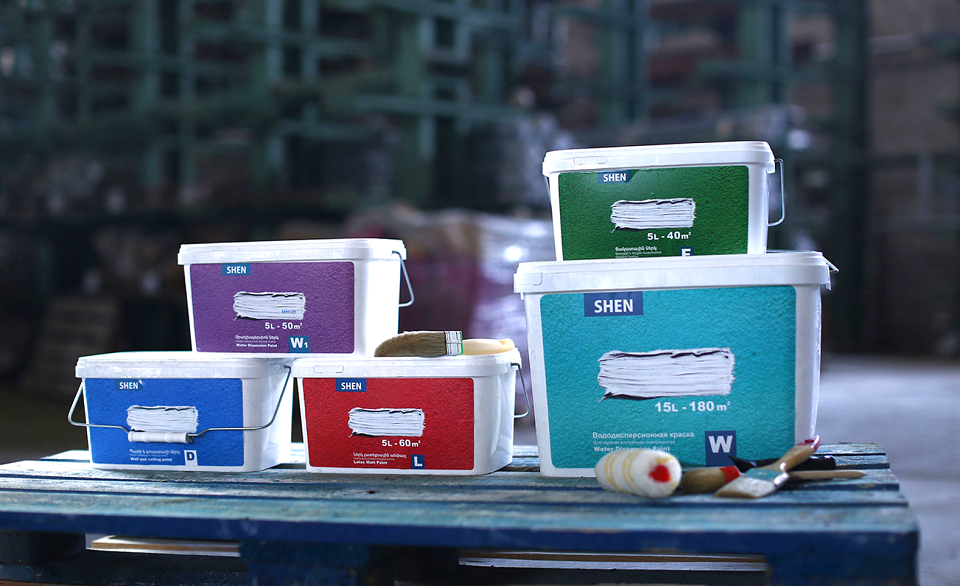
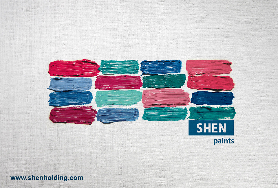
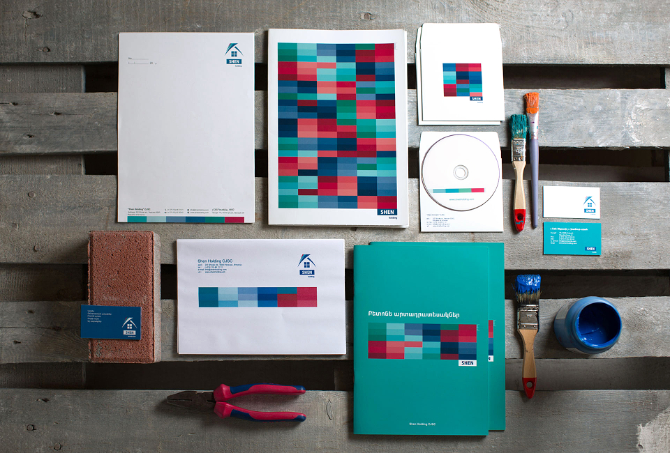
The concept here lies on the word itself which means “a pillar” or “the foundation” during the construction.
After the logo restyling brick was added in logo and used in different colors in identity as a symbol of different directions. Additionally, in various printing materials and handouts the brick size was printed exactly 1 cm, so that the architects, or the interior designers could use it as a ruler in different situations.