Anita Macdonald
Client Director
ABOUT
BRIEF
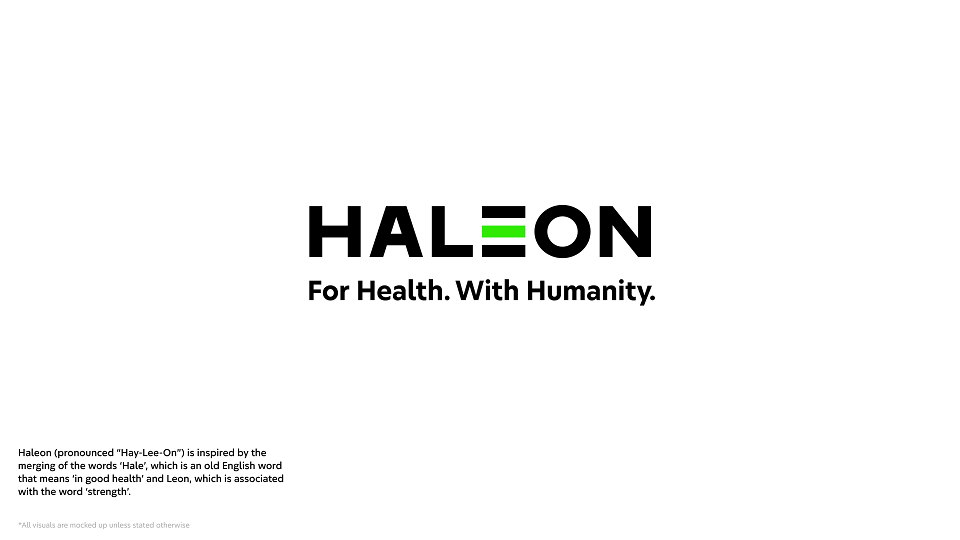
When GSK split into two stand-alone businesses, our challenge was to create a new visual identity for the new consumer health division. With a presence in 70+ countries and category-leading brands like Centrum and Panadol, the division's launch offered an opportunity to make a difference to the way billions of people engage with their everyday health.
DESIGN SOLUTION
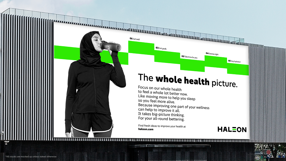
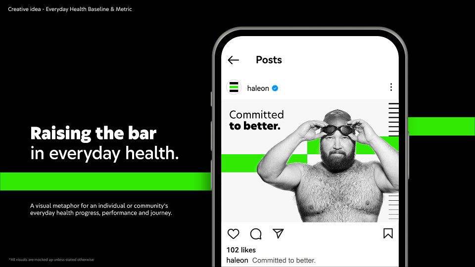
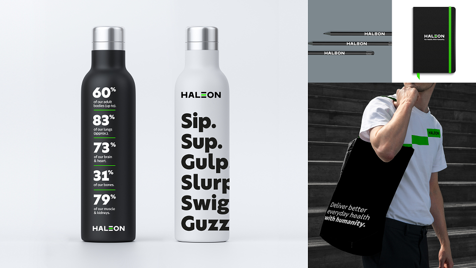
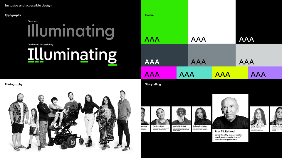
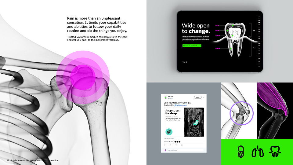
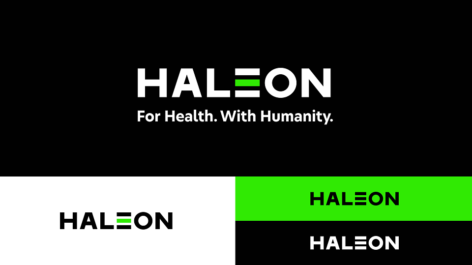
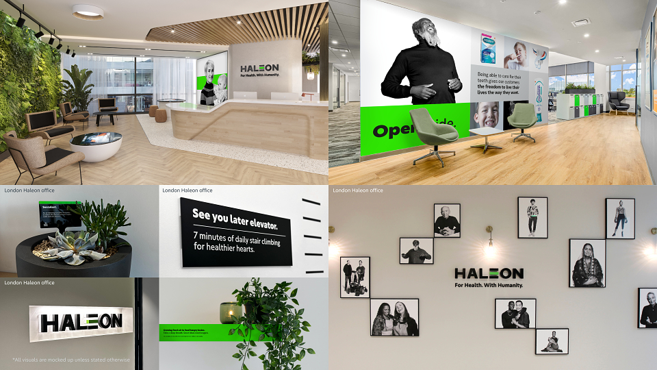
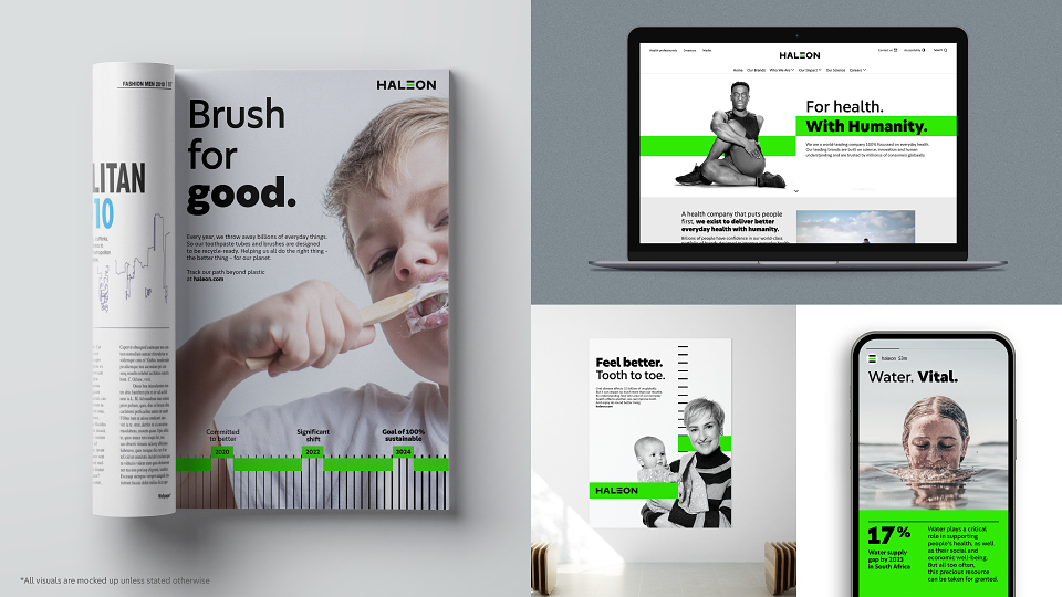
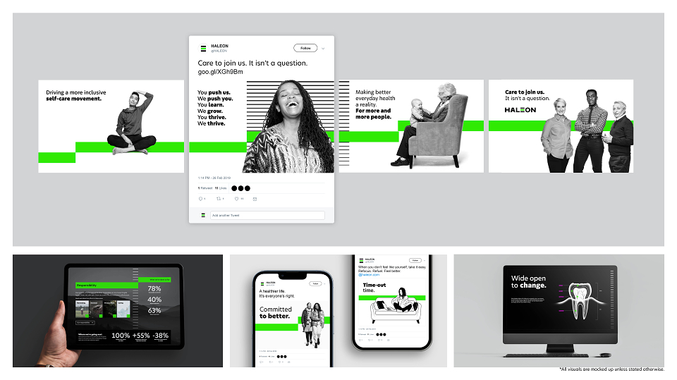
Haleon's stripped-back design and motivating voice speaks to everyone, raising the bar for everyday health. The company's core purpose is to deliver better health with humanity through inclusive and sustainable storytelling. The Baseline sets a standard for progress on individual health journeys, guiding and galvanizing individuals with empathy and respect for their challenges.
RESULTS
Haleon became a standalone business and brand in July 2022. The demerger was the UK’s largest stock market listing in a decade.
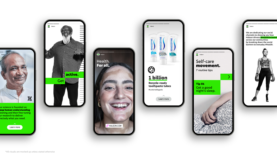
Since launch, it has been evident through social media and personal affirmations that the new identity is highly appreciated by the employees of Haleon. From photographs next to new signage to even dyeing hair green, the team worldwide have embraced the new visual world with gusto.
Nearly a year in and the brand identity is fully incorporated across the business.
All agencies are harnessing the distinctive assets and delivering campaigns and content from financial reports to recruitment campaigns.
CULTURAL CONTEXT
Healthcare can be a crowded, confusing space. From Apple to Google, brands are vying for our attention at a time when healthcare systems are under significant pressure – presenting difficult decisions in many parts of the world. What was clear to us was to increase the level of humanity in this fundamentally human-centric sector. And the urgent need to act.
MADEIT CREDITS
-

david pughClient
-

Macaila VorsterDesign Director -

Interbrand London -
Anita MacdonaldClient Director