Angelos Botsis
Designer & Visual Artist
ABOUT
ambience™
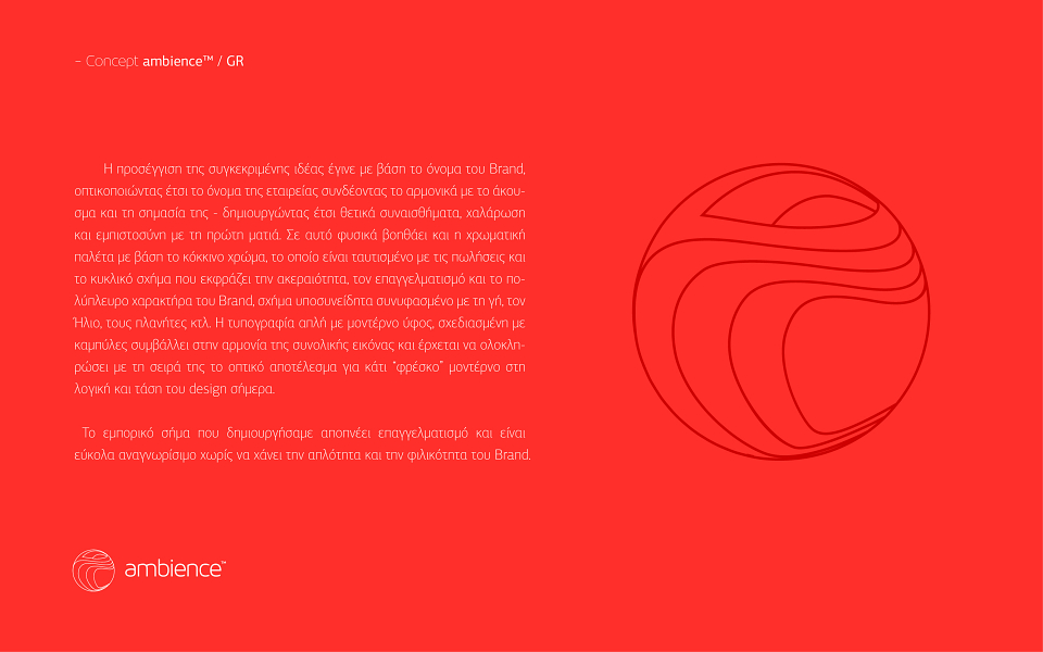
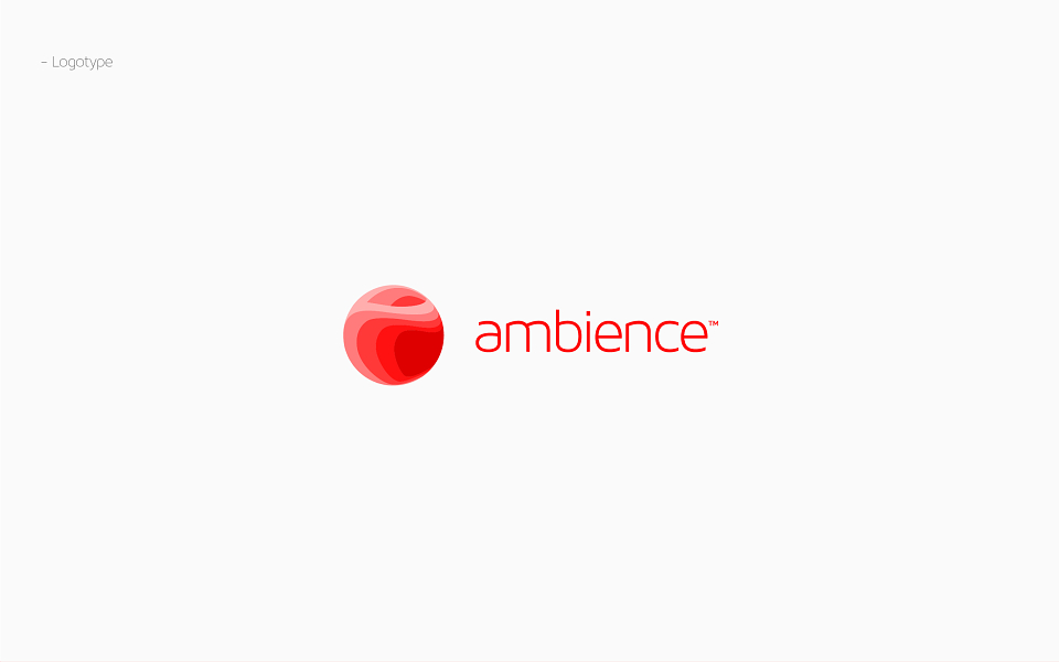
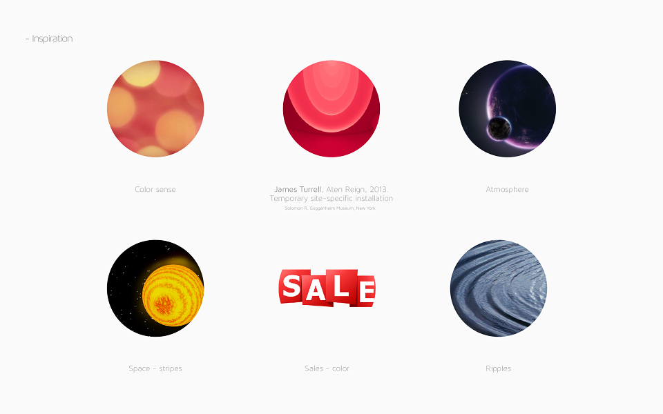
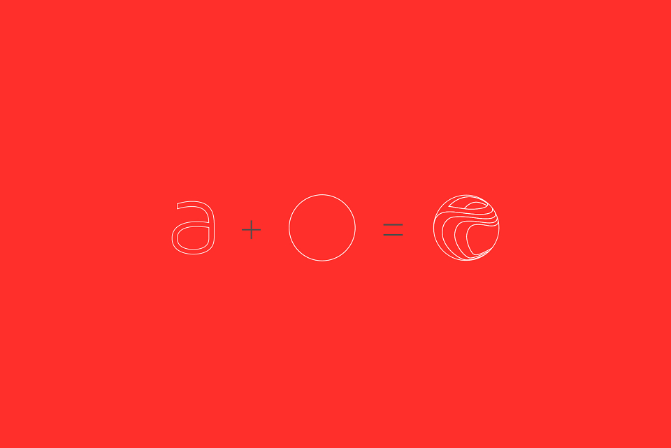
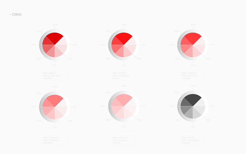
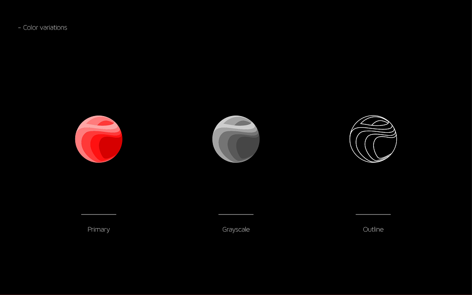
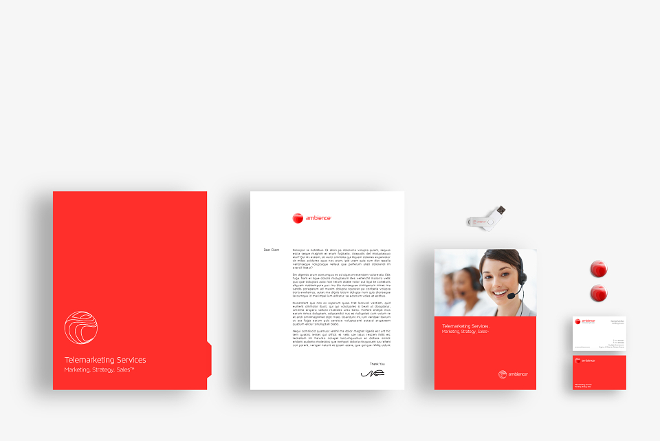
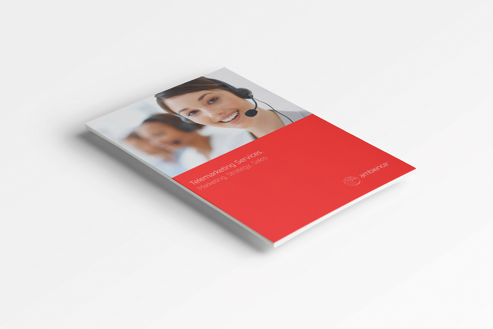
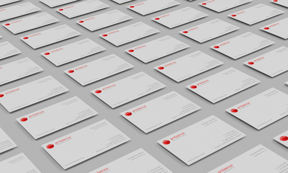
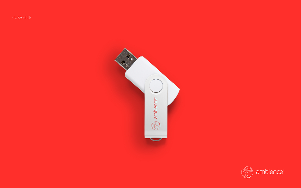
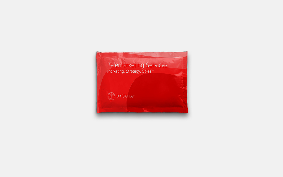
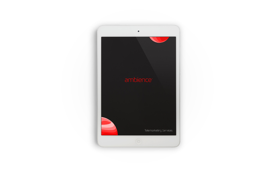
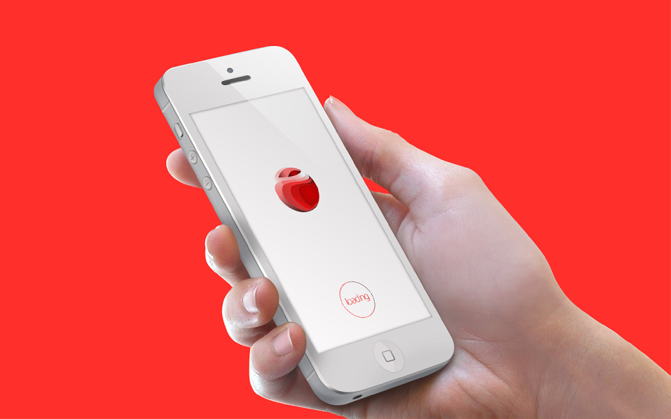
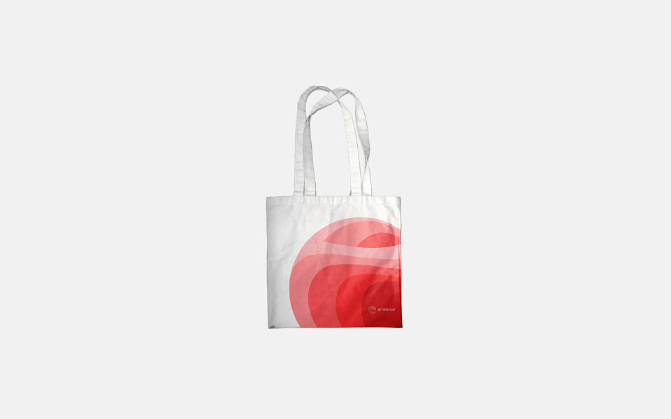
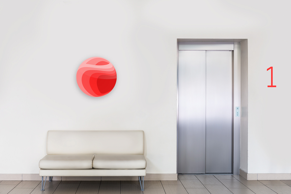
The approach of this idea was based on the name of the Brand, thereby visualizing the company’s name connecting it seamlessly with how it “sounds” and its meaning – creating positive emotions, relaxation and confidence at the first glance. The color palette is based in red color, which is commonly used in the “Sales” area. The circular shape, a shape subconsciously intertwined with the earth, the sun, the planets etc. represents the integrity, professionalism and the multidisciplinary nature of the Brand. The typography has a simple, clean, techy style to contribute to the overall feeling and complete the visualization for a fresh, modern logotype at todays trends.The brand we created conveys professionalism and its easilyrecognizable without compromising the honesty and the friendliness of the Brand.
AWARDS
ADWEEK
aiga
Design and Design Award
HiiiBrand International Awards 2014 / Professional Logotype – Merit Award