Andrew Avdeev
Graphic Designer - Production
ABOUT
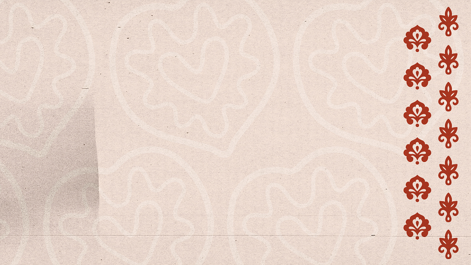
The main goal was to create an authentic, modern design that reflects tradition, history, and culture.
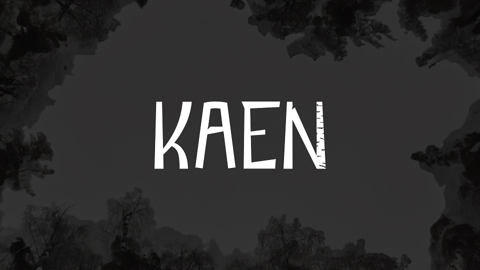
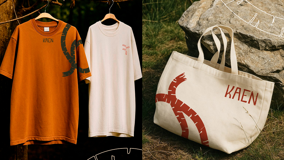
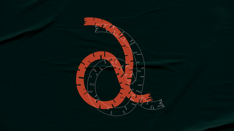
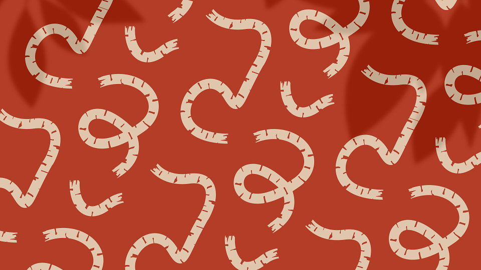
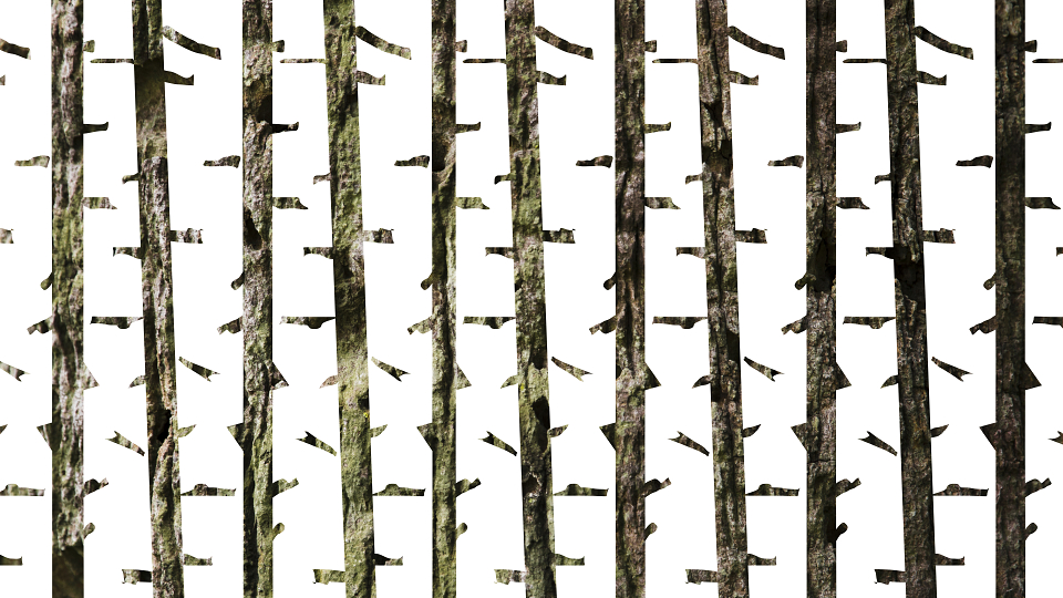
“Kaen” means “birch” in Turkic languages - and birch is the central thread woven through the entire visual identity. It appears in the logo, patterns, and graphic elements.
This concept blends natural harmony with cultural heritage, striking a balance between organic simplicity and a contemporary take on tradition.
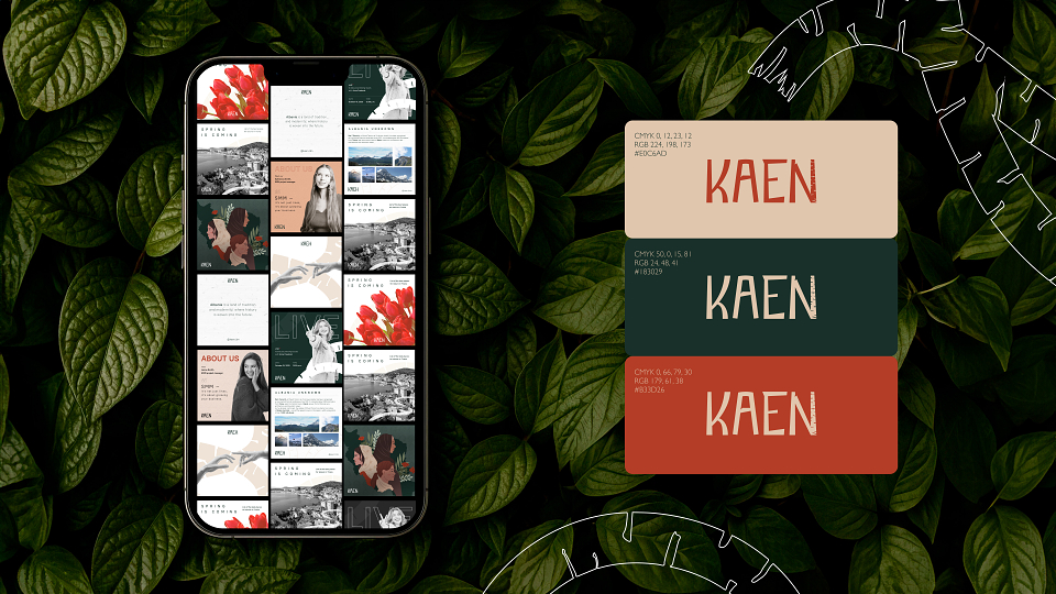
The colour palette is built around deep green, warm brown, and neutral beige - evoking a sense of stability, naturalness, and comfort.
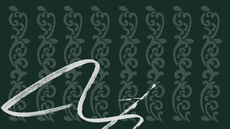
Textures play a key role, reinforcing the nature-inspired theme and creating an organic feel. They’re used subtly throughout the identity to complement the minimalist design without overwhelming it.
MADEIT CREDITS
-

Andrew AvdeevGraphic Designer - Production