


Data does not always have to be a confusing chunk of numbers. Here are two ways that show us how beautiful data actually can be.
What’s beautiful data?
The most obvious, and also most developed area in this regard is probably data-informed user experience (UX) design. But in my opinion, this is only the tip of the iceberg. There are (at least) two more areas of data-centric creativity that are growing at light speed and therefore are worth a closer look.
1. Data visualization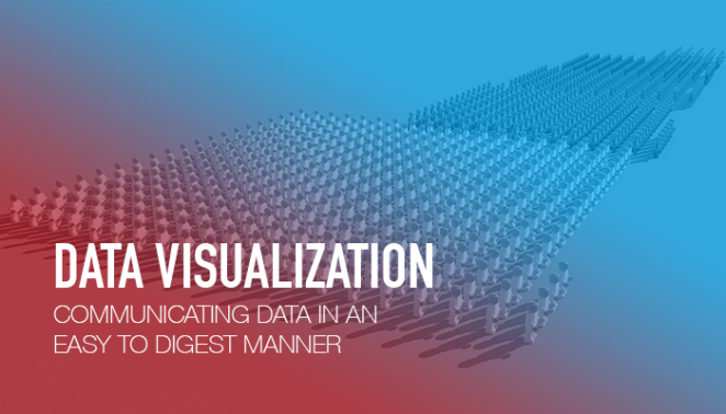 All the data in the world doesn’t mean anything if it cannot be understood. In order for it to be understood, it needs to be communicated in an easy to digest manner. And that’s where data visualization comes into play.
The visualization of data is often overlooked or deprioritized – especially here in Asia. If you’re guilty of doing so, here are two consumer-facing campaign examples that should put data visualization back on your radar.
Netflix: #Cokenomics
In order to promote its TV show Narcos, which tells the story of Pablo Escobar and the Medellin cartel, Netflix created infographics that brought the economy of the Columbian cocaine trade to life in a socially engaging way.
Spotify: Found Them First
Spotify’s Found Them First gave music fans a way to prove that they were really into certain bands and singers before they actually became famous. Listening data was used to show users all the artists they had discovered ahead of other Spotify users.
Data Tools
In most cases, data doesn’t actually need to be communicated to customers directly, but to internal stakeholders. For such instances, there are several tools that can help you avoid the all-too-common walls of text with stock charts presentations, and substitute them with something a little more engaging and inspiring. For example, if you are looking to beautify your charts, graphs, maps and timelines, make sure to check out the likes of RAW, Datawrapper, and Timeline JS.
Should you have a little more time on your hands, and also know how to code, have a look at D3.js, which comes highly recommended by my team’s creative technologist.
2. Data-informed product design  Another space to watch is the one of data-informed product design. Now I’m not talking here about your typical research-initiated product innovation cycle. I’m talking about an evolution of data visualization that quite literally and directly translates data into an actual product.
Here are three of my favourite projects within this space, the likes of which I can’t wait to see more of.
Flowing Data: Multivariate Beer
Nathan Yau from Flowingdata took U.S. demographics to brew four different types of beer. For example, he mapped population density to the total amount of hops, and ethnicity to the type of hops used. See Flowingdata’s website for a more detailed description of the process and other ways it transforms data.

Tempescope
Tempescope was invented by Japanese software engineer Ken Kawamoto. It is a device that displays either current weather conditions or forecasts them physically.
Crafted By My Heart
Obviously, I cannot talk about data-informed product design without doing a bit of shameless self-promotion. Our agency’s own start-up, Crafted By My Heart, takes heartrate data and transforms it into personalized pieces of jewellery.
The examples above show us there are no boundaries to how beautiful data can be – a lot of it however is still driven by artists, scientists, and entrepreneurs.
My hope for the future is to see the marketing and advertising industry more strongly recognizing the beauty that lies within data and the compelling stories it can tell. Storytelling is after all, a major part of our jobs.
An earlier version of this article was first published on ClickZ.