Andrea Belfiore
Graphic Designer
ABOUT
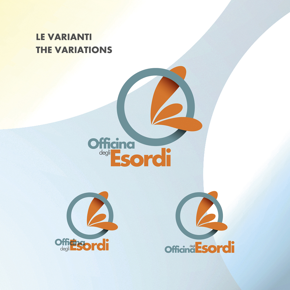
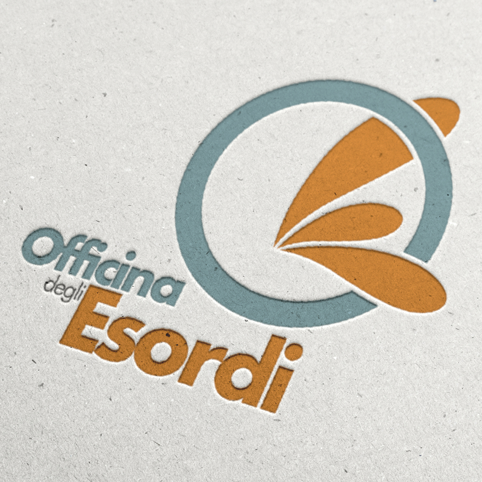
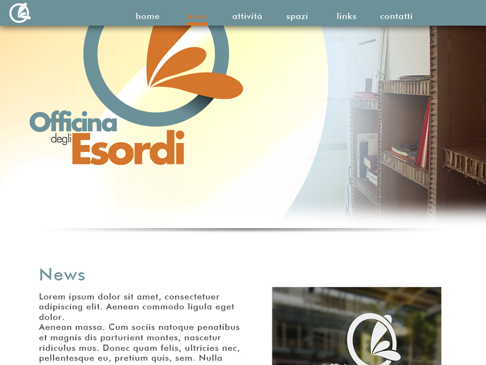
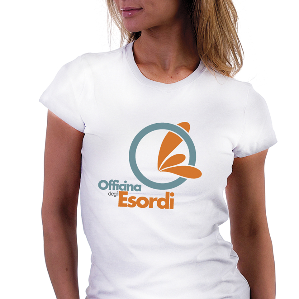
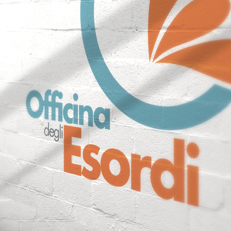
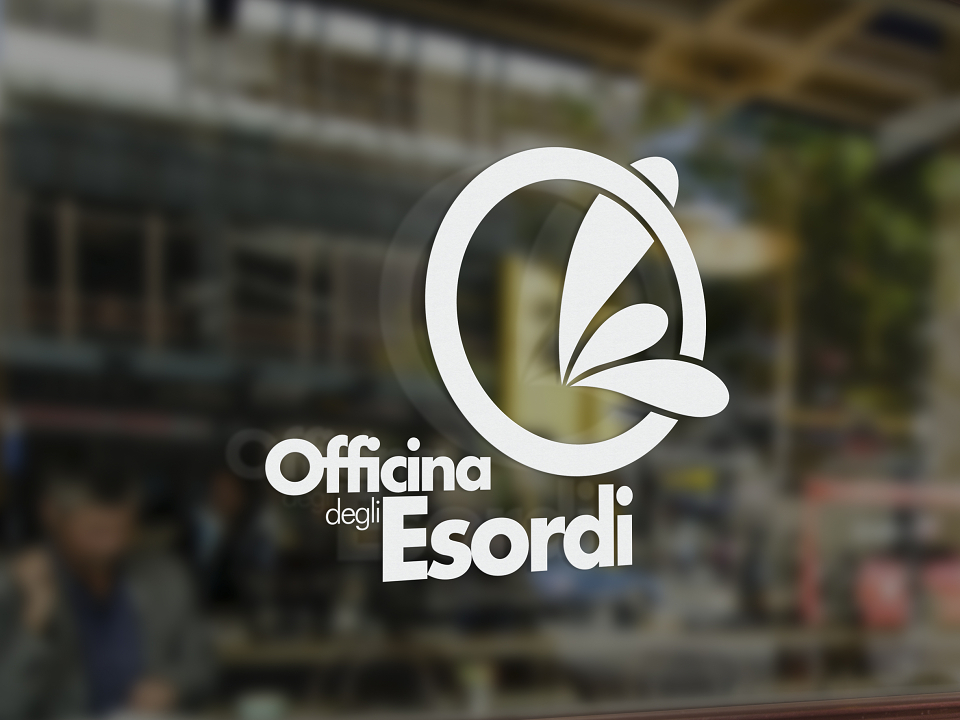
The whole concept is based primarily on the meaning of the word "beginning". The design of the logo was born by the union of the letter "O" and "E" that wants to look the stylization of a water squirt, the birth of something, a "come to the surface".
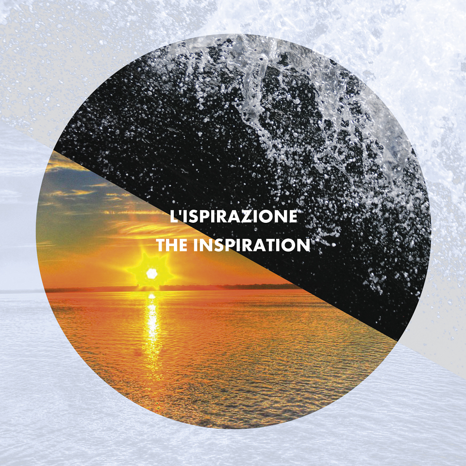
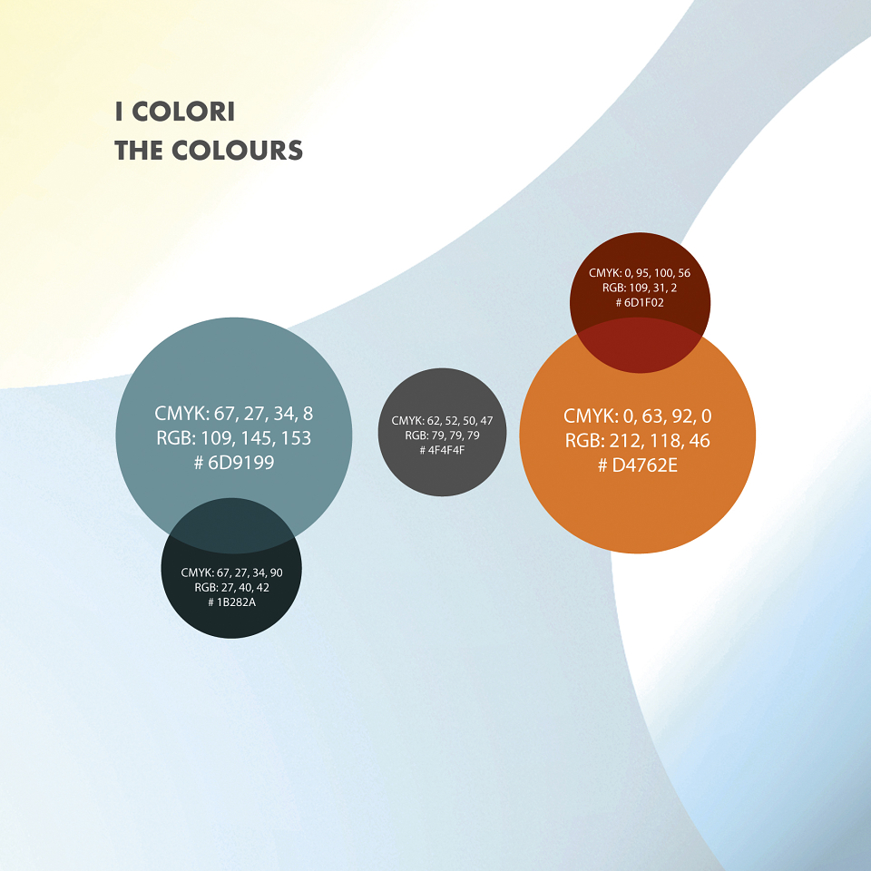
The colors, cool, pastel colors, are also inspired by the concept of debut and novelty that are ideally represented by the sunrise.