ABOUT
Concept
Sainsbury’s set out to define a clear and consistent way its brand should express itself across digital products and channels. While the brand had strong equity, its digital execution lacked a unified visual language and a shared framework to guide design decisions.
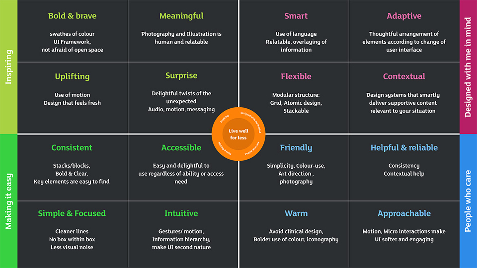
The objective was to establish a robust digital visual language and translate this into a design system that could support consistency and quality at scale. A small set of design principles helped articulate how the brand should look, feel, and behave digitally, providing a clear link between brand intent and execution.
Execution
The project was delivered in three stages, progressing from definition to application and systemisation.
The Discovery phase focused on analysis and visual exploration. Existing digital outputs were reviewed, and a clear visual point of view was defined through art direction across typography, colour, layout, hierarchy, imagery, and tone.
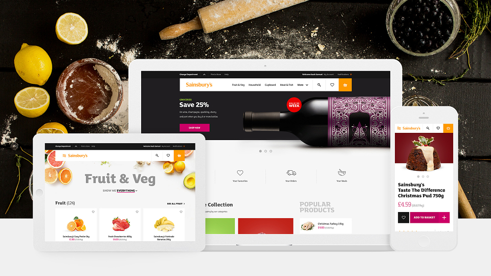
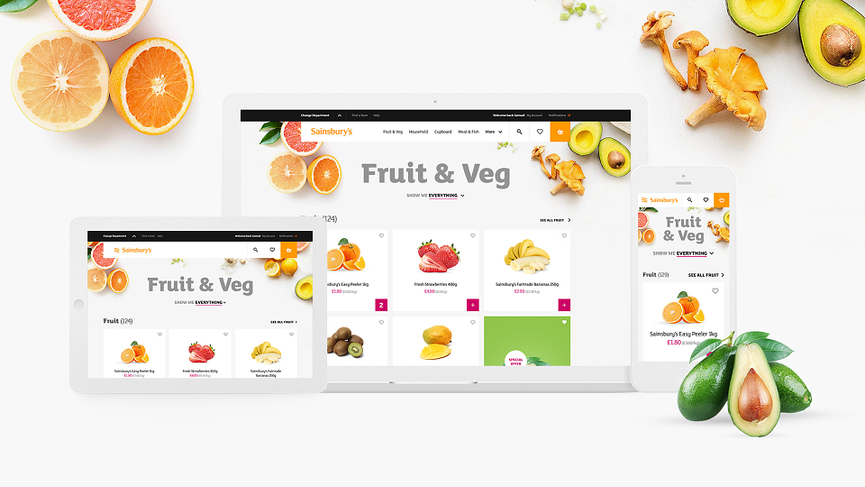
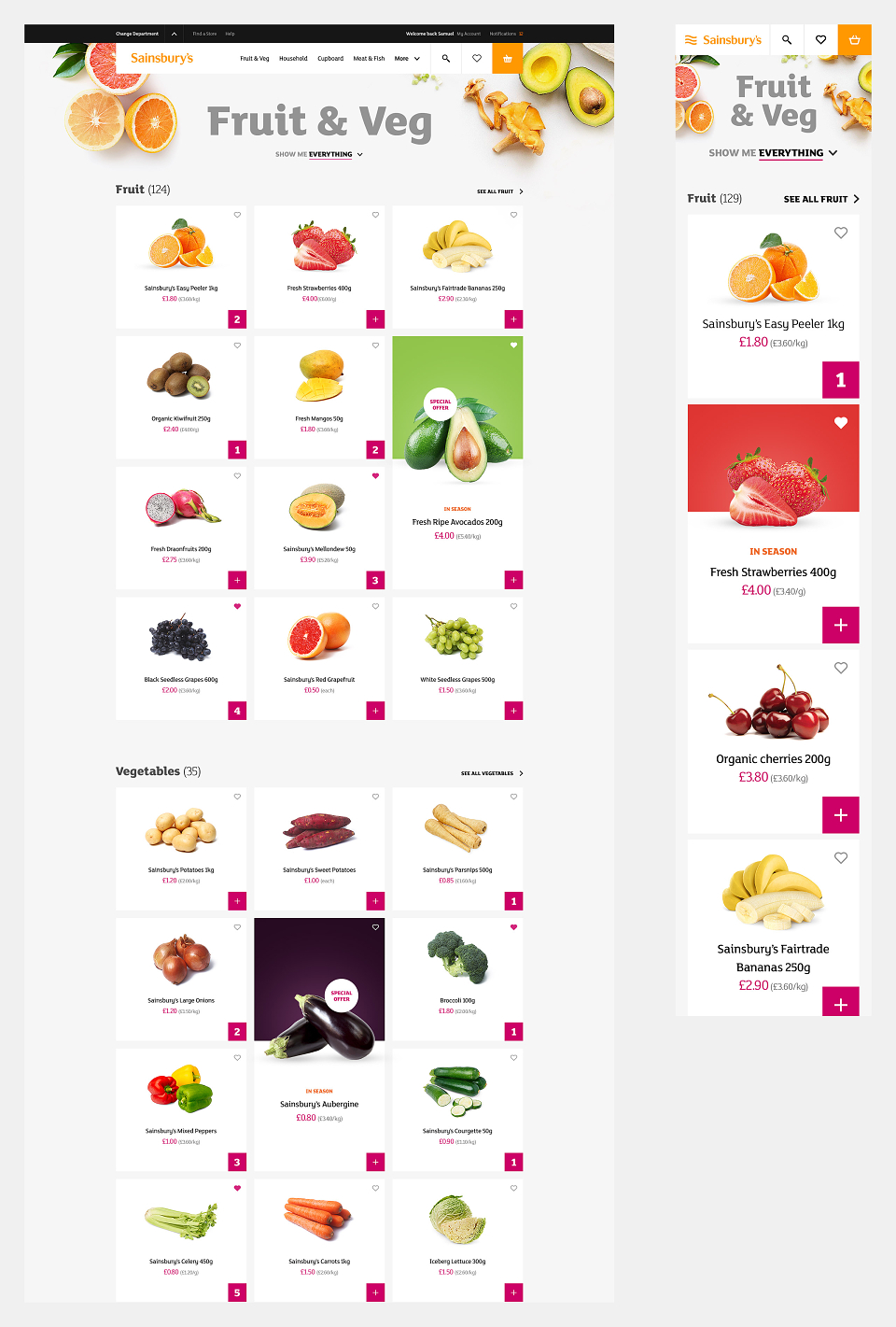
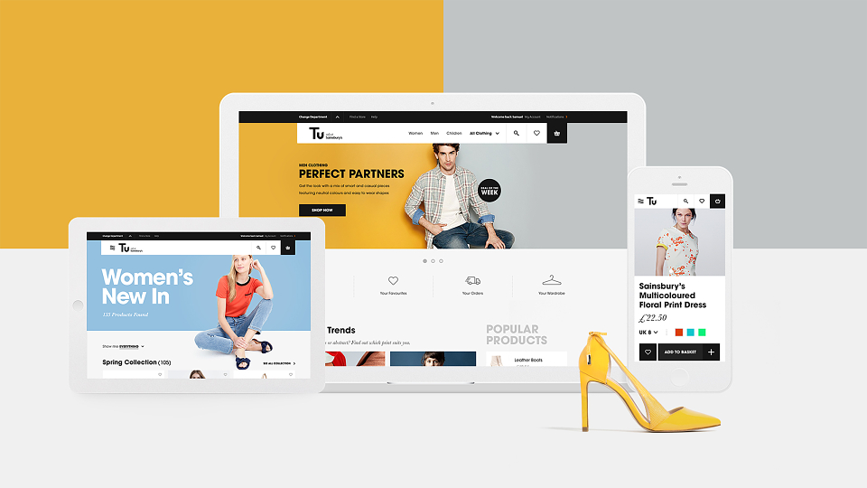
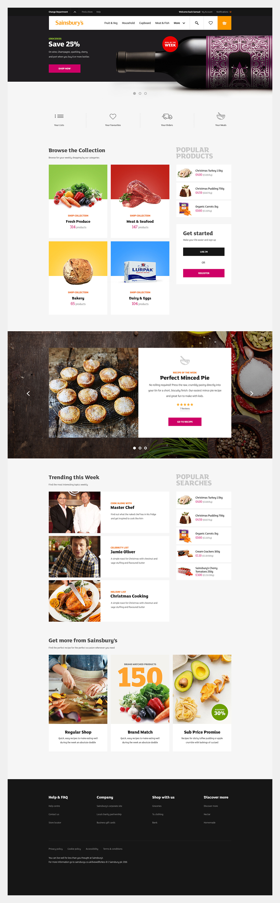
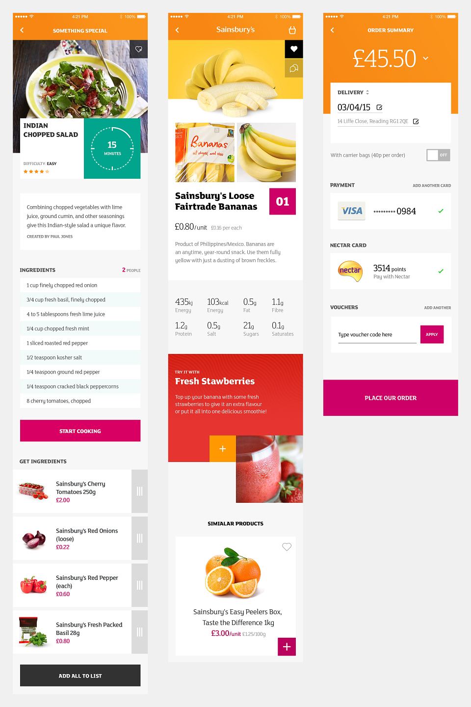
During the Concept phase, the visual language was applied to real product examples across different digital channels. This brought the direction to life and demonstrated how the principles translated into practical design decisions.
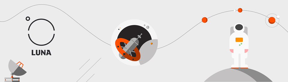
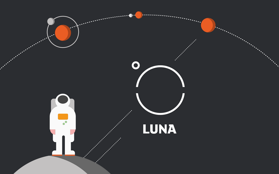
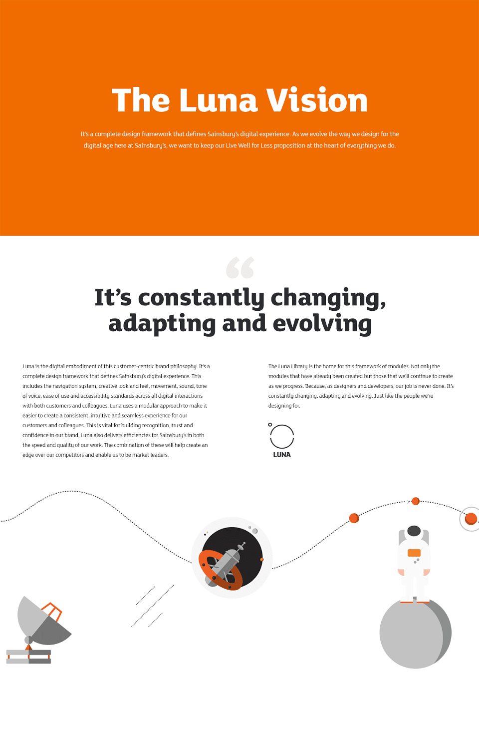
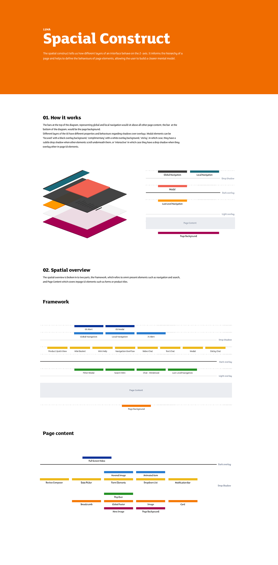
LUNA then formalised the visual language into a structured design system. It defined core elements, patterns, and guidance that enabled consistent application across digital products.
Results
The project delivered a cohesive digital visual language and a design system to support it. Together, these provided Sainsbury’s with a clear framework for consistent, high-quality digital design and a durable foundation for the brand’s ongoing digital evolution.