Allison Murray
Creative Director
ABOUT
Forthay required a strategic evolution to strengthen its market presence and support an expanding product range.
Originally created as a small-batch granola for B&B guests, the brand had grown into an award-winning, gluten-free offering spanning muesli, porridge, granola, and snack bars. However, its identity no longer reflected the scale or ambition of the business, nor did it provide a cohesive framework for future growth.
The solution was to simplify and consolidate. The name was refined to Forthay, creating a more confident and flexible masterbrand capable of unifying the full range.
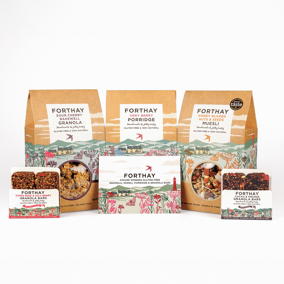
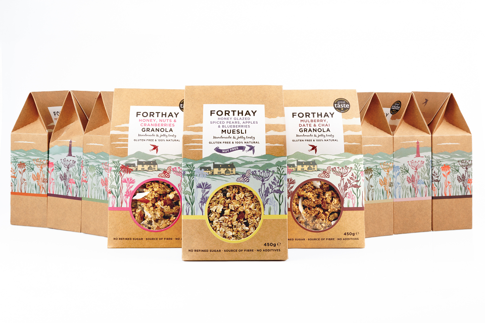
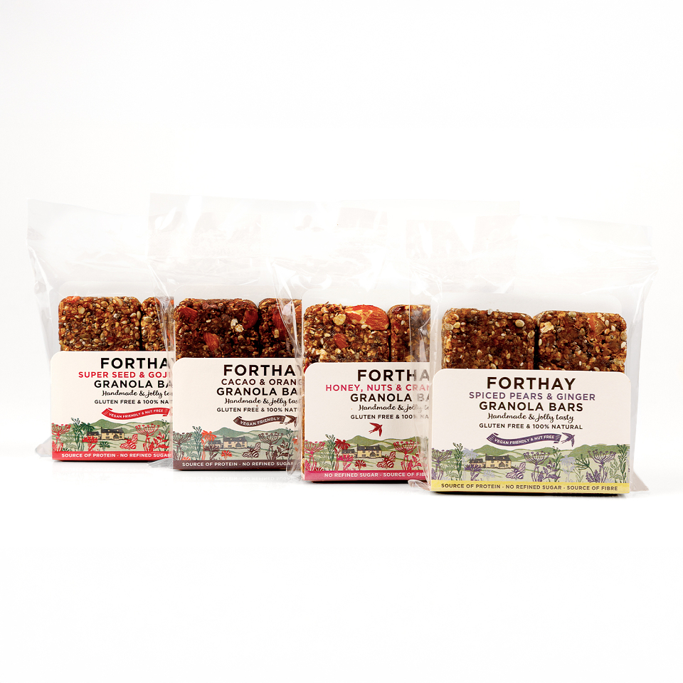
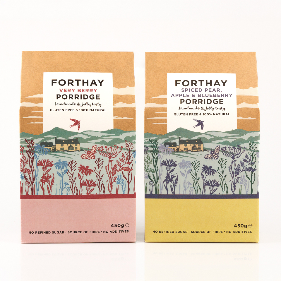
At the heart of the redesign is a distinctive packaging system: a shift from conventional bags to Kraft board boxes. This structural change elevates shelf presence while introducing a more considered, giftable quality—positioning the product beyond everyday breakfast and into a more premium, lifestyle-led space.
The visual identity centres on a woodcut illustration of the farm and surrounding village, grounding the brand in its provenance while creating a recognisable and ownable asset across the range. The tactile quality of the Kraft material reinforces this connection to craft, land, and authenticity.
The result is a cohesive and scalable brand world that balances heritage with contemporary appeal—allowing Forthay to stand apart in a crowded category while supporting continued product innovation.
The redesign has significantly increased visibility, driving both sales and demand, and repositioning Forthay as a distinctive voice within the premium breakfast market.
MADEIT CREDITS


Annual 2026 ShortlistForthay GranolaGraphic