Alister Shapley
Director
ABOUT
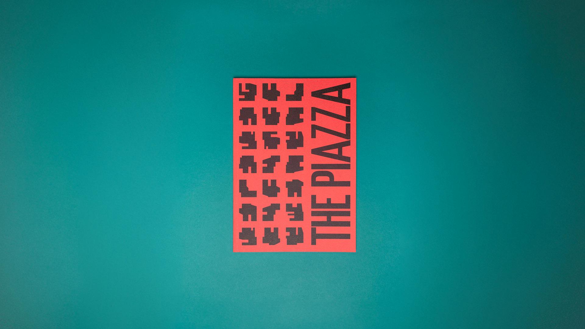
The Piazza magazine was part of the post rebrand of City Tower. They wanted to create something that explained the heritage of the tower and it's current relationship with the surrounding area. The magazine was for the local occupiers as well as being used for marketing material.
A towering 1960s office block in the centre of Manchester that is perceived to be stuck in the era. Our role was to change this and make City Tower a place for brave decisions; similar to what lead to it’s creation in the first place. The project is a complete overhaul from strategy and positioning through to interior style and staff processes. The aim is to be a place for fast growth organisations to flourish through innovation and bold new ideas. This lead to the creation of a bespoke elongated woodblock inspired typeface that captures the energy and history of the building. The typeface is a variable font to be used in large graphical elements to emphasis it’s bold nature. The identifier reflects the building façade’s original circuit board concept and the new digital era.