Alejandro Esteves Ponte
Executive Creative Director | Brand Transformation
ABOUT
CHALLENGE:
The fried chicken category was split between two poles: the global fast food giants (cold, corporate, functional) and the artisan fried chicken wave (cool but self-conscious). Neither had a brand that fully celebrated indulgence without guilt or pretension. There was no brand for the person who simply, joyfully, unashamedly wants fried chicken, waffles, and a sauce so good they'll lick the box. The market had ingredients everywhere. Nobody had built the permission structure to eat them without apology.
IDEA:
This is a fried chicken brand built from zero for indulgence-lovers, finger-lickers, and the gloriously unapologetic — from delivery dark kitchen to full retail.
WISH YOU · POLLO FRITO · NO APOLOGIES.
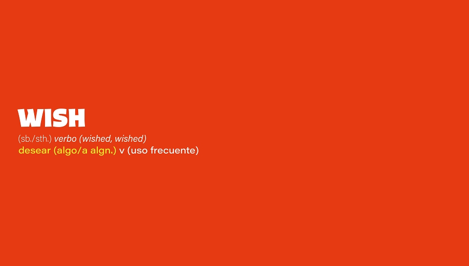
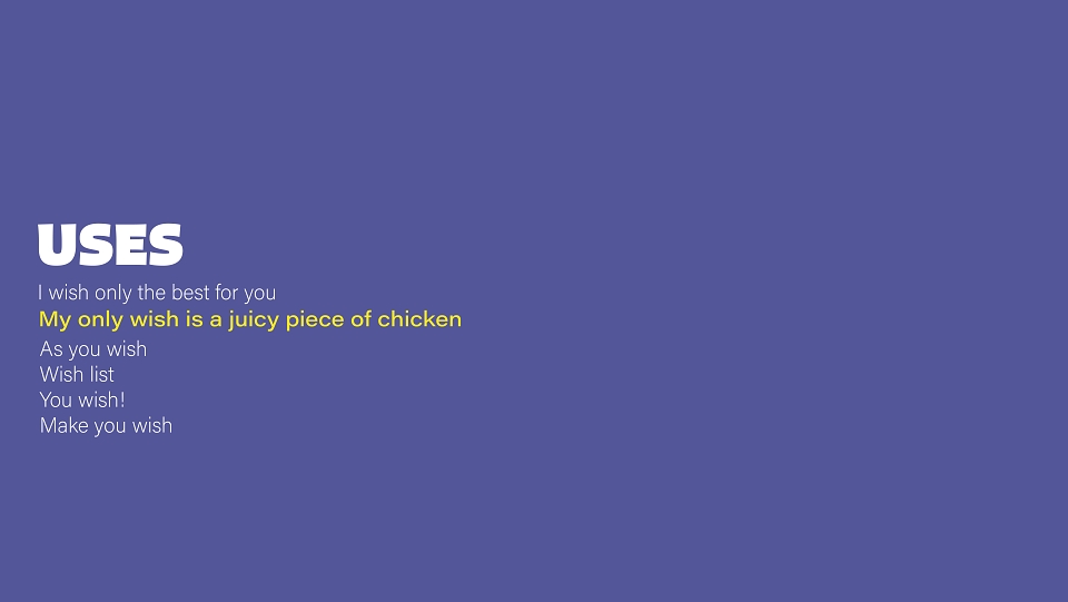
Build a brand entirely around desire — not product. Wish is not a chicken brand. It's an emotion: the permission to want something, go for it, and enjoy every messy, glorious second of it. The brand voice is direct and irreverent: "Vegetarians? We respect you. But don't come — you'll waste your time." This is a brand for gluttony-as-self-care, for the treat you earned, for the sauce on your fingers you don't wipe off until you absolutely have to.
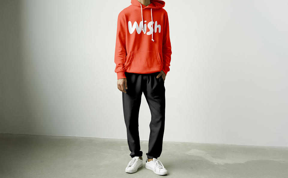
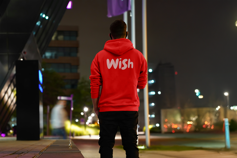
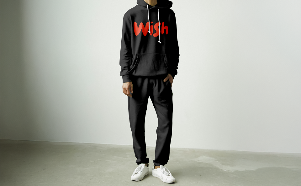
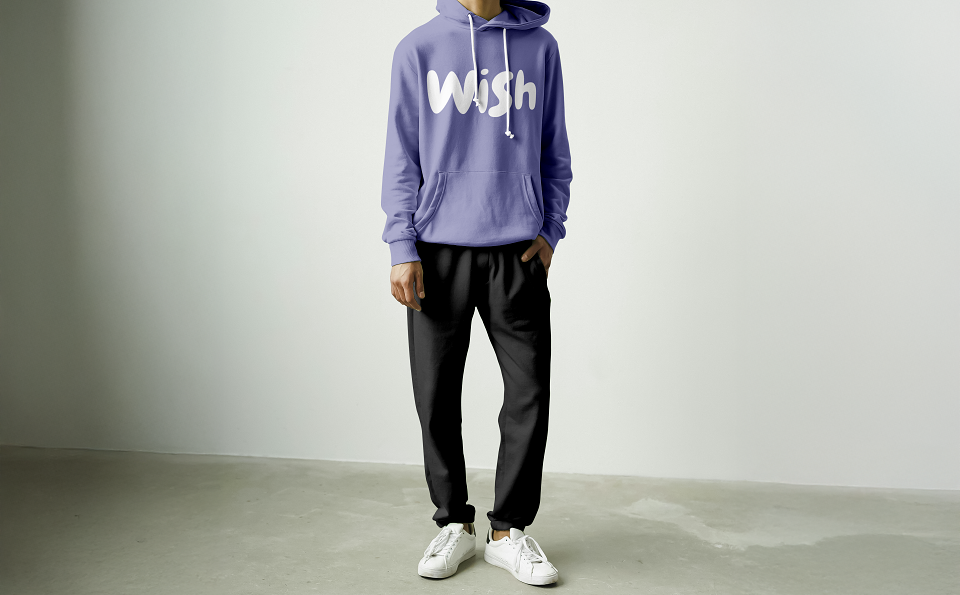
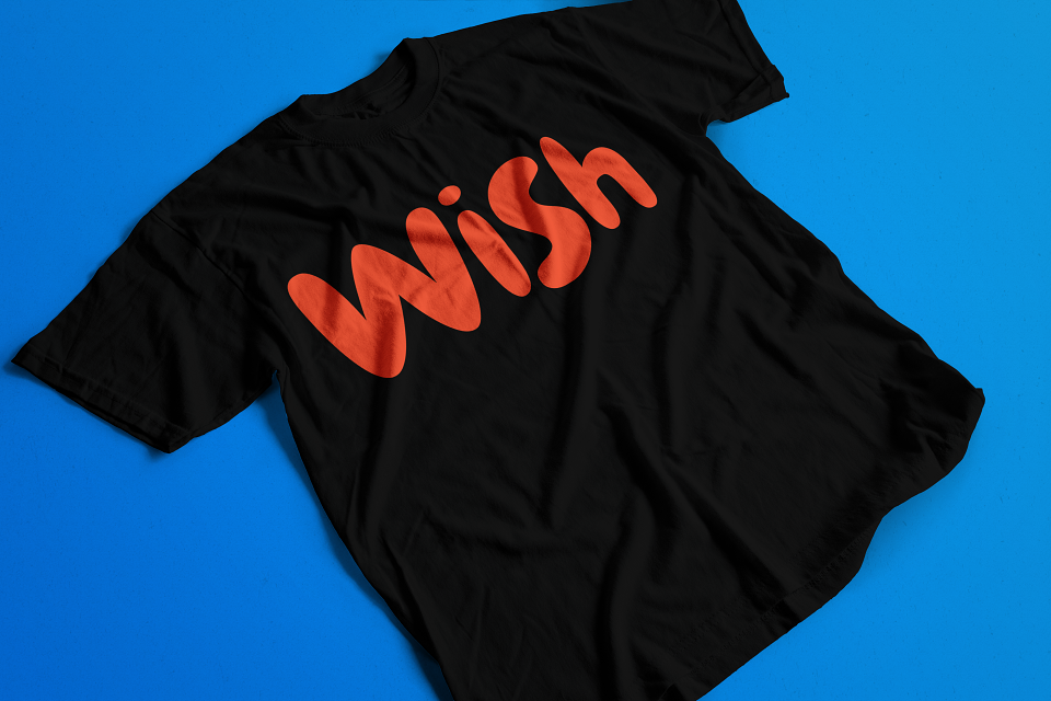
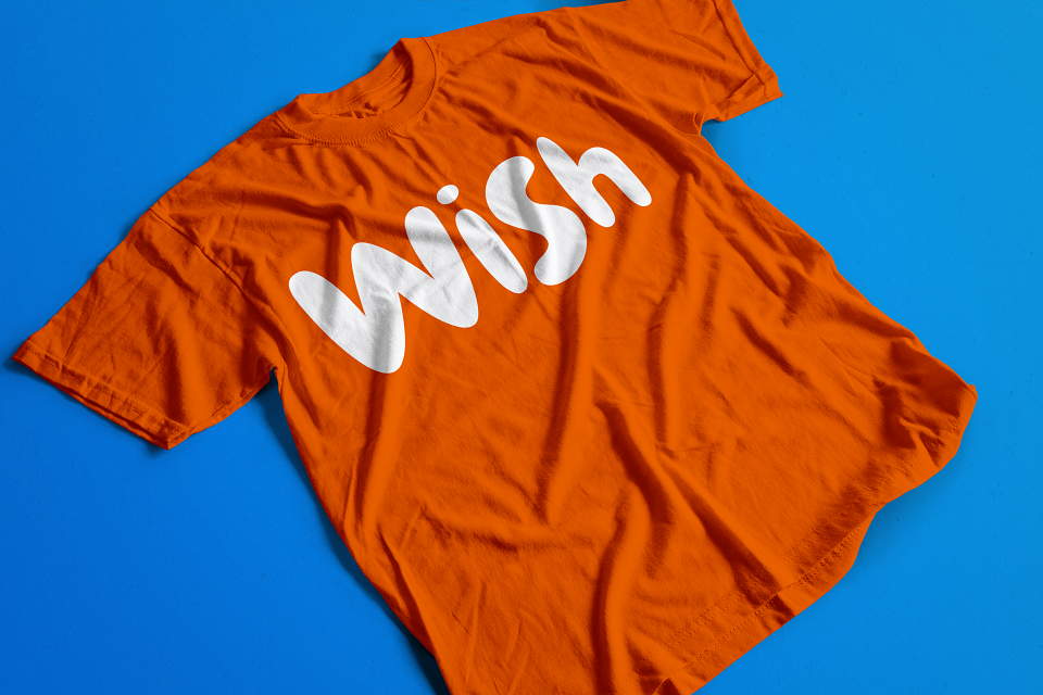
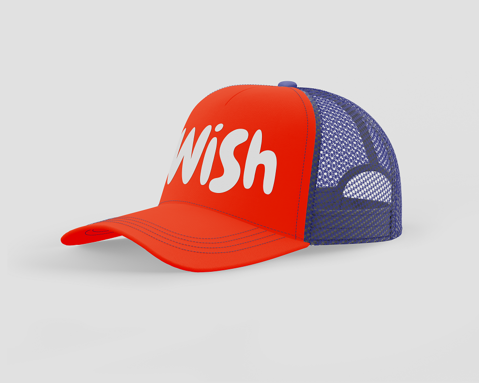
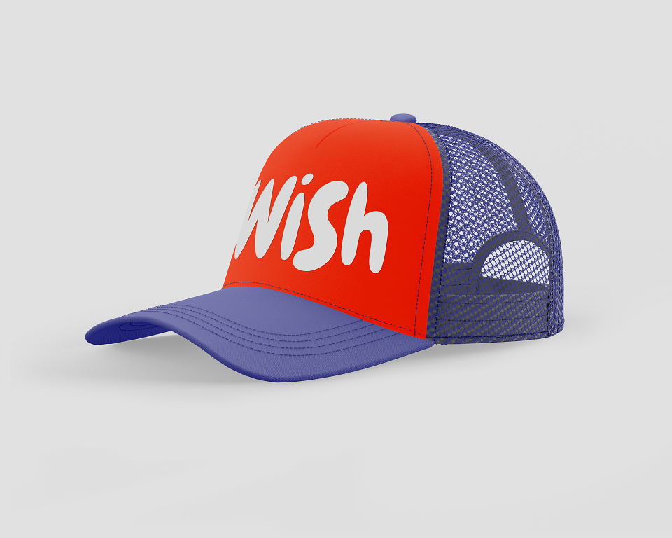
The orange and purple palette was a deliberate departure from every warm-toned, wood-textured fried chicken brand in existence. Bold, saturated, typographically playful — Wish looks like a toy brand and tastes like a reward.
Brand manifesto:
"If you want it — have it. Fried, crispy, sauced, and yours. Wish is not for those afraid of grease or licking their fingers. It's for the ones who know a good meal is a moment worth living.
You Wish?
Colorimetry:
-Wish Orange
Heat. Appetite. Energy. Hero brand colors.
-Wish Purple
Contrast. Playfulness. The unexpected partner.
-White
Relief. Typography. Clean canvas on orange.
-Accent Yellow
Menu highlights. Sauce cues. Appetite accent.
MY CONTRIBUTION - CREATIVE DIRECTOR:
As Creative Director, I built Wish entirely from zero — name, identity, brand manifesto, menu architecture, full packaging system, delivery model, and retail identity:
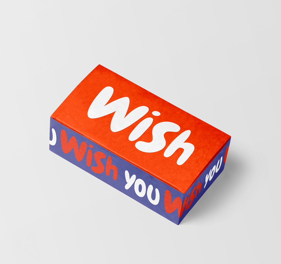
-Brand creation & naming: I named and defined Wish as a desire-based brand — not a food brand. The name works as a verb, a feeling, and a permission slip. "Wish you" on the box is not a typo: it is the brand's way of saying the product is yours, made for you, a gift to yourself.
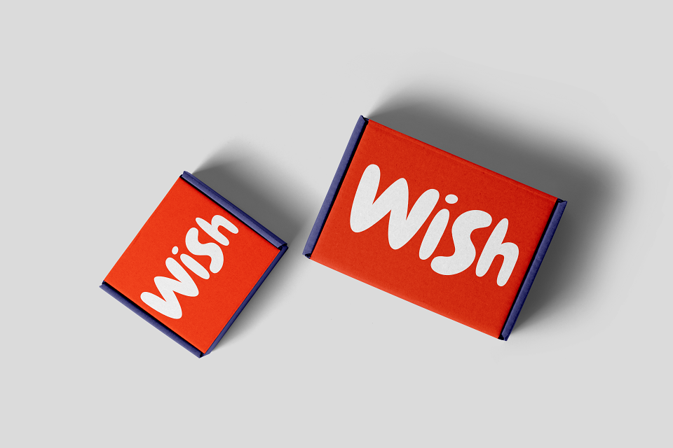
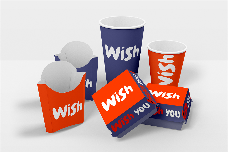
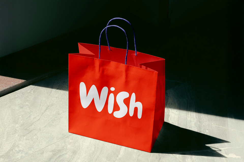
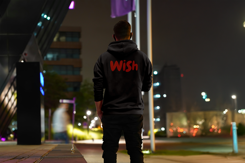
-Visual identity & packaging system: I designed the complete packaging architecture — large box, small box, fry holder, cups (large and small), paper bags, and sauce tubs — in the orange and purple palette with the Wish logotype as the dominant graphic element across all surfaces. Every piece is a brand impression.
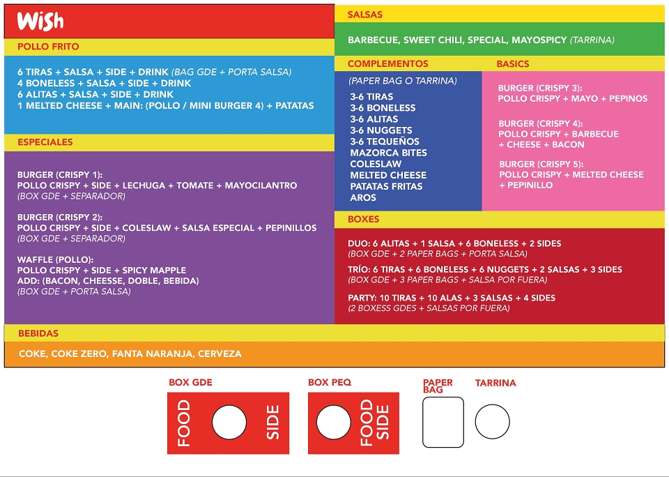
-Menu architecture: I structured the full menu from scratch — Pollo Frito (tiras, boneless, alitas), Especiales (5 crispy burgers + waffle), Boxes (Duo, Trío, Party), Complementos, and Salsas — with a deliberate packaging logic where each format (Box GDE, Box PEQ, Paper Bag, Tarrina) maps to a specific menu tier, optimising kitchen flow and customer experience simultaneously.
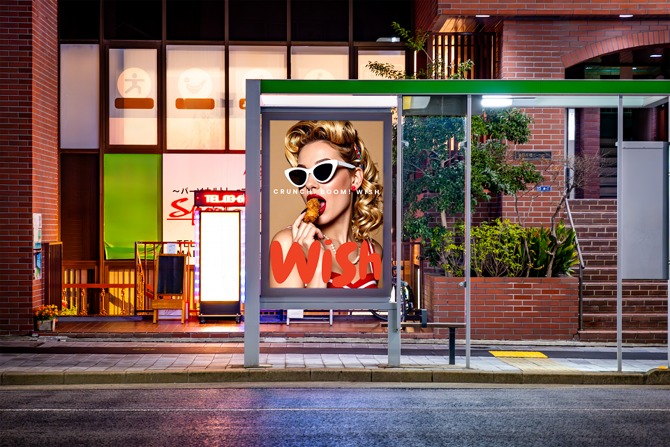
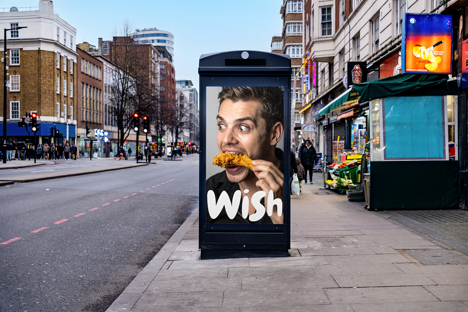
-Delivery-first to retail expansion: I designed Wish to launch as a delivery brand and scale to retail — the identity, packaging, and menu structure were all engineered to work at street level (OOH, booth) as powerfully as on a Glovo or Uber Eats screen.
-Brand identity
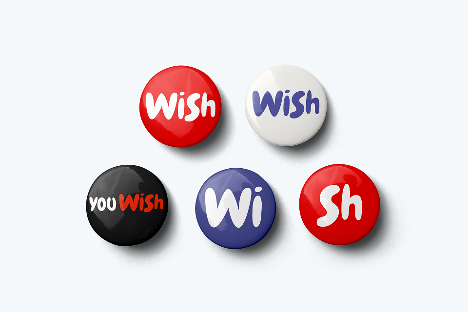
Name, logo, palette, type system, brand manifesto — built from zero
-Packaging system
Full suite — boxes (lg/sm), cups, fry holder, bags, sauce tubs — every surface branded.
-Menu architecture
Category structure, combo logic, packaging format mapping per menu tier.
-Delivery identity
App listing design, Glovo / Uber Eats visual identity, thumbnail and hero image system.
-Retail & OOH
Street booth design, billboard executions — orange takes the street.
-Social & digital
Instagram content system — food-forward, desire-led, unapologetically indulgent.
MADEIT CREDITS
-

WishClient
-

Alejandro Esteves PonteExecutive Creative Director | Brand Transformati