Alejandro Esteves Ponte
Executive Creative Director | Brand Transformation
ABOUT
CHALLENGE:
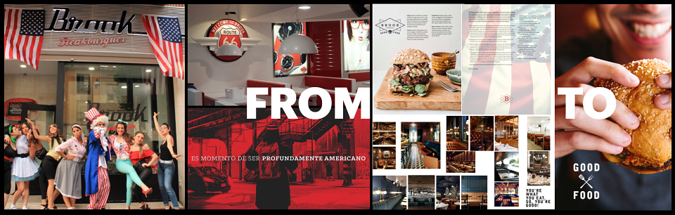
Brook had a product worth believing in and a space worth being proud of — but a brand identity that was actively working against it. The visual world was drowning in Americana clichés: electric guitars, Elvis posters, vinyl records, neon signs, the full Hard Rock Café starter kit — applied without conviction and read by customers as exactly what it was: decoration, not identity.
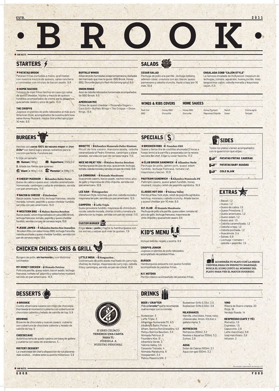
The menu compounded the problem. With over 60 items, it communicated indecision rather than expertise. In a restaurant where a burger should be the hero, a 60-item menu tells the customer that nobody is sure what this place is actually about. The brand was visually loud and strategically silent — caught in a no-man's land between fast food and fine dining, claiming to be different while looking like everything else.
There was no coherent delivery strategy, no sub-brand architecture for dark kitchen revenue, and no experience design system connecting the customer from arrival to exit. Brook needed a total repositioning — not a cosmetic refresh.
IDEA:
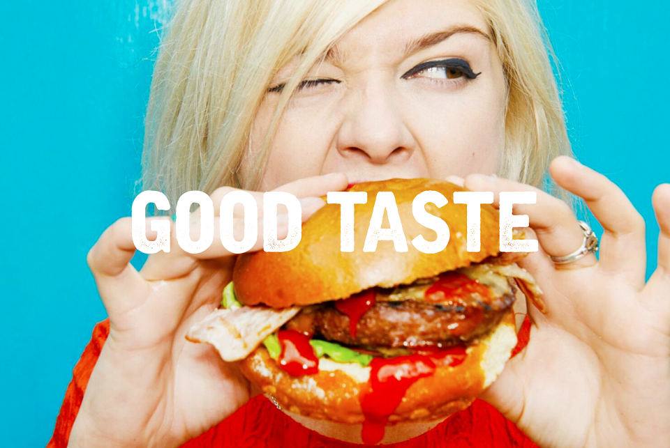
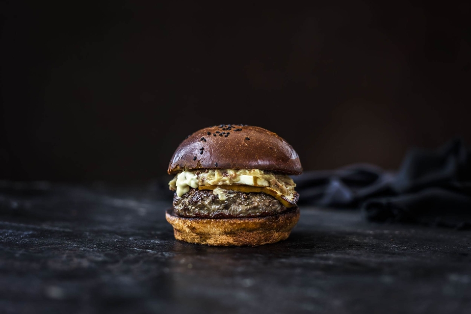
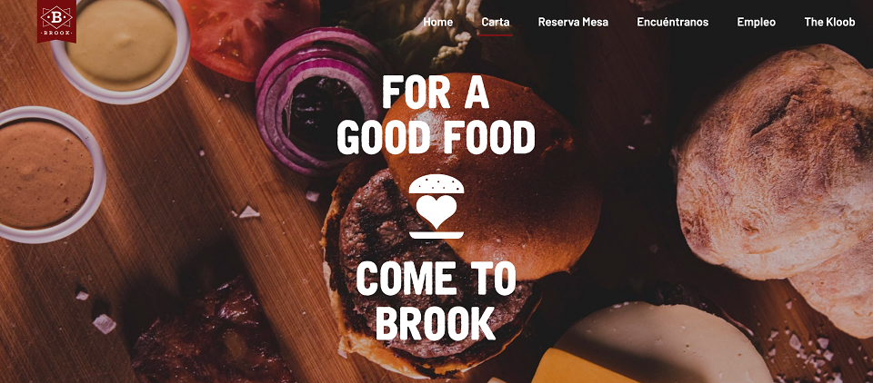
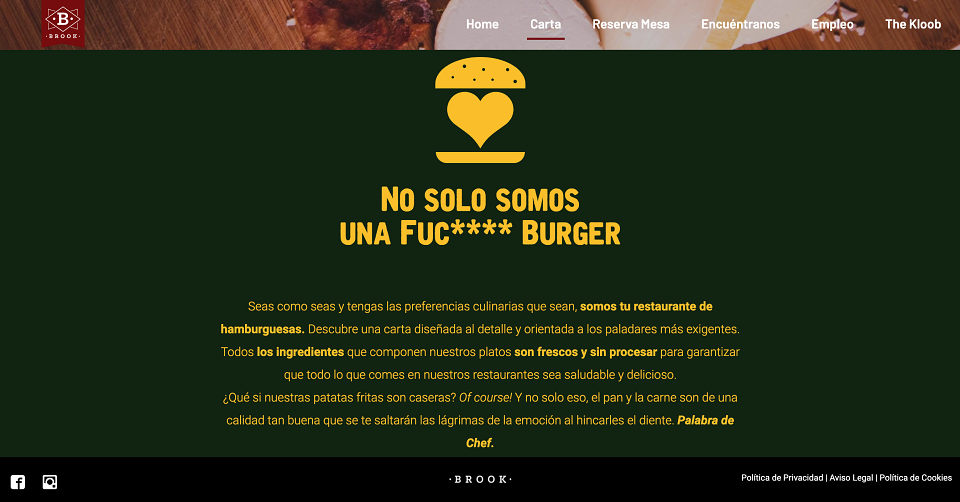
Claim the territory no one in Spain had confidently owned: Good Food. Not fast food — which trades quality for speed. Not slow food — which trades accessibility for ideology. And certainly not casual food — which trades ambition for comfort. Brook would be the honest, confident, no-pretension American diner done with real craft: handmade daily bread, 100% national beef, house-made sauces, and a menu so focused it becomes a guarantee rather than a catalogue.
The repositioning was built on three deletions and one declaration: delete the clichés, delete the excess menu, delete the visual noise — and declare Brook a GOOD FOOD restaurant with the character, physical space, and brand voice to back it up. The visual identity was rebuilt around the dark charcoal-and-electric-yellow palette — confident, modern, nothing to do with Route 66.
The brand was also structurally expanded: alongside the repositioned main restaurant, I created a dark kitchen sub-brand architecture to capture the delivery market without diluting the Brook dine-in experience.
-Fast Food
Deleted
Speed over quality. Volume over craft. Not Brook.
-Slow Food
Rejected
A trend, not a philosophy. Not what this brand is.
-Good Food
Claimed
Honest, handmade, authentic — Brook's owned territory.
The Brook Golden Circle (by Sinek) — Why / How / What:
WHY?
Because we want people to live the true experience of American cooking — not a theme park version of it.
HOW?
Fresh products, made by hand, in-house. No shortcuts. Widest variety in the category. Not just another burger.
WHAT?
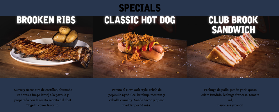
Burgers, sandwiches, hot dogs, ribs, chicken. Without disguise. Without decorations. Just flavour.
-Main restaurant
Brook
Repositioned dine-in experience. Redesigned logo, new retail identity, 5-step service model
-Dark kitchen
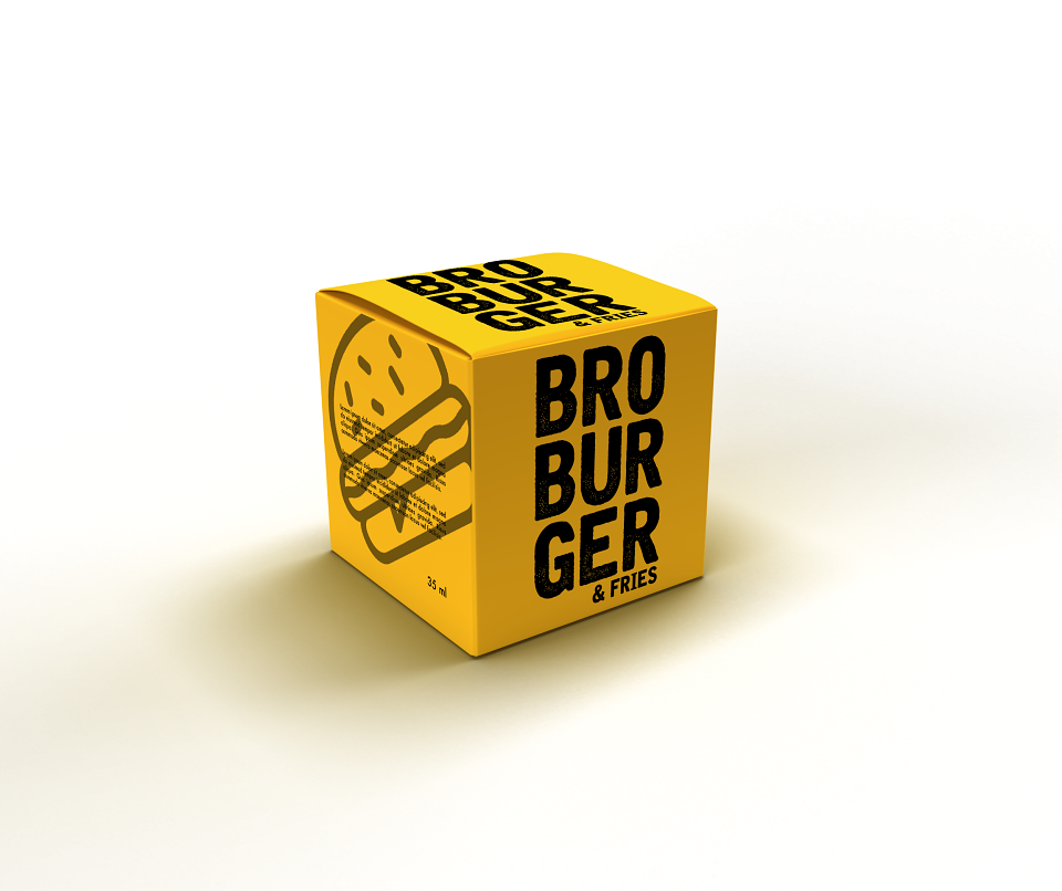
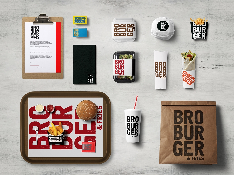
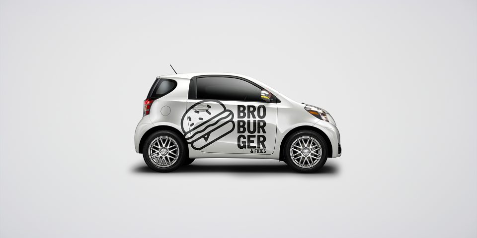
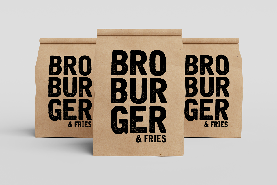
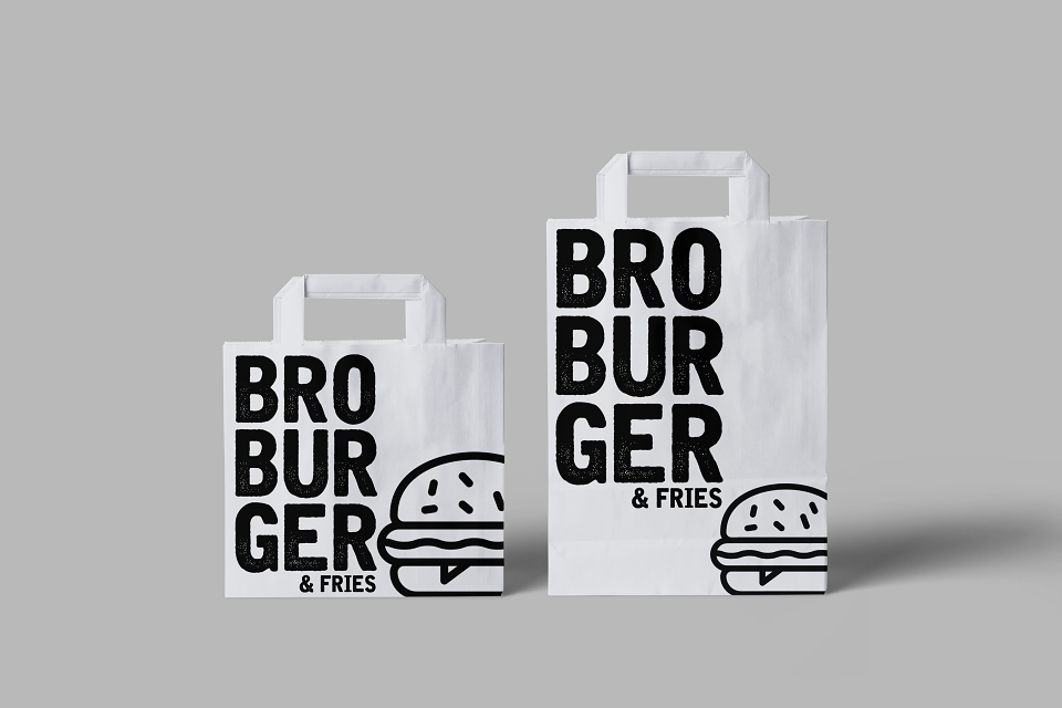
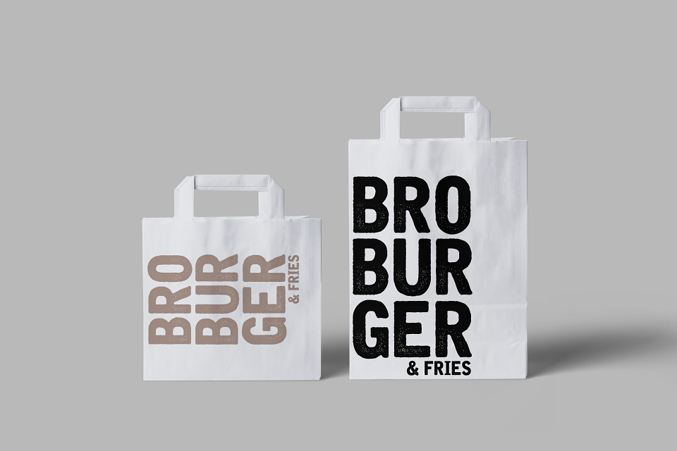
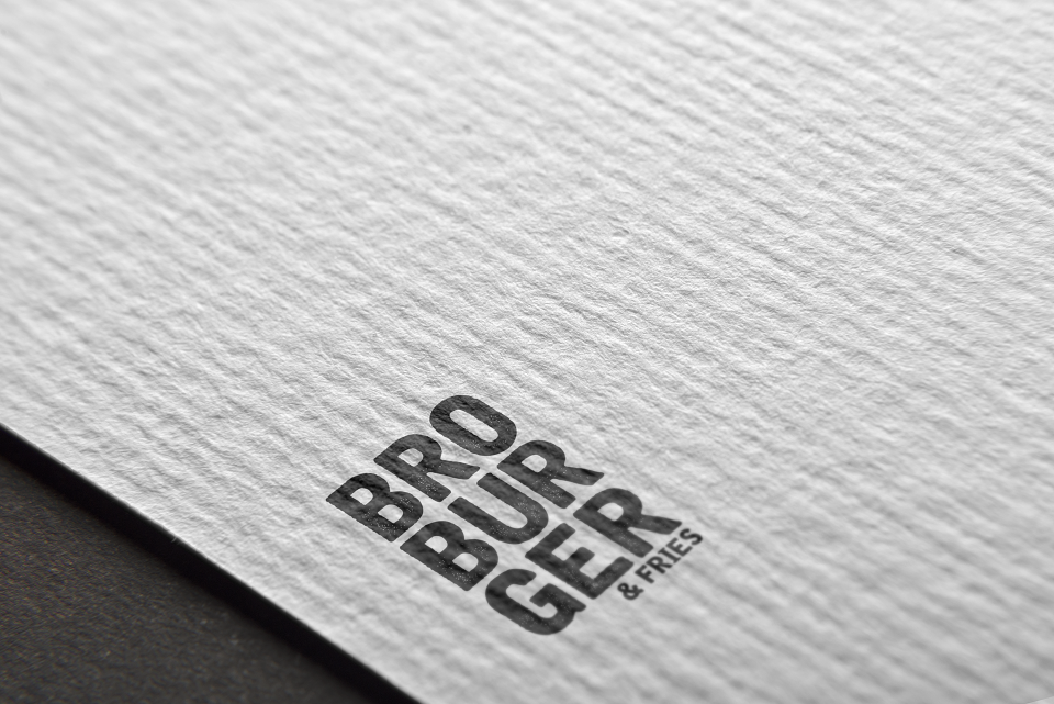
Bro & Fries
Delivery-first sub-brand. Just Burgers and fries. Street voice, no restaurant overheads.
-Dark kitchen
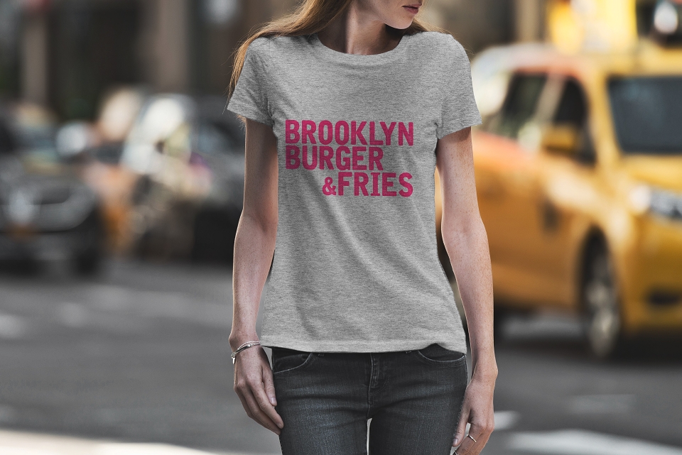
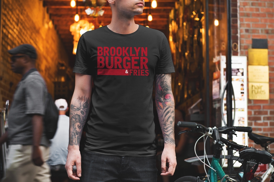
Brooklyn
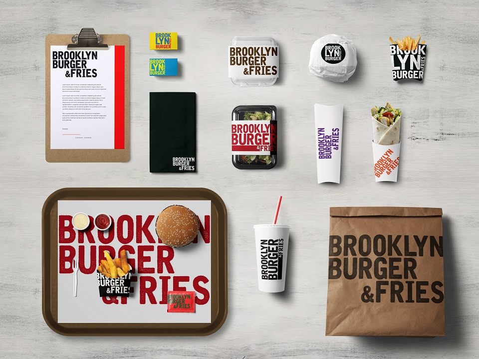
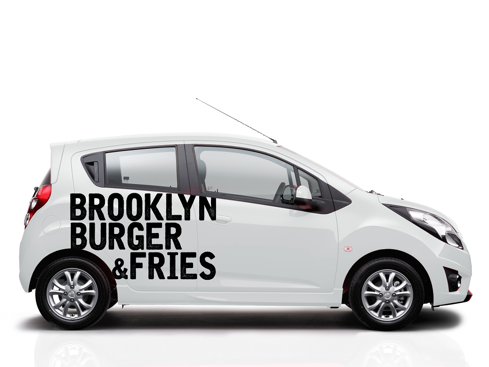
Delivery-second sub-brand. NYC deli aesthetic. Separate target, same kitchen, new revenue stream
Competitive positioning — brand voice
"We're not Fast Food. We're definitely not Slow Food. We're not that fleeting trend either. We are Good Food — American, authentic, handmade with your name on it."
MY CONTRIBUTION - CREATIVE DIRECTOR:
As Creative Director, I directed the full repositioning of Brook — from brand strategy and naming architecture through to retail identity, menu redesign, experience system, digital extensions, and dark kitchen sub-brand creation. My contribution covered:
-Strategic repositioning — Good Food territory: I defined and claimed the "Good Food" positioning as Brook's unique and defensible territory — a deliberate rejection of the fast food, slow food, and casual food categories, grounded in the Simon Sinek Golden Circle framework. Why, How, What. The clearest competitive statement the brand had ever had.
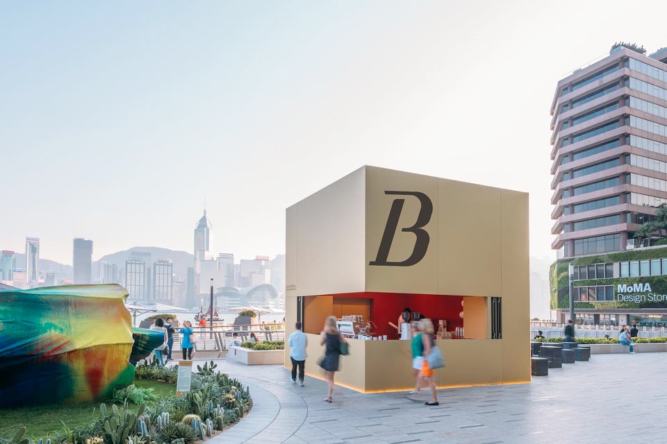
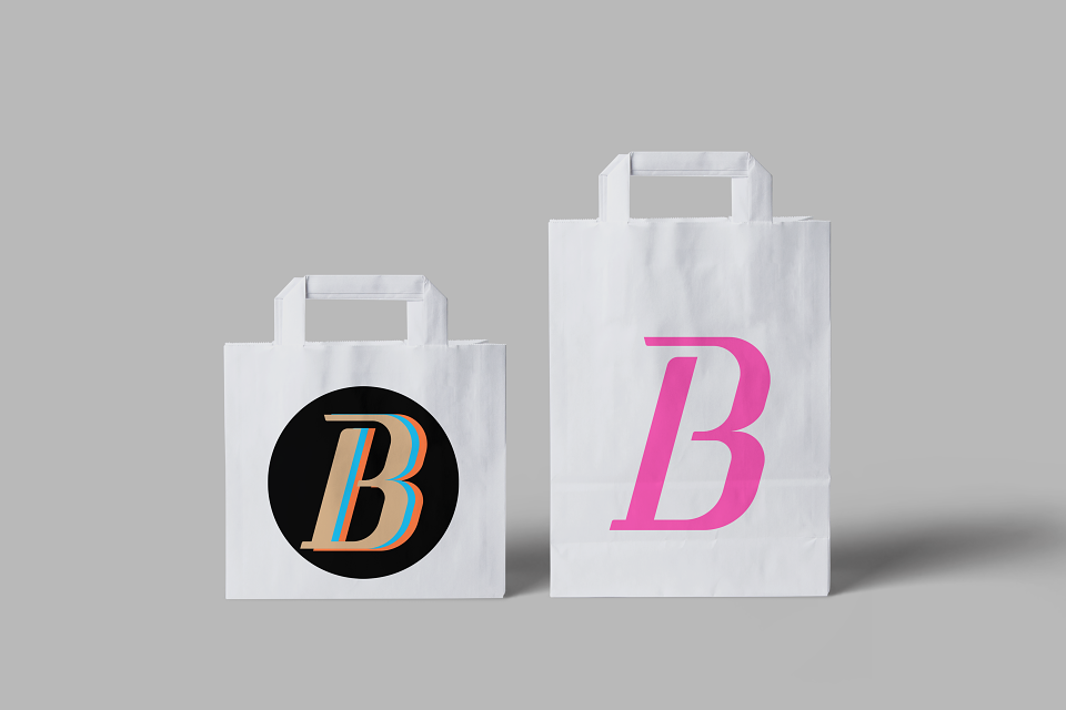
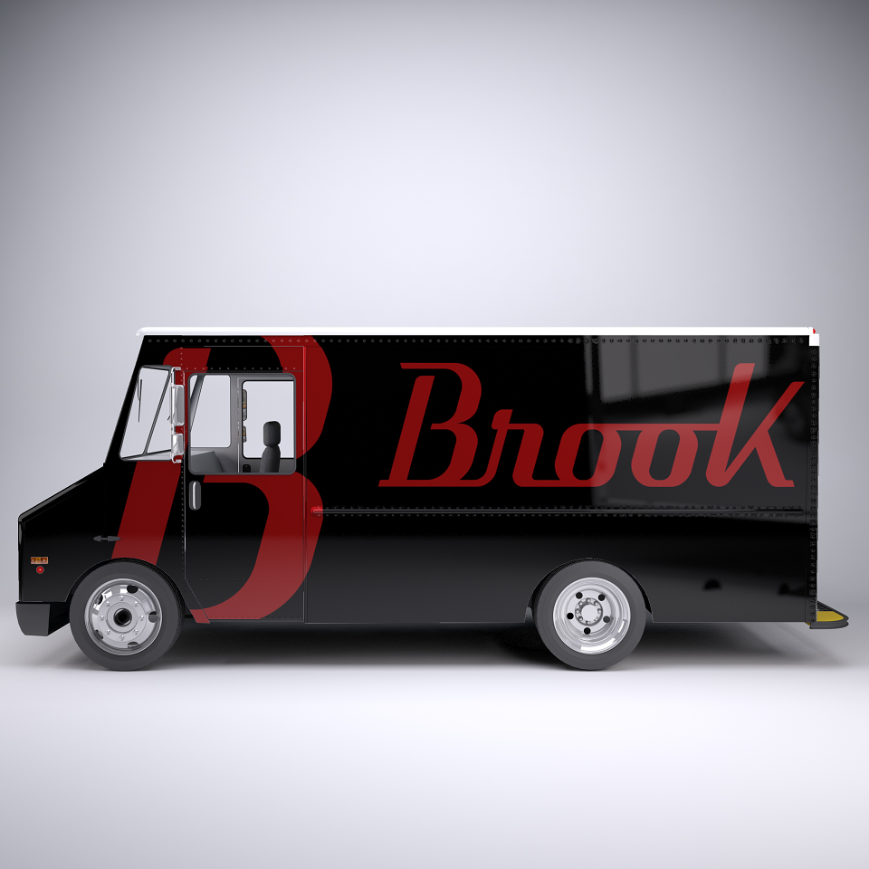
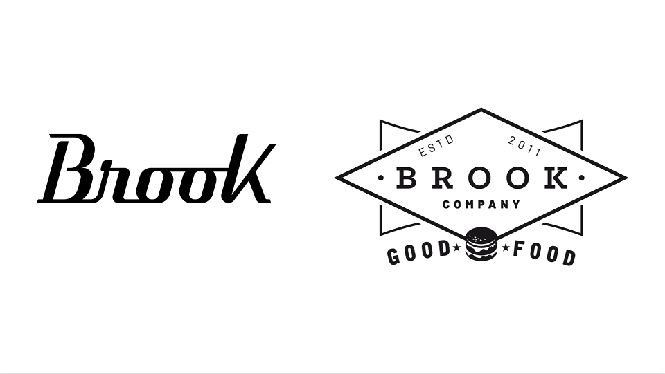
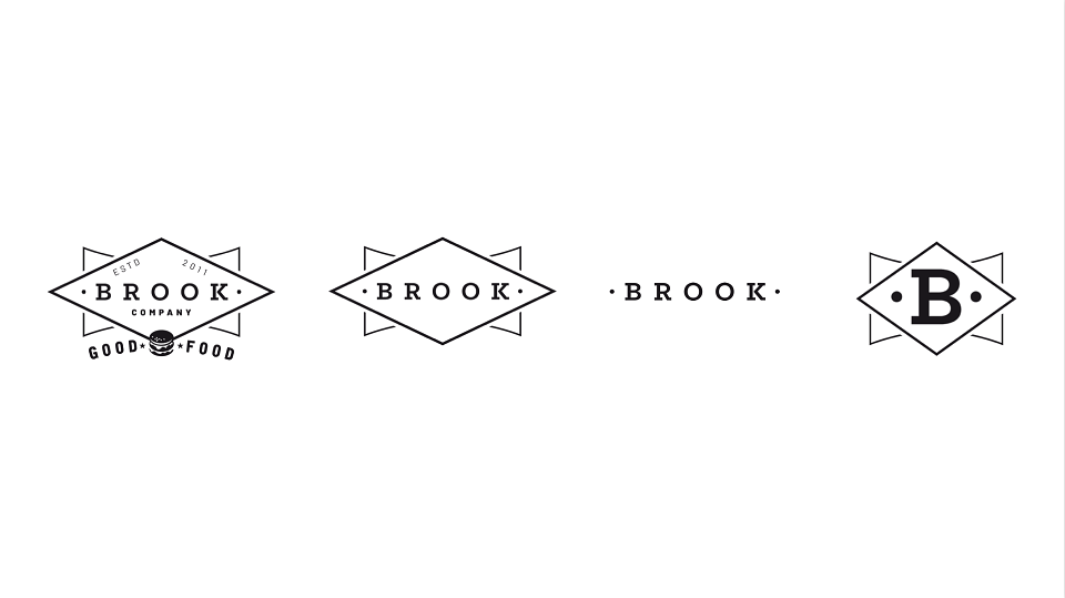
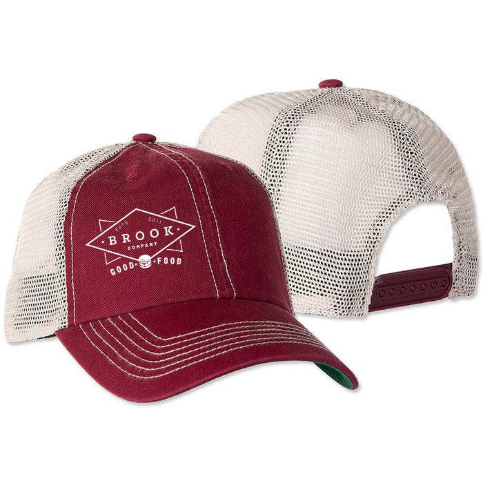
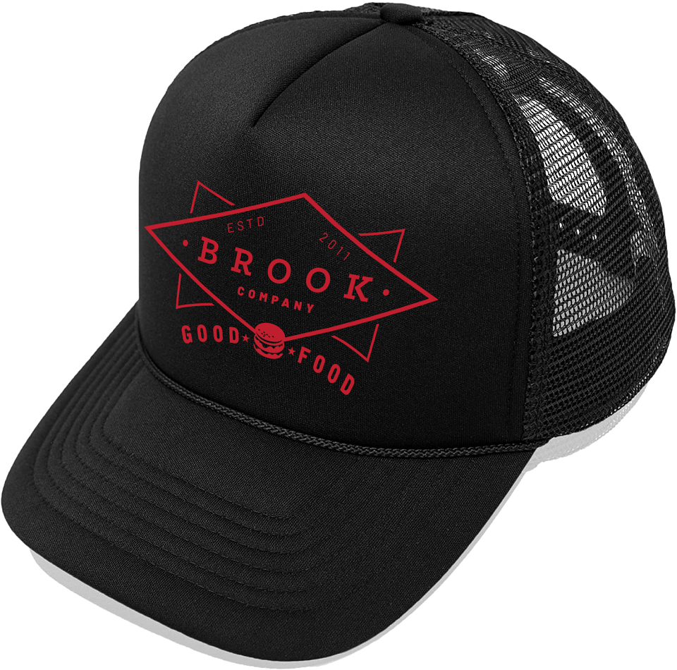
-Brand redesign — logo & visual identity: I directed the logo redesign (by Carlos Ruano AD) to bring it closer to the brand's new personality — modern, confident, premium without being precious. The charcoal and electric-yellow palette replaced the cliché Americana visual world entirely. No guitars. No vinyl. No Elvis. Just Brook.
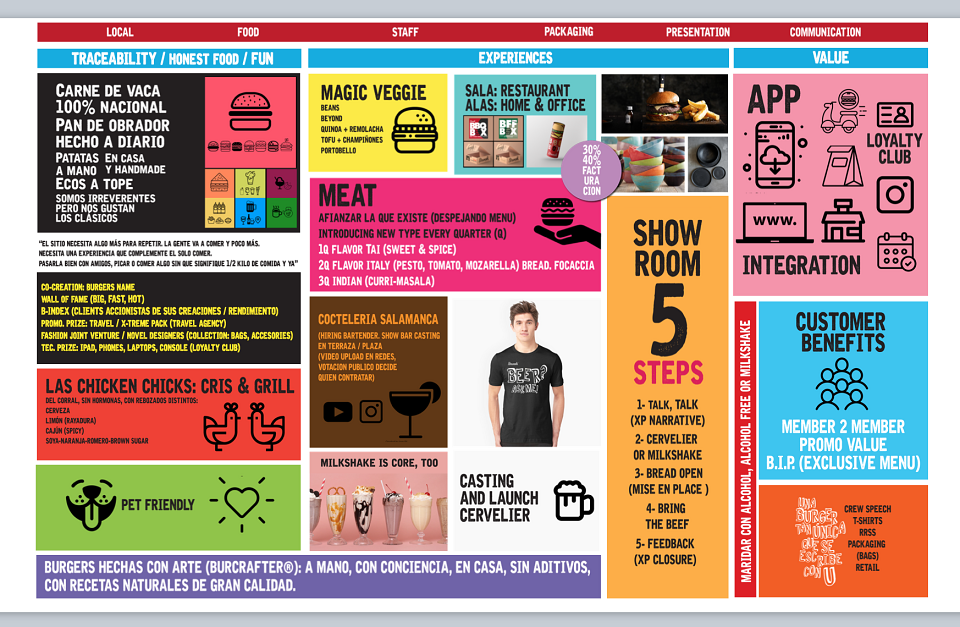
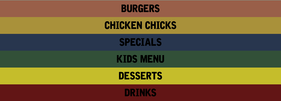
-Menu surgery — 60 items reduced to under 30: I restructured the menu from a sprawling, unfocused 60+ item list to a curated offering of under 30 items — with clear hero products, seasonal rotations, and a quarterly new-flavour introduction mechanic (Thai Q1, Italian Q2, Indian Q3). Fewer items, higher quality perception, faster kitchen execution, better profitability per dish.
-Retail experience design — Showroom 5 Steps: I designed the full in-restaurant experience system — from the entry narrative and mise en place to the 5-step service model (Talk, Cervelier, Bread Open, Bring the Beef, Feedback) that turned every visit into a branded ritual. The interior redesign direction — red banquettes, dark brick, checker accents, neon signs, wood warmth — replaced the cliché with a genuine American diner aesthetic executed with Spanish quality.
-Dark kitchen sub-brand architecture: I created Bro & Fries and Brooklyn as independent delivery-first sub-brands — each with its own visual identity, tone of voice, and target profile — operating from Brook's kitchen. This model had the potential to generate 30–40% additional revenue through delivery channels without touching the dine-in brand or adding operational cost.
-Traceability & product narrative — BURCRAFTER® platform: I built the honest food narrative around Brook's sourcing credentials: 100% national beef, daily bakery bread, handmade sauces, no additives. I named this platform BURCRAFTER® — burgers made with art, conscience, and craft — giving Brook's quality story a proprietary, ownable label.
1- Talk
XP narrative on arrival.
2- Cervelier® (Beer Sommelier)
Beers to pair with burgers.
3- Bread Open
Mise en place moment
4- Bring the Beef
Main delivery with ritual
5-Feedback
XP closure & loyalty trigger
-Brand identity
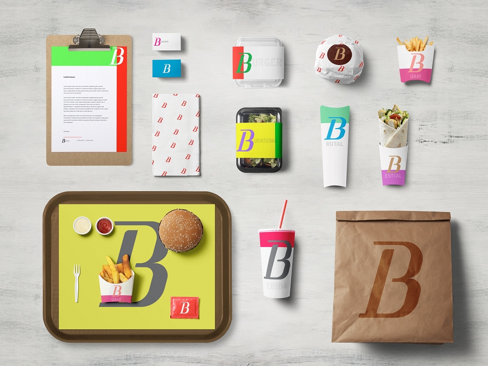
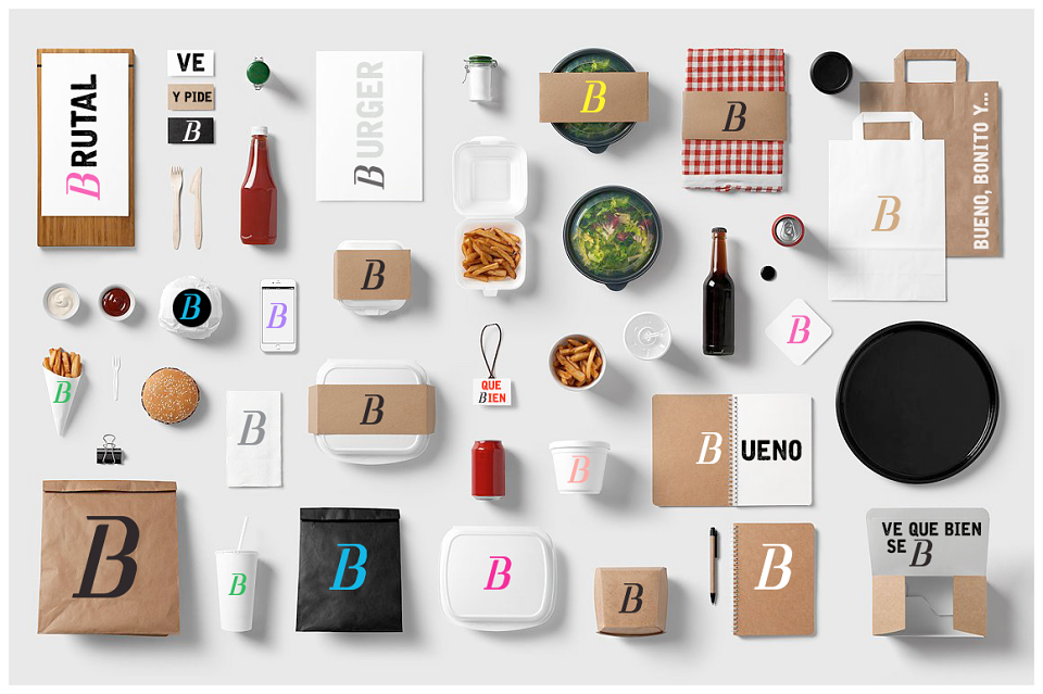
Logo redesign, full visual system, palette, typography, tone of voice.
-Retail design
Interior concept direction — banquettes, brick, checker, neon, warm wood system.
-Menu redesign
60 → under 30 items. Quarterly flavour drops. Hero products elevated.
-Sub-brand creation
Bro & Fries + Brooklyn — delivery-only dark kitchen brands with independent identities.
-Service system
5-step experience design — every table interaction scripted as a brand ritual
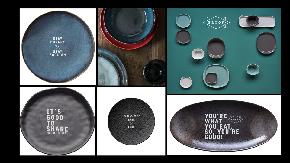
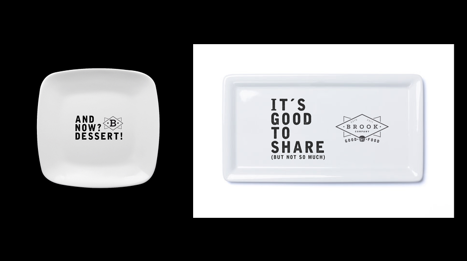
-Tableware & packaging
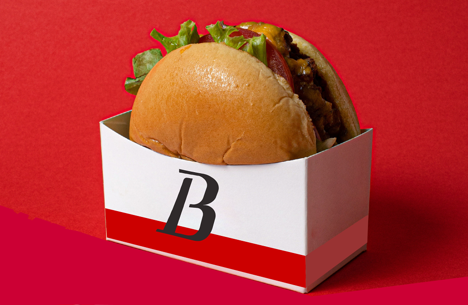
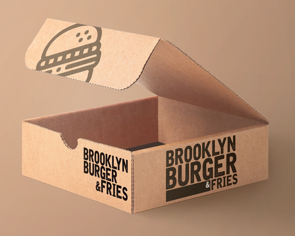
Crockery, glassware, tray liners, delivery packaging — all on-brand touchpoints.
-Loyalty — B-Index
Loyalty club, burger co-creation, Wall of Fame (Big / Fast / Hot), member privileges.
-Social & digital
Instagram, TikTok & Facebook content strategy, app integration, BURCRAFTER® storytelling.