Alejandro Esteves Ponte
Executive Creative Director | Brand Transformation
ABOUT
CHALLENGE:
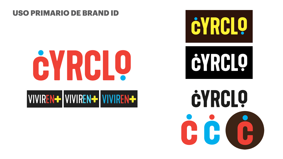
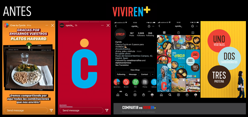
Cyrclo (logo designed by Baud) existed in a no-man's land. It was not fast food, but it felt bland and tasteless. Like hospital food. It was a sit-down restaurant, but it lacked the energy of a modern eatery. Most critically, it had built its identity around healthy eating — and somehow managed to make that feel like a punishment. The brand was visually beige: muted, forgettable, with no personality, no emotional hook, and no reason for a Madrid consumer to choose it over the dozens of comfort food spots or grab-and-go alternatives spreading across the city. The product had genuine potential. The brand and place was actively killing it.
The brief was clear: repositioning from invisible to irresistible — without losing the healthy core, and without raising prices or reinventing all the menu.
IDEA:
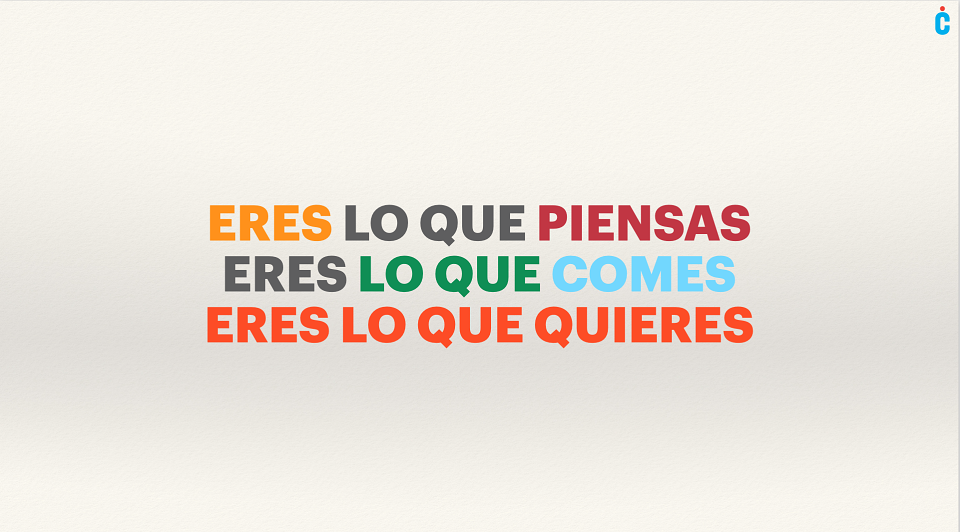
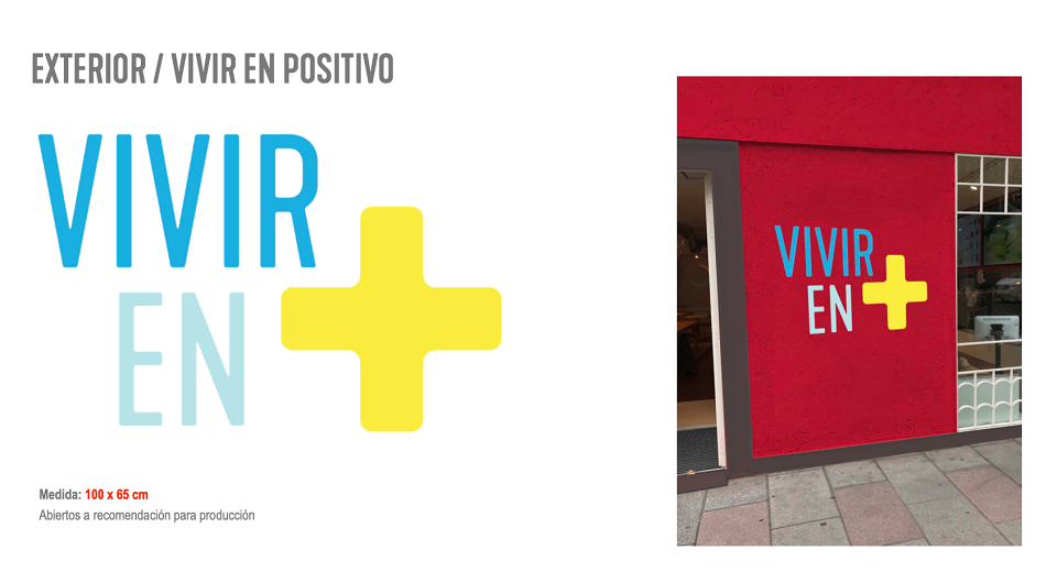
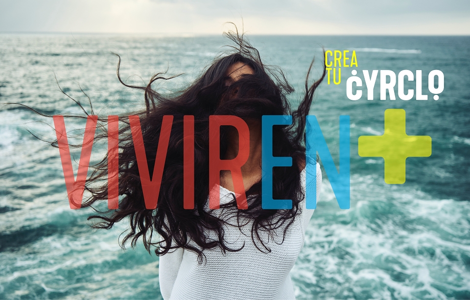
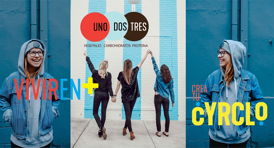
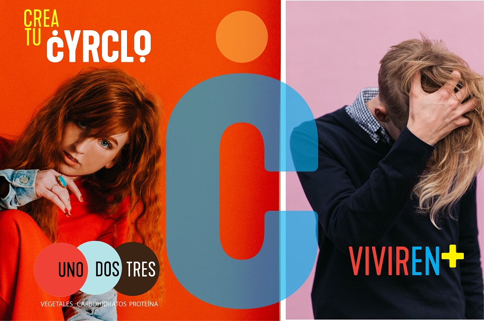
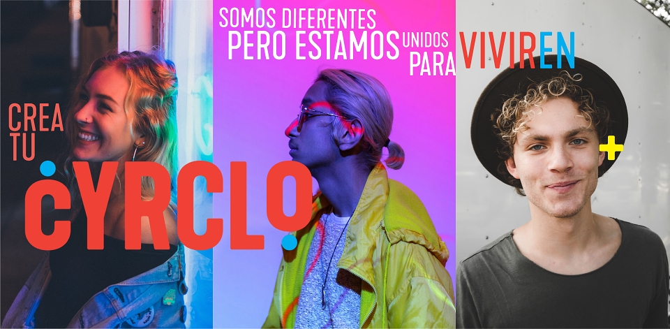
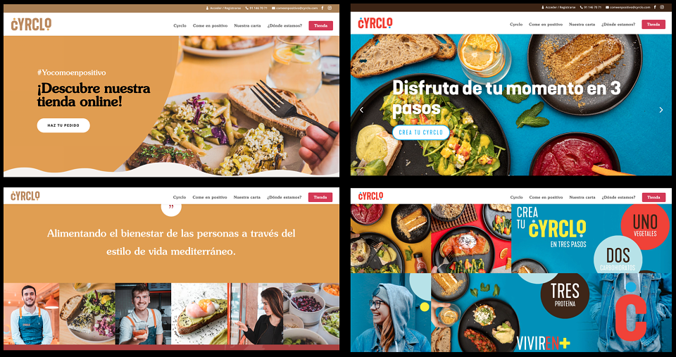
Reframe healthy eating as a positive act of living, not a diet. The brand claim — Vivir en + (Living in Positive) — repositions Cyrclo from a place you go when you're trying to eat well, to a place you go because you actually want to feel good. The entire creative direction was built on one cultural insight: Madrileños don't sacrifice — they celebrate. Eating well had to feel festive, fast, effortless, and beautiful.
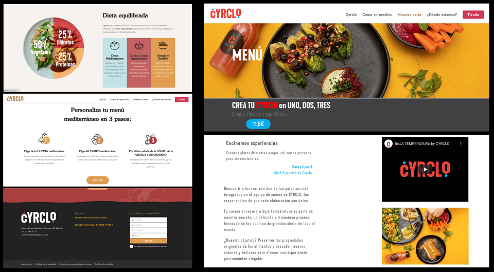
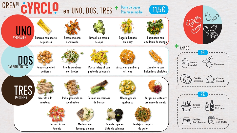
The customer experience was rebuilt around a 3-step ritual — simple, empowering, and fast — that gives every customer a sense of control and personalisation without complexity. And as Madrid's only Water Bar, Cyrclo introduced flavoured water on tap as a signature differentiator: a free, all-you-can-drink experience that no competitor could copy.
1- Choose your protein
Chicken, fish, legumes, tofu — you lead
2- Two sides + drink
Seasonal, colourful, no filler
3- Pay & go — or stay!
Optional dessert. Zero guilt either way.
The Water Bar — Madrid's first flavoured water tap station.
A signature concept exclusive to Cyrclo: free-flow flavoured still and sparkling water on tap, all you can drink. A designed, differentiated moment that reinforces the brand promise — health is abundant here, not rationed.
MY CONTRIBUTION - CREATIVE DIRECTOR:
As Creative Director, I led the complete repositioning of Cyrclo — from brand strategy and naming refinement through to retail identity, content system, and channel rollout. My contribution covered:
-Brand repositioning strategy: I defined the strategic pivot that moved Cyrclo away from the functional "healthy food" category and into the aspirational "positive living" space. The shift was both semantic and visual — renaming the emotional territory of the brand, not just redesigning the logo.
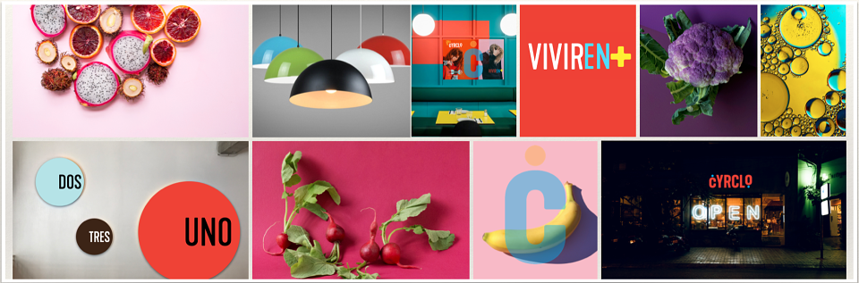
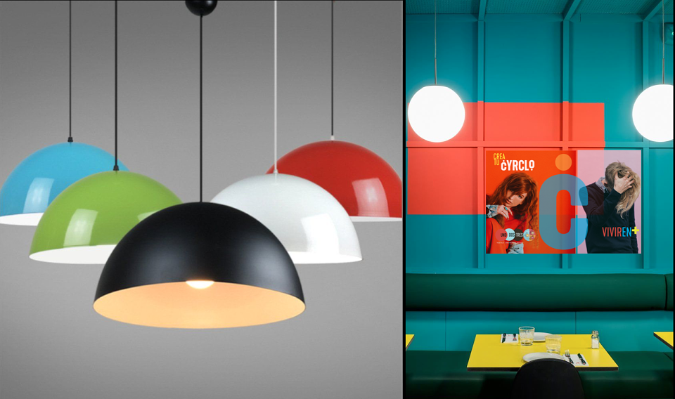
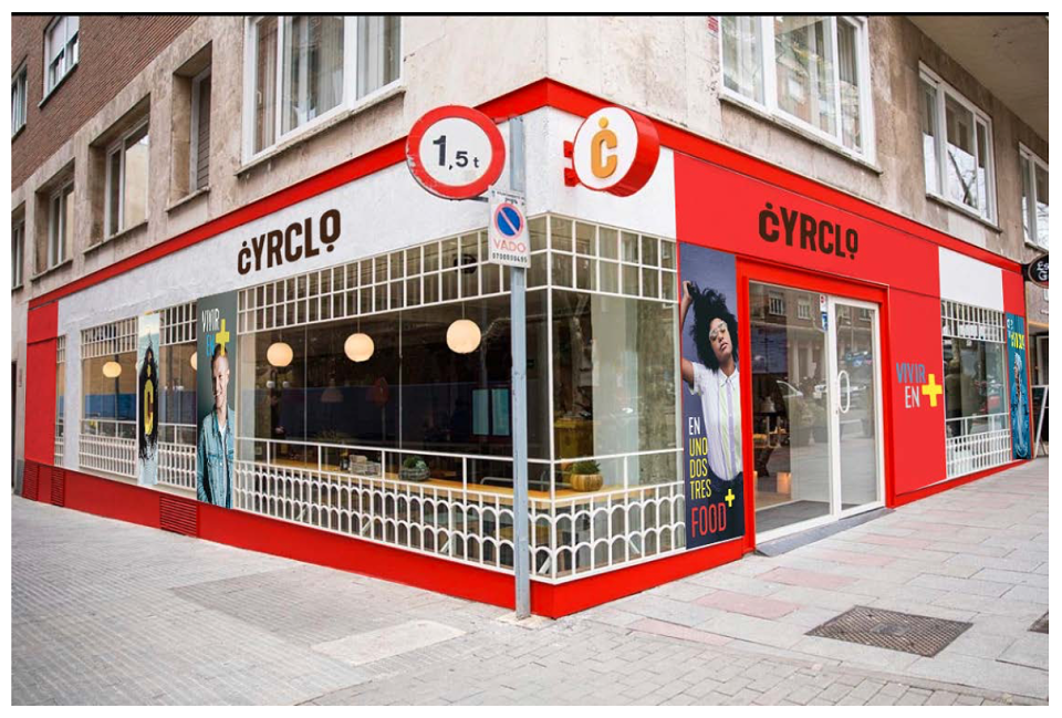
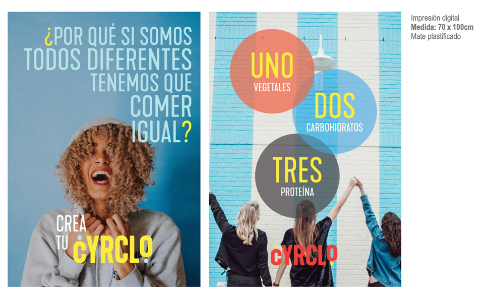
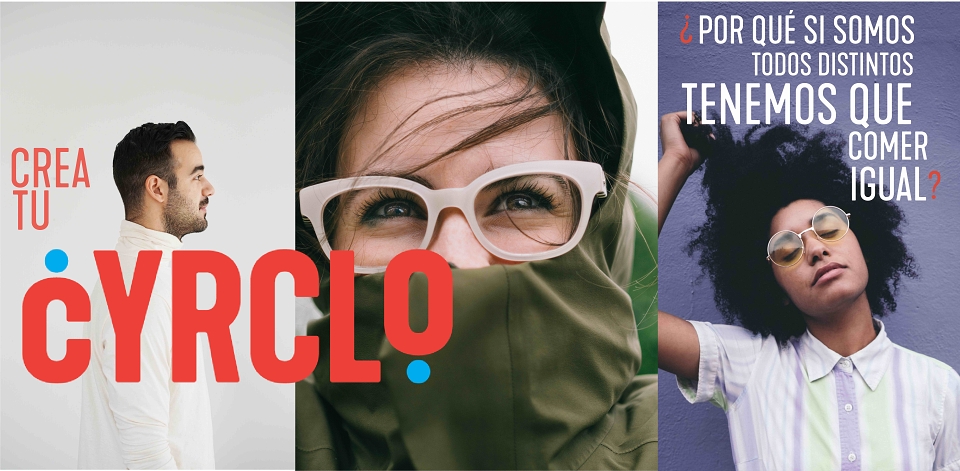
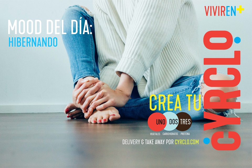
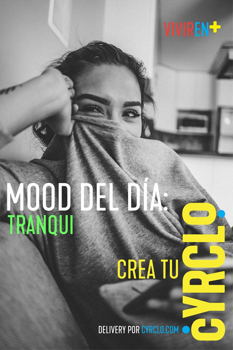
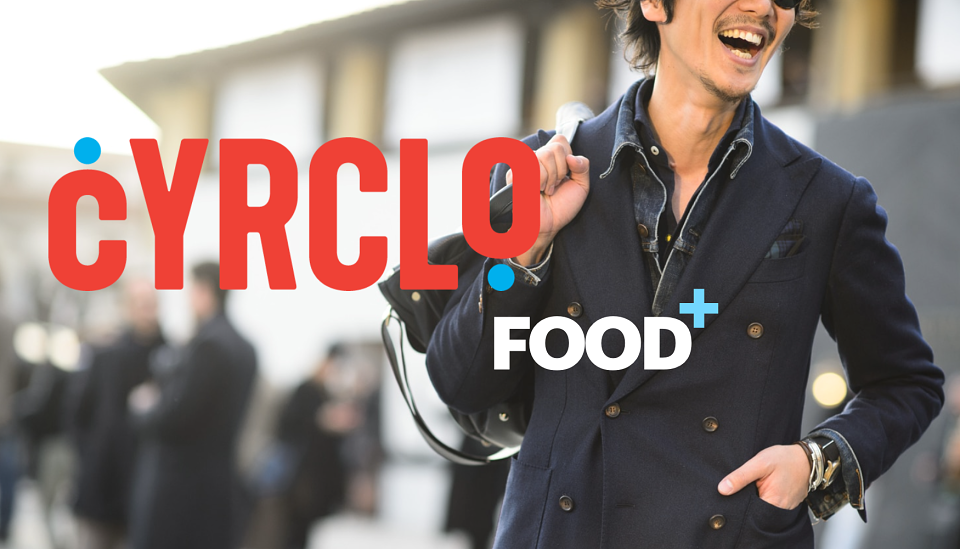
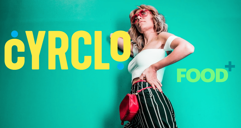
-Visual identity overhaul: I directed a full colour revolution — out went the beige palette, in came a vibrant, high-contrast system built on greens, oranges, reds, and aquas that signalled energy, freshness, and joy. The visual language was built to own the retail space and explode on social.
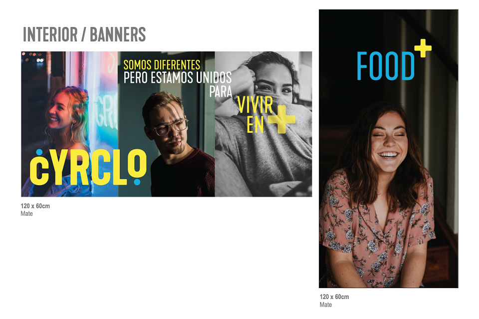
-Retail experience design: I conceptualised and directed the in-store journey — from the 3-step ordering flow signage and counter design, to the Water Bar installation as a hero feature. The space was designed to feel like a discovery, not a cafeteria.
-The Water Bar concept: I conceived the Water Bar as a proprietary brand moment — a unique, ownable experience that no Madrid competitor offered. Flavoured taps, designed station, free-flow model. It became the single most talked-about feature of the restaurant and a powerful word-of-mouth engine.
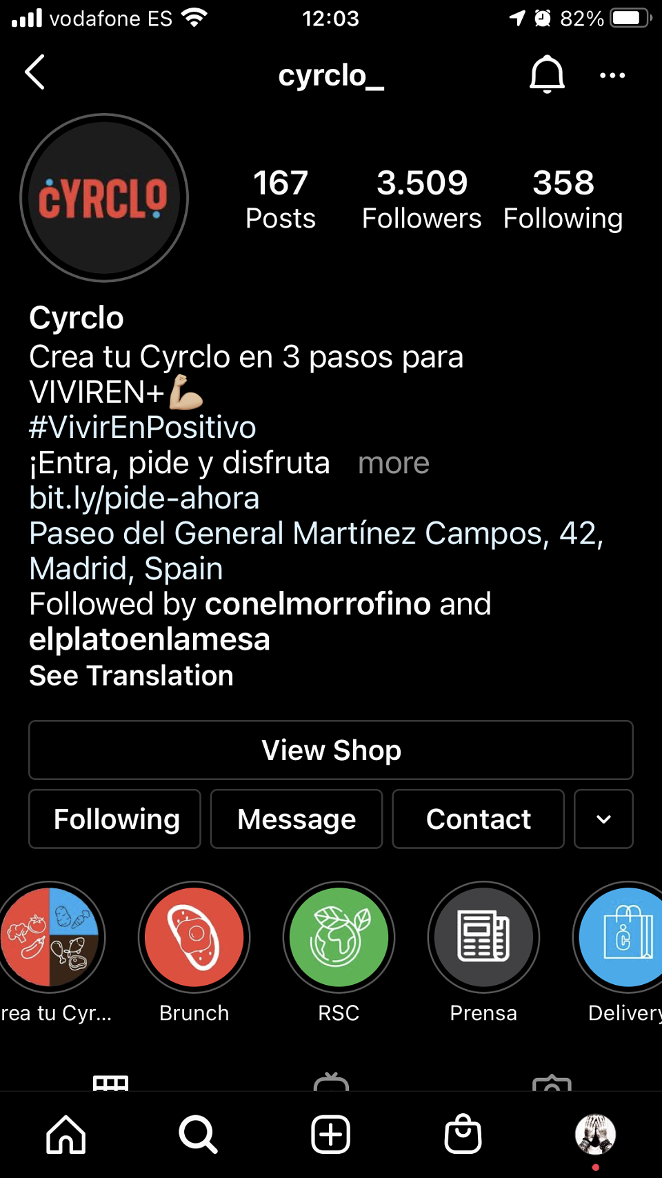
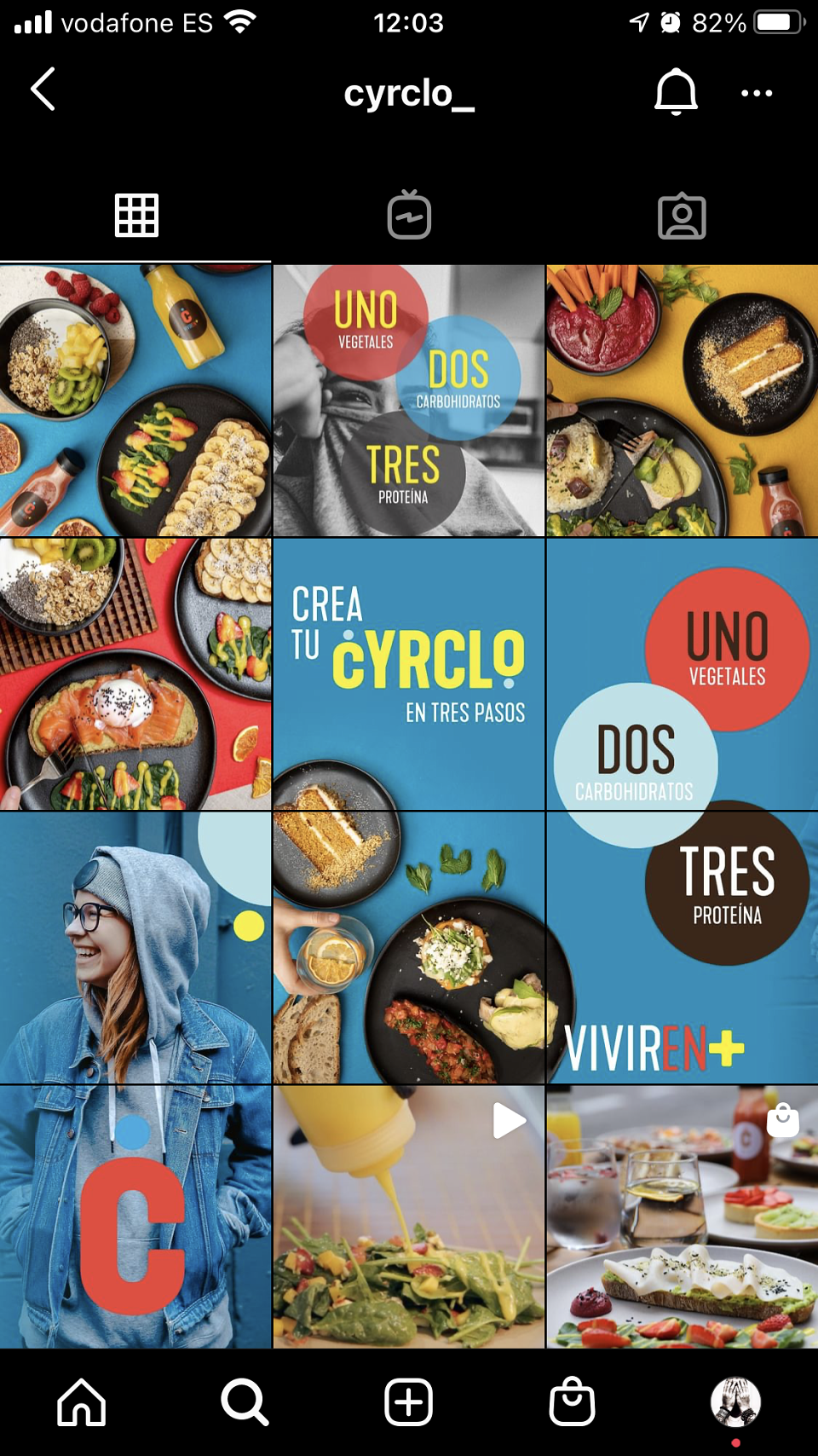
-Content & digital identity: I built the Instagram content system — a high-colour, food-forward feed built around the "Vivir en +" narrative, product close-ups, and lifestyle moments that made healthy eating look like the most desirable choice in Madrid.
-Retail identity
Full in-store design system — signage, menus, counter flow, Water Bar station.
-Instagram
Colour-driven content strategy, product photography direction, feed architecture.
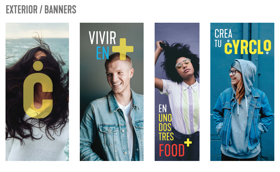
-OOH & street
Posters and street-level formats in high foot-traffic zones near the restaurant.
-Water Bar PR
Press and influencer strategy built around the Water Bar as a launch story.
-Packaging
Takeaway boxes, cups, and bags as brand carriers — every piece colourful and shareable.
-Digital ads
Social paid formats targeting health-conscious urban Madrileños aged 25–45.
-Loyalty card
Stamp a digital card app and digital loyalty mechanic — the 3-step system extended into repeat behaviour.
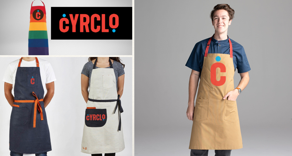
-Staff identity
Uniform design and tone-of-voice guide — brand personality expressed through people.