Alejandro Esteves Ponte
Executive Creative Director | Brand Transformation
ABOUT
CHALLENGE:
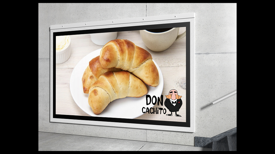
The "cachito" — a filled, horn-shaped pastry deeply rooted in Venezuelan bakery culture — was completely unknown to Madrid's food scene. The challenge was double: introducing an unfamiliar product in a market saturated with premium pastry offerings, while also carrying the weight of an immigrant food brand trying to earn credibility and affection in a new city. Without a strong character, a clear cultural story, and a retail identity that could compete visually on the shelf and on the street, the cachito would remain a niche curiosity rather than a beloved staple.
IDEA:
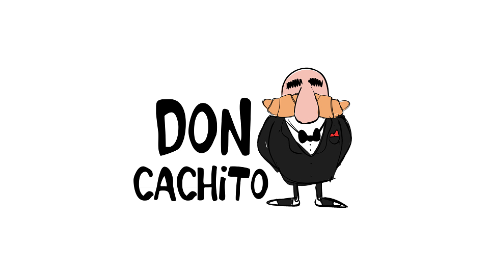
Give the brand a Don — a master baker with unquestionable authority, old-school honour, and a mustache that curves exactly like a cachito. The title "Don" carries dual power: it's the mark of respect for a family patriarch, and the tradition of the "capo" — the boss who holds the secret formula, answers to no one and take care of everyone.
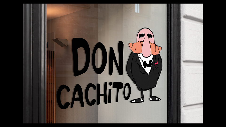
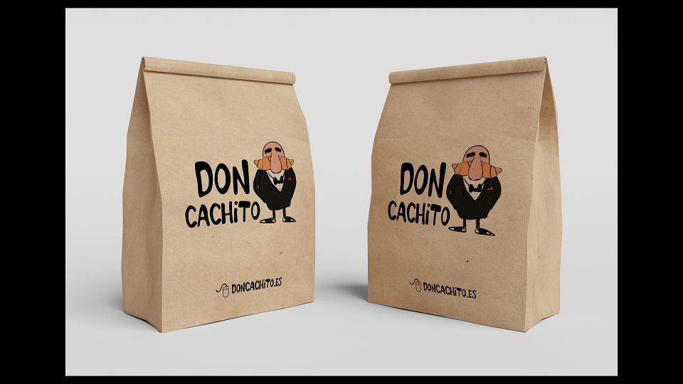
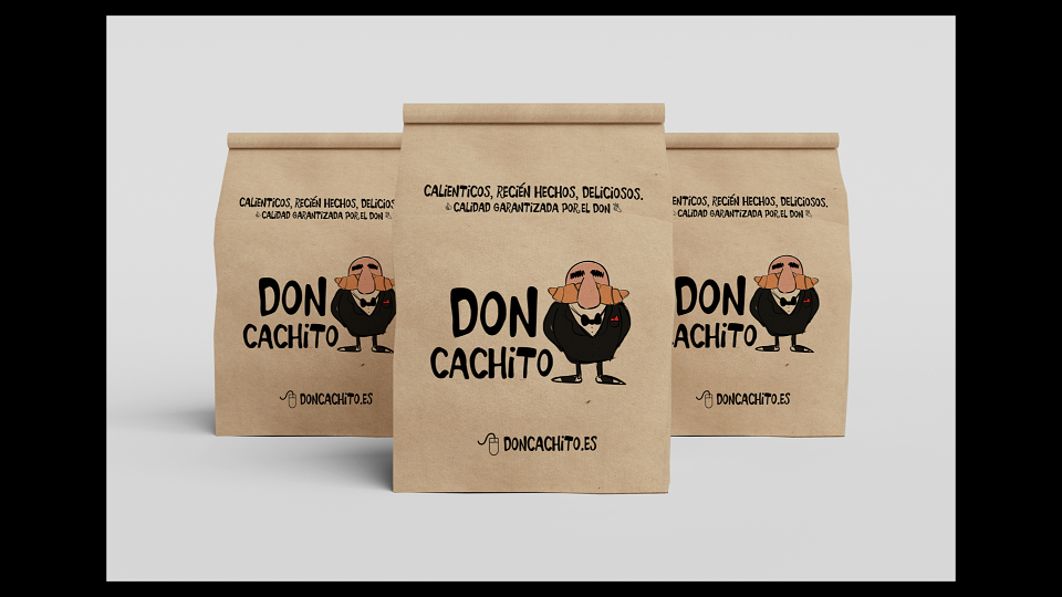
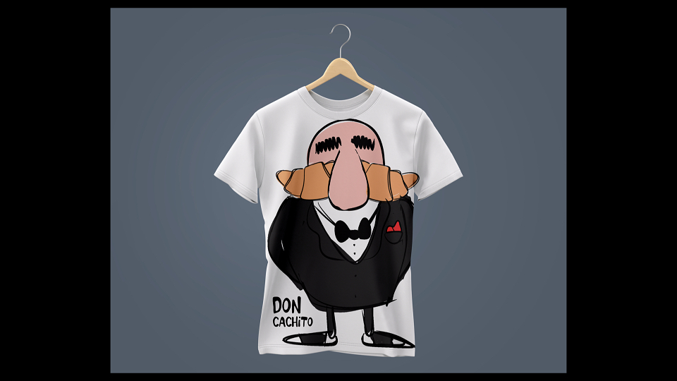
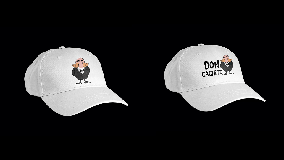
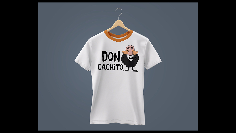
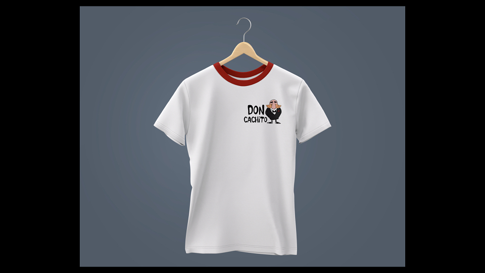
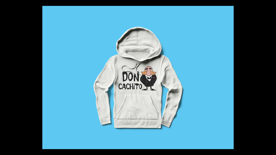
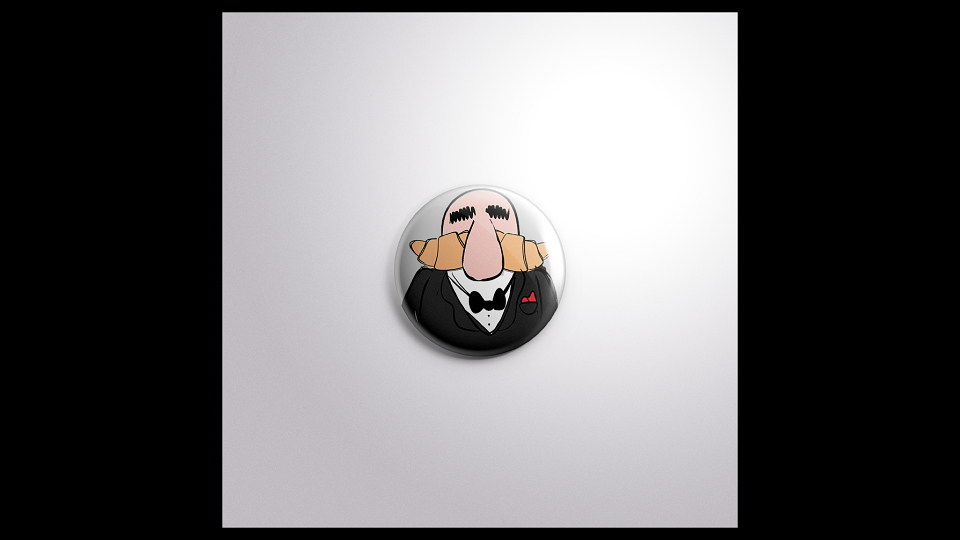
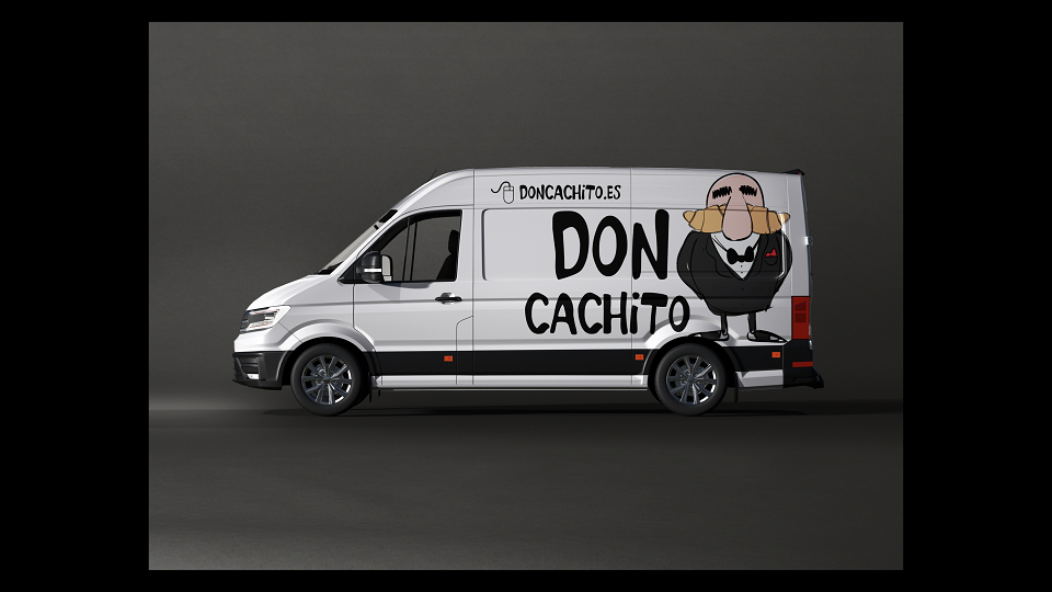
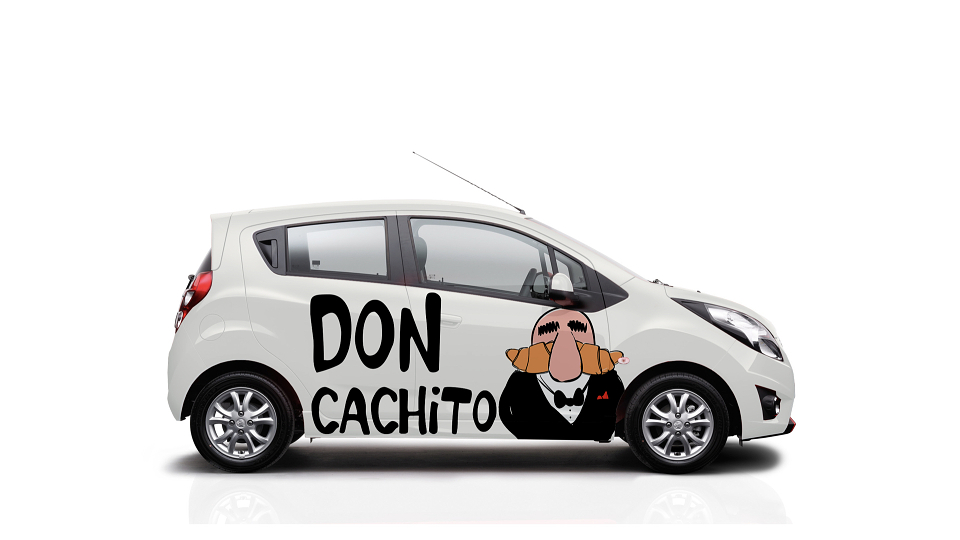
The entire brand is built around this character, drawn in bold comic-book style — expressive, warm, and instantly merchandisable. Don Cachito is not just a mascot; he´s the product made human. His mustache is "the cachito" ! His posture is the recipe. His silence is the secret.
"The recipe? It stays with me. But the cachito — that I'll share with all of Madrid."
MY CONTRIBUTION - CREATIVE DIRECTOR:
As Creative Director, I conceived and built the entire Don Cachito universe — from character creation to retail environment. My contribution covered:
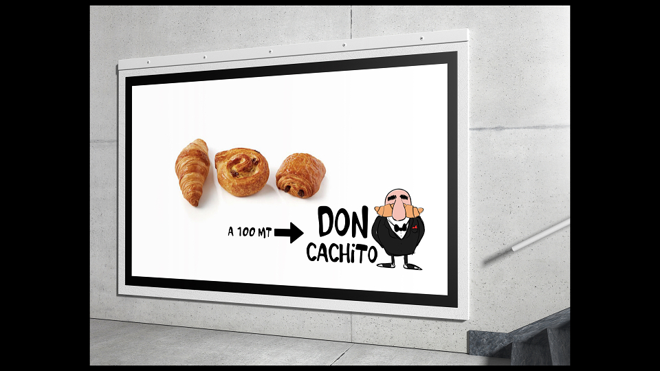
-Character design & comic aesthetic: I defined the visual DNA of Don Cachito as a hand-drawn, comic-traced character — bold outlines, eyes closed as if in profound wisdom and that signature horn mustache. The style was chosen deliberately: comic illustration travels across cultures, drives merchandise appeal, and makes the brand feel handcrafted and human rather than corporate.
-Nomenclature & brand architecture: The name "Don" was not decorative — it was strategic. I positioned it as a title of mastery and family honour, giving the brand a personality with gravitas and warmth simultaneously. The "Capo with the secret formula" narrative was embedded into every layer of the identity, from packaging copy to in-store communication.
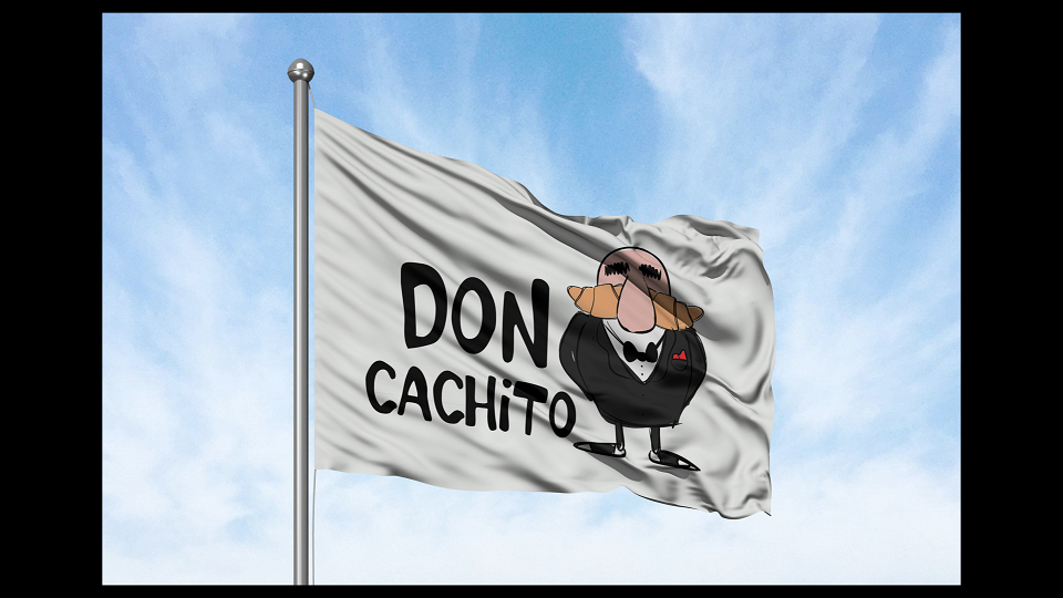
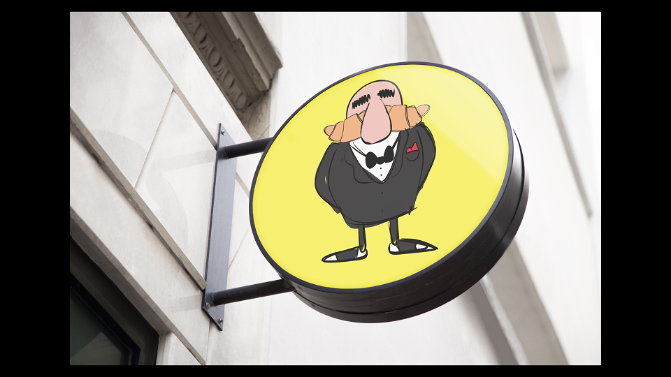
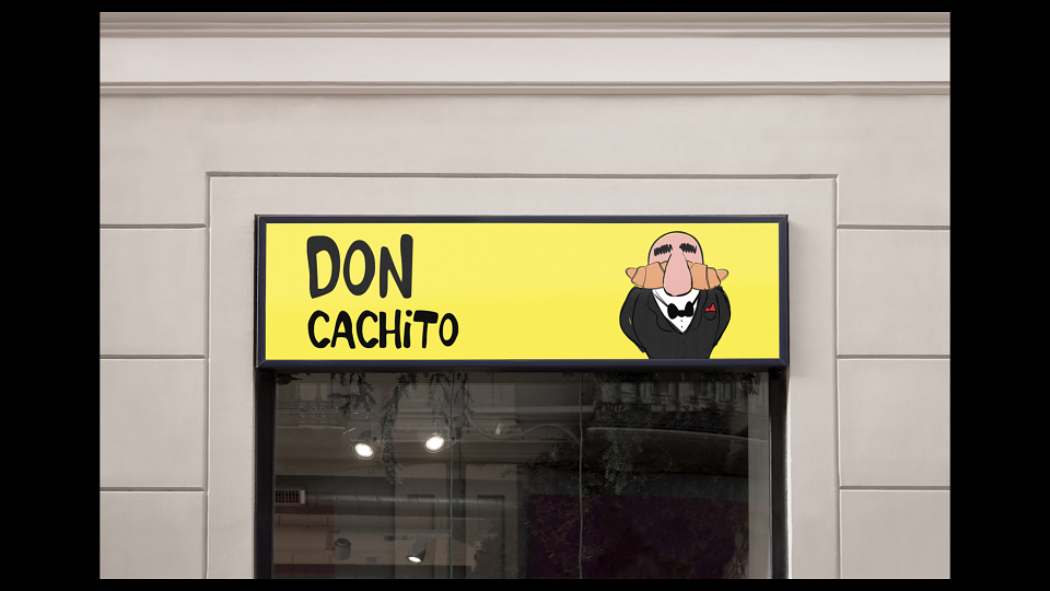
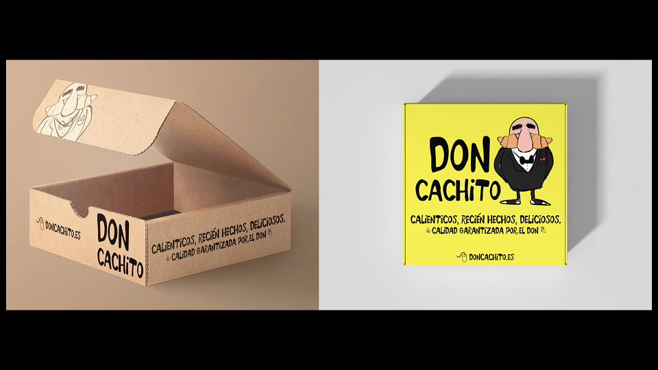
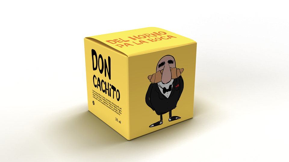
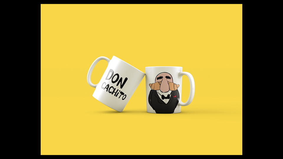
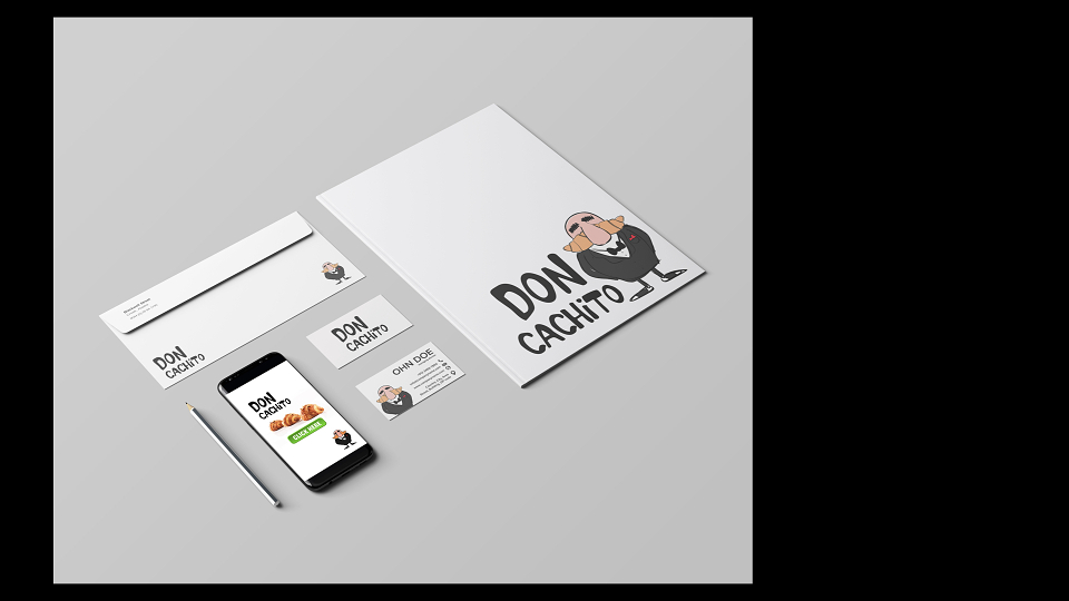
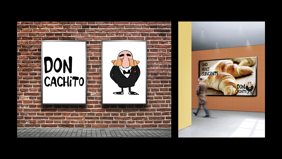
-Retail & merchandising system: I designed the full retail experience for the Madrid launch — packaging, signage, in-store character applications, and a merchandise line (totes, cups, aprons, stickers) that turns Don Cachito into a collectible icon. There's even a series of print and digital comics featuring different "villains" who want to steal Don's formula. Created in collaboration with various urban artists. The comic style was engineered to work across every format without losing personality.
-Cultural bridge strategy: I crafted the brand's entry narrative for Madrid — framing Don Cachito not as foreign food, but as a discovery: a Venezuelan legend finally crossing the Atlantic, bringing his formula with him.
Pillars:
The Don — character design
The mustache — product as icon
The secret — formula mythology