






CHALLENGE:
Miami's food truck scene in 2020 was a saturated, visually noisy landscape of burgers, tacos, pizza, sushi, ice cream, and donuts — all competing in the same formats, the same colour worlds, and the same locations. The acquisition of the Captain Lobster brand and its relaunch as Captain Lobstar presented a clean opportunity: a premium seafood product with genuine New England pedigree, a fleet-ready operation, and a truck that needed to be immediately, unmistakably visible in a crowd.
The challenge was both strategic and visual. The brand had to differentiate at the kerb — making the truck stop people mid-stride — while simultaneously communicating product quality (authentic Maine lobster rolls, fresh ingredients, original recipes) that justified premium pricing in a market conditioned to expect $10 street food. A forgettable truck with a generic wrap would have killed the business before the first roll was sold.
IDEA:
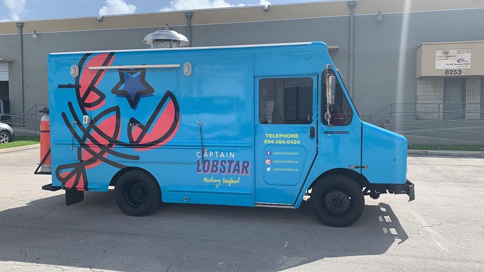
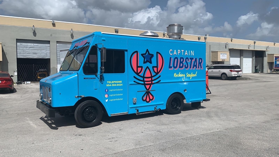
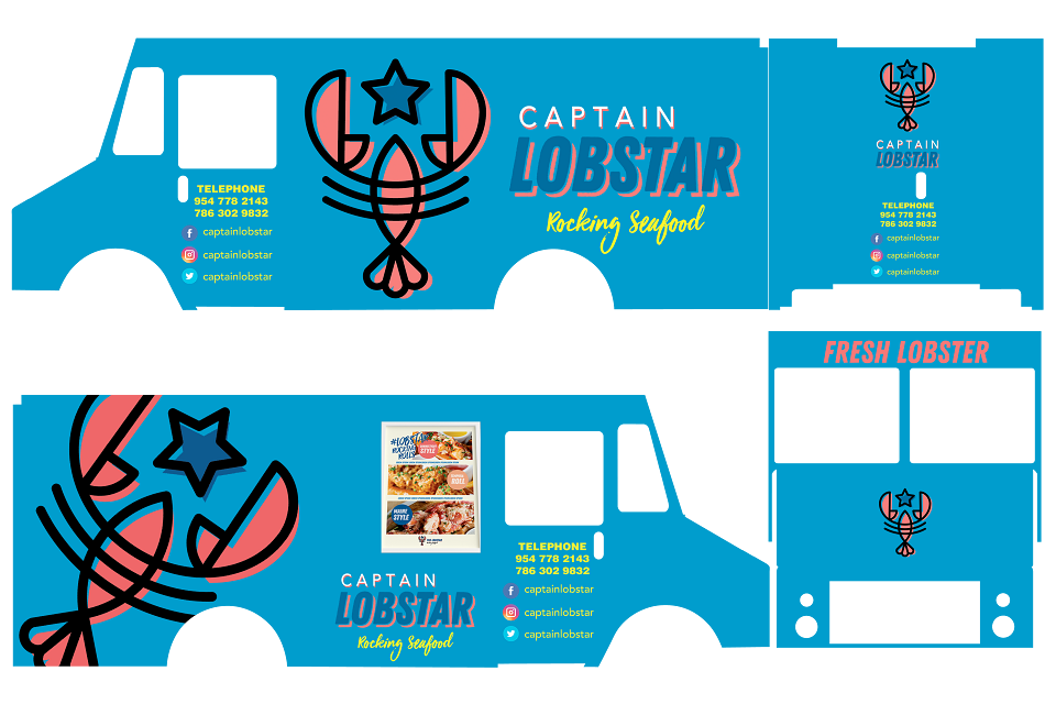
Own the colour no one else had claimed. After researching Miami and Florida's active food truck landscape, I identified a clear visual gap: no food truck in the market was sky blue. The combination of electric light blue and vintage salmon-pink was not just beautiful — it was a strategic territory claim. Blue for the sea. Pink for the American lobster. Together: a moving canvas that reads as fresh, premium, and completely unique the moment it turns a corner.
The truck wrap was designed as a giant illustration — an abstract, graphic lobster rendered in bold comic lines over the pink circle, referencing street art and pop culture rather than traditional seafood restaurant codes. No anchors. No fishing nets. No rustic wood textures. Captain Lobstar would feel like a rock concert for your appetite — hence: Rocking Seafood.
The naming adaptation from Lobster to Lobstar was also deliberate: the star suffix elevated the brand from product descriptor to personality — a rock star of the sea. The hashtag system (#LobStarRockingRolls) turned every customer's Instagram post into an organic campaign impression.
-Sky Blue
The sea. Claimed. Zero competitors in this space.
-Vintage Salmon
The American lobster. Warm, premium, appetite-driving.
-Deep Navy
Contrast anchor. Typography, outline, authority.
-Butter Yellow
Melted butter. Contact info highlight. Appetite cue.
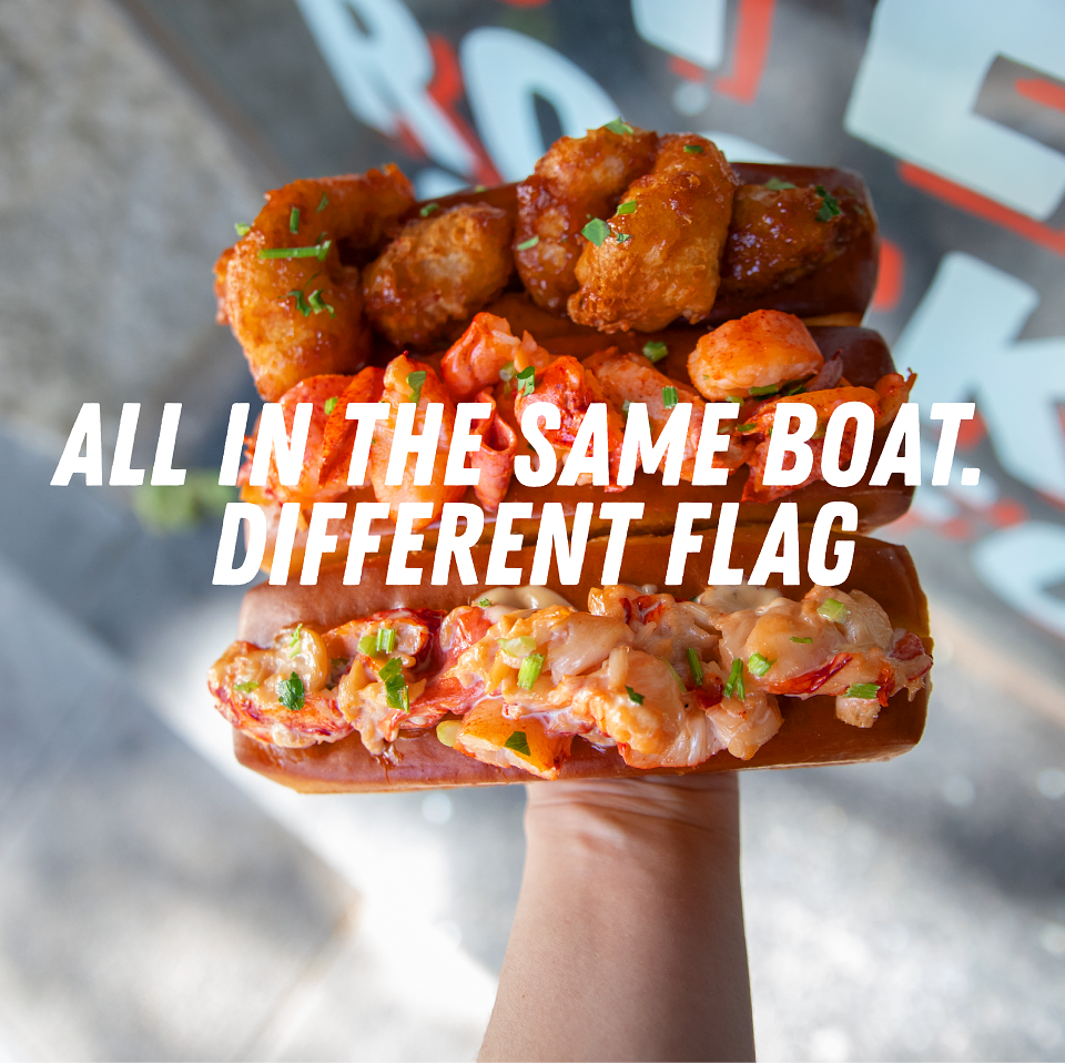
Hero product — The Roll menu (Maine originals):
The Black Pearl
Maine lobster, bacon, avocado, garlic-cilantro sauce, toasted NE bun
$19
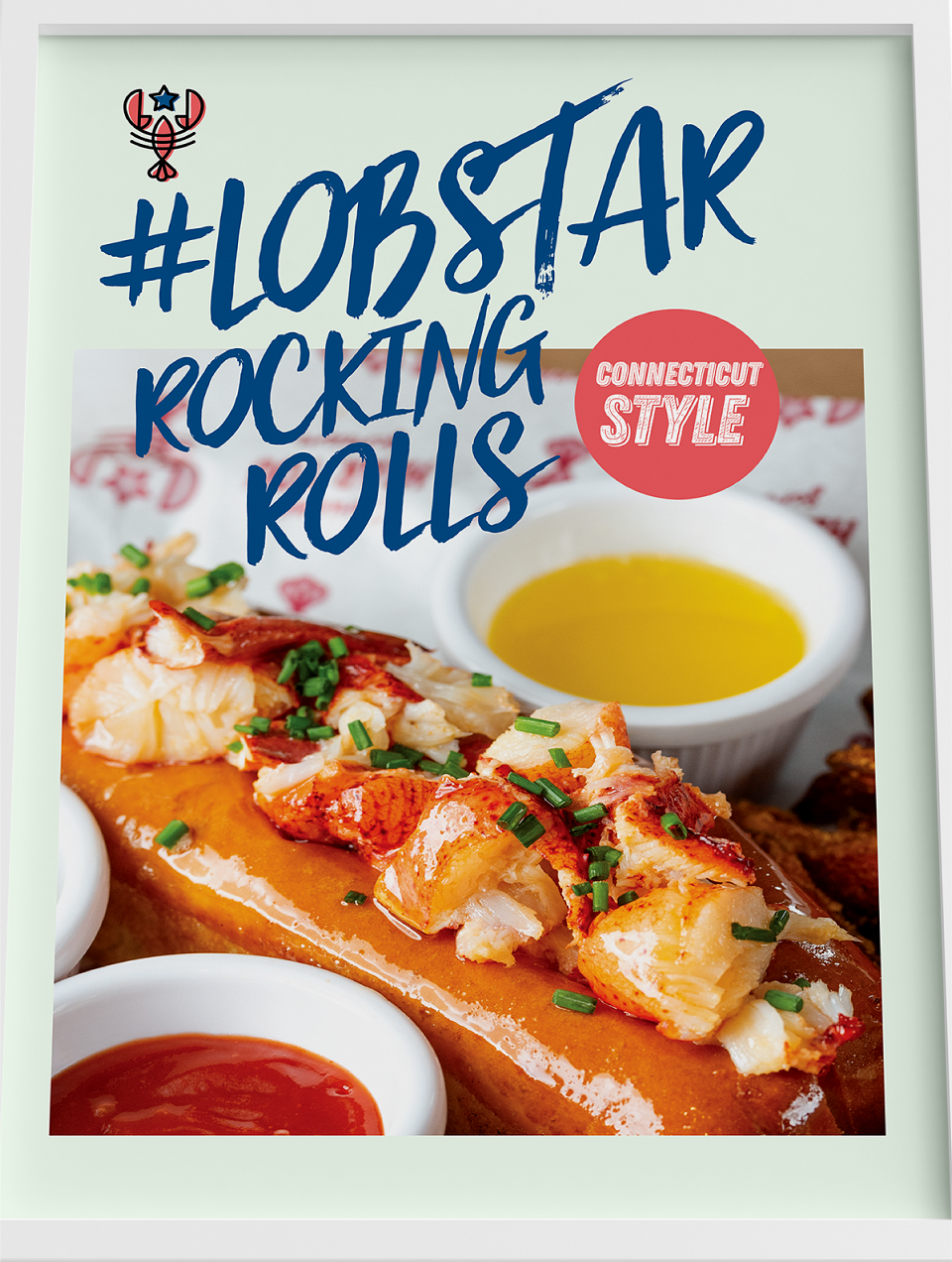
Connecticut Style
Chilled Maine lobster, warm butter, lemon, green onions, NE bun
$17
Caravell Garlic
Maine lobster, warm garlic butter, lettuce, lemon, NE bun
$17
Fried Boat
Fried shrimp + fried calamari + fries — the signature combo plate
$20
MY CONTRIBUTION - CREATIVE DIRECTOR:
As Creative Director, I directed the full brand adaptation and truck design for the US launch of Captain Lobstar — from competitive colour research through to the complete visual system, truck wrap design, menu board, and brand extensions:
-Competitive colour research & visual territory: I mapped the Miami food truck visual landscape and identified sky blue + vintage salmon-pink as an unclaimed, high-impact colour combination. This was not aesthetic preference — it was strategic positioning. The truck needed to be the only blue truck in Florida, and it became exactly that.
-Brand adaptation — Lobster to Lobstar: I managed the naming transition from the acquired Captain Lobster brand to Captain Lobstar, preserving the equity while injecting a stronger personality. The star suffix repositioned the brand from product to character — the rock star of the seafood world — and enabled the entire "Rocking Seafood" menu platform.
-Full truck wrap design — Creel 1 flagship: I directed the wrap design for the first truck (Creel 1), the flagship of the Florida fleet. The giant abstract lobster illustration — bold outlines, salmon fill, navy strokes — was designed to work as a street-level icon: recognisable at distance, photographable up close, and unmistakable in any food truck court or festival lineup.
-Menu board & appetite communication system: I designed the sandwich board and in-truck menu display system, applying the principle that in food truck environments, visual product photography drives up to 200% more sales than text-only menus. Every top-seller and high-margin item was hero-featured.
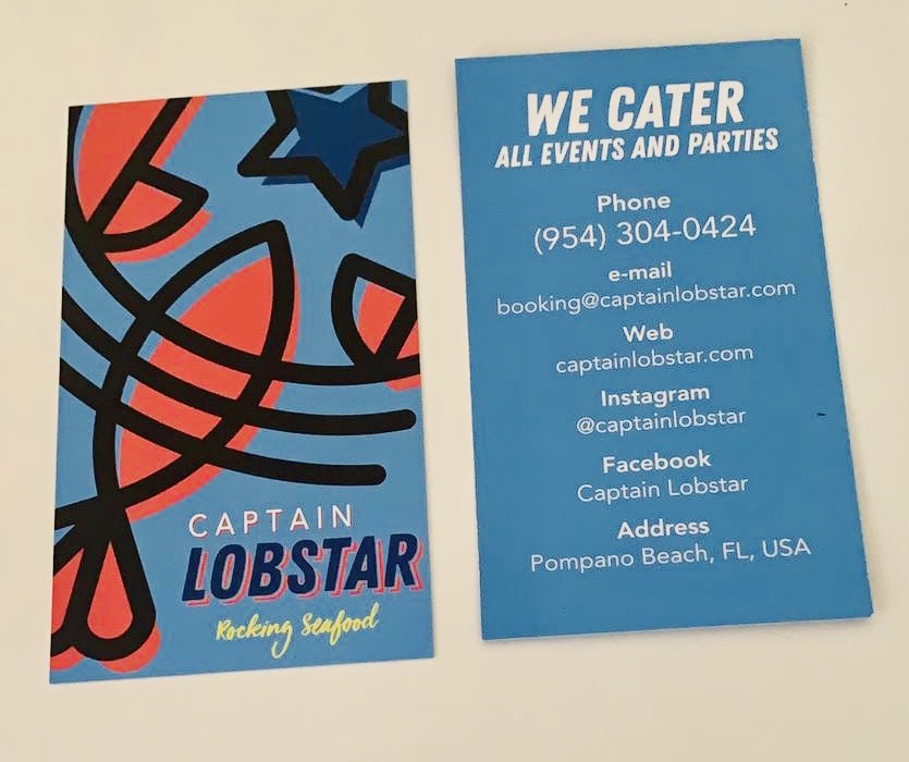
-Brand extensions & catering strategy: I directed the brand identity application across all touchpoints — from in-truck signage and A-frame boards to catering, weddings, and corporate events positioning. The truck's mobile format was leveraged as both a revenue stream and a moving billboard, driving organic awareness across South Florida's events, festivals, and corporate campuses.
-Loyalty & upsell
Loyalty programme design, topping upsell system — 30–50% revenue uplift strategy.
-Seasonal menu
Limited-edition roll strategy per season and celebration — Valentine's, Halloween, Thanksgiving.
-Merchandise
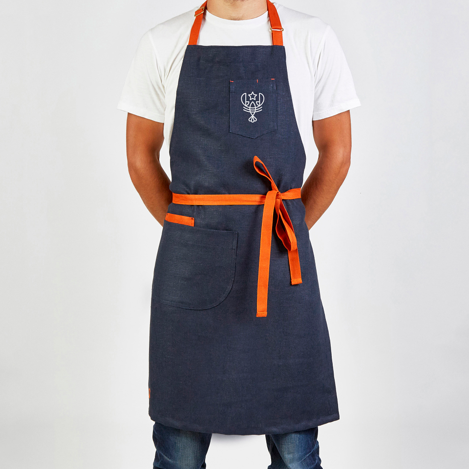
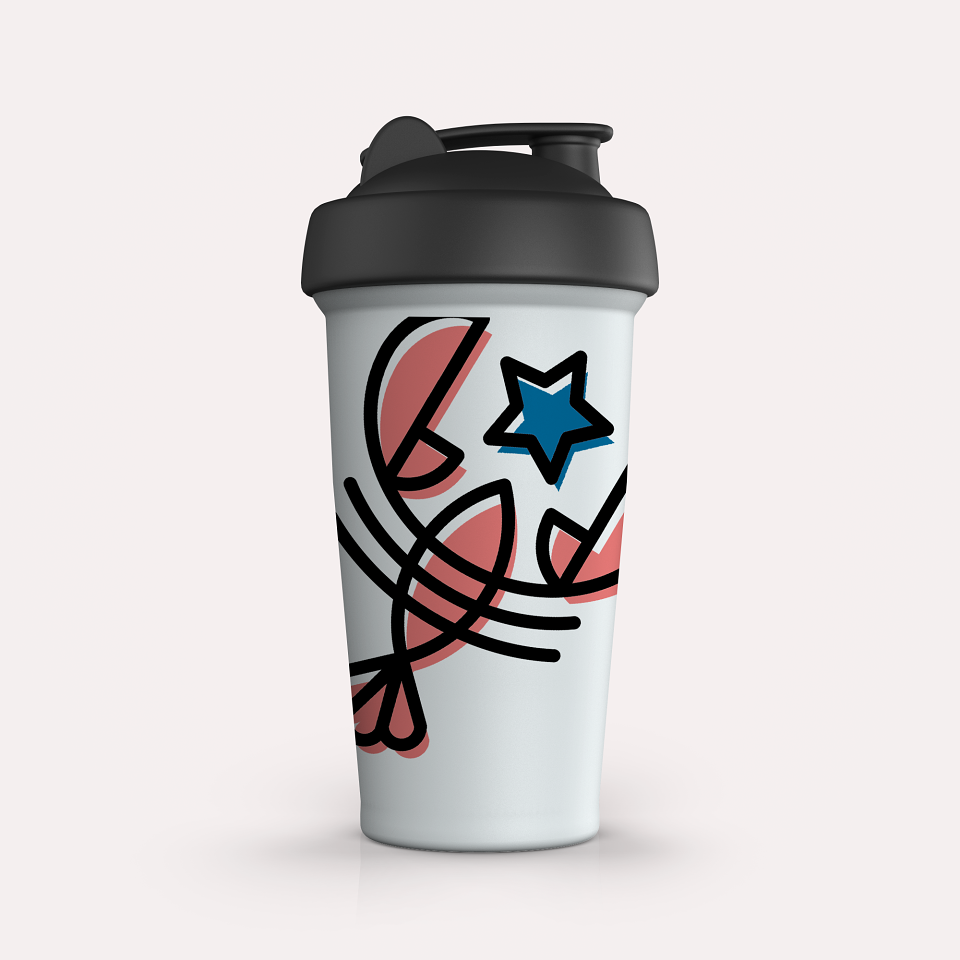
Caps, bags, can coolers, barbecue kitchen utensils — useful merch that extends the brand off the truck.