Alan
Studio Director
ABOUT
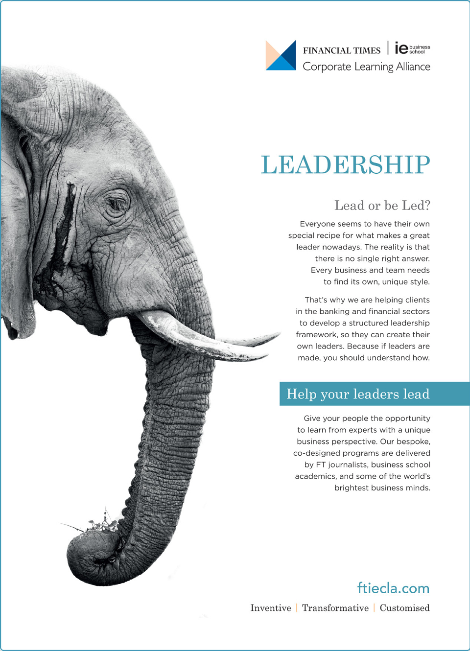
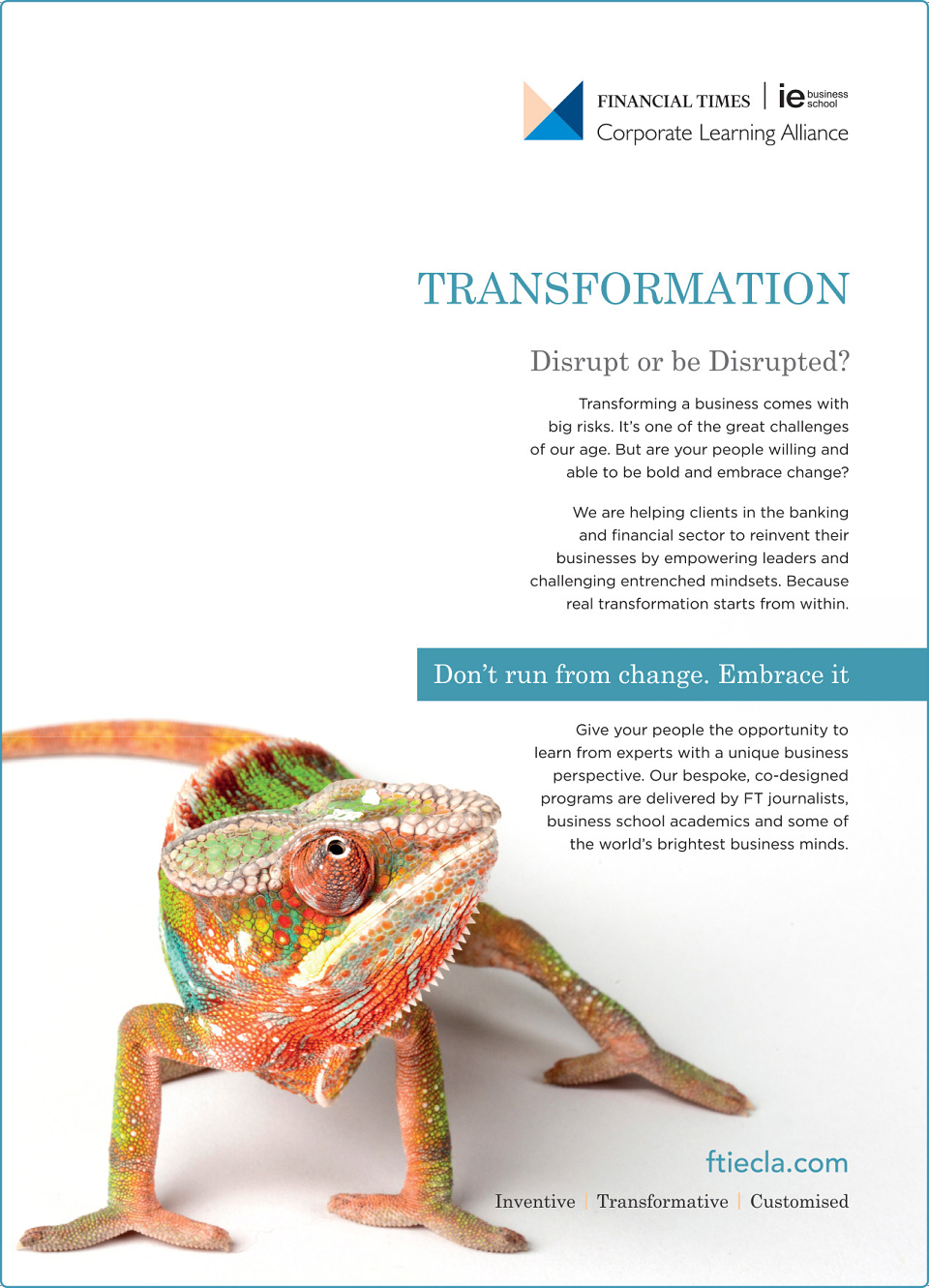
FTIECLA is currently looking to refresh it's collateral in the lead up to a full re-brand (led by myself). The Head of Marketing required a couple of full-page adverts for inclusion in The Banker. The brief was to create something simple, clean and fresh that communicated what we offer in a simple, engaging and effective manner.
Adverts created previously by this company (before my time) were cluttered and somewhat stoic. I used animals as a means by which to convey the overarching themes. And although the connections are fairly simple and i'm sure this has been done many times before, I wanted to use strong imagery and bold colours to bring these to life and evoke an emotive response. I wanted the images to act as the way in to the content, and align with the headline text nicely. I was particularly pleased with the leadership version as the use of b&w felt intriguing and the connection is not immediately obvious.
In this industry, this is a bold approach and steers away from the use of corporate, conservative colours and imagery. I'll let you know what the impact is once these are out in print!
MADEIT CREDITS
-

Financial Times | IE Business School Corporate Learning AllianceClient
-

AlanGraphic Designer