ABOUT
Palmolive is a legacy brand with efficacy at the heart of its promise. With the growth of 'natural' brands and shifting consumer expectations, Palmolive had to rethink itself as a brand that stands for more than a sole functional benefit. They would need to be a brand that could live in an eco-friendly world, inspiring optimism for everyone.
Our challenge was to re-energize the brand through a refreshed visual identity they could apply to packaging and across their brand ecosystem to communicate their evolved values.
An iconic household brand, Palmolive dishwashing liquid has long been a trusted cleaning product that consumers can rely on to get the job done. With no shortfalls in efficacy, Palmolive found themselves at a pivotal point in their brand journey: they needed to put a bigger stake in the ground when it came to sustainability.
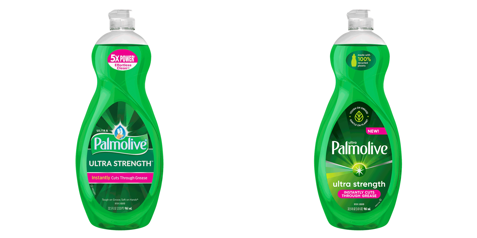
Having already made the transformative decision to move to bio-friendly ingredients in their dishwashing liquid and 100% recyclable plastic bottles, Palmolive needed to communicate this shift both visually and verbally. Now, not only could Palmolive continue to get your dishes clean, but they could accomplish something bigger – optimism for a brighter future was at play.
With an abundance of momentum, the time was ripe to refresh Palmolive’s identity and packaging in a way that could signal change, while still maintaining its strong heritage and reputation for making a product that works.
With a brand evolution in the making for over a year, entering the process when we did meant landing new creative and getting it to market fast.
Working from a strong brand foundation, including an iconic logo that would remain untouched, we needed to identify ways to modernize and simplify key elements of Palmolive’s identity and packaging to better communicate efficacy and shine a light on their improved sustainability.
Grounded in research, we worked together to uncover new opportunities and explore what could be for this legacy brand while staying true to the brand’s core essence.
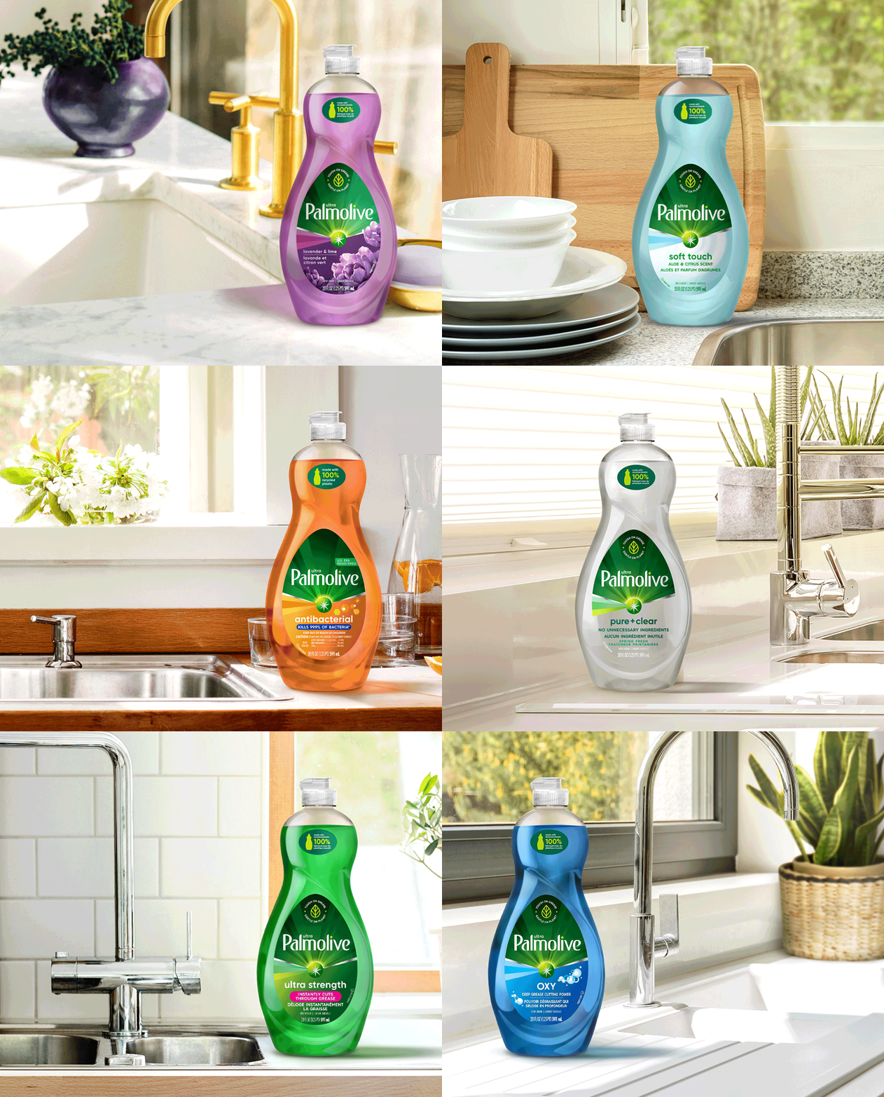
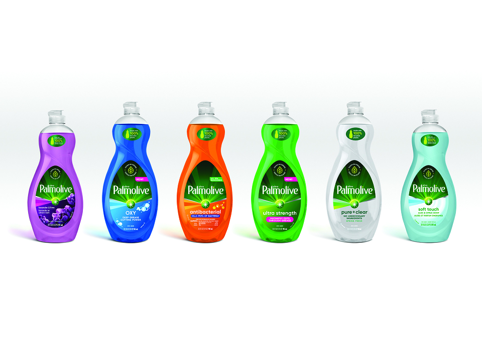
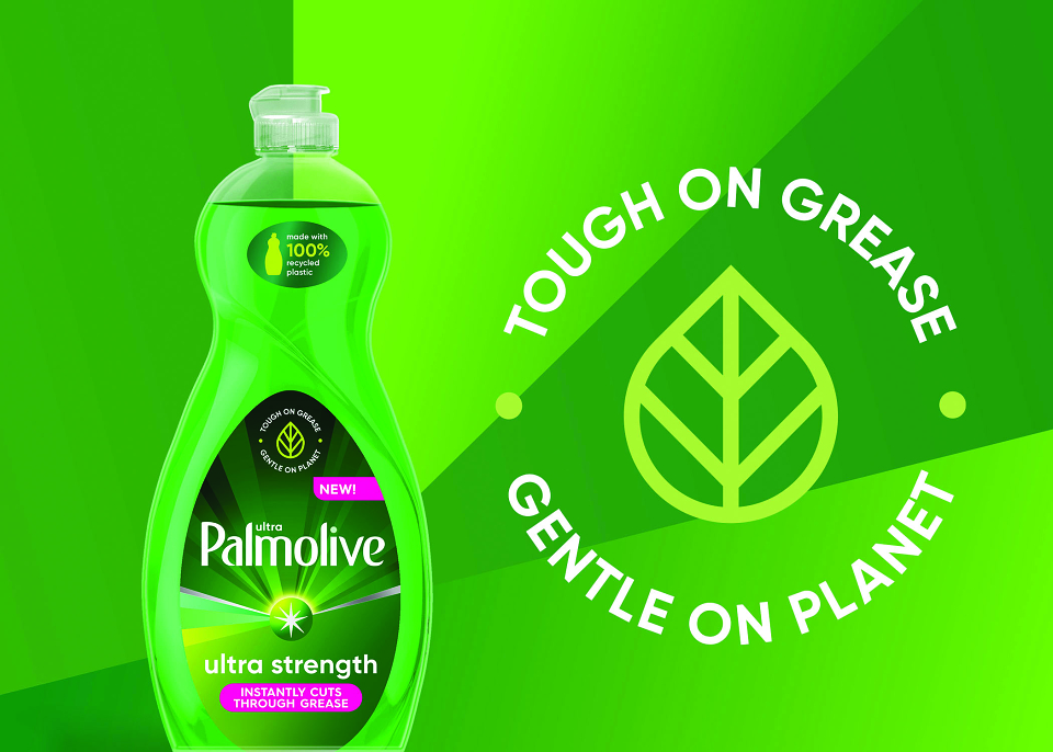
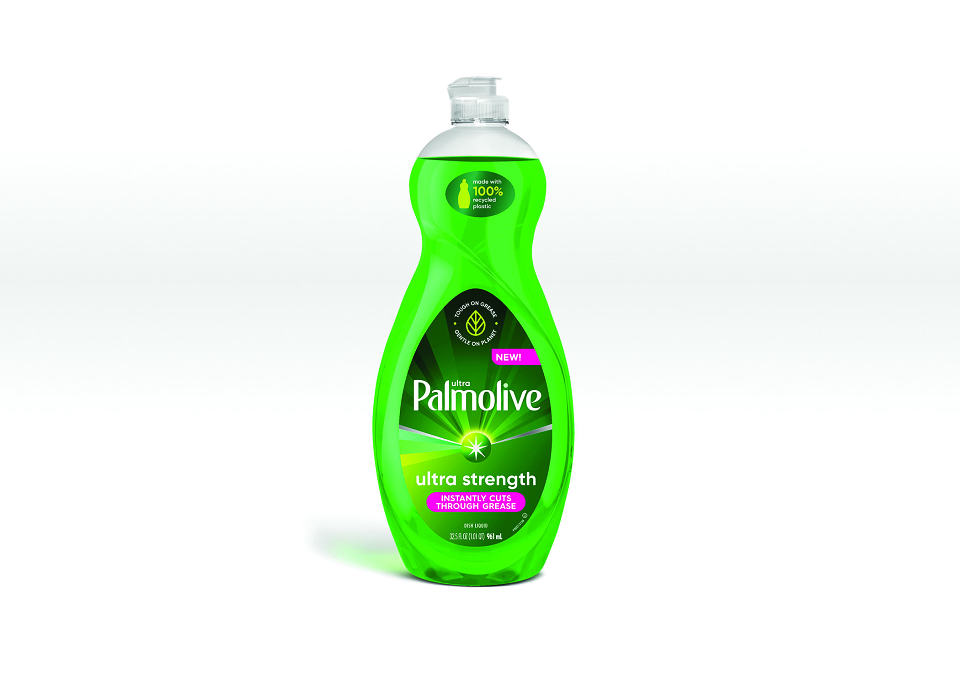
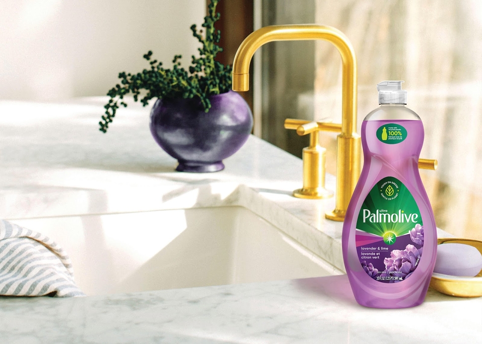
We arrived at new visual elements to serve as universal, inclusive, contemporary catalysts for Palmolive’s brand evolution. The most distinctive change on the packaging is the Ping which acts as an activation point below the Palmolive name to represent the unleashing of an efficacious cleaning power. The newly defined rays that originate from the Ping further emphasize activation and reach while also adding a feeling of bright optimism. The equity seal that reads “Tough on Grease. Gentle on Planet” simplifies how Palmolive communicates their commitment to sustainability and provides a subtle nod to their familiar tagline.
Beyond new packaging design, we codified these new distinctive assets to define what they meant and how they fit into the brand ecosystem. A brand governance system would enable Palmolive teams to apply the new identity regardless of channel or touch-point.
The essence of this legacy brand remains the same. Through subtle shifts in icons, graphic elements and messaging we were able to establish a new perspective with deeper meaning.
The simplicity of these changes means Palmolive can stay true to their core equities while still communicating their new place in the world and allowing them to have different conversations with consumers. A refreshed website provides a new place for the brand to connect with consumers in a meaningful way from both an educational and shopping perspective.