Adam Bradley
In House Designer
ABOUT
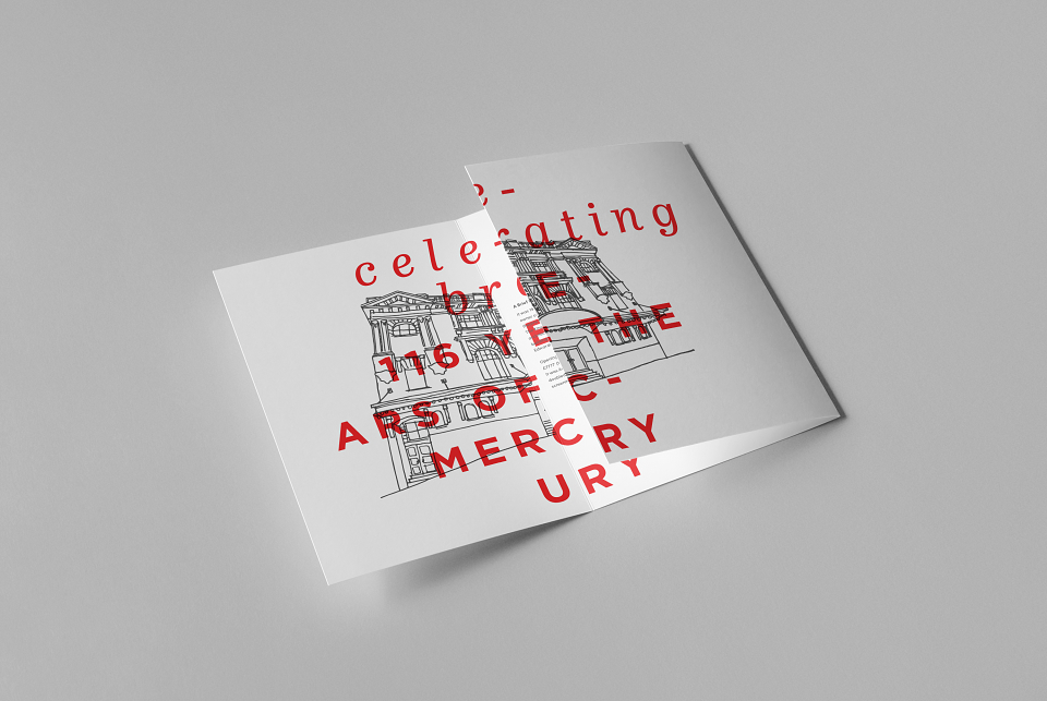
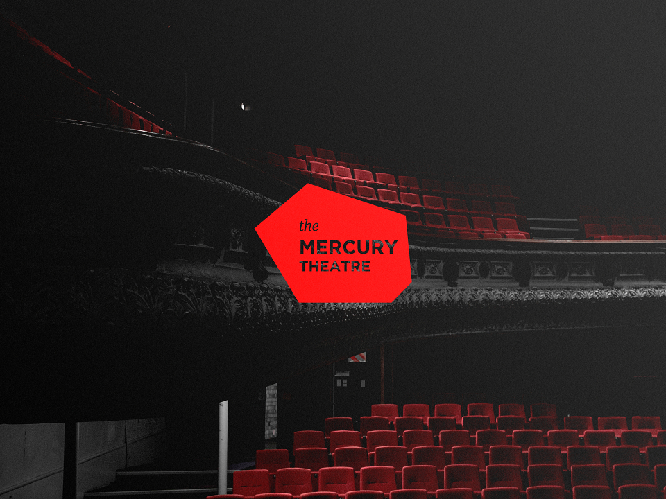
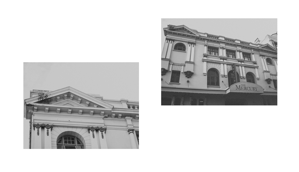
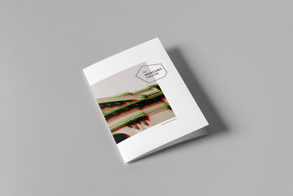
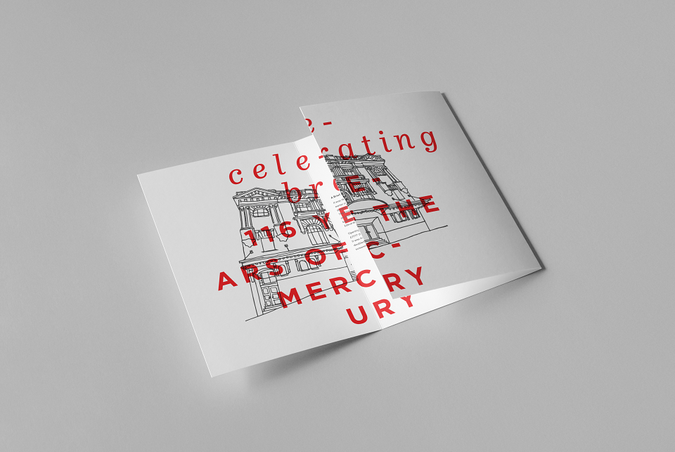
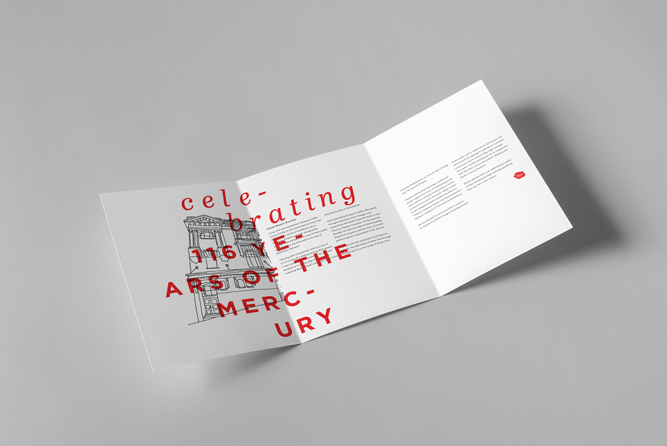
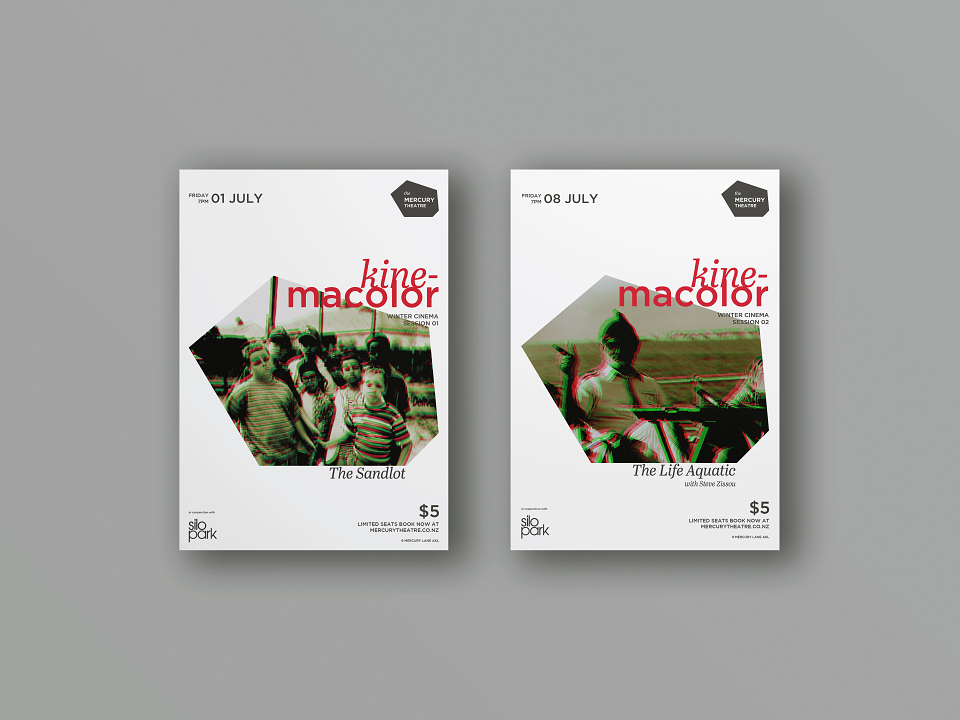
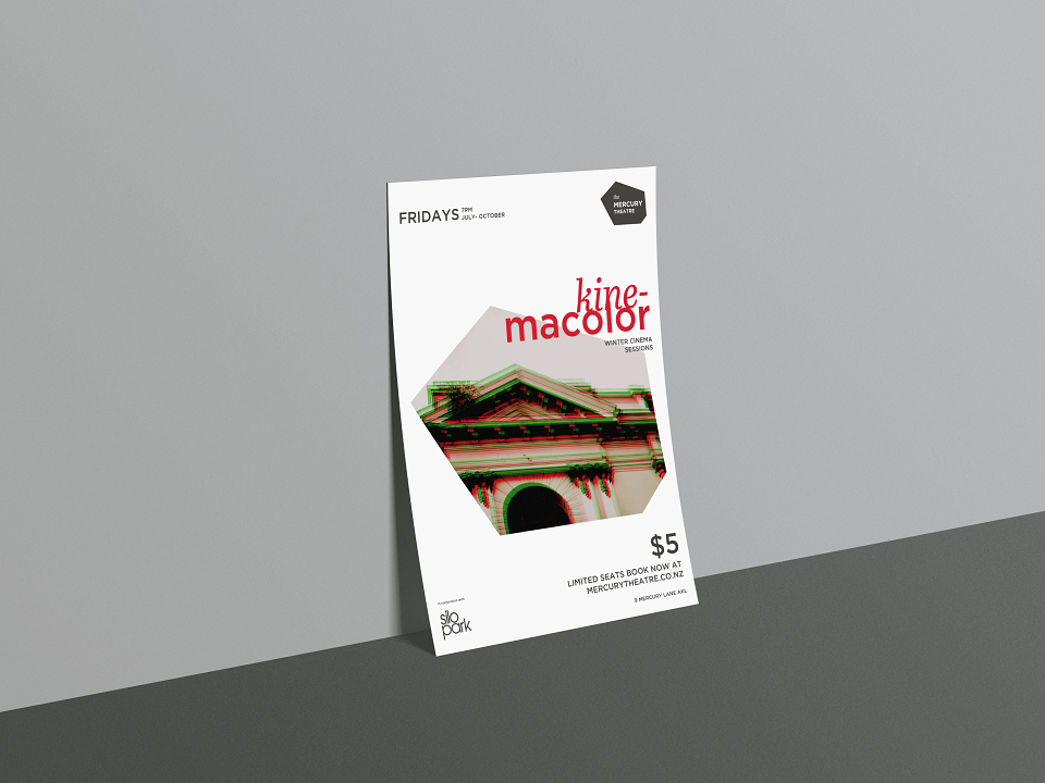
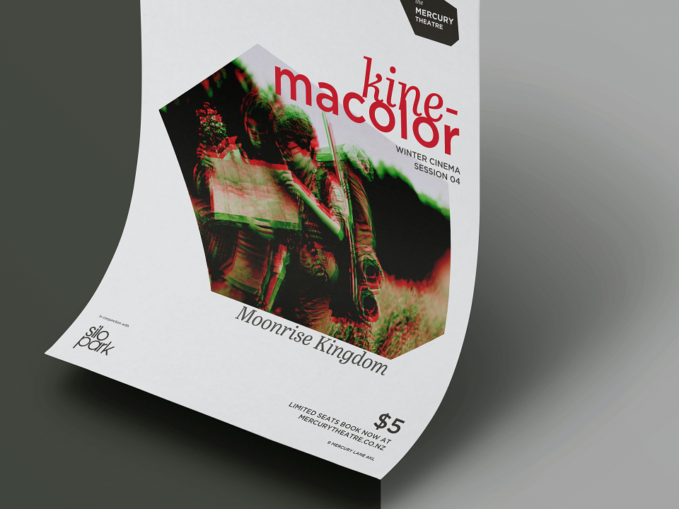
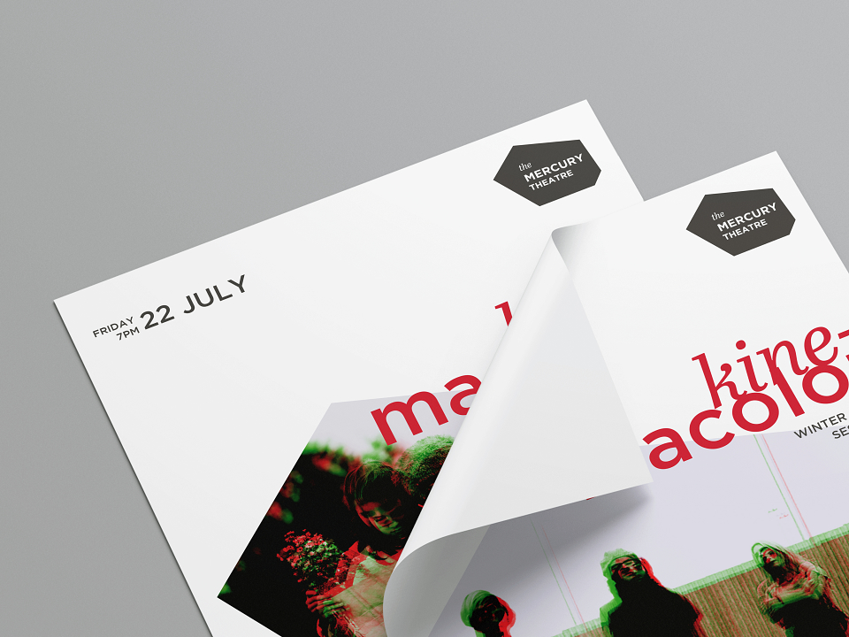
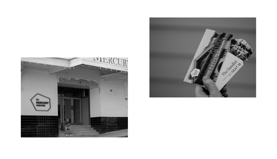
The aim was to rebrand the theatre in such a way that celebrated the rich history of the building but hinted toward it’s future. The new logo is a shape taken from forms of architecture that are unique to the style of the Mercury. The type treatment is a direct representation of the aim in celebrating the old but hinting at its future. The treatment of ‘the’ is based off the original logo type and the ‘Mercury Theatre’ is written in Gotham, a modern typeface that is inspired by forms of architecture. This idea was then followed and explored right throughout the rest of the project.
MADEIT CREDITS
-

Adam BradleyIn House Designer