Scott Randall
Lead Designer
ABOUT
Brenwards Ltd, an electrical and building contractor, asked HHCreative
to create their new identity. They were looking for a fresh, modern look, which still reflected the nature of their work.
With many formats to fit within Digtial and Print, we had to make sure the logo could exist in both portrait and landscape formats, so creating a flexible brand-mark that could work alongside the logotype was important.
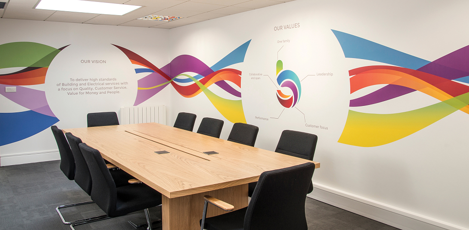
The idea behind the brandmark was based on looking at a twisted electrical cable, head-on, to form the letter ‘b’. This shape was then split into 5 sections to reflect the 5 core values of the company. We then found a modern font for the logotype that matched the brandmark.
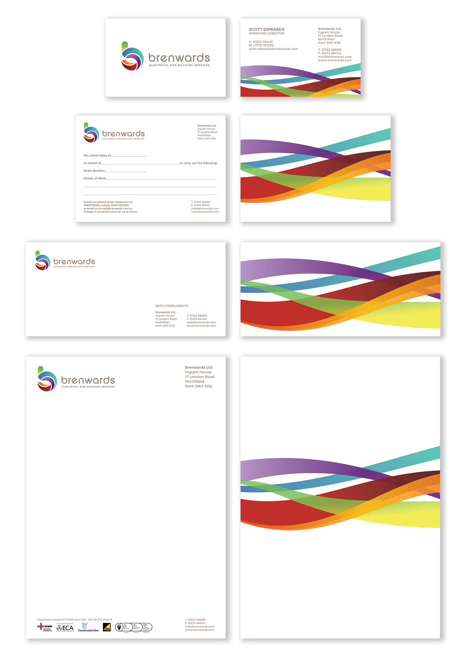
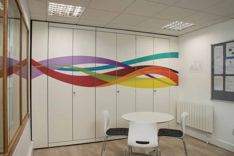
As part of the identity, we created an associated graphic, based on unravelling the 5 different colour sections of the brandmark, which help visually support content on all the assets.
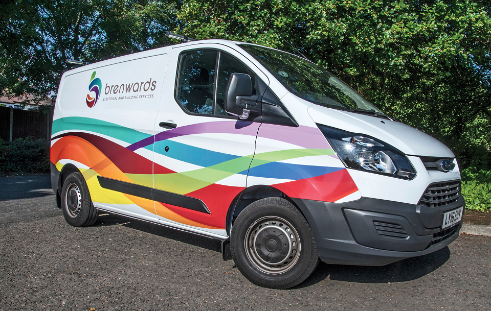
The new identity was rolled out to a full suite of stationery, email signatures, vehicle Livery, wall artwork and website (soon to be live).