

When it comes to rebrands that truly shifted the way we think about identity design, few voices are better placed to weigh in than our very own Matt Atchison, Senior Creative Director at Saffron Brand Consultants.
With decades spent shaping how global brands express themselves, Matt brings both craft and clarity to the debate around what makes a great rebrand truly great. In this article, he reflects on some of the most defining identity systems of the 21st century and explores how these designs didn’t just refresh brands, but redefined the very language of modern branding itself.
When thinking about rebrands, and what might be the best of them this century, there are plenty of worthy examples, and it’s debatable which stand out and why. For me, a handful exemplify something fundamental that was changing in the industry, helping open the door to a different way of thinking about brand design.
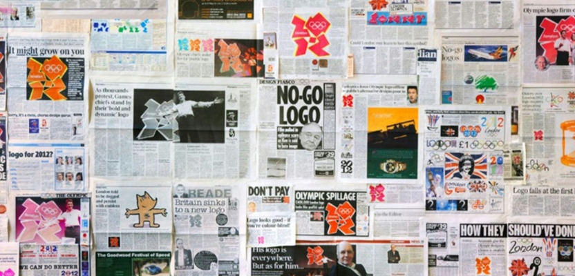
Starting with the London 2012 logo and identity: it may not win first prize for beauty, but it certainly wins for boldness—a non-conformist visual attitude that refused to play safe. Somehow, it evaded the almost inevitable watering-down by Olympic committees, political stakeholders, and public opinion. It ruffled feathers across the world and made everyone look. I admire it because it genuinely flew in the face of Olympic convention. In a world of corporate sponsors and sameness, it stood apart from the clichés of the city and made a statement about London itself.
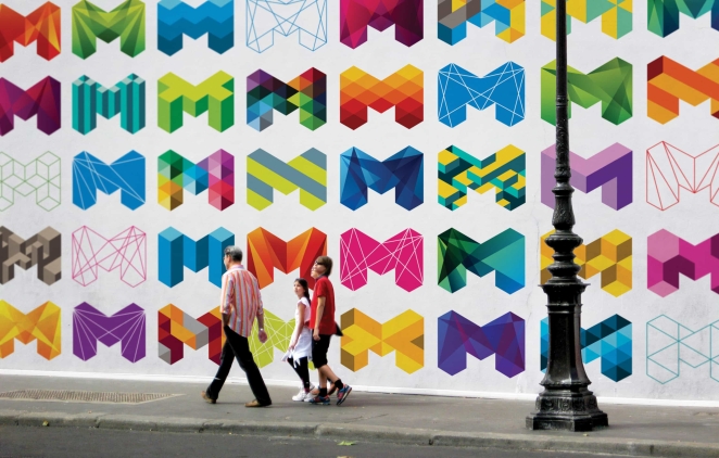
In the same vein, the City of Melbourne’s rebrand also turned heads around the same time. The work uses a simple iso-grid structure to build an engineered framework: an M that can hold any number of geometric forms and colours to express the richness and multifaceted personality of the city. It’s playful, confident, and raised the bar for what a dynamic logo system could do.
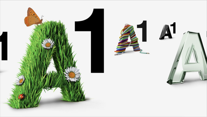
The idea that a brand personality can be expressed through a humble logo and flexible, adaptable elements means a brand is already communicating before you’ve even seen any messaging. A1 Telekom Austria’s rebrand is a great example of this in practice.
As the country’s largest incumbent telco, A1 needed to reinvent itself in 2010 and did so through its identity, Everything for Everyone—a concept that put human connection at its core. Telcos can often feel like faceless corporations that deliver a service but rarely invite emotional attachment. A1 flipped that expectation. By building a visual system around the individual, it used self-expression and personality to drive its design language, challenging the conventions of telco branding.
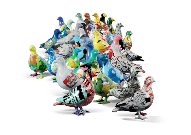
A more recent addition to this world of dynamic identity systems is the Museum of London, launched in 2024. It’s a brilliant concept built around the ubiquity of the London pigeon, and created a symbol that can carry almost any visual story drawn from the museum’s vast archive. At its core lies the idea of consistent variability and a flexible system that mirrors the city’s constant flux. By using the pigeon to embody London’s evolving character, the museum has crafted a brand that feels unmistakably of the city: fun, inclusive, and engaging for visitors of every age.
The reason these are some of the best rebrands of the 21st century isn’t simply because they’re dynamic, but because they emerged from a moment when the forces shaping design were shifting. Since the millennium, these identities have shown that the old dogma of uniformity in brand design is no longer sacred.
The digitalisation of media and design tools has allowed identity systems to embrace the constant flux of digital communication, while digital printing has freed designers from the constraints of offset. So why not have a logo that changes every time you see it? Why not let it evolve as a living, breathing asset within a brand’s language?
What these examples share is a refusal to sit still. Each redefines what a brand can be: not a rigid mark or a single expression, but a living system that adapts to context, medium, and moment. This shift isn’t about abandoning consistency, it’s about finding a new kind of coherence, one born from personality rather than control. In a world that changes by the second, brands that move with it don’t just stay relevant, they stay alive.
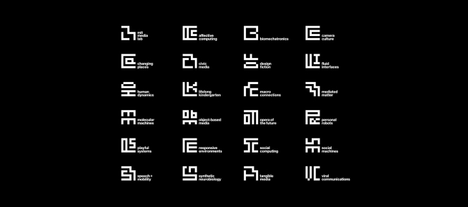
Personally, I still lean toward simplicity (perhaps even old-school plainness) when it comes to brand design. Give me Muriel Cooper’s MIT Press logo any day: a solid modernist masterpiece. But even the evolution that led to the MIT logo, and then to Pentagram’s work for MIT Media Lab, carries that same spirit of variability. Yet, you could still print it in a single colour...if you wanted to!
Shawnee Dee October 24th, 2025, late at night
Great article.