James
Lead Designer
ABOUT
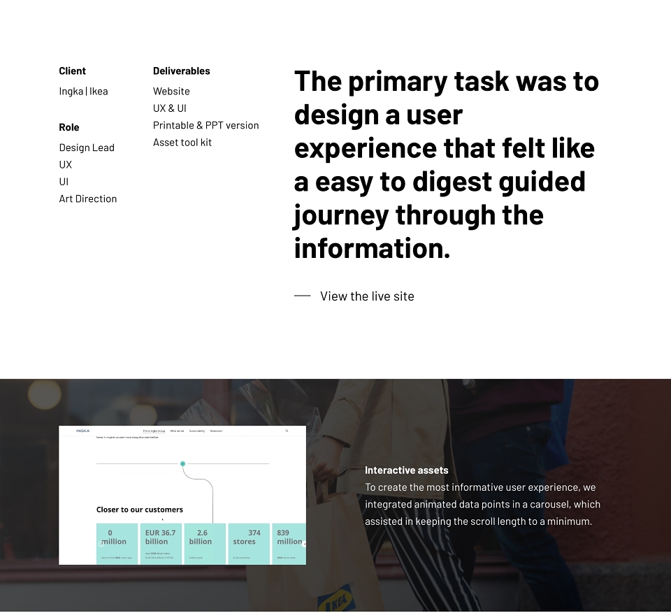
The primary task was to design a user experience that felt like a easy to digest guided journey. Simple and on brand.
Interactive assets
To create the most informative user experience, we integrated animated data points in a carousel, which assisted in keeping the scroll length to a minimum.
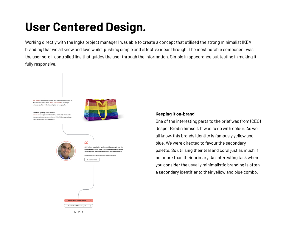
User Centered Design.
Working directly with the Ingka project manager I was able to create a concept that utilised the strong minimalist IKEA branding that we all know and love whilst pushing simple and effective ideas through. The most notable component was the user scroll-controlled line that guides the user through the information. Simple in appearance but testing in making it fully
Keeping it on-brand
One of the interesting parts to the brief was from (CEO) Jesper Brodin himself. It was to do with colour. As we all know, this brands identity is famously yellow and blue. We were directed to favour the secondary palette. So utilising their teal and coral just as much if not more than their primary. An interesting task when you consider the usually minimalistic branding is often a secondary identifier to their yellow and blue combo.
MADEIT CREDITS
-

JamesLead Designer