Poke
London
ABOUT
The brief:
Create a new site for Ted Baker that can improve the domestic shopping experience, while playing a vital role in Ted’s international expansion plans.
Poke’s answer:
We developed a user focused site that fully supports the company’s growing number of omni-channel activities, without sacrificing any of Ted’s uniquely quirky personality.
Nitty gritty
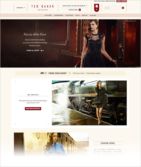
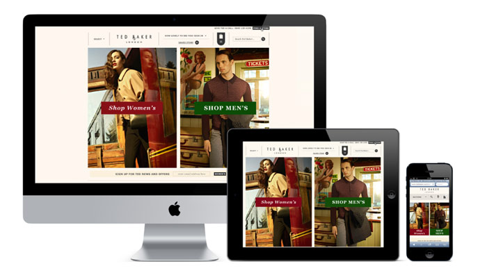
We’ve transformed Ted Baker’s online experience with a complete redesign using a responsive web design approach. The newly launched site balances e-commerce best practices with Ted’s irresistibly quirky personality to create an experience that’s as enjoyable as it is hard working (just like the great man himself).
Our first job was to look at the differing way in which men and women shop. Interviews at Ted’s flagship Covent Garden store provided us with an insight that many had long suspected: women tend to have a clear idea about what they’re looking for, while men (sorry fellas) often need a little more direction.
Our findings helped us to reconsider the traditional UX of retail e-commerce to better suit the browsing and buying patterns of Ted’s customers. We decided to create two highly flexible page templates, so that men and women can be guided along two different journeys. With a focus on personalisation that is set to grow in the coming months, each journey is tailored to specific browsing behaviour and interest in different products and collections.
A toolkit has also been developed, containing 27 distinct templates in total. This means the site can be easily adapted for each season – and each region – as Ted continues his adventures into new and exciting far-flung lands.
With a logically structured and user-friendly structure in place, we were able to bring Ted’s signature quirky personality to life online. This wasn’t just for our amusement (fun though it was). Rather, as a brand that is rapidly expanding into regions with lower awareness – and often minimal or zero store presence – it made a great deal of financial sense. Ted’s personality inspires loyalty and gives the brand a unique positioning in the fashion world.
Taking our responsive design, software solution provider neoworks then implemented the new site based on the Hybris commerce suite. Neoworks have implemented new functionality around the user journey and integrated the platform directly to the back end warehouse, OMS and CRM systems. Furthermore, integration with other 3rd party tools for search and navigation now drives flexible merchandising opportunities on the site.
The new site delivers a seamless customer experience that further enhances Ted’s omni-channel capabilities.
Highlights
- Meetings at The Ugly Brown Building (Ted Baker HQ). Anyone arriving late was required to complete 10 press-ups!
- Being given the freedom to add personality to even the most functional of elements.
- Working with a brand with such a clear and distinct vision of who they are.